appt


Purrweb
UI/UX
About
the Project
APPT is a smartly structured web application that is designed for independent individuals and growing companies to organize the web presence and automate lead generation.
Entrepreneurs or businesses can set up their own professional website, advertise the variety of services and let clients book the service providers online.

Our Targets
-
01
To create a consistent and appealing product for clients
There are a lot of successful projects on this business field so far e.g. such giants as “StyleSeat” or “Treatwell”. We wanted to compete against them and that sounded like a challenge that we accepted. To create a meaningful UX we had to consider the process from the client perspective, highlight pain points and interview real users of our potential competitors.
-
02
To create a smart business tool app for businesses
We considered applicable industries for the appointment setting, researched across business pain points and tried to emulate the familiar app environment for the user on the business side. During that research, we indicated top 5 web apps used by our target audience - that were Gmail, Facebook, Commbank (Australian banking app), youtube and eBay.
-
03
To design a smart, neat and interactive prototype that is able to raise funds
We were aimed to not just create an appealing design but to create a successful product that could have been easily proposed to investors and got some funds raised for further development and support.
Product The Prototype
We came up with a plan to start with wireframes. That was the only way allowed us to test our ideas before the real designing started.
Wireframing stage actually was the most complex and time-consuming thing. During that stage, we established the app architecture, navigation components and ended up having a clear vision of the user journey.
Screens
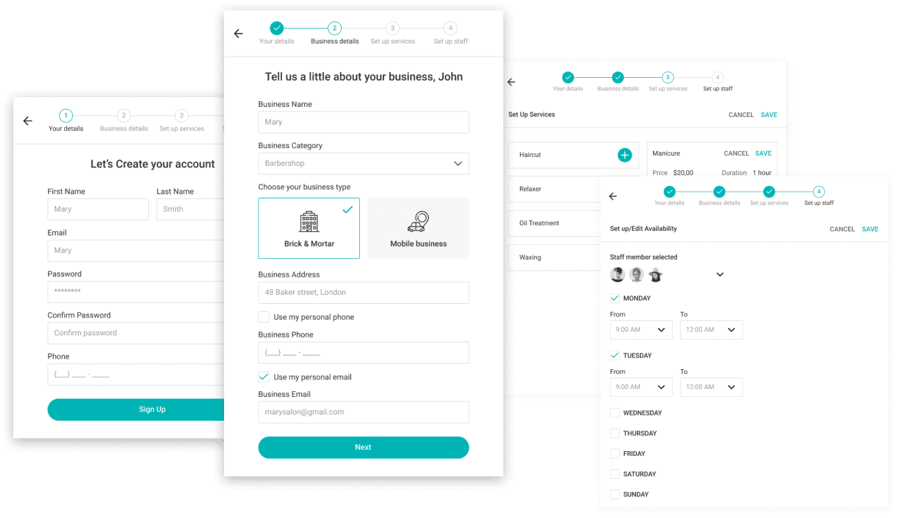
01 Onboarding
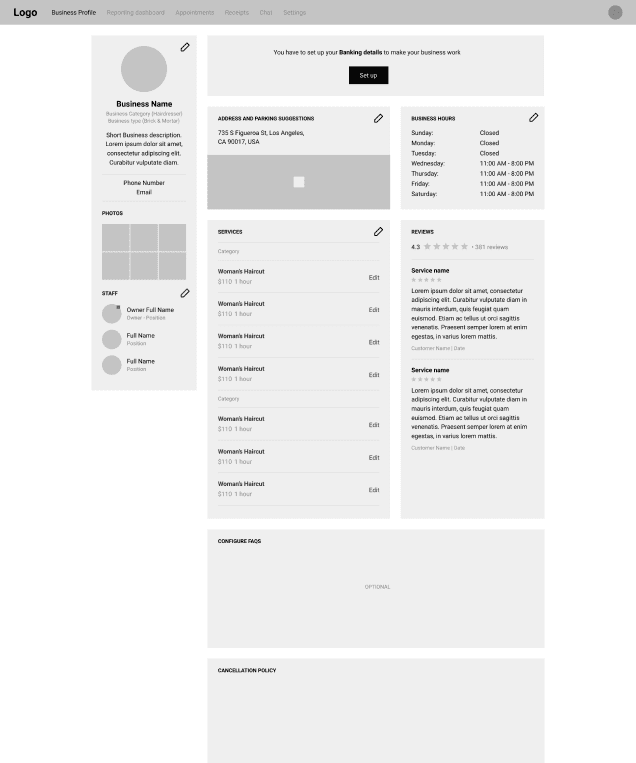
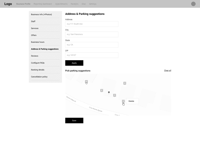
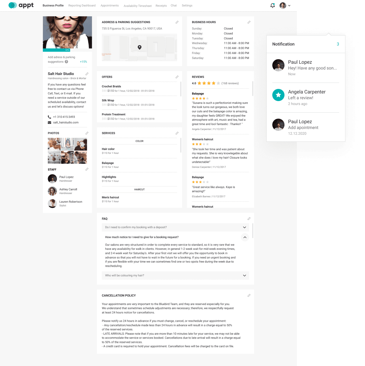
02 Business Profile
The main goal we persuaded when designing a business profile was to get it clear, comprehensive and appealing. We tried to let the user have everything he/she needs within reach. No complex navigation, no hidden functionalities - just a useful dashboard with key features at a hand.
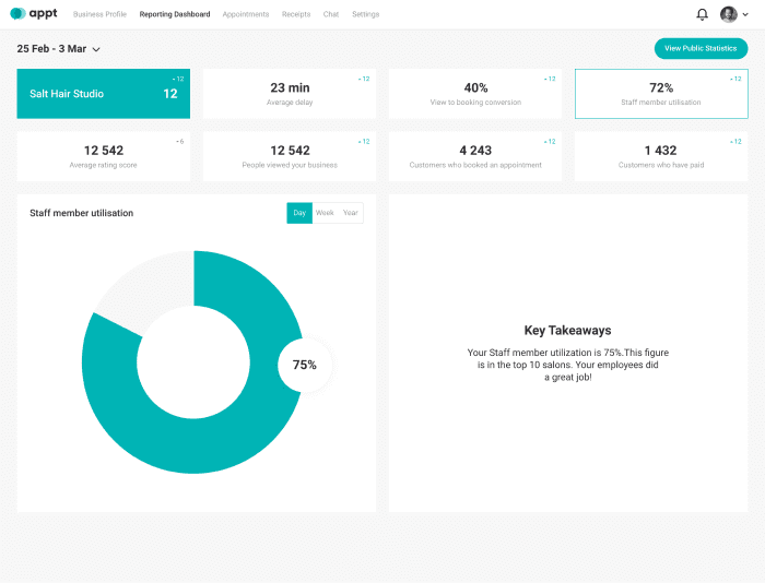
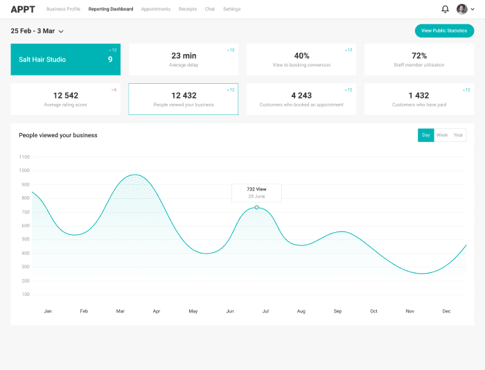
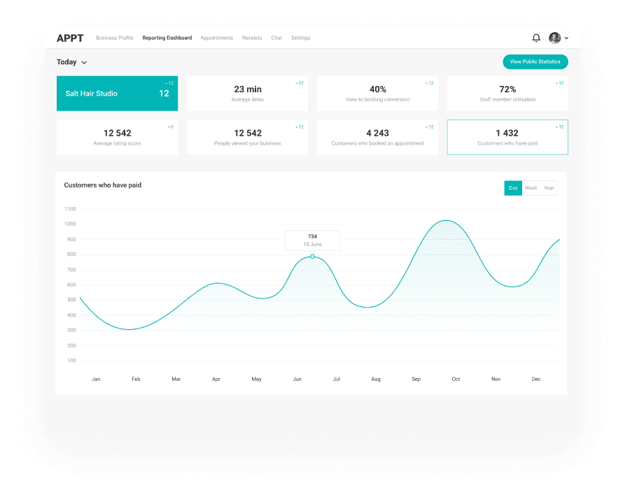
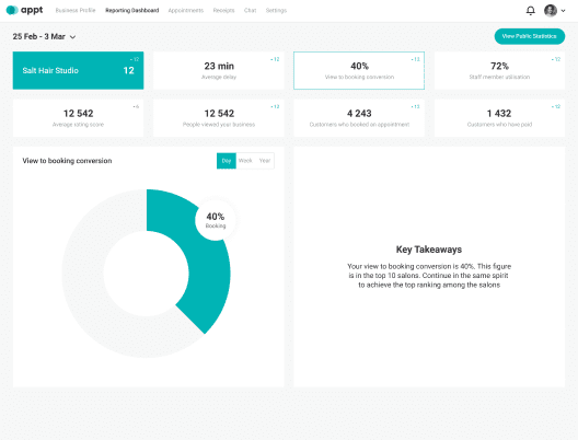
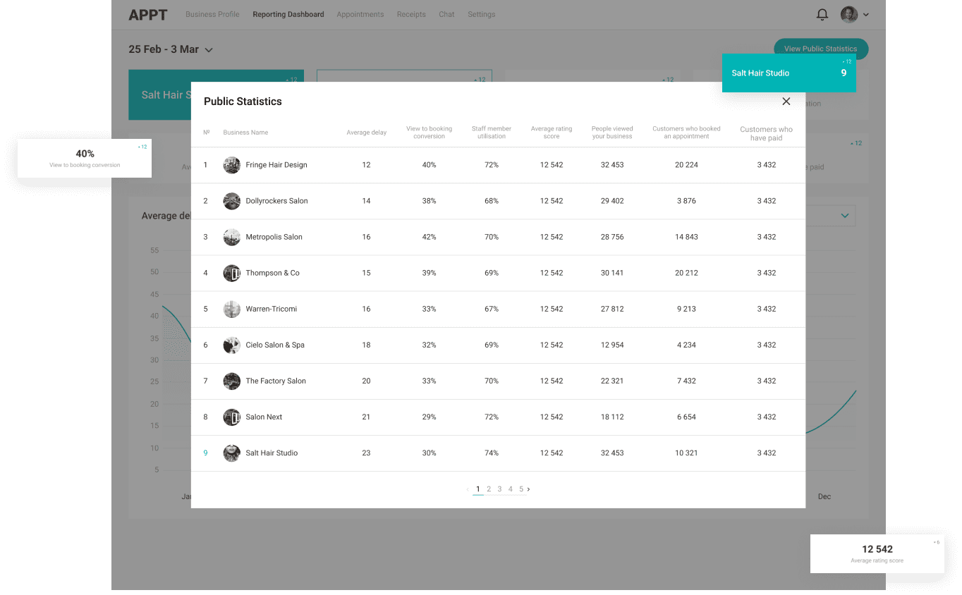
03 Reporting Dashboard
It’s a smart tool that is used to track and monitor the KPIs, business metrics, and analytics. The killer goal within the Reporting Dashboard was to organize analytical data and make it simple to be perceived.
Colours
- #00B4B5
- #F7F7F7
- #E8F3F0
- #BDC5C0
- #FFFFFF
- #AAA9A9
- #6B6B6B
- #302F33
Typography
Roboto
- Regular
- Medium
- Bold
12-48 px
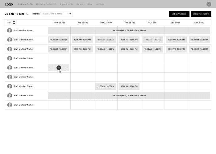
04 Staff Member Availability
That was one of the most complex flows to design, because we had to simultaneously display several availability conditions, such as “Working Hours”, “Break”, “Vacation” and “Moonlighting” and to not confuse a user. The only screen, too many options - lots of solutions.
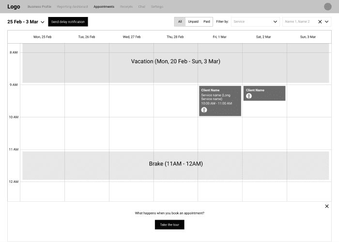
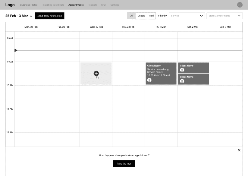
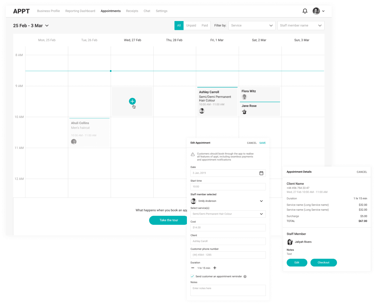
05 Appointments
The killer feature of the app, it’s a revenue-raising tool for our customers. We wanted it to be clean, rationally structured and neat. All needed information about the upcoming or past appointments at one sight - that was the agenda. We came up with a smart search and toggles to let the user easily navigate within the different categories of appointments. We managed to provide a user with full functionality for creating and editing an appointment without switching between tabs or pages. All stuff in one place.
Counters
-
128.5
Hours
-
90 +
Screens
-
15
Meetings
Thanks for your inquiry. We usually take up to 24 hours to get back with reply.
Wanna schedule an online meeting?