Explore

Need help with your project?
Oops! Something went wrong while submitting the form.
Web service
UI/UX Design


2020

An e-wallet that allows users to buy, keep,and transfer their cryptocurrency assets,as well as exchange one cryptocurrencyto another within one service — a project born from our broader crypto e-wallet development work.

.webp&w=1080&q=75)
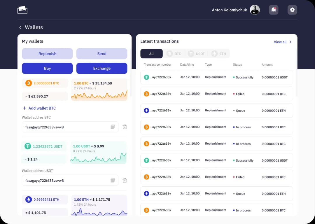
When the client came to us, he already had a working app and a landing page. Both were created based on a Themeforesttemplate (a template for WordPress), that didn’t meet the case: the app lacked individuality, and the landing page didn’t sell — a case for rebranding rather than a quick facelift.
The client was looking for an agency that could handle his needs and redesign his app and landing page — lucked into one of our cases on Behance. The case was about Fintarget.app — a project where we developed an interface that makes the app easy to get even for newbies in the investment sphere. The client liked our approach to solving problems.

Most people associate cryptocurrency with mining and a surge in bitcoin in 2015. However, it’s a complicated niche with its own pitfalls and nuances that require mastering.
The project became our internal experiment. We tried to put to work a sprint methodology: thought it would fit the design processes. But it turned out to be only our wishful thinking.
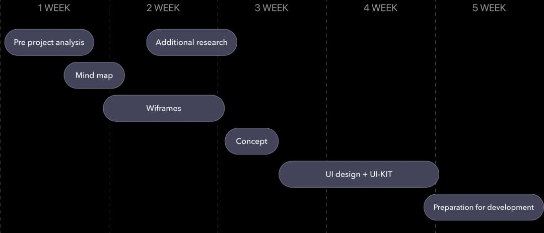
We decomposed the project into small tasks, planned the sprints,and started with UX design. Cryptocurrency is a niche product, and you cannot spend 2 weeks working on a bunch of screens without proper understanding.



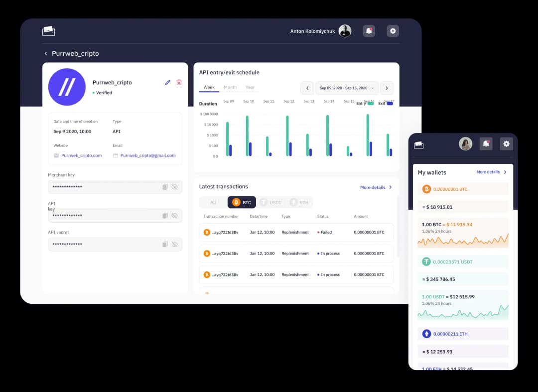
To test the waters, the client started with a simplified solution and went on with an MVP. The product was in demand, and hedecided it’s time to complete it with a proper UI/UX design and build a recognizable brand.
High security, low fees, no chargebacks, and anonymity — crypto payments have a lot to benefit users. To acceptBTC, ETH, or USDT, a business needs to integrate with a payment system. It generates a wallet address that allows users to transfer cryptocurrency.
Consulting about investing in Bitcoin, Ethereum, or Tether requires strong analytics tools. Those who monitor the exchange rate of cryptocurrencies and predict the dynamics need a dashboard to trackchanges in the rates.
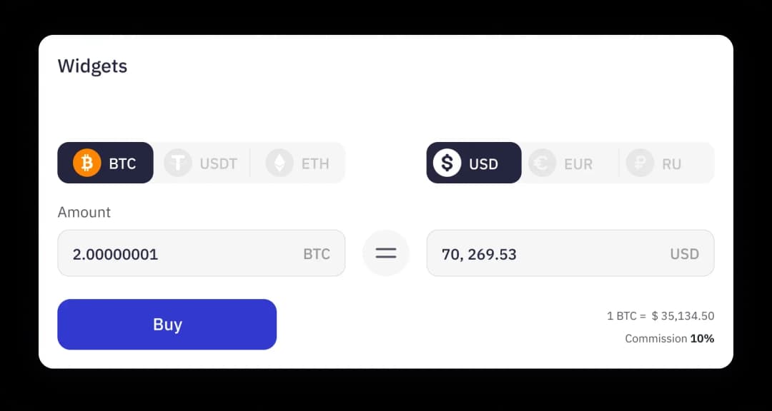
You can buy or sell cryptocurrency in different ways: on the stock exchange, at ATMs, or via P2P exchanges— in any case, you will need an e-wallet. A widget that shows how the service works will help the user quickly understand the matter.




Nice minimal design
Convenient widgets

Difficult navigation
Use red to sell BTC, which looks more like a bug

Modern and creative landing page design
Availability of widgets
Simple navigation
There is no general dashbod on which you can track several recent activities at the same time

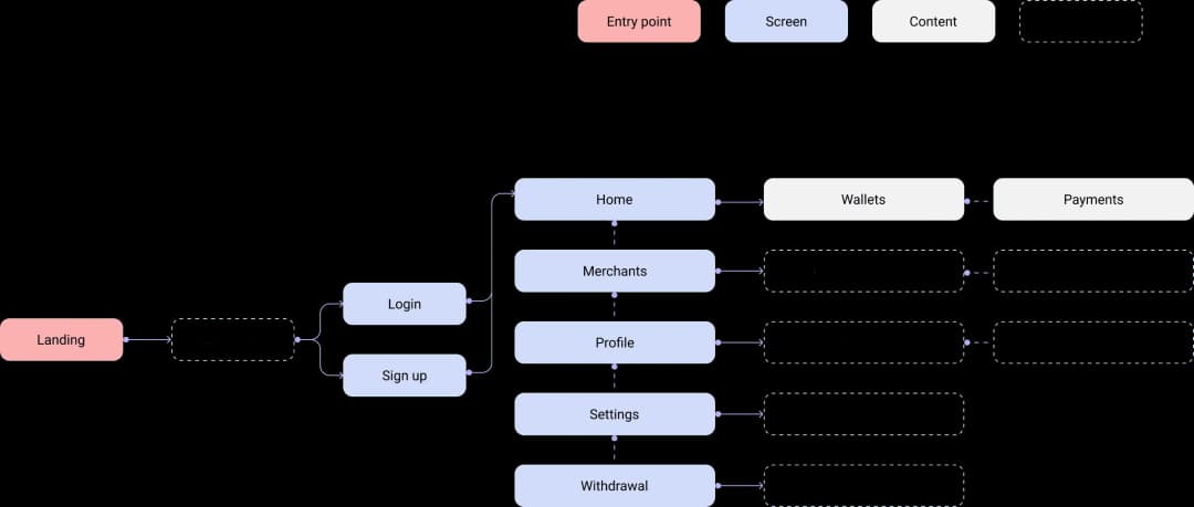
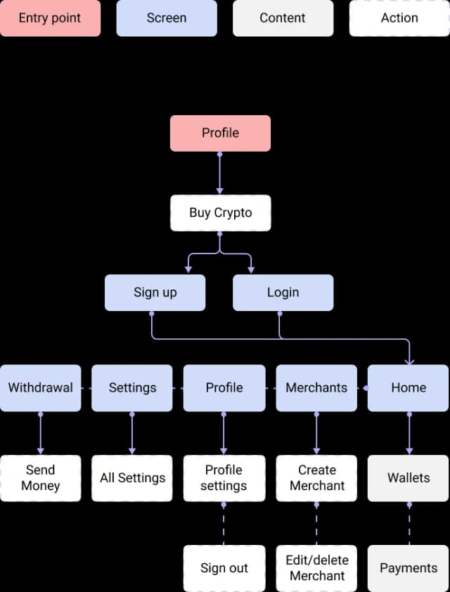
We built a detailed mind map and spent tens of hours on calls with the client. The mind map allowed us to look over the old architecture and think out how to wrap changes and not disappoint existing users.
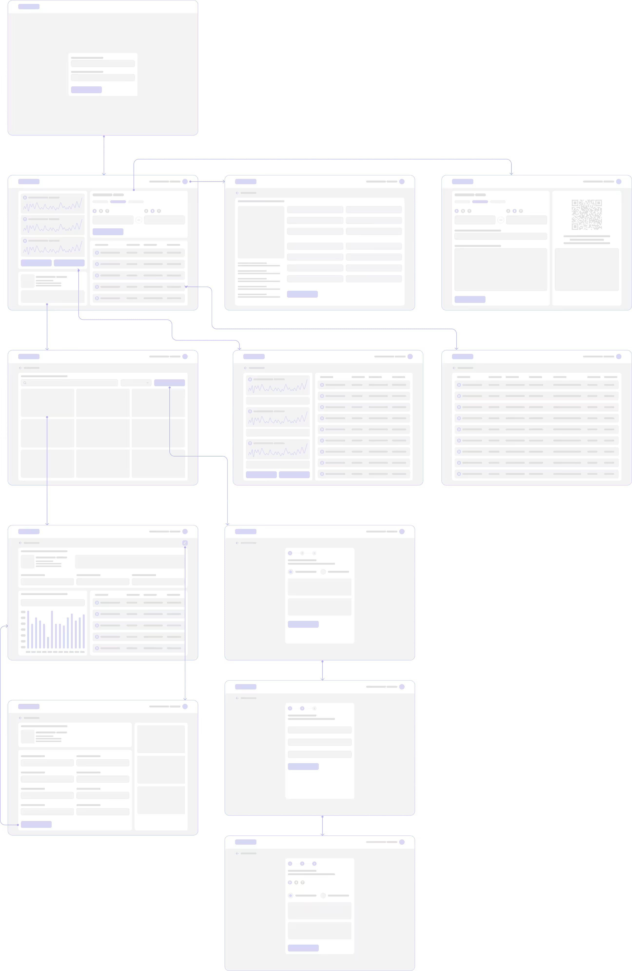
Showing each screen to the client helped us get updates and makeedits on-the-go — this is how we managed to upgrade the user experience without damaging the product’s logic.
We started developing UI concepts earlyon and delivered 3 versions.

We decided to simplify the interface. It was coolyet the client didn’t like the result: he wanted a “one-of-a-kind” design with many wow-effects
Following the client’s recommendations, we wentfurther. This time the interface was bright. Plus, we added art-objects. However, this versionseemed unserious to the client
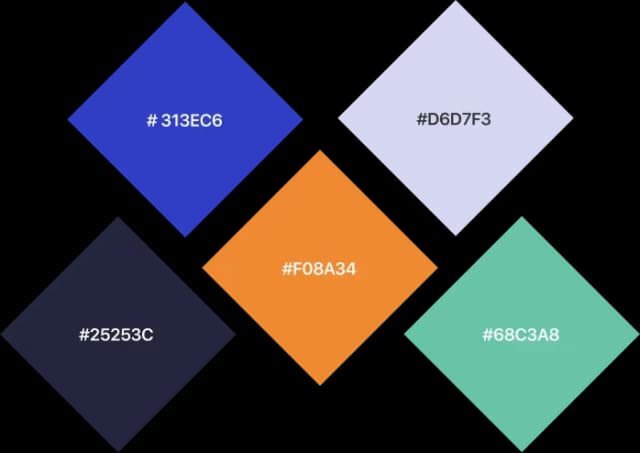
“I want darker” — this is where we started finishingoff the concept. The colors became darker and the whole interface is more like a banking app


The logic was unclear to the user: similar features on different pages. In the meanwhile,some of them were hard to find.
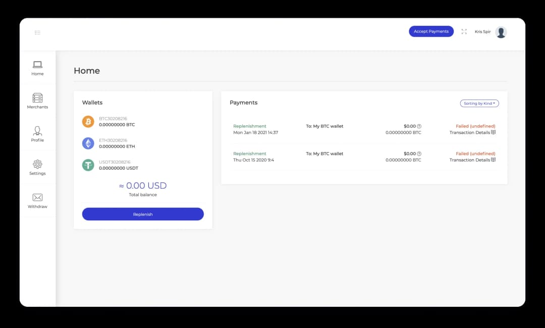
Now all action-buttons are available from the main screen, and usersdon’t have to spend time looking for features across the screens


.webp&w=1080&q=75)
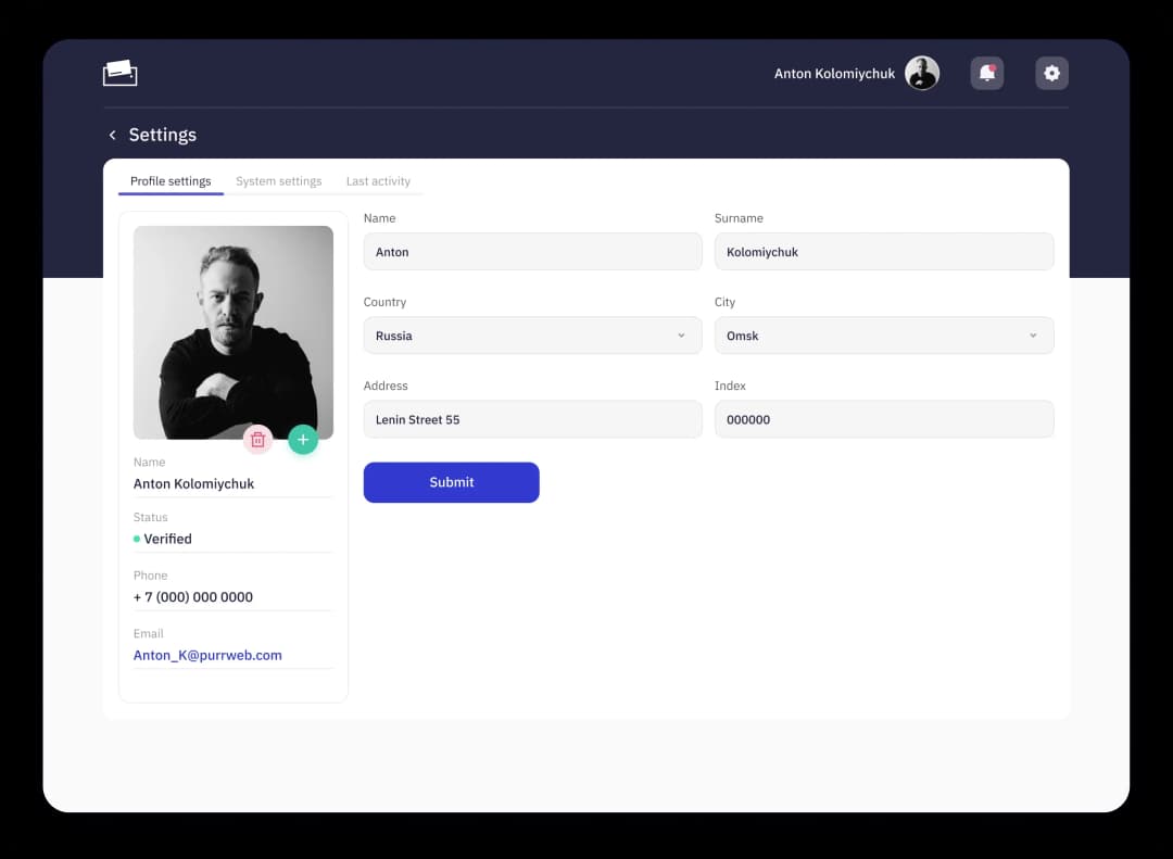
For some reason, the system and profilesettings were placed together.
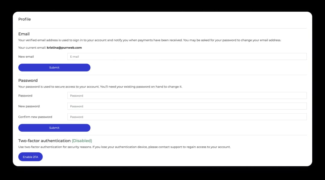
The screen felt overloaded, that’s why we rebuilt it andleft everything the user needs with a single “Submit”
The widget can help to draw the user’s attention:it allows to see how many bitcoins the user will get if have $N.
Most of the competitors had such a widget, which showed us that it is a must-have. We addedit to the PayPay landing page — users key in a sum(both sides, to see equivalents here and now) and get asked to sign up.
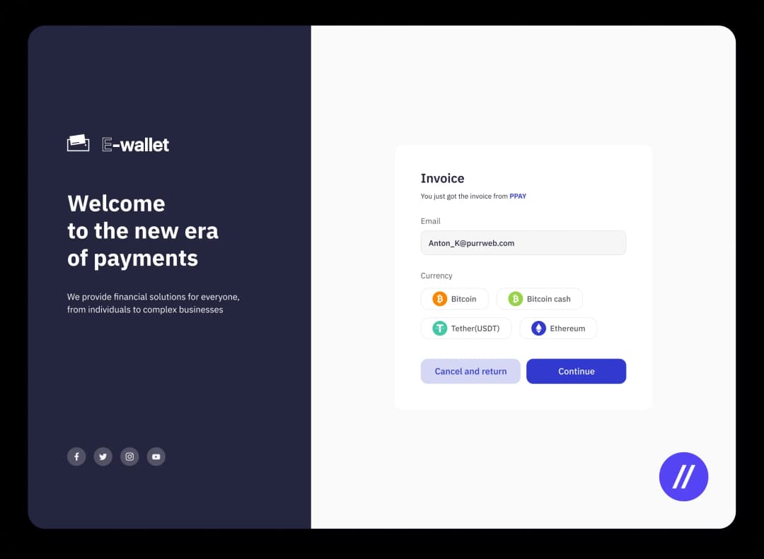
Initially, the service had only one feature: Replenish. We split up the functionallyof the “Replenish” into “Replenish”, “Buy”, “Withdraw”, and “Exchange”.

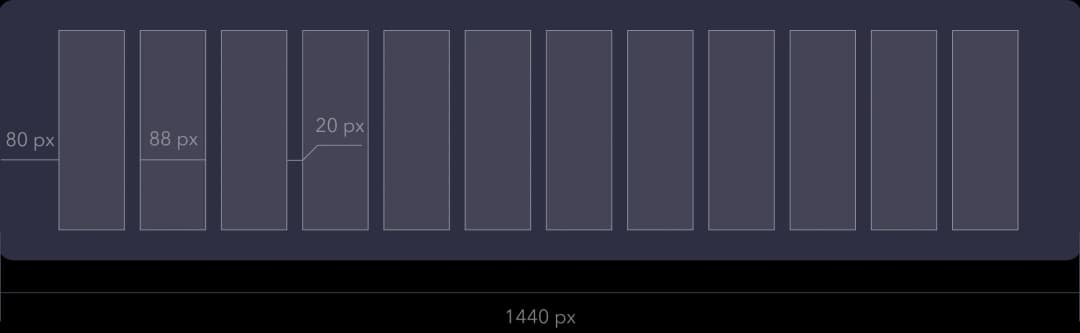
Desktop
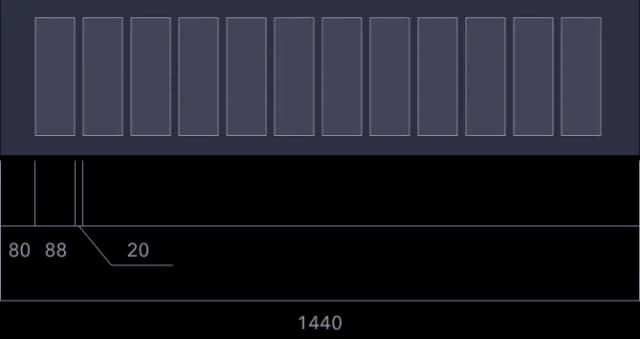
Tablet
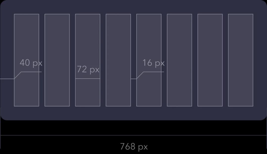
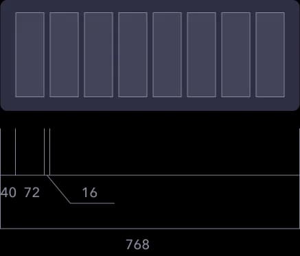
Mobile
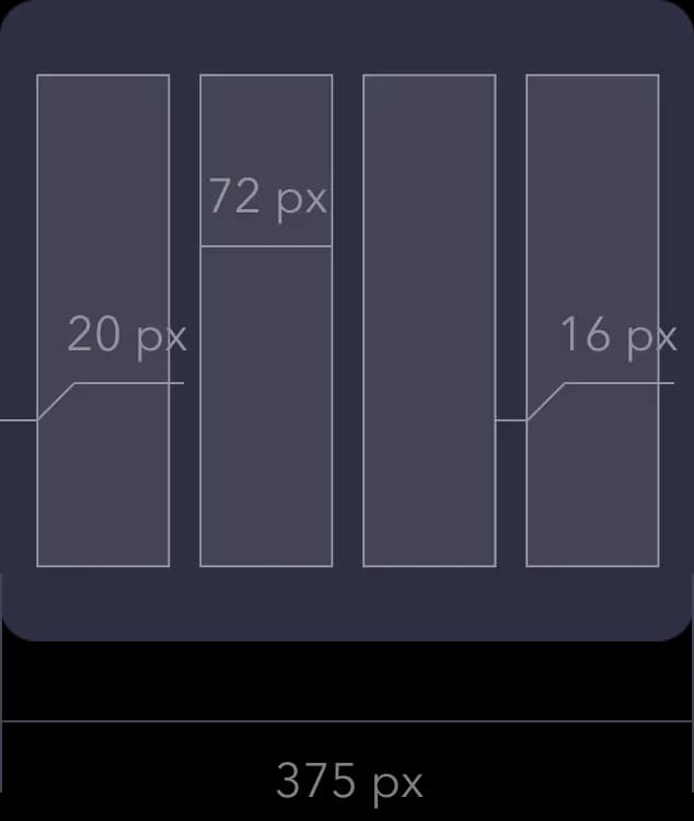
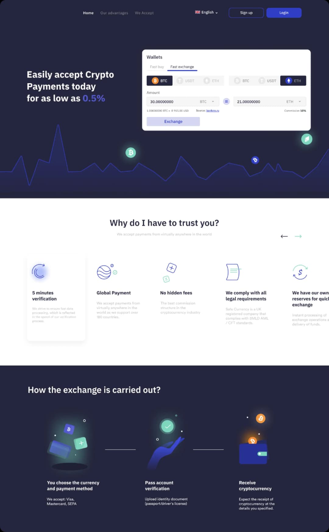
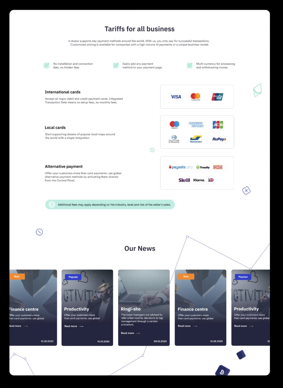
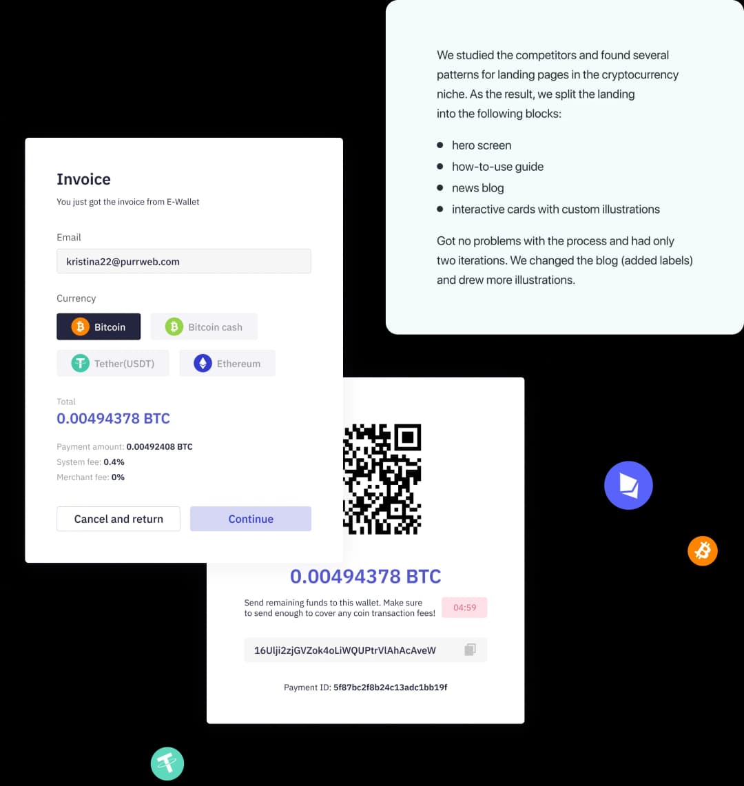
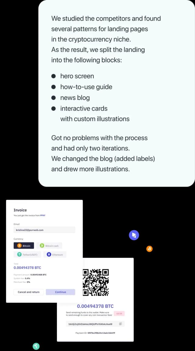
We had a subtask to rework the landing page for the app.
Although there were no requirements for the landing page, we had a solidunderstanding of the cryptocurrency and the client’s tastes. We wanted to make a transparent landing page and would help users understand where they are and why they need it.
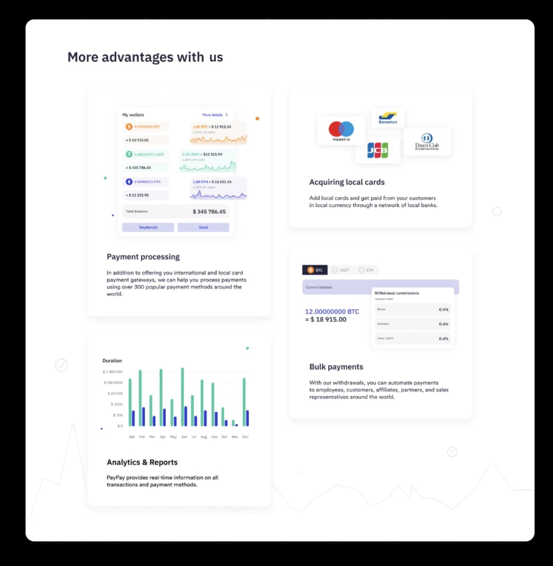

The authorization screen now has a custom illustration on it — the designer wanted to leave a mark. The client liked the ideaand approved the cat.
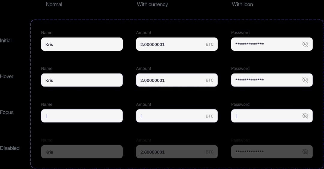
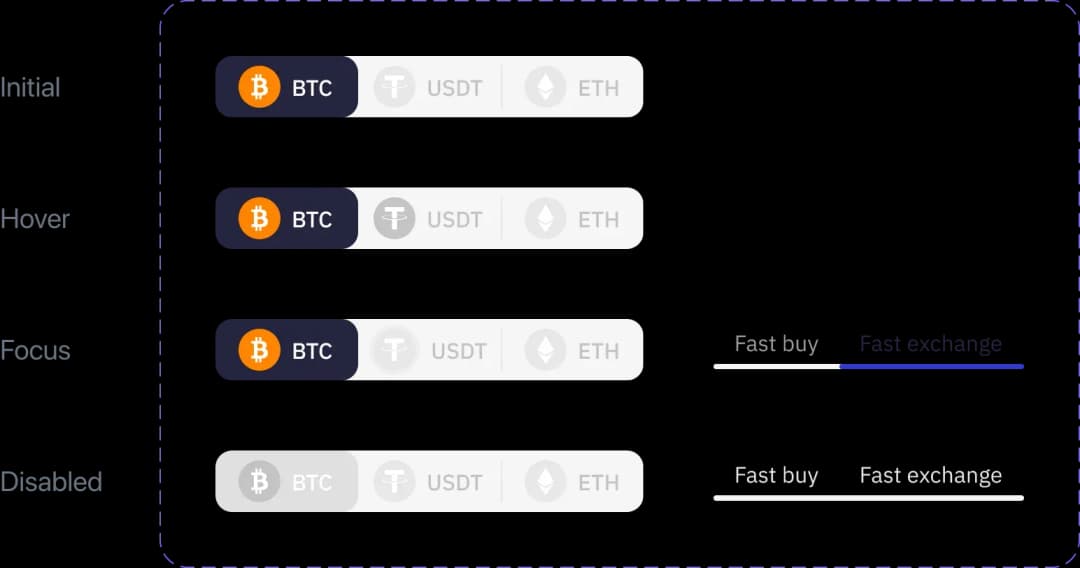
We carefully worked out the UI-kit and handed it off to the client’sinternal development team. Now they are bringing it to life.
8
12
20
32
48
80
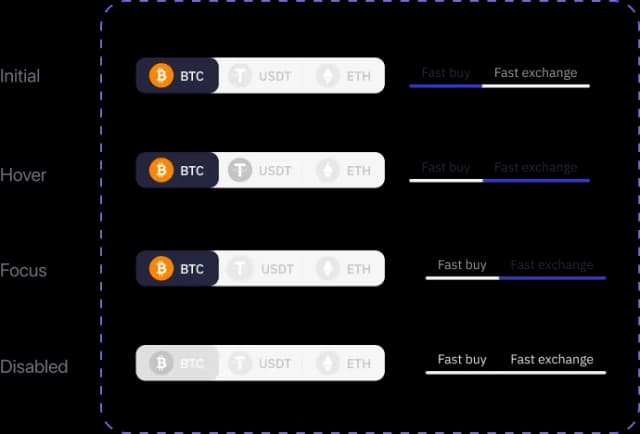
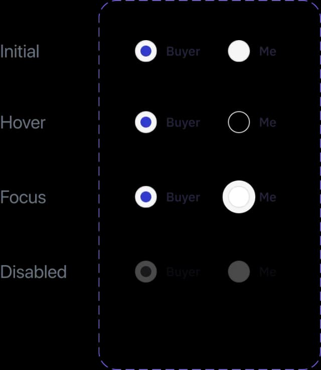
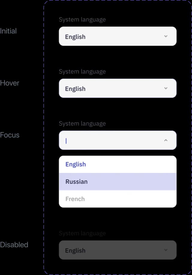
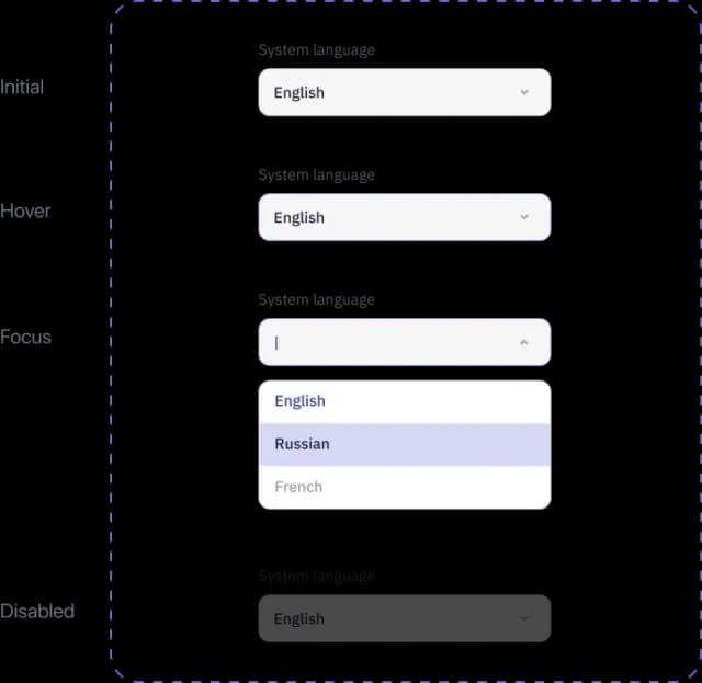
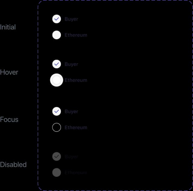
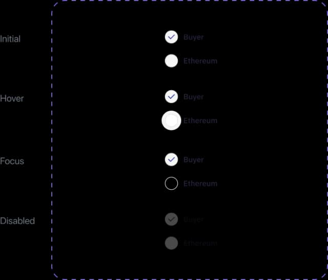
To create the UI-kit we used Variants — a new feature in Figma that allows to collect allelements in one easily changeable component



To develop the new logic for our product, Purrweb’s manager carefully studied our competitors, created a detailed mind map,and spent hours discussing interface elements with us. The Purrweb team did a great job and provided us with UI/UX design assets of the highest quality. They completely reworkedthe way navigation works and streamlined the core user flows, which made our service more intuitive and convenient for the users. The design is finished, and we’ve already started implementing it with our development team.
The client

The client was totally into the project and patiently explained to the designer how every feature works. We’re happy with such a close involvement of the client.
Svetlana Kolpakova , Project Manager

It was pleasant to see our project among referencesprovided by the client.
Kristina Spiridonova, Аccount Manager

This project was not about prioritizing features or thinking out the IA from scratch. We applied our UI/UX skills to deliver what the client came for.
Julia Vakulenko, Lead UI/UX Designer

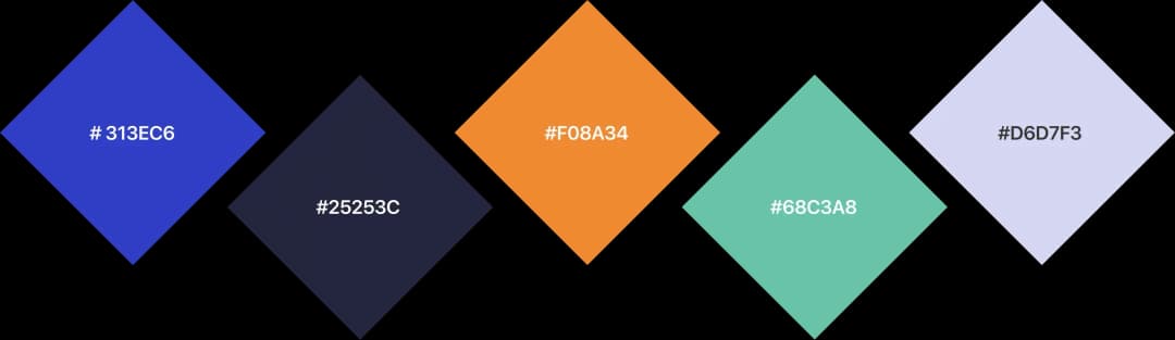
To understand the landing page structure, we studied competitors and analyzed the market. We managed to create a unique look, ditch humdrum colors, and makeit minimalistic.
Victoria Minaeva, Lead Graphic Designer