MOBILE APP REDESIGN
POWERED BY PURRWEB STUDIO
ABOUT PROJECT
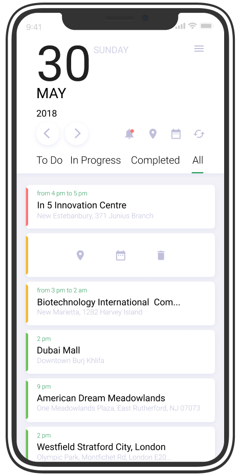
JOURNY is an easy-to-use mobile app that monitors and manages field teams in real-time providing a 360-degree view into all field activities.
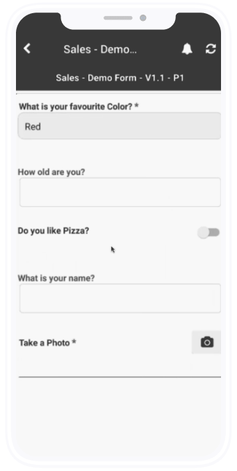
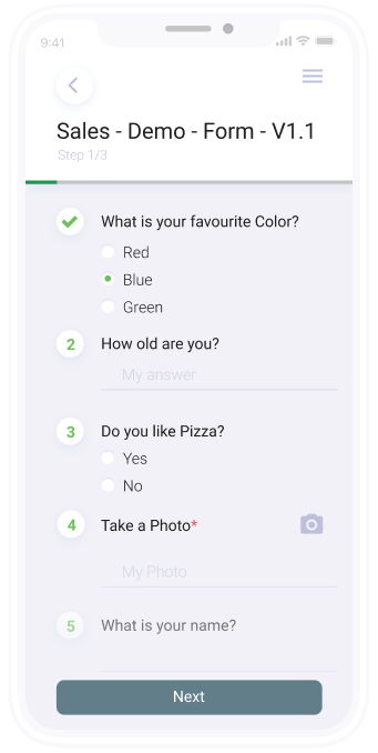
Field teams can benefit from route optimizations, dynamic forms for data collection, pre-scheduled tasks, taking geotagged photos, collecting purchase orders and more.

-
DESIGN
Julia Sanyuk
-
PROJECT MANAGER
Sergey Nikonenko | Kate Strokina
-
COPYWRITING
Sergey Nikonenko
-
DEVELOPMENT
Sergey Ivanov | Sergey Ponomarev

PROBLEMS OF THE OLD VERSION:
- outdated UI;
- lots of missing features that prevented seamless UX;
- difficult differentiation between statuses of visits;
- design was only Android specific. That design can not be used on IOS devices.
REDESIGN GOALS:
- check users’ feedback and app analytics;
- refresh the UI but keep it calm;
- find out missing features;
- come up with the new filter/status concept;
- design became universal and can be supported on both IOS/Android devices.
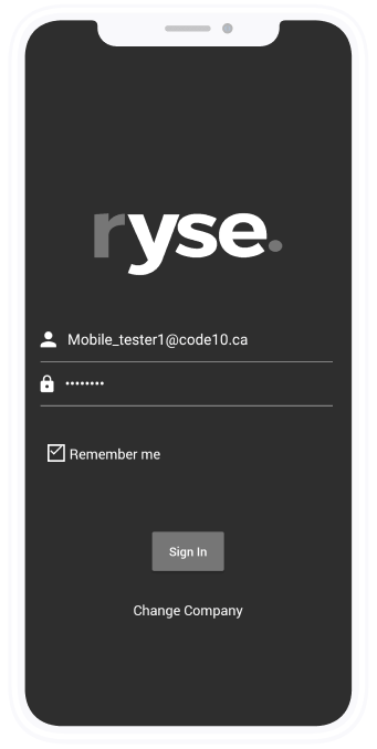
Before Problems
- missing “forgot password”
feature - small log in button
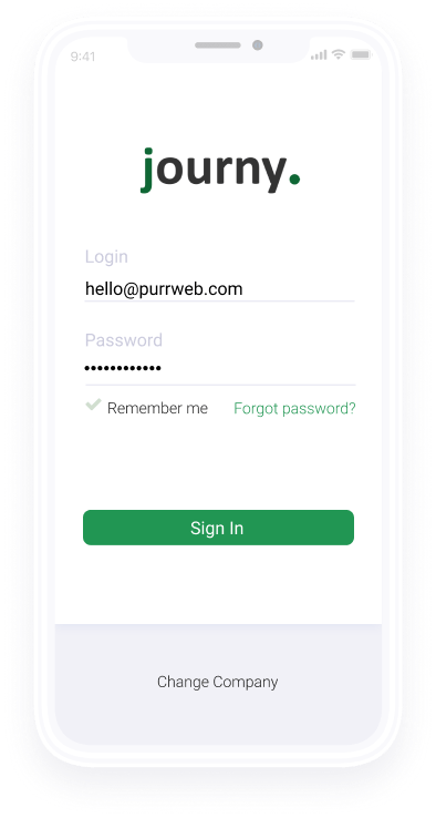
After solution
- added gentle feature to
remind the password - increased button
size
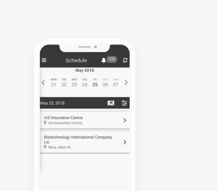
Before Problems
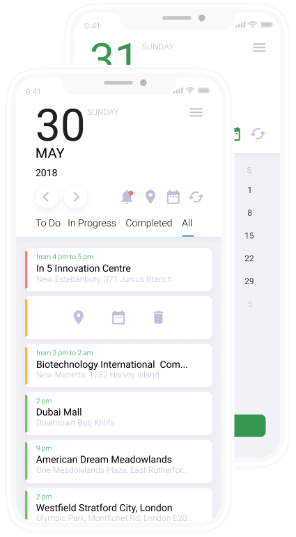
- Inconvenience to check past visits (e.g. 1 year ago) - user’s request
-
No need to show the whole week to a user, he’s only interested in the visits for
a single day - No way to understand visit status
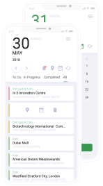
After Solution
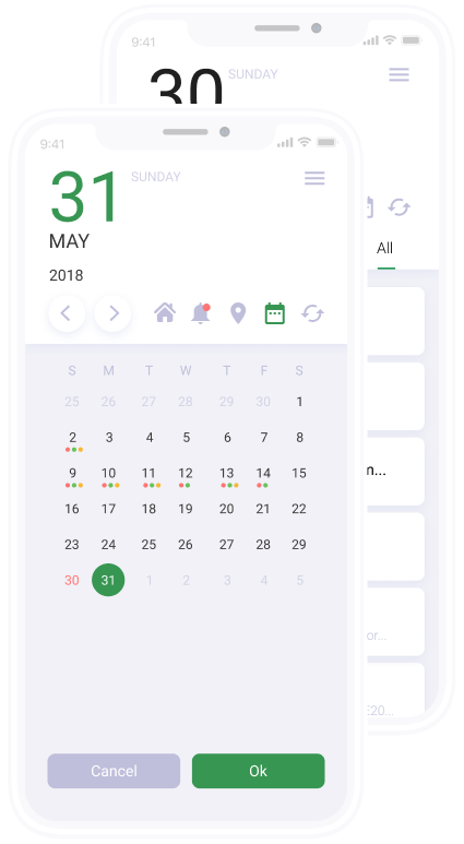
- Added the feature to trace the history back with the calendar
- Restructured the layout of the whole screen to manage the focus of the user on a specific day and it’s visits
- Implemented a new color status map and map legend
2 BLOCK PAGES / DASHBOARD
BEFORESOLUTION
AFTER
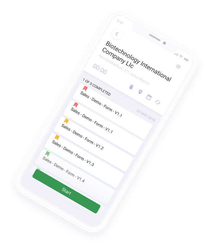
- Designed the rescheduling
functionality - Added ability for a user to
check the visit location on
the map - Changed the visit layout
to make it scalable for
multiple surveys
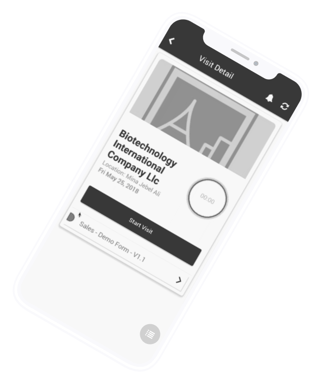
no way to cancel,
reschedule a visit
user can’t track the
location of a specific visit
layout was’t scalable to
add several surveys
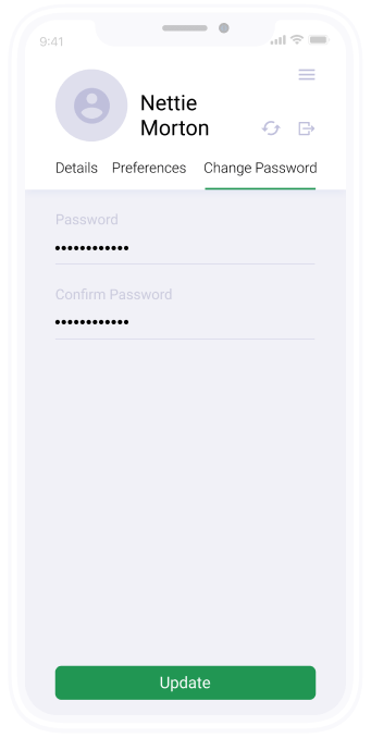
PROFILE PAGE
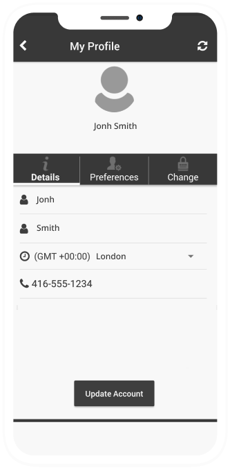
before problems
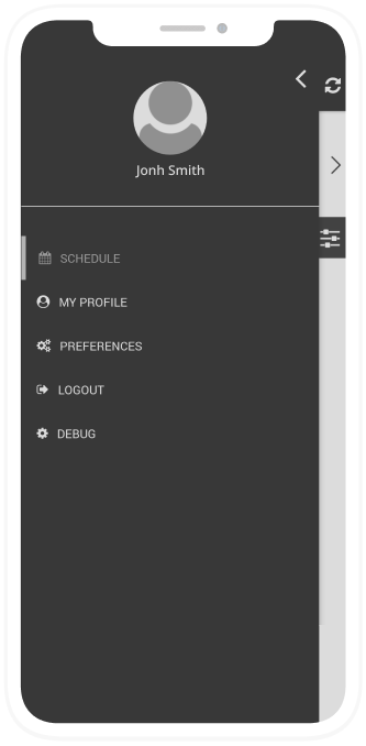
an old-fashioned layout of the profile screen
mobile app redesign
after solutions
-
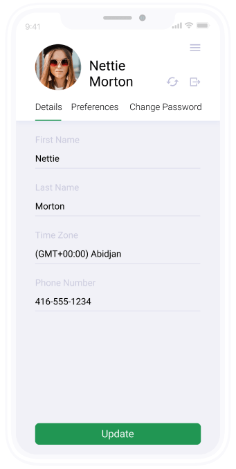
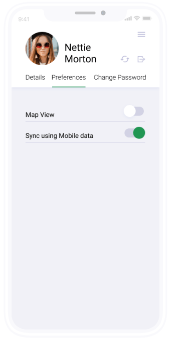
1changed the button size, colors and fonts
-
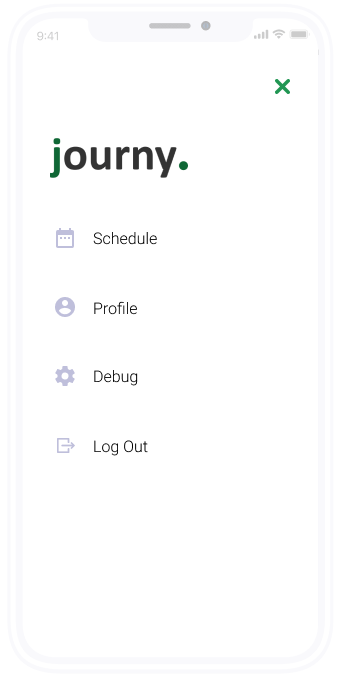
2polished the ui for profile and menu screens according to a new styleguide
COLOR
Text Color
Color
- Green sea - main color #219653
- Light steel blue - main color #BFBFDB
- Gray slate - complementary #627E89
- Lavender - complementary #E0E0F3
Style Shadow
- Shadow #D6DCF1; blur-10, y-3; opacity 50%
- Shadow #8BAE9A; blur-10, y-3; opacity 100%
- Shadow #C3C3DA; blur-10, y-3; opacity 50%
Complementary color
- Saffron #F6B830
- Craiola Fern #6AC259
- Light carmine pink #FF7573
interaction
The appearance of elements on the site
APP DESIGN UI/UX - JULY 2018
journy purrweb
Field teams can benefit from route optimizations, dynamic forms for data collection, pre-scheduled tasks, taking geotagged photos, collecting purchase orders and more.
Businesses can increase efficiencies and revenue by bridging the gap between management and field teams.

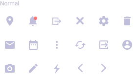
ICON
Icons


Sorry, something went wrong with your request.
Please, try again later.
