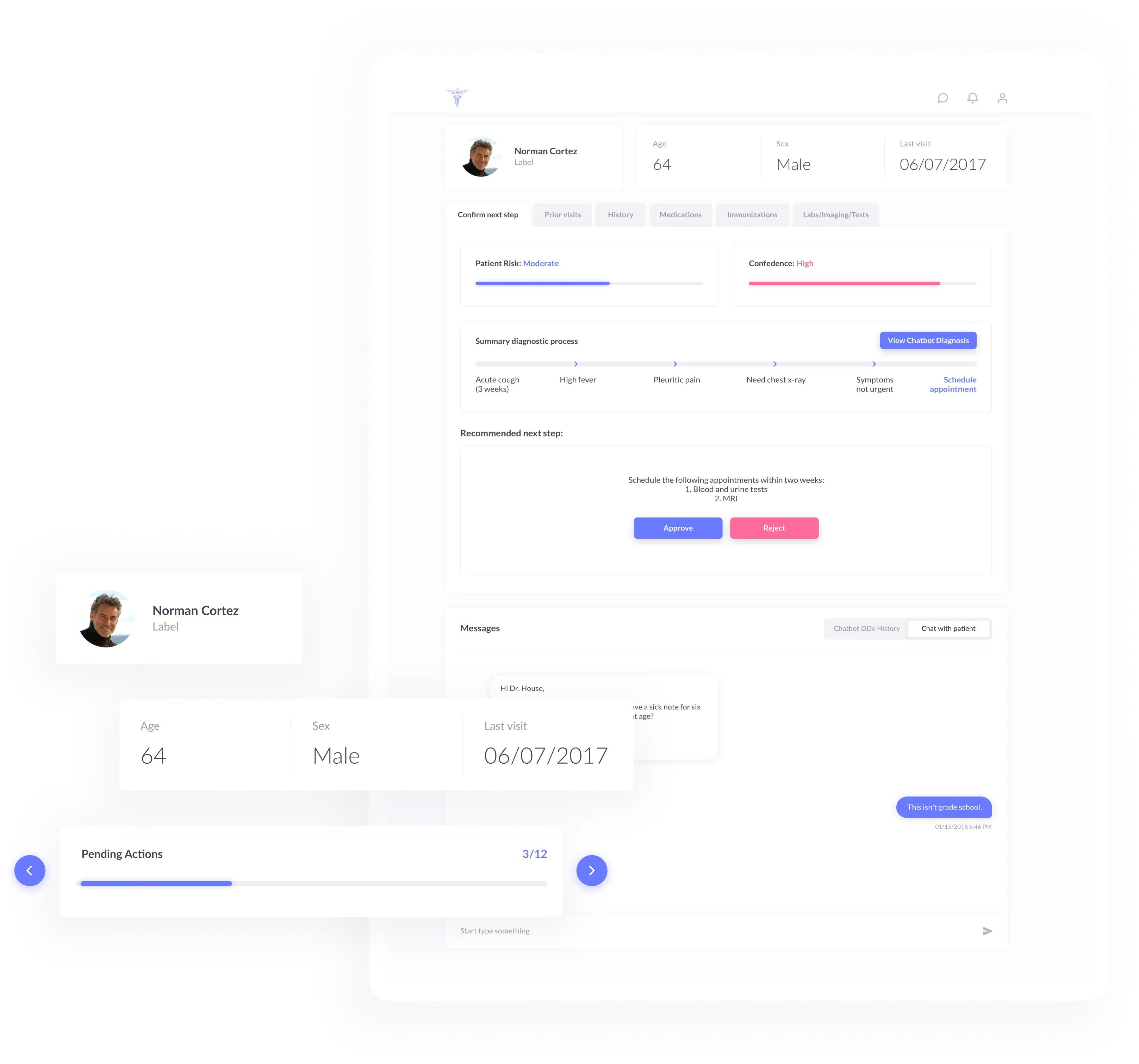


Web and mobile apps for patients and doctors to automatically determine preliminary diagnosis and schedule the appointments.
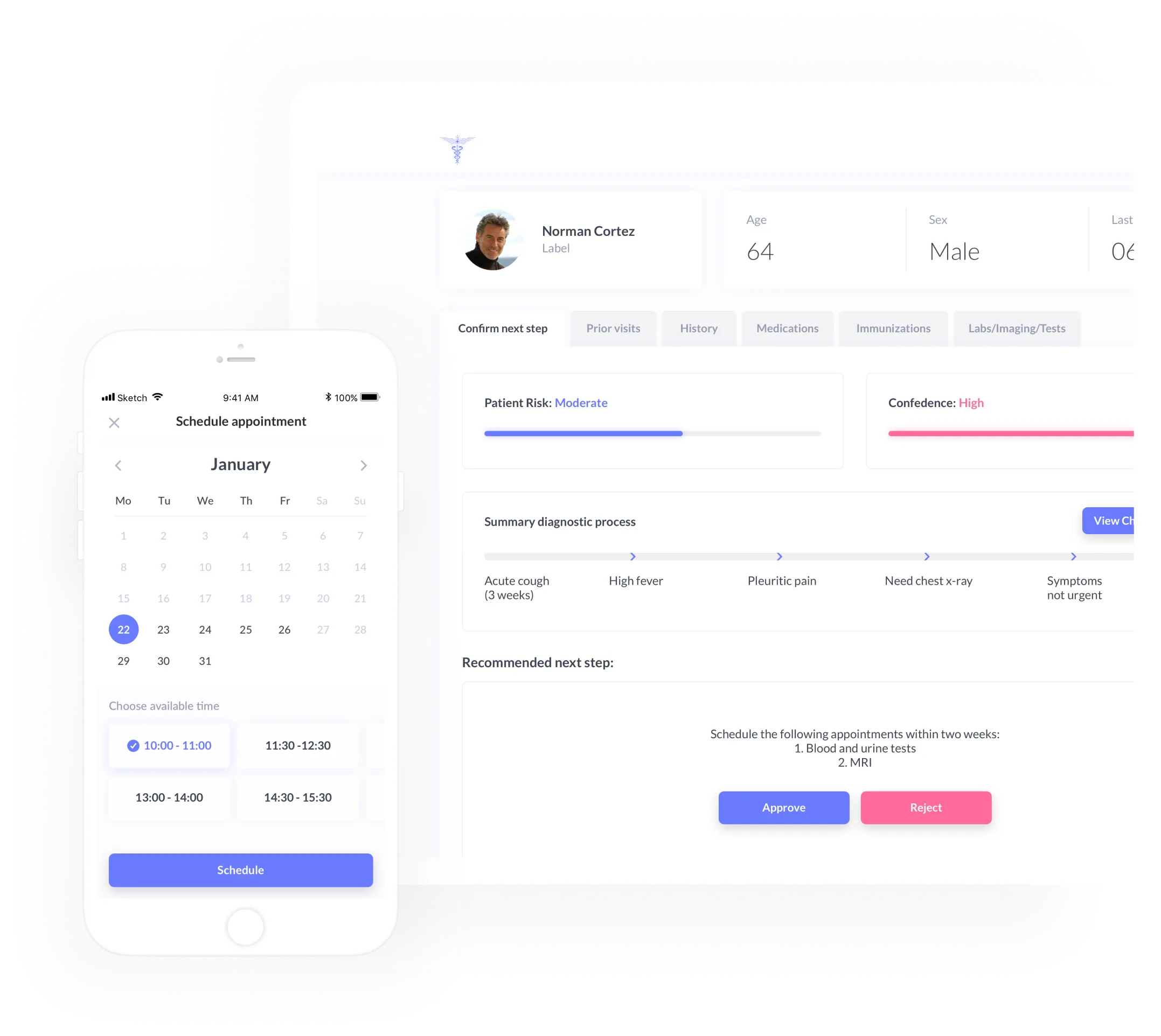
Doctors spend lots of time on patients that don’t have symptoms requiring medical treatment. So, they could have spent that time on people that are really in need of such. The idea is to automate that process and free up the doctors’ time.

We chose calm, natural Color Palette with shades of grey and blue.

#959CB1

#FF6A9C

#13D7BC

#3E4554
Kept it classic and in style.


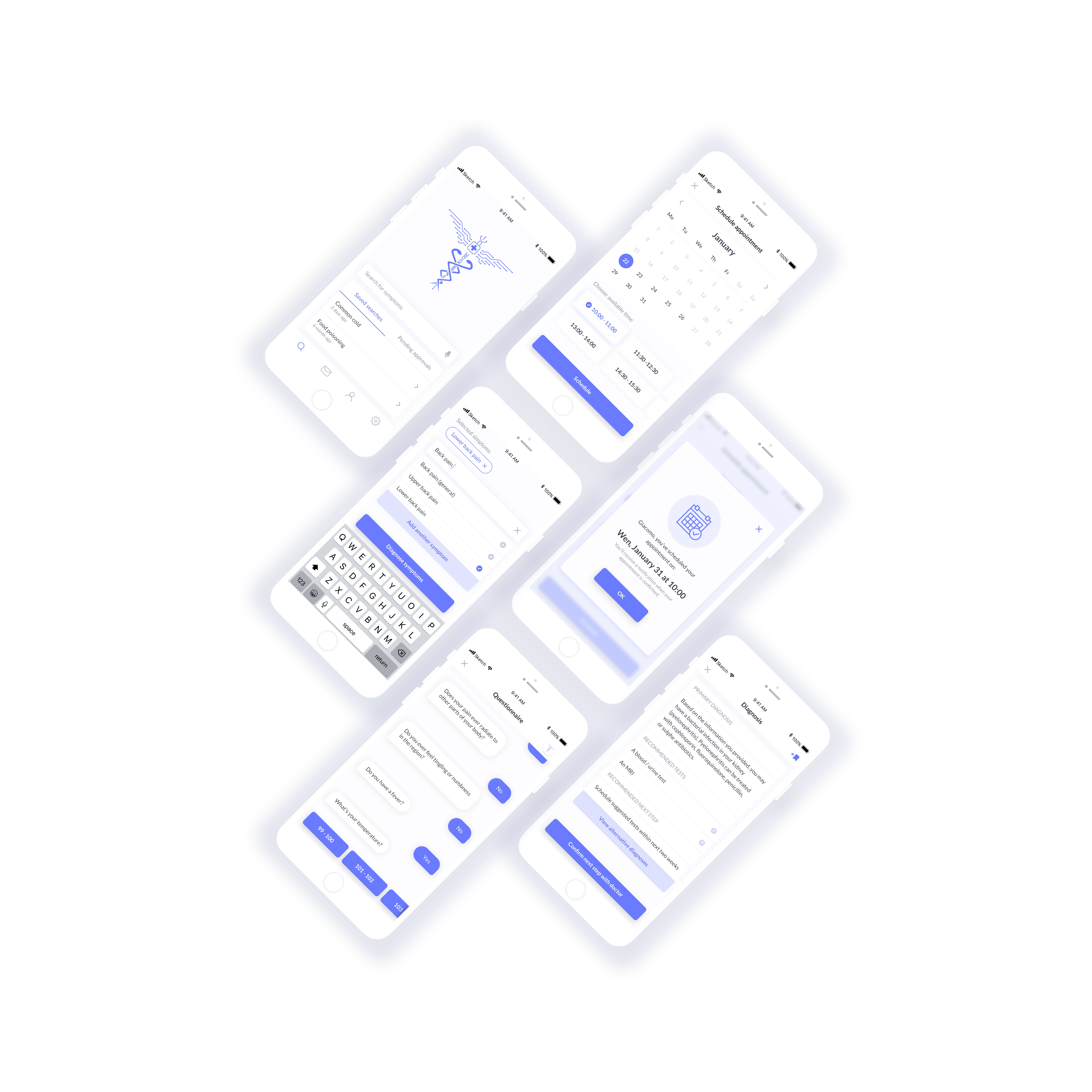
Home screen comprises general navigation, symptom search first step, saved searches and appointments pending doctor’s approval.
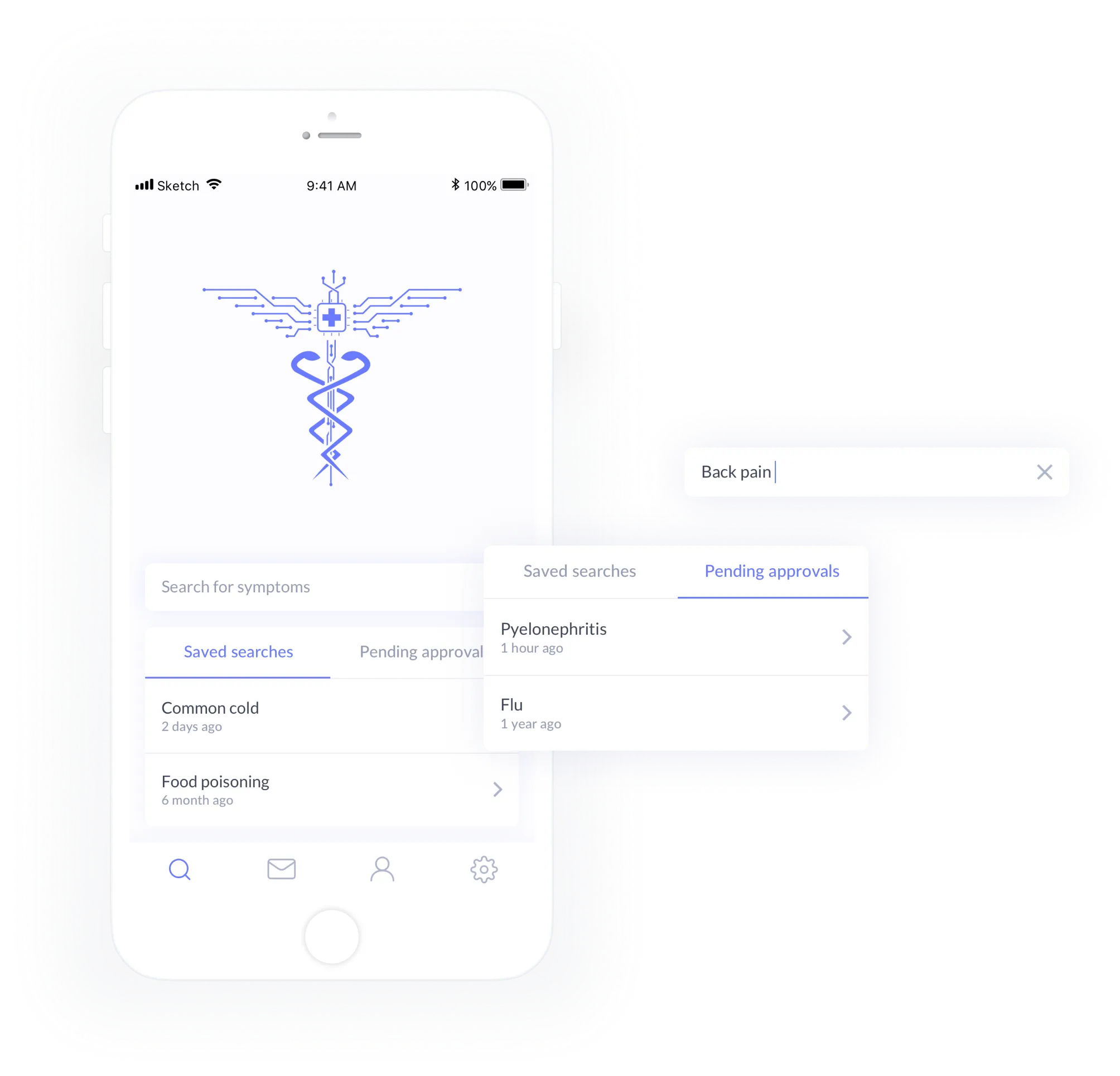
The screen includes suggested search functionality along with tagging, that allows having multiple symptoms and more exact diagnosis as a result.
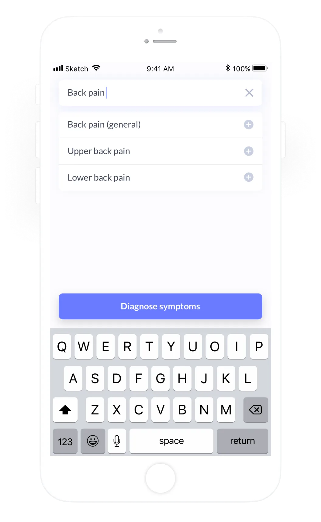
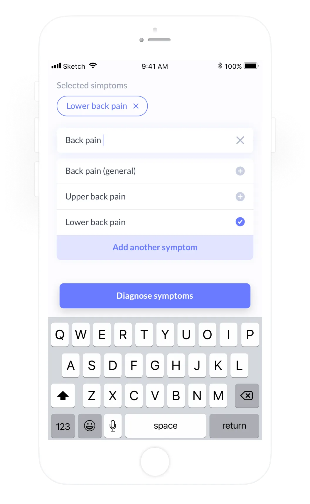


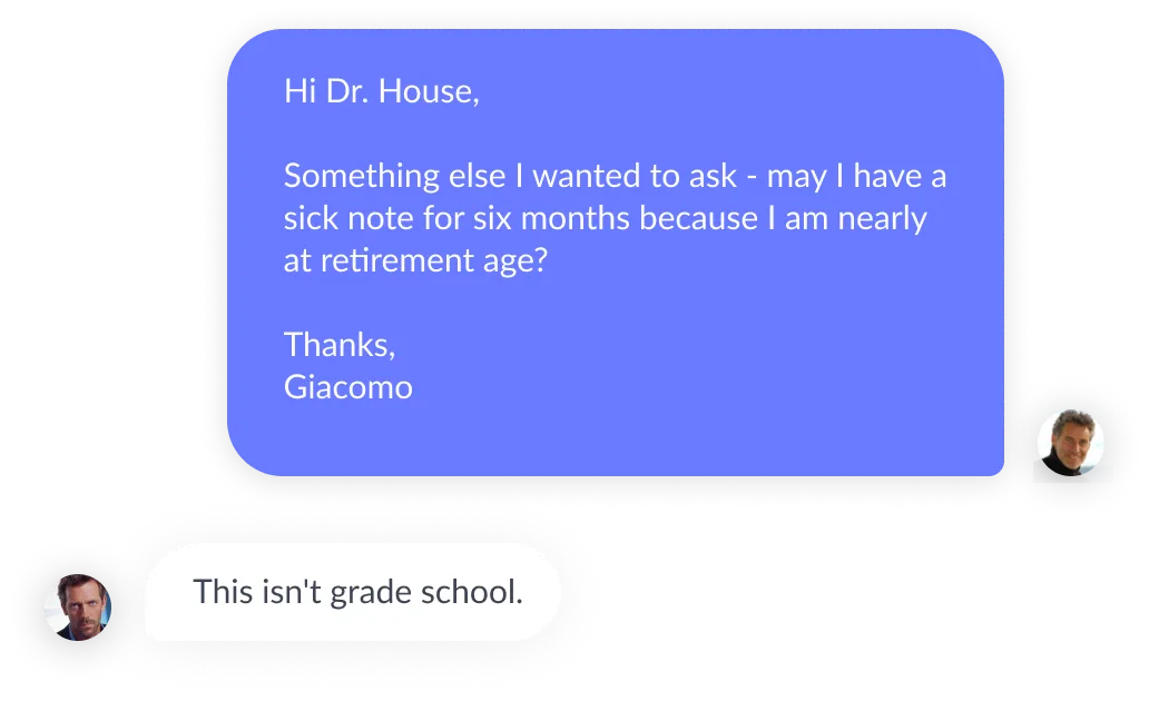
Bot asks a number of question based on the symptoms chosen on the previous step. Typical messenger like view should give a comfortable impression of talking to a human but not machine.

Bot can suggest making an appointment with doctor in case there are health threatening situation. Scheduling process requires just 3 clicks to make that happen.



Clean summary of most relevant information. Quick access to chat and patient statistics.
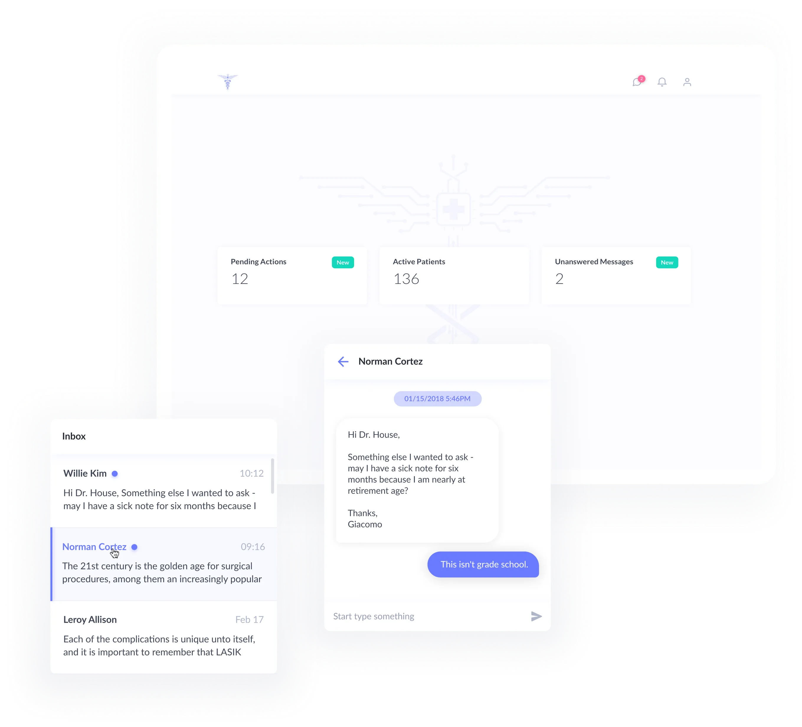
Table view of all the Patients with their recent statuses. Ability to sort and search is taken into account.
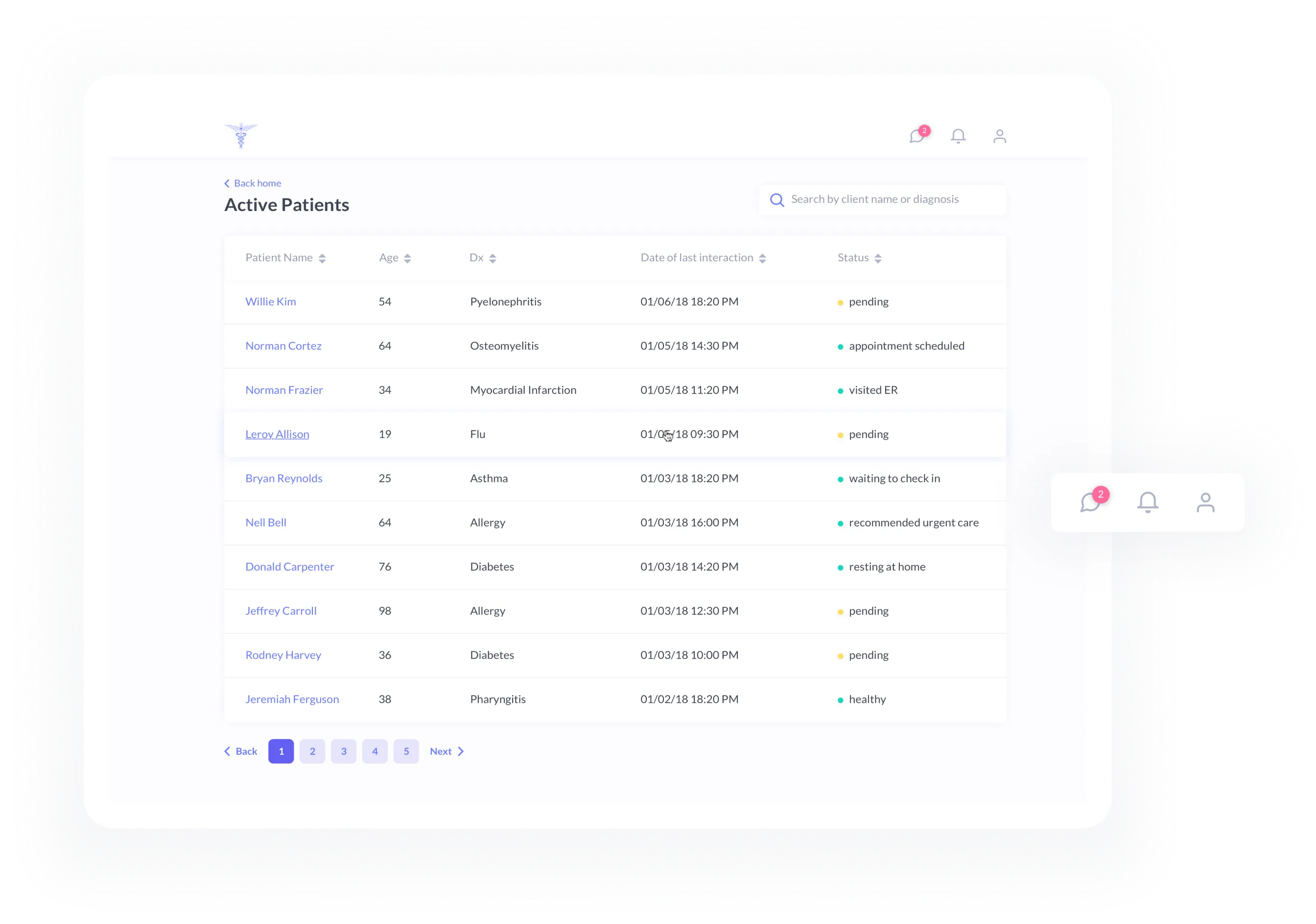
The most important part of the doctor app. Keeps doctor in the loop of the critical patient data. Colors help to attract the attention to places requiring some action.
