



Friday app Portfolio


2021
is an app that helps to:
- gather friends and have a party
- attend interesting events
- make communication more convenient
Client
American IT company outsourced this project to us. We communicated with Jack and Mitchell who were project and product managers at that company. They contacted us to get a cool interface for the app. And they definitely knew what they wanted to get: neon, neon, and one more time neon.

Idea
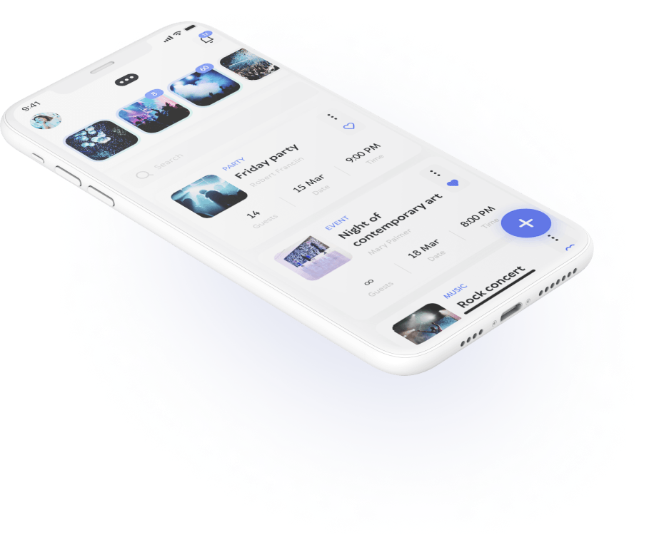
Friday is an app for arranging parties with friends. No matter what activity you are up to: meeting friends at a bar for the evening beer, going to the cinema with a pleasant company or going to a club and dance till the morning light — you can arrange or join any party



Process
-
Idea
- Negotiations with a client
- Defining scope
- Time and budget evaluation
-
Research
- Competitive analysis
-
UI/UX design
- User stories
- User journey map
- Concept
- Preparing interface
-
Presentation
- Demonstration to the client Behance case
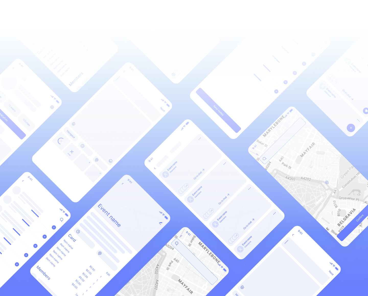
Wireframes
We found a common language with the client very fast — they understood the process and trusted us. Our work on the interface went in such a way: we showed everything that we have done and they liked it. The client gets 5 out of 5, 10 out of 10, 100 out of 100.
Julia Vakulenko, lead UI/UX designer at Purrweb
Authentication
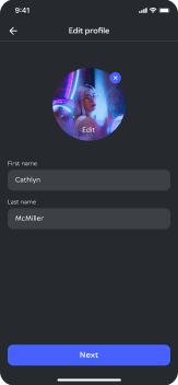
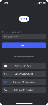

The main advantage of ‘Friday’ is that users can see upcoming events even without registration. When users decide to join the event — they will be asked to register.
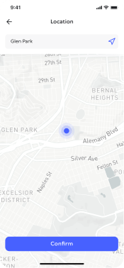
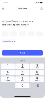
The registration takes less than a minute: you need to enter a phone number, get a code and that’s it. You can register with Apple ID, Google or Facebook accounts. Then you can add a photo, information about yourself, and social media.
All in one place
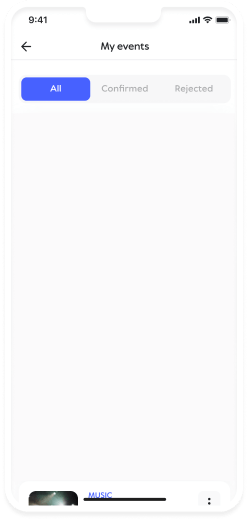

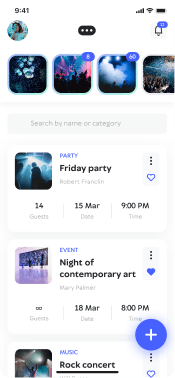
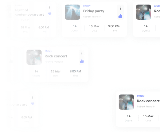
The app has not so many features: you can get anywhere from the main screen and everything has easy access.
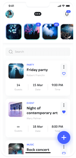
- With the help of the main button, users can add a new event. When they press it, the screen gets blurs and focuses user’s attention on the targeted action.
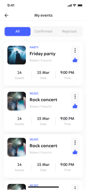
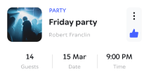
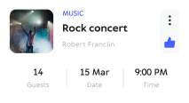
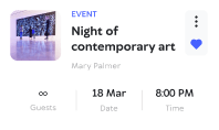
- In the event card, you can see event’s name, host, and participants. Users can like the event and choose whether they want to attend it or not.
- On the top of the screen, there are cards of events that the user will attend. Also there you can find unread messages in event chat.
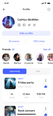
- In the profile, you can find information about users, events that they attended, and their upcoming events.
Arranging
a party in 3
easy steps
-
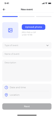
Add a photo of event and fill in the information where and when the event is going to be.
-
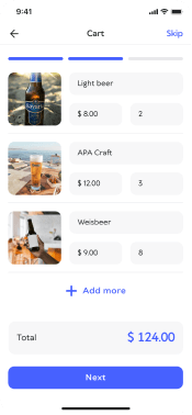
Complete shopping list and bring it to event. If you don’t need a shopping list — you can skip this step.
-
Invite friends to your party!

Event page
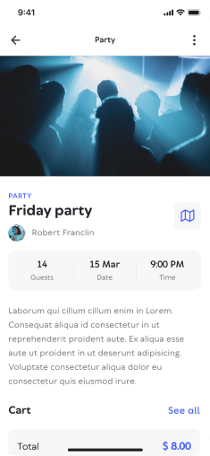
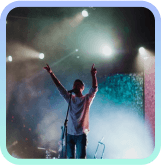

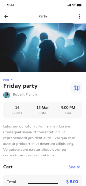
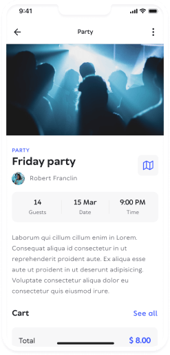
When users open the event page, first thing that they see — description and a shopping list. Each participant can bring something from this list — for example, a case of beer.
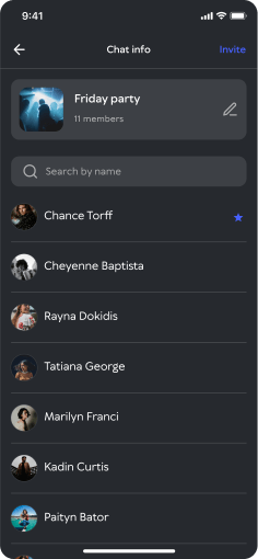
On the other page users can see who is going to attend the event. Event hosts can tag participants. They can tag friends as dancers, DJs or barmen. There is also a role caled ‘killjoy’.
Chats
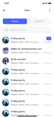
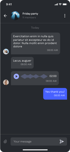
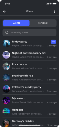
We’ve made 2 chats — private messages and event chat. As everything is based around events it’s more convenient to communicate inside the event card than to chat with someone individually.
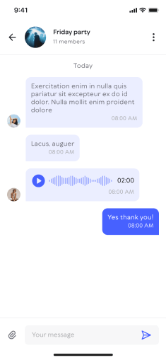
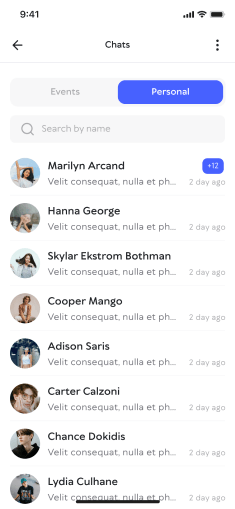
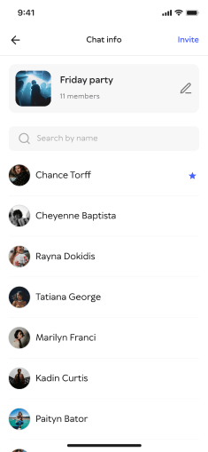
Chats
We’ve made 2 chats — private messages and event chat. As everything is based around events it’s more convenient to communicate inside the event card than to chat with someone individually.


Profile
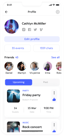
As this app is closely connected with communication we’ve made the user’s profile like a social media account. In the user’s profile, there is information about attended and upcoming events. Here you can write messages, become friends, see a friends list, and find links to social media. Also, users can upload photos and add them in event albums.

Our client had mini-branding: we took fonts, 3 main colors, and a logo. Jack wanted to add logo on each screen and place it in the header. Maybe it looked OK on the main screen but on the others it looked like a black spot that could embarrass the user. We’ve reduced logo and made just a minimalistic mark that perfectly integrated into the interface.
Polina Tolmacheva, senior UI/UX designer
Typography
and colors
Originally we designed the interface in a dark theme — it’s a party app after all. But later the client decided that it’s too specific because some people don’t like dark theme in a broad manner. We decided to add a light theme to offer users a choice.
TT Wellingtons
Bold
AaBbCcDdEeFfGgHhIiJjKkLlMmNn
OoPpQqRrSsTtUuVvWwXxYyZz
1234567890!@#$%^&*(){}?./,
AaBbCcDdEeFfGgHhIiJj
KkLlMmNnOoPpQqRrSs
TtUuVvWwXxYyZz
1234567890!@#$%^&*(){}?./,
Medium
AaBbCcDdEeFfGgHhIiJjKkLlMmNn
OoPpQqRrSsTtUuVvWwXxYyZz
1234567890!@#$%^&*(){}?./,
AaBbCcDdEeFfGgHhIiJj
KkLlMmNnOoPpQqRrSs
TtUuVvWwXxYyZz
1234567890!@#$%^&*(){}?./,
Results
The clients really liked the design. They entrusted development to their in-house team — our technical stack didn’t fit them. We parted our ways on a positive note and recently they got back with a new project.

120 hours
292 screens
2 designers
Sorry, something went wrong with your request.
Please, try again later.