Carbon accounting

2022
Idea
The platform for companies that care about nature and want to attract investments with greener production.
About the client
One of our regular clients: we've already made two projects with him. This platform has become the third one.
Why do people
need it?
Businesses all over the world try to mitigate their negative impact on nature.
In many countries, companies are obliged to monitor the amount of greenhouse gas they emit and find ways to neutralize it. For example, by financing eco-projects.
Startups that want to get their first investment round in the USA or EU have a better chance if they include environmental indicators in their business plan.
Banks place great emphasis on green standards too by assessing the ecological risks while lending.
The solution:
a digital eco consultant for business

How does it work?
-
Companies choose
the country
of operation in the app -
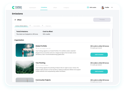
Record the amount of emissions
-
The app analyzes
data using emission
factors relevant
to the country -
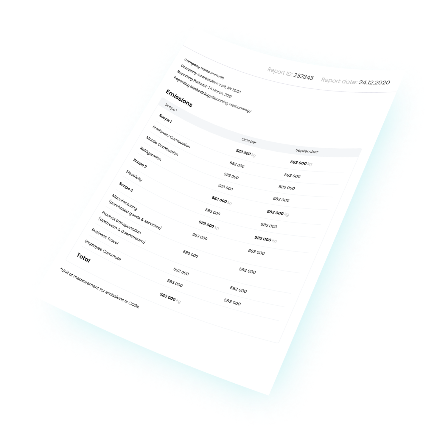
It also counts how much money the company needs to offset the negative impact on the climate, and then creates reports
We used GHG for analytics

GHG standards (Greenhouse Gas Protocol) are international standards for industrial greenhouse gas monitoring
Greenhouse
gas emissions
-
Direct
Scope 1
Direct emissions
-
Indirect
Scope 2
“Energy”
emissionsScope 3
Other
emissions
Mind map
and wireframes
We created a mind map to model user paths. Each role in the app has access to a different functionality set, which we have divided on the preparatory stage.
The app has 4 user roles:
-
super administrator
-
company owner
-
manager
-
staff member
UI/UX design
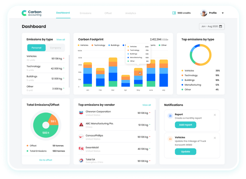
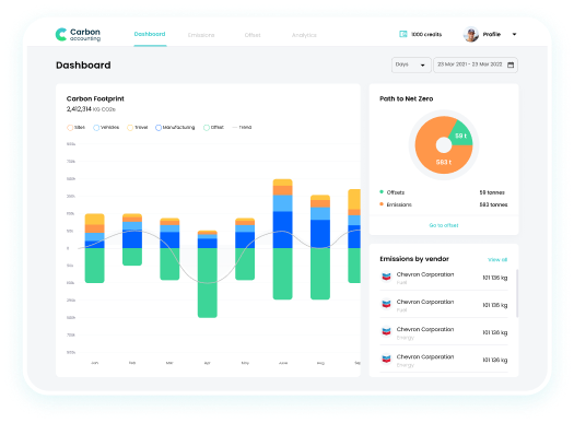
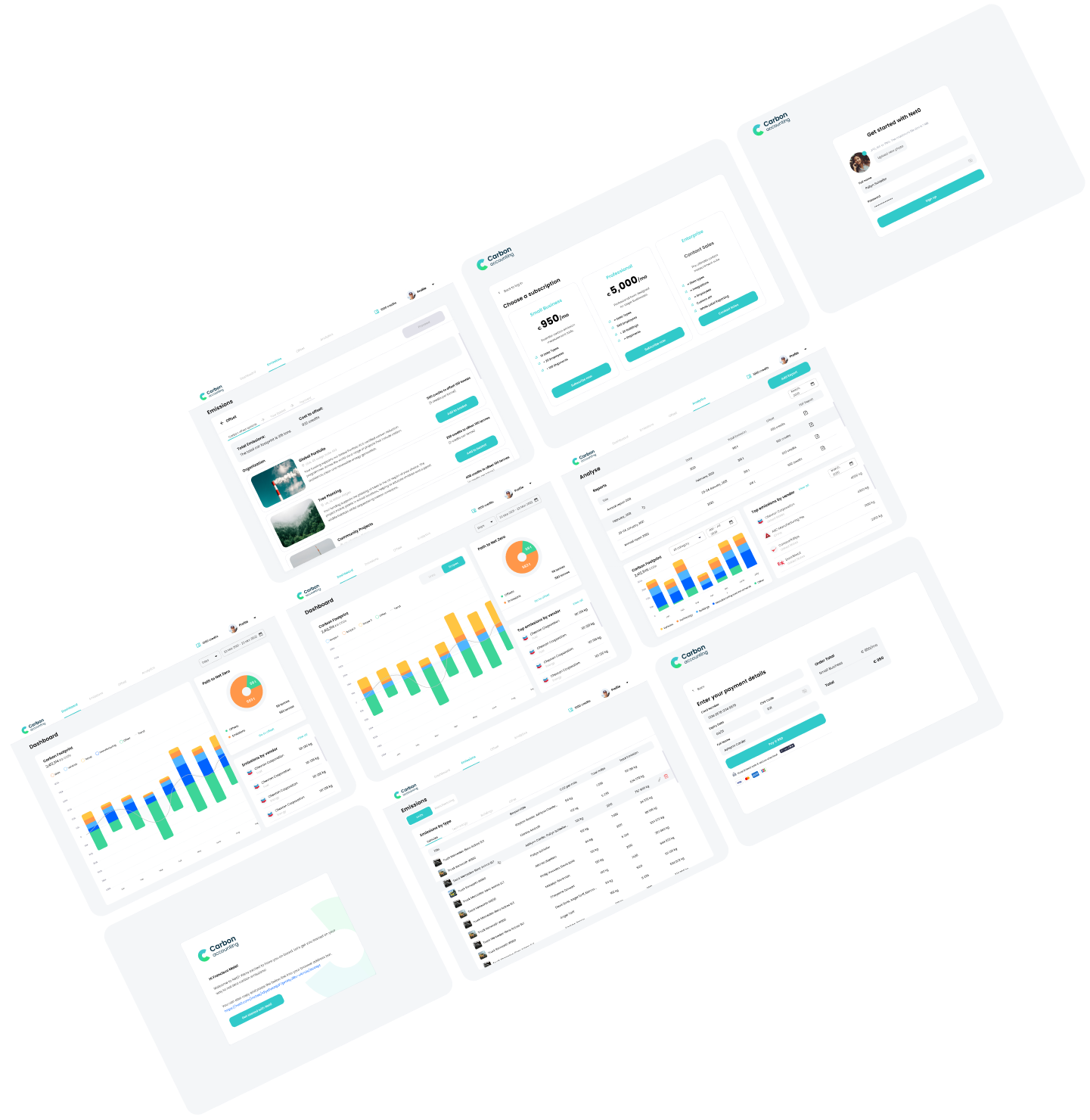
We developed a design concept based on our past dashboard experience
-

Intuitive interface that needs no onboarding
-

Light theme with
green accent color -

Statistics visualization
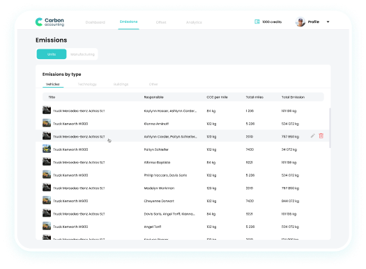
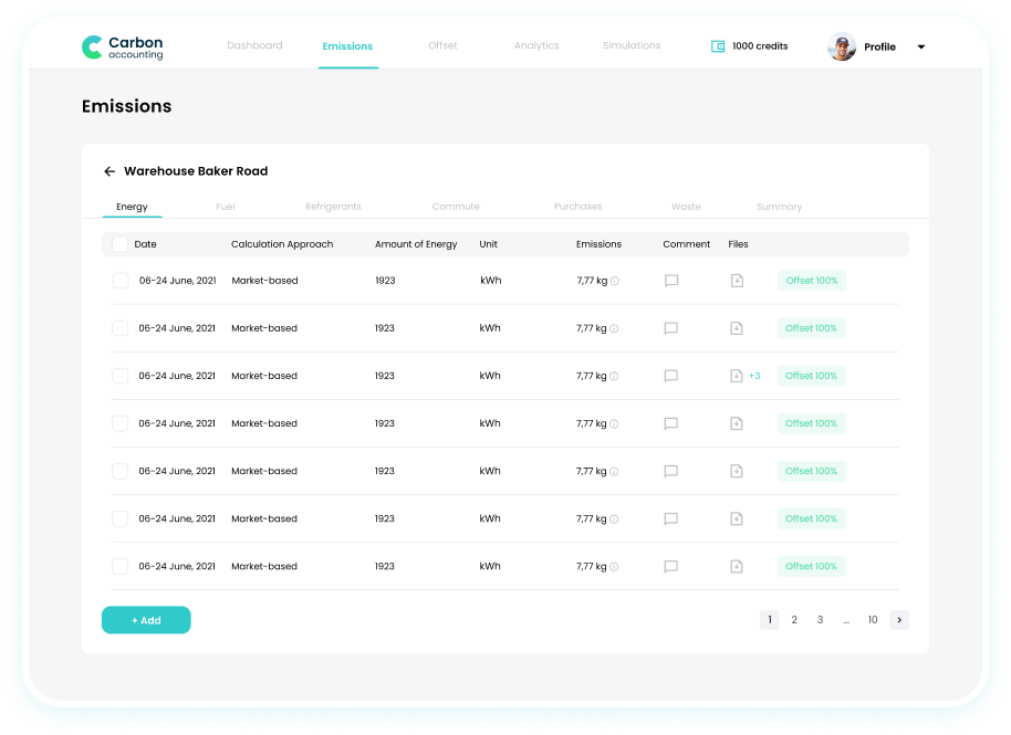
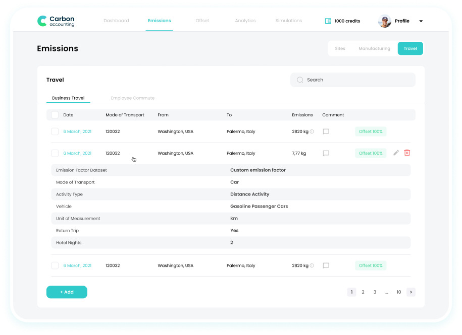
More tables for the table god

Typography and colors
We used a shade of green
for accents to
underline the ecological character of the project
Poppins
AaBbCcDdEeFfGgHhIiJjKkLlMmNn
OoPpQqRrSs
TtUuVvWwXxYyZz
1234567890!@#$%^&*(){}?<>./,
- #31CACA
- #3DD598
- #F4F6F8
- #FFFFFF
Development
We used our classical stack for a web application:
- NestJS
- TypeORM
- AWS
- Postgres
- React
- Redux Toolkit
- Styled-components
- Final Form
- Rechats







The result
-

User-friendly design
-

Complicated terms
in plain language -

Clear interface
-

Automatic
calculations -

Standardized reports
The app works in demo mode for now, but there are a lot of requests from potential users. When the registration opens, we'll see how many companies join.
Sorry, something went wrong with your request.
Please, try again later.

