Need help with your project?

Oops! Something went wrong while submitting the form.


Did you know that 76% of customers will switch to a competitor if they experience just a single issue with the brand? It means that bad UI/UX design of the products can lead to the failure of your digital commerce startup.

These days, competition in the eCommerce market is really tough. Many companies offer competitive prices and fast delivery, so friendly customer service and a well-thought-out interface are some of the few things that could help you stand out. If your solution is not easy to navigate, a user will just download another one.
At Purrweb, we know how crucial it is to research the audience, plan, execute, and test the interface for startups’ success. That’s why we came up with 5 tips for eCommerce app UI/UX design that will enhance your solution. Plus, mistakes to avoid and a lot of examples to steal get inspired. Enjoy!
Today, we will mostly discuss the UI (user interface) performance of the app and design elements not to miss out on. But if you want to dive deeper into the eCommerce app design and market and learn about potential monetization strategies and key features for the solutions, check out our recent blog article.
Let’s be honest, creating digital selling and buying platforms has been a growing recent trend. UI (user interface design) is exactly the solution to stand out from your competitors. A well-executed and premeditated eCommerce app design will turn potential customers into buyers by making the interaction between users and your app the most comforting and transparent. If the ordering process went smoothly and the customer had an overall pleasant experience with your app, they are very likely to come back within a short period of time.
Despite the fact that the number of apps is rising, the quality of their UI/UX design sometimes has room for improvement. To help you avoid frequent mistakes from the start and save your time on designing and technical requirements, our team created the ultimate guide on UI design in eCommerce mobile apps.
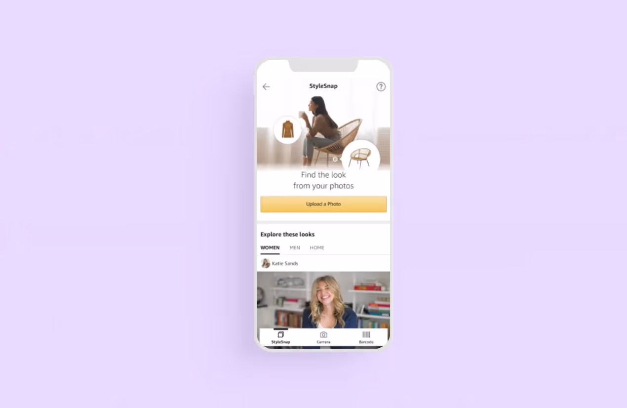
Tip #1 to add to our eCommerce UI design kit is to keep the login form clear and concise. Firstly, our recommendation is to ask for the necessary information to create a user profile. A name, an email address, a phone number, and an address for delivery — yes. Household income, how did they find out about us — no, because at the login stage, users are not ready to entrust all their personal info yet and want to be done with the form as soon as possible to make an order. But you can ask those questions later when they complete several orders and are retained if you are willing to collect that data for audience analysis.
Secondly, all design elements and buttons should be centered and highlighted in color to draw the user’s attention. If some fields are necessary, while others are not, it also has to be marked down.
The main rule is simple. The interface layout should navigate the customer and guide where to tap next.
Here is an example of how important clarity and consistency are.
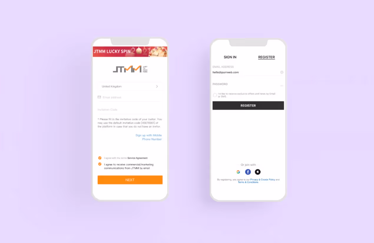
There are several options for sign-in that you can use for your e-commerce solution. Just choose which one suits your goals and vision the best.
When talking about the consistency of the app design, we must underline — it is one of the factors that influences users’ intention to buy something in your app. Long story short, all the elements of your eCommerce app design should look and work the same way. We can divide app design consistency into 3 parts:
Consistency is important for your eCommerce app design. It provides several benefits:
The simpler the interface, the easier it is for users to find the product they want to buy in your app. If people have to break through complicated onboarding or instructions to use your app — it’s bad, and if your app design is intuitive and looks native — it’s good.
We recommend using a minimalistic design. It means you need to:
The second hack is to locate all buttons within the thumb-friendly zone. Want to know where it is? Just casually grab your phone in your hand and check what corners of the display you can reach with your thumb only.
Important note: consider both right-handed and left-handed users when you are creating the design requirements for your solution.

While the thumb-friendly zone has not been officially included in Apple and Google app development guidelines, it is an unspoken rule amongst developers. Frankly speaking, if your solution lacks this feature, it will definitely raise questions from app market parties.
The next tip for your eCommerce app UI design is adding different search options for user comfort. The less time they spend searching for the particular thing they need, the quicker they decide to buy and proceed with the cart. Here are 6 examples of search options you can add to your eCommerce mobile app design
The search bar should be centrally located on the top of the page and give some suggestions to users on how to look items up. Remember to add filters to help customers sort items by price, color, brand, and other features. Filters are the best way of searching. Horizontal filtering is a great idea — it enables you to use the entire screen and see all active filters while scrolling. It’s tablet and smartphone-friendly and quite flexible.
If you want to create a convenient app, navigation is key. Design an easy flow for your app to help users make a target action faster and easier. If the navigation is complicated then it will be hard for users to make a purchase and they’ll be confused and unsatisfied.
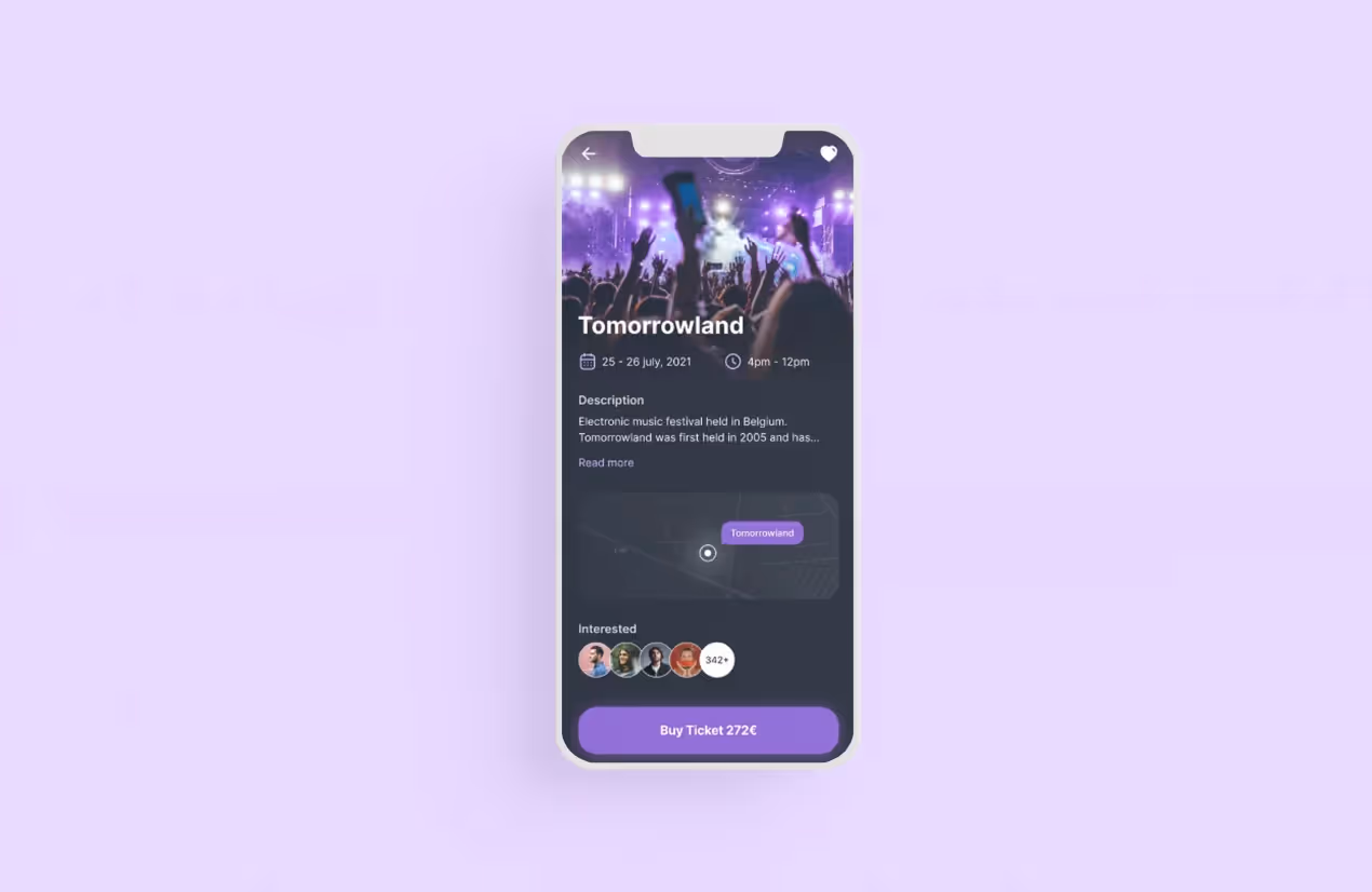
To be high-converting, your solution will need different call-to-action buttons, depending on the stage the user is at and how ready they are to make a purchase. For example, when a customer adds an item to their cart, you can gently suggest they see the total with the ‘Proceed to cart’ or ‘Checkout’ buttons instead of offering to ‘Select the payment option’ right away.
Another tip from us is to make CTAs look like actual buttons. Sounds way too simple, but this tip is often forgotten. They should have borders and shadows and be colored to stand out. Make sure there is some distinction between primary and secondary buttons to guide users through their app journey. For instance, the primary CTA could be black or red, while the ghost one could be transparent.
Here is an example from our personal experience. When we were designing the platform for buying tickets to music festivals, we decided to put the price on the CTA at the search stage to let the user know potential costs up-front.
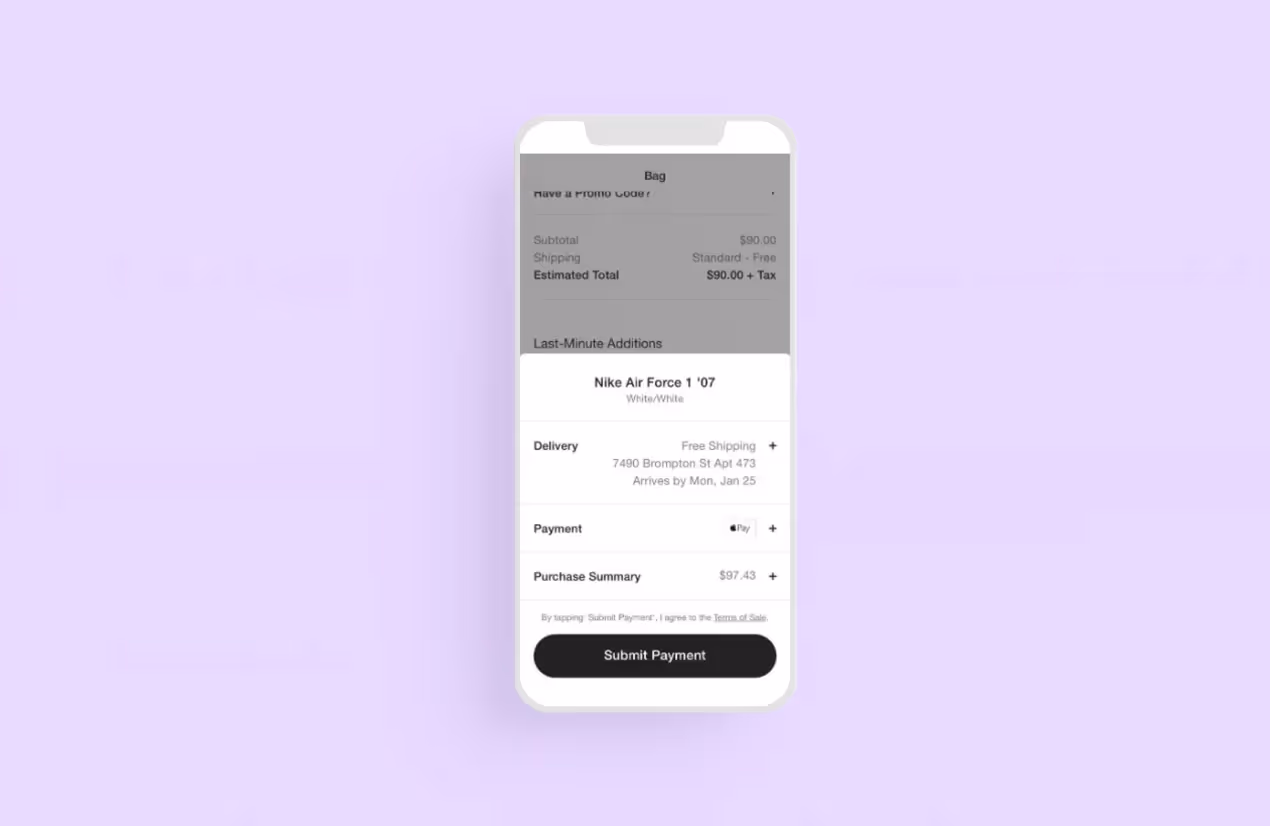
The checkout process should be as fast as the login. We advise avoiding long forms and procedures because the high number of abandoned carts is often related to extra fees and the overwhelming complexity of the process. Also, make sure the customer can see the total price with delivery and service fees included before moving forward. High or hidden extra costs are often why some 83% of people abandon their carts.
Tip: The ‘Pay now’ or ‘Buy now’ button should be located in the center of the thumb-friendly zone to be visible. Our recommendation is to stick to a minimalistic design and not overload the page with elements.
To avoid overburdening the checkout page, many companies use the progressive disclosure feature as a part of the eCommerce app UI/UX design. This design pattern allows the sequencing of the information across several screens or sets. A user can simply hit a plus icon or tap ‘Next’ to reveal more information about the order.
The structure of an eCommerce app design should be as clear as possible. The three-tap rule helps here — it should take no more than 3 taps for users to get to the product they need to buy. It’s a golden rule of best eCommerce app UX design — the fewer steps each action takes, the better.
Support of pinch and double-tap zoom gestures. The ability to zoom in on a product can influence the users’ decision whether or not they want to buy it. Plus, users already got used to such gestures in other apps so they would consider this feature in your eCommerce app a nice bonus.
Virtual Reality (VR) shopping. VR implementation helps your app achieve a new level of online shopping. VR integration into UI/UX design allows users to view each product in reality and, for example, check how the piece of furniture would fit their apartment.
Wishlist feature. If some users like a product but don’t want to buy it for various reasons, they can save it for later. Also, users can get notifications about price changes or product availability.
UI/UX design will have a huge impact on the success of your eCommerce solution, along with smoothly running business processes. In dense markets like digital commerce, clients will always choose the one that offers better terms with a user-friendly and time-efficient solution. Studies show competitive interface design increases sales and retention rates, as well as decreases the number of abandoned carts.
Your eCommerce mobile app design should not only be well-executed but also carefully planned to predict user behavior and potential issues they could face. The right allocation of elements solves potential problems with navigation and exploration. For example, an explicit distinction between the primary button of ‘Add to Cart’ and the secondary ‘Save for Later’ button will encourage users to proceed with an order and guide them directly to the cart.
Research says 76% of users will switch to a competitor if they face even just one issue with the app, which means there is absolutely no room for a single mistake. Always prepare in advance and test the UI/UX design of your app before the release. We collected 5 tips to boost your eCommerce app UI/UX design performance and avoid the occurrence of any problems with user experience.
For eCommerce app development, we work with React Native, the time and cost-efficient framework that uses a shared codebase to build apps for both iOS and Android with around 65% of shared code. It doesn’t matter if you already have a ready-made solution or are just preparing to rock the market with your startup, we will be ready to help with cutting-edge and trendy eCommerce app UI/UX design. Check out our portfolio with previous UI works on Dribbble.
<a class="blog-modal_opener">Ask us any questions</a> about eCommerce app UI/UX design and we will reply within 48 hours.

.svg)