

UX audits allow you to improve your product, retain more users, and convert them into loyal customers. With it, it’s easier to find errors and problems that hinder user experience, and understand how they came about. For example, we want to know why clients stop using your product after a particular screen.
Read on to find out how to conduct a UX audit and what it should look like. We’ll also tell you when a UX audit is unnecessary.

UX audits consist of studies made by UX researchers. They use them to determine where the product can be improved. These studies are based on user experience and errors in particular interfaces, e.g. buttons that lead to nowhere or design elements that simply don’t work.
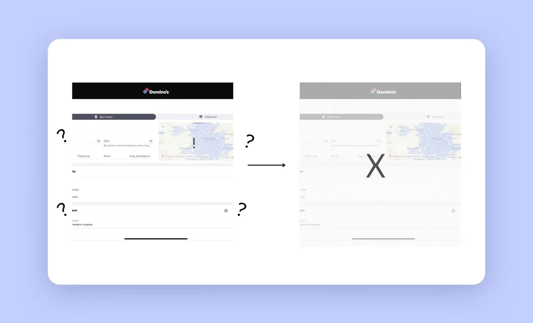
Imagine a food delivery app. UX researchers will look at what’s preventing users from placing orders. For example, they can’t see restaurants nearby, or the checkout page is too big and confusing. Researchers take this information — they then tell you what you can do to save money.

If an interface has problems that aren’t addressed, the clients may stop using the product. Sure, some users may tolerate bugs or try to figure out how the product is supposed to work. But others may lack patience — they'll delete the app or use it less. Worst case scenario, they move on to a competitor.
UX audit helps save money in the long run. Your clients will go through desired user flows: signing up for services and buying products and subscriptions. The business is thriving.
We recommend conducting a UX audit for any project involving designers. This will optimize user experience and increase the chances of success. But beyond that, there are specific reasons why you should hire UX researchers for an audit. Here are a couple of examples:
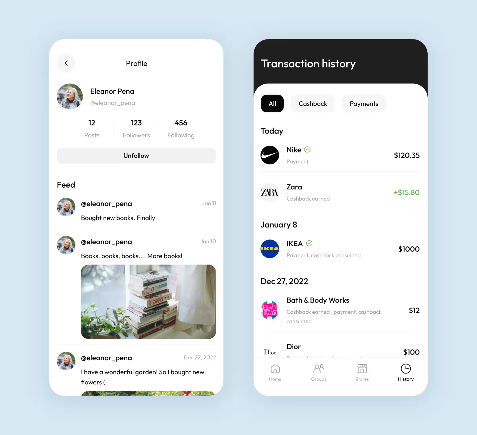
Conversion issues motivated the owner of Budss, a cashback service, to approach Purrweb for a UI/UX review.
During the usability testing, we identified several key issues:
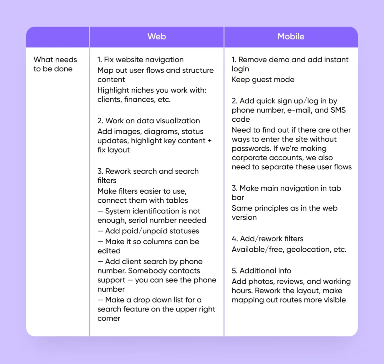
Within a month, we redesigned the app. It’s not only modern but also functional. The client didn’t have to sacrifice any of the application’s features for the sake of a new design.

We’ve retained the original features and delivered a clean and simple user interface.
However, sometimes conducting a UX audit can be detrimental to business. For example, if the product is glitchy, or there are very few users. Problems related to marketing strategy and servers are rarely related to design. Focusing on UX instead may only waste time.
Conducting a UX design audit can help improve your product and increase user satisfaction, resulting in revenue growth. Let’s look at the main benefits of a UX audit in detail:
A thorough UX audit can help you detect issues with the user experience of your product and make it more convenient for clients. By eliminating UX issues and shortening the client onboarding process, you’ll make your service more user-friendly. This will result in improved conversion rates and increased user engagement.
A seamless user experience will increase the number of returning customers. By improving your UX design through the audit process and ensuring the service is easy to use, you’ll motivate clients to come back. This will also allow you to boost your brand’s reputation and build trust with your customers.
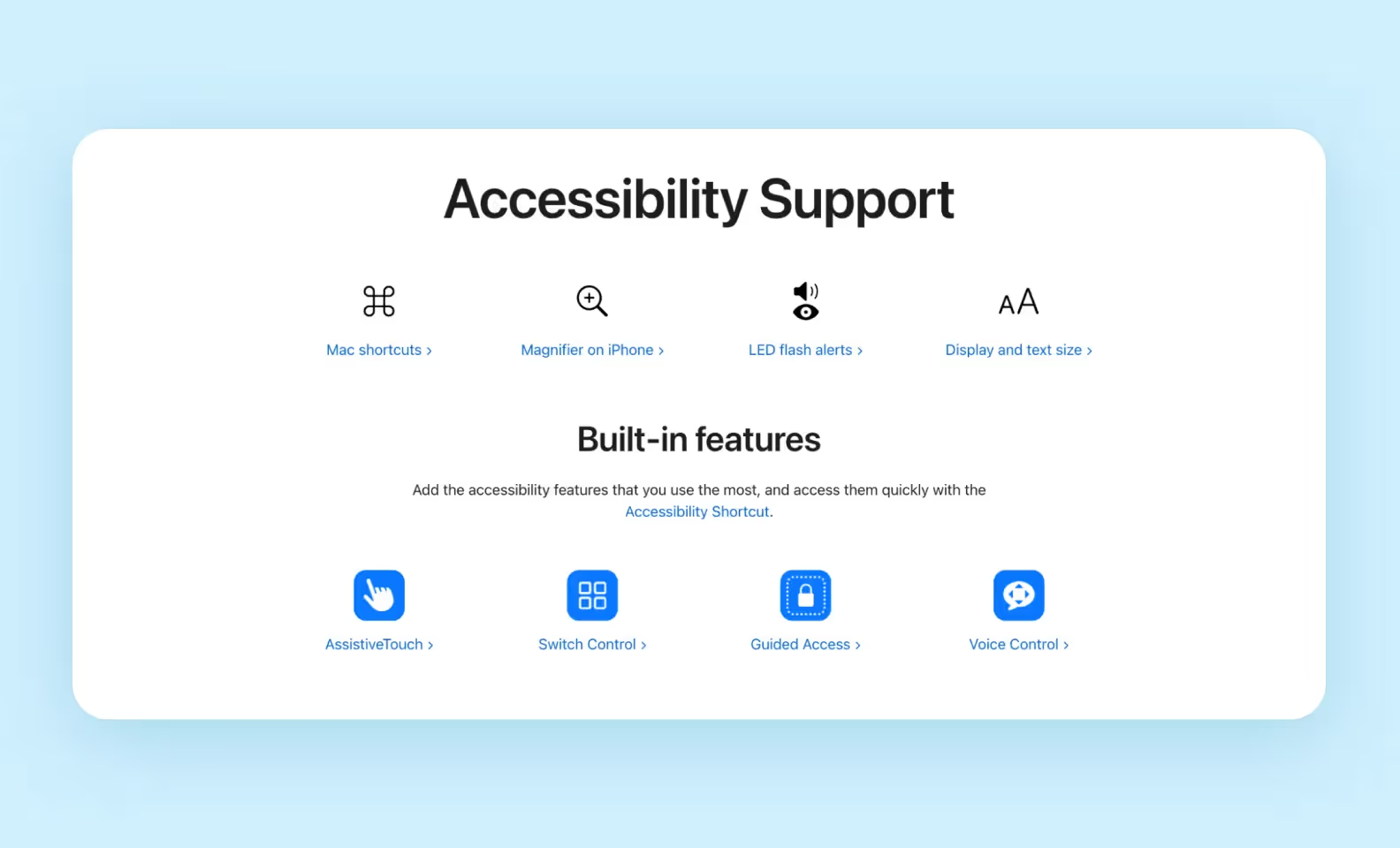
Designing a smooth and responsive user experience will give you access to a broader audience. For example, through the audit, you’ll be able to develop accessibility features aimed at people with health impairments. These features will attract a new audience to your brand and boost user satisfaction, which will increase the overall profitability of your business.

Through the UX design audit process, you’ll be able to address usability issues and improve the user experience. This will help you offer a unique product that will stand out from the competition.
While it’s clear that conducting a UX audit can be useful for improving your product, not everyone will benefit from it equally. Let’s find out which categories of businesses will be able to gain the most value from a UX audit.
The effectiveness of a UX audit tends to differ depending on the type of business and where they are in their respective life spans. Here’s who a UX audit will be most useful for.
If you’ve recently launched a startup, conducting a UX audit will allow you to gain insight into how well your product performs, and pinpoint UX problems early on. Also, it will help you come up with an effective roadmap for improving the user experience of your service. To make the audit as smooth as possible, first gather initial data about your audience and perform a post-launch UX review of your product.
Launching a product takes a lot of preparation and planning, so it can be intimidating for fledgling startups. Many of them don’t have a lot of prior design experience, so things like UX design might not come easily to them. If you’re one of those startups, conducting a UX audit can help you prepare for the product launch and avoid common user experience mistakes. That way, your product will have more chances of succeeding right after the launch.
Lytic.Health, an early-stage medical startup, had a limited budget but great ideas. We knew we could support the founders if we simply prioritized features.
What we did for this project:
1. Minimalistic design. We created a clean design typical of medical applications. We knew the app would evolve, and we needed to leave some room for future enhancements.
2. User scenarios. We divided user scenarios into two groups: standard and unique. For standard flows, we analyzed competitors’ best practices and incorporated them. This approach saved our clients both time and money.
For patients and doctors, we’ve designed two different interfaces.
The design and MVP we created helped the startup secure a $400,000 investment.
Many established companies offer great products but have outdated websites. Users tend to associate the look of a website with the quality of service, so an outdated website can easily scare off clients. A thorough UX audit can help you build a modern website for your business to keep up with the times and attract new users.
When it comes to UX audits, having measurable goals is critical to success. This applies both to small startups and large companies. That way, you’ll be able to benchmark your initial design expectations against the results of the UX audit and achieve the desired outcome.
Next, we’ll do a step-by-step breakdown of the UX audit.
To conduct an audit, designers use analytics services, collect user feedback, check with standards and review competitors’ products. Let’s look at these 4 audit tools.
Through analytics tools researchers track user activity and look for problems in the UI. They also monitor the average duration of a single session a user may spend with the product.
If the product doesn’t have any systems connected to it for collecting data, researchers may gather a focus group. They develop user flows, ask respondents to go through them, and take a survey. Based on their responses, designers can identify trends and UI errors. With this information, they can make recommendations.
Think of a marketplace app — researchers can gather a focus group to identify problems. They ask participants to add items to the cart and place an order. Then researchers observe how they navigate through this scenario. They also collect feedback on which parts of the interface made respondents lose focus, and when it is unclear what to do next. With this data, the interface can be improved.
Let’s break down the 7 steps required for conducting a UX audit. We’ll share our knowledge and explain the audit workflow from our perspective.
If we were tasked with performing a UX audit, we’d start by researching the business, its target audience, and its business model. We usually ask our clients questions like:
At this stage, it’s also important to define what the UX audit needs to achieve — whether it’s to maximize conversion, decrease bounce rates, or improve user retention. Generally, the more information about the product we have, the easier the whole audit becomes. Once we have gathered enough data about the business and its audience, we can move on to the next stage.
In the second step, we select as many direct and indirect competitors of our product as possible. It’s better to find as many direct competitors and related areas as possible from the very beginning. Then, select 3–4 of the most relevant ones. Those with whom your business shares goals, users, and solutions the most.
Then, we highlight the features they have and write them down in a column. It’s important to describe every little thing so that the selection is as broad as possible. This list will play a significant role in what hypotheses we will be able to generate in the future.
In the columns next to the first one, we list the competitors themselves. Finally, we can start noting whether each competitor has a certain feature or not. This step can largely replace full-fledged research, especially if we select only our biggest competitors. They have already done this research and know exactly what’s worth adding to the app/website and what’s not.
Here’s a template that we use for competitor analysis:
Our next step is to create 2-3 user profiles that best reflect the target audience of the business. A user persona is a hypothetical image that describes your average client. To create a user persona, first conduct user research to gather analytical data.
This will allow you to build accurate user profiles. When it comes to creating user personas, the most important characteristics include age, employment, location, marital status, and income level. Aside from that, knowing the behaviors and preferences of your target audience is crucial for creating a descriptive user profile.
Here’s a template that we use to establish user personas:
.avif)
Next, we move on to analyzing the UX of the product to identify its weak and strong points. To perform a UX audit, we examine each separate screen of the interface in terms of a customer journey and compare it to the competitors’ UX. That will allow us to benchmark the user flow of our product against that of our competitors to see what can be changed or improved. Then, we’d pinpoint the elements of the UX that competitors use to streamline the user pathway.
When mapping out user scenarios, it’s important to have the end goal in mind. For example, if you want to motivate users to make purchases, your interaction flow should direct customers toward that end goal.
In general, the fewer steps and branching paths are included in the flow, the easier it will be to funnel users toward the desired goal. Having a clear and simple UI is also very important to ensure a smooth user journey.
Next, based on the results of the UX and competitor analysis, we’ll draw our conclusions and create a hypothesis that we’ll use to improve the user experience. The hypothesis should describe the potential UX problems, the desired outcome, and how to fix those problems. Also, it should have clear metrics for measuring success — later on, that will help us verify the hypothesis and prove its effectiveness.
When forming a hypothesis, offer actionable recommendations on what elements can be changed or added to the UX to achieve the desired result. We recommend using this template to create a hypothesis:
After forming the hypothesis, we’ll present it to the client and decide what we’ll be doing during the next stage of the audit.
During this stage, we’ll be testing our hypothesis. This process will consist of heuristic evaluation and usability testing.
The goal of a heuristic evaluation is to examine the interface and benchmark it against the standard usability principles. Apart from heuristic evaluation, the designers will also measure the approximate time it takes to go through an app’s flow. After that, we can begin usability testing.
Usability tests are conducted by ordinary users, who are not design experts. They’re recorded on video and would allow us to identify issues with user navigation and onboarding. Through usability testing, we’ll gain insight into how users interact with the product and learn how long it takes them to go through the flow.
During tests, it’s important to measure the user’s time and compare it to the designer’s time obtained through heuristic evaluation. We’ll use our hypothesis to bring the user’s time as close as possible to the designer’s time and streamline the UX flow.
After testing is done, we’re ready to review the results. They'll show if our hypothesis improved the user experience. If the tests show flaws in the hypothesis, we’ll do a redesign and conduct tests once again.
Then, we can present the results of the UX audit to our client. We’ll provide concrete data based on tests and heuristic evaluation, and offer our client actionable recommendations for achieving the desired outcome.
Now that we’ve made a full breakdown of the audit, let’s summarize. Here’s a complete UX design audit checklist.
.avif)
We’ve found this checklist useful in our own UX audit workflow, and we hope it’ll be helpful to you as well. Download our checklist to make the UX audit more convenient. We even made a usable one.
After gathering and analyzing your data, the next critical step is to compile a comprehensive UX audit report.
Start with an executive summary, highlighting the most significant user experience problems. This section should provide a quick overview, allowing readers to grasp the essence of the report without delving into details. Focus on major pain points and overarching themes identified during the audit.
Detail the main usability issues identified during the audit, focusing on both UX (user experience) and UI (user interface) elements. Categorize these findings into themes such as navigation, usability, accessibility, and visual design. For each theme, provide specific examples and data points that illustrate the problems users are facing. Prioritize these issues based on their impact on the user experience and interface design.
Incorporate quotes from user interviews. They should highlight user frustrations, successes, and suggestions, giving a human voice to the data. This part offers a deeper understanding of the user’s perspective and makes the issues more relatable.
Include a detailed design audit for each significant page or section of the website or app. Use screenshots with annotations to point out specific design elements that need improvement. Provide a brief explanation of the usability issues identified on each page, such as visual inconsistencies, navigation problems, or accessibility barriers.
Develop a clear and actionable plan to address the issues you found. For each problem, propose specific recommendations and prioritize them by impact on the overall experience and ease of implementation. Outline who’s responsible for each task and set realistic deadlines. Use a format that is easy to follow, like the checklist we used when conducting the audit, to ensure accountability and effectively track progress.
In our case, we hand over a presentation with issues found, hypotheses as to why they exist, and solutions.
We use diagrams and screenshots to highlight problems in the app’s logic and UI. This makes it easier to understand what needs to be fixed to improve the UX.
We compile a guide with actionable steps. As a result, you get a path with clear goals: what features to add and what to remove to improve the product.

We stick by our clients. After the UX audit, our partnership may go three ways:
We tune some aspects of the design. Our designers help change some parts of the interface, e.g. remove extra buttons or pages. It’s great when the design as a whole isn’t bad, but the interface could be simpler.
We fully redesign the product. We recreate branding and a user-friendly interface from scratch. It works best if quick fixes aren’t enough and everything has to change for the user to get a better experience.
We give you a clear plan with instructions so you can fix design flaws yourself. This is useful if you have your own design team. We make a usability checklist with a list of recommendations and give it to you.
➡️ If you need a UX audit, <a class="blog-modal_opener">fill out the form</a>. Our project managers will contact you within 24 hours to schedule a call
