

No matter how much healthcare organizations can be resistant to change, innovations are inevitable. Technological advancements have penetrated digital healthcare solutions, such as electronic health records, symptoms, prescription management apps, and appointment scheduling platforms. Good UX design improves the usability and accessibility of any digital products and services in healthcare, creating a positive user experience.In this article, we’ll talk about UX design for healthcare and why it matters based on our experience. Learn about the benefits, challenges, and future of healthcare UX. Let’s go!

When we say UX or user experience, we’re referring to how users interact with an app, services, and solution. It includes various aspects, from interface navigation to accessibility.

🚨🧑🏻💻 The article is based on our experience: we designed multiple healthcare applications for our clients, from small startups to medical centers and pharmacies. We provided development and design, project management, market research, and consulting services. Overall, we’re an old hand at it, including the UX in the healthcare industry.
User-centered and effective UI/UX design can benefit digital healthcare solutions in many ways. Here are the 5 most common benefits of prioritizing UX when developing a digital healthcare platform:
Online appointments allow patients to book or manage visits from anywhere, anytime. They can schedule consultations without needing to call during business hours or wait on hold, which is helpful for those with busy schedules.
A well-designed app interface should quickly and intuitively guide users to the “book an appointment” button. This increases the likelihood that the patient will complete the desired action.
To achieve this, focus on clear visual hierarchy with minimal distractions. Use contrasting colors and clear call-to-action buttons that match the app’s user flow.
In My Therapy Assistant, we used contrasting buttons to grab the user’s attention and take them to the healthcare professionals section.
When designing a healthcare UX for a UK-based therapy app we were developing, we kept it simple. Use color accents and clear calls-to-action to guide patients through the platform.
My Therapy Assistant exists as a mobile app and a web app. Therefore, the healthcare UX designer created different UI versions for a psychotherapist and his client.
During the healthcare design stage, we focused on a neutral and minimalistic look for both the versions. We optimized the user flow by reducing the number of steps the users need to go through.
Health monitoring apps require a different approach to healthcare UX design. UX designers need to present large amounts of information to the user in a simplified format without overwhelming them.
Using simple charts and graphs can be effective for interpreting lab results and other health metrics. In Biogeek, we have highlighted critical information with accent colors. That way, patients will quickly find the information they need without getting lost in the process.

The foundation of every UI/UX design project is user research. When you study your users under a microscope, you can pick what’s relevant to your customers and make better service offerings.
Talkspace, an online therapy platform, takes personalization and customization of services seriously. When you first visit the website, their main call to action is to take the quiz to find the type of mental health support you need.

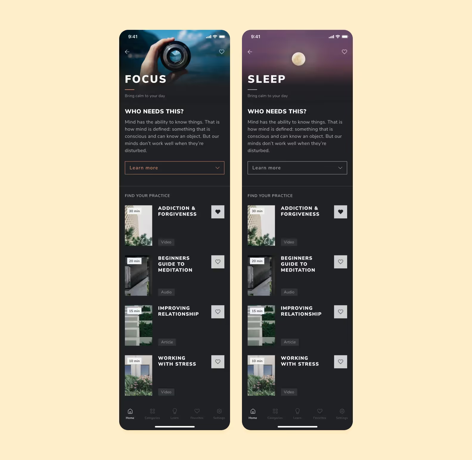
Here’s another example from our portfolio. The Breath Method is aimed at people who may feel depressed, stressed, or exhausted. All of which can be helped by meditation and breathing practices.
Our UX designers used photos with nature patterns: water, rocks, plants. For each section, whether it’s about focus or sleep, there’s an illustration that communicates the goal of the breathing exercise and puts the focus on it.

Easy-to-navigate interfaces make digital healthcare services more user-friendly for patients with different abilities. For example, large, high-contrast fonts, alt texts, and audio cues can help people with visual impairments or hearing difficulties to understand the provided information.

In some countries, accessibility is a legal requirement for most digital products. For example, healthcare organizations in the United States, Under Section 1557 of the Patient Protection and Affordable Care Act, are required to make their information and communications technology (ICT) accessible to people with disabilities. This applies to websites, web applications, software, and hardware.
Also, an efficient and user-friendly healthcare UX design assists patients with receiving healthcare services online, which has been important during the global pandemic. Accessing healthcare services and medical advice from home can be challenging and complicated. However, suggestive and intuitive design will help patients figure out how to use the platform.
For example, we developed an online therapy service that allows patients to consult their healthcare providers remotely, reducing the need for travel and increasing accessibility for people who live in remote places. Focus on user-centered UX helped us make online therapy more convenient by using minimalist and non-overloaded interfaces, setting up a clear layout for therapist profiles, and useful filters so a user can match with a professional faster.
Good design can help with user training — different design elements and content inside the app can guide users through the product’s features and functionality. For example, clear language, engaging onboarding, and interactive elements can help explain how to use the product effectively and lead to a more informed and engaged patient base.
UX designers know that educational features can be very useful in healthcare design as they help users stay informed on medical issues and even prevent diseases. Medication tracking apps like Medisafe provide users with helpful features for managing their prescriptions.

These include smart medication and refill reminders as well as information on side effects. Medisafe also notifies users about how different medications interact with each other. All in all, the educational features will improve your healthcare UX and encourage your users to lead healthy lifestyles.
Overall, UX design for healthcare helps hospitals and healthcare providers streamline work processes and better serve patients, providing a tailored experience. It makes taking care of yourself more manageable and widespread, increasing access to medical services.
In healthcare, UX challenges are inevitable. When it comes to someone’s health, things get serious, and mistakes cannot be forgiven. The medical platform should be thought-out, secured, and protected from top to bottom. Check out the four key challenges to consider.
Laws and regulations. There are many regulations and acts that control healthcare solutions. Depending on the country you operate in, you need to research what’s required. For example, if you work for American users, your design has to be HIPAA and PHIPA-compliant.
Privacy protection. In healthcare, you work with sensitive and confidential information: not just name or address, but medical diagnosis and prescribed medication. Your solution needs to be protected from cyber-attacks and security leaks as it will impact the UI/UX design. For example, you’ll need to include password suggestions and two-factor authentication in your user’s journey.
Different types of users. Healthcare apps are used by several groups of users at the same time: doctors, administrators, patients, and insurance specialists. So, you may have to create multiple versions of the same app.
Here’s a list of user categories for a healthcare app with their objectives, concerns, and how effective UX design may resolve them.
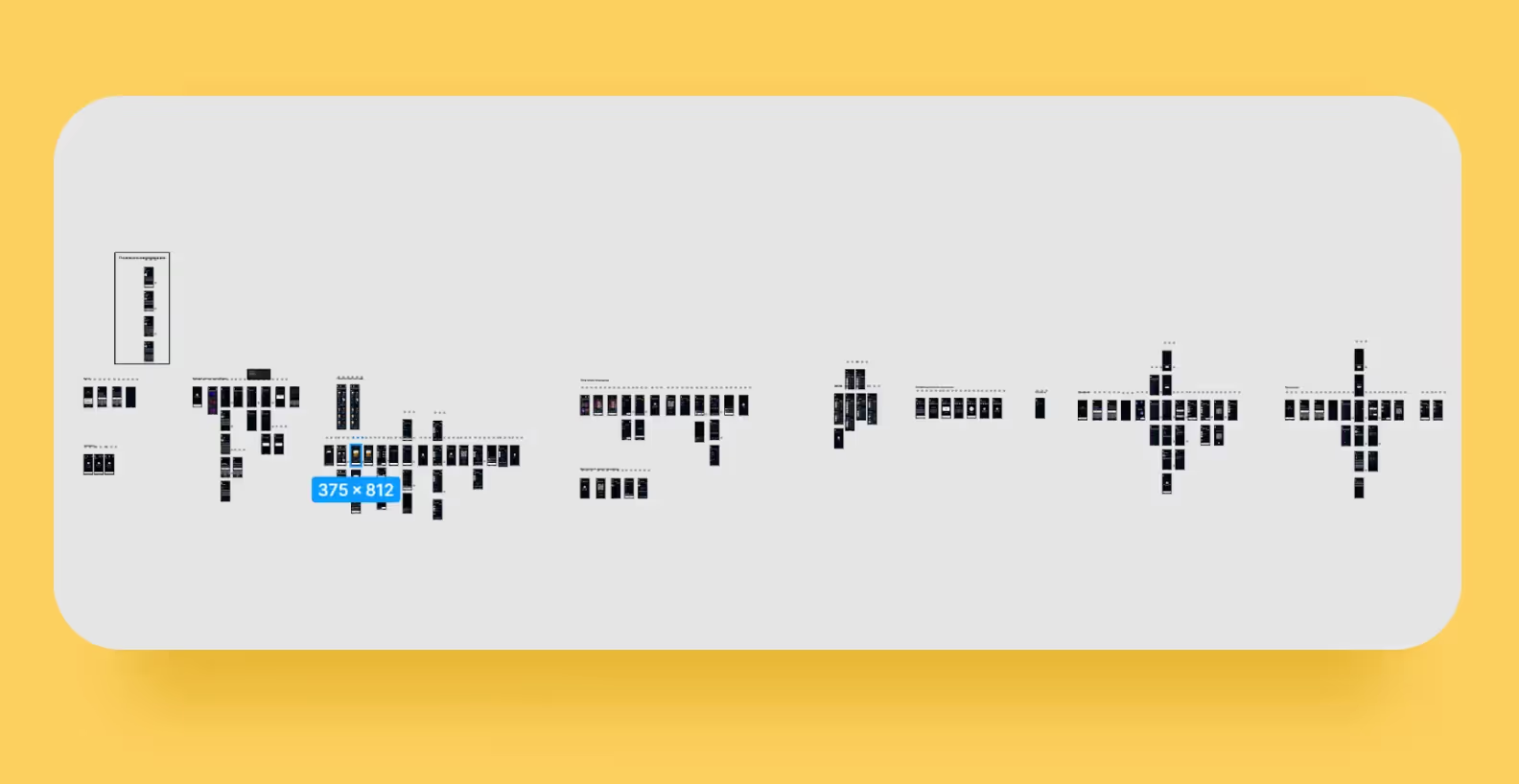
For one of our projects, we once developed over 100 screens for 3 different user roles.

Interoperability standards. Interoperability is the ability of computers and software to exchange information between systems. In medical development, interoperability refers to timely and secure access, integration, and use of electronic health records (EHRs). Lack of it can cost a company financial penalties, legal problems, and extra headaches. Only 22% of EHR-integrated apps support FHIR, the industry-wide interoperability standard for data exchange.
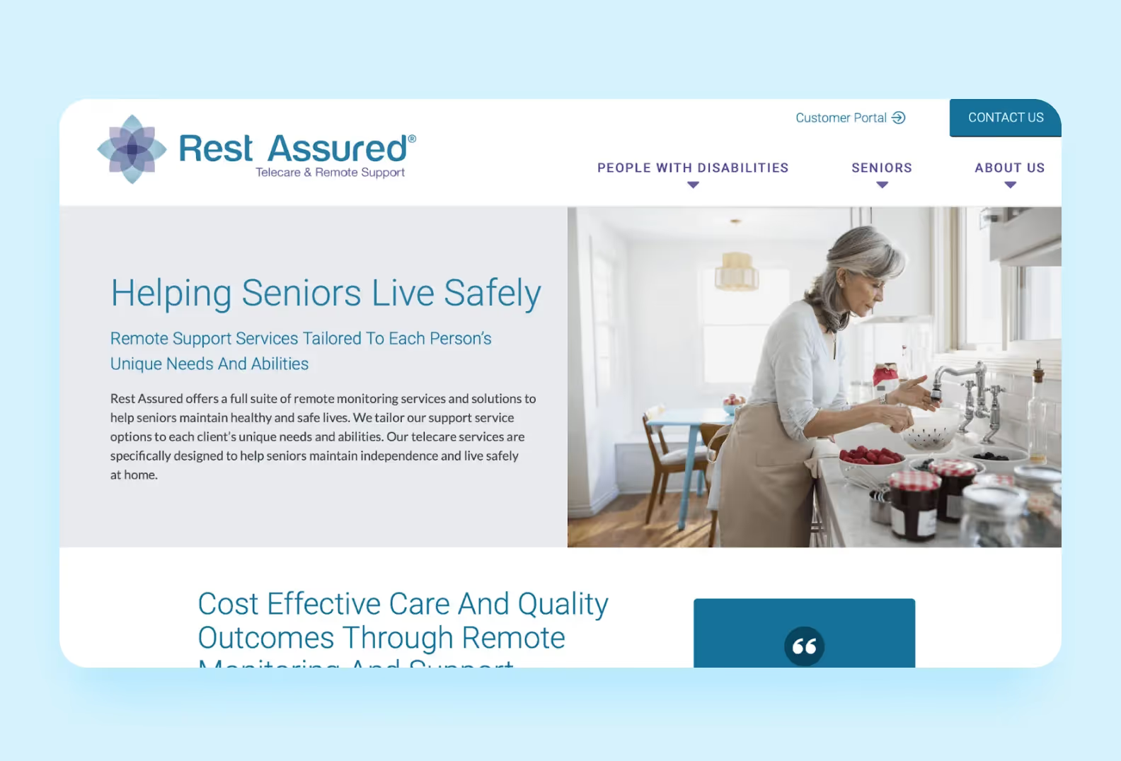
Accessibility. Healthcare design needs to be mindful of the needs of its audience. For example, when designing for seniors, it’s crucial to prioritize things like adjustable text size, contrast, and colors, as well as using bigger interface elements. The latter includes buttons with a larger surface area so they’re easier to find, tooltips that guide users through the app, and so on.
Healthcare user experience that facilitates engagement. Healthcare apps need to be creative to keep users engaged. Especially those focused on wellness, habit building, and medication reminders. Adding features that draw users in can help. These include gamification and push notifications.
Multi-device integration. It’s not unusual for a hospital to have an app that works on different devices, serving different users. Doctors could enter key data and test results on their computer. Meanwhile, patients could access the app on their phone. It’s crucial that a product like that runs smoothly.
Complex data visualization. Healthcare professionals deal with data-dense healthcare systems on a daily basis. That includes patient data like checking bed occupancy rates at a given hospital, identifying abnormalities, interpreting test results to predict how a patient’s diagnosis could progress, and so on
It’s up to UX designers to create an intuitive interface that can present data without hiding parts of it. If healthcare info is hard to understand, it can lead to problems for patients and doctors. Healthcare professionals struggling to understand complex data can make mistakes, such as prescribing the wrong medication or misdiagnosing. While patients will have trouble understanding their condition, requiring more of the doctor’s time.
With new healthcare technologies transforming the ways we coordinate with healthcare providers and receive medical care, design stands to play a unique role. We put together 4 trends to keep an eye on because they’ll take over the future of healthcare design:
AI (Artificial Intelligence) and VR (Virtual Reality) are the technologies that will be used on digital healthcare platforms to improve the quality of services and enhance the patient experience. For example, VR technology can be used to provide non-medication treatment to patients with stress and anxiety.
Have you seen how ChatGPT takes over the world? Similar AI algorithms assist with diagnostics and identify potential health risks before they become serious problems. Chatbots powered by AI can be used to answer patients’ questions, provide education, and help users make more informed decisions about their health.
After the pandemic and series of lockdowns, mental health needs have risen, and the demand for new treatments continues to increase. The market needs more accessible, remote, and easy platforms to take care of yourself, manage anxiety, and promote mindfulness.
For example, the niches of depression management or mental health help for children and teens are still empty. Look into this area if you want to be riding the wave in the future. When working on such applications, designers will need to take their specifics into account and pay special attention to the color palette, using nature-like shades and soft graphic elements.
DTx stands for digital therapeutics, software solutions that have evidence-based, clinically evaluated therapeutic capabilities. For instance, chronic disease management and prevention platforms, such as eczema or sleep-wake disorders. These platforms deal with serious conditions, therefore they need to be scientifically backed and have an experienced R&D (research and development) team on site.
Many sources predict that in the upcoming years, DTx will empower remote healthcare and revolutionize telehealth services as well as UX design for healthcare. Due to their nature, DTx solutions need to emphasize the education of patients when designing an app and involve healthcare providers in creating data-informed interfaces.
No one wants one-fits-all solutions or advice when it comes to health matters. Instead, patients want to use solutions designed specifically for them.
Personalization and customization will continue to be big trends for years to come. There are 4 main factors that contribute to patient-centric care and need to be considered: education, communication, feedback, and shared knowledge. To encompass all aspects of the patient’s interaction with the startup, its services, and the product, patient journey mapping is an essential tool.
Many healthcare digital products are focused on telemedicine — providing online doctor consultations. After exploding in popularity during the pandemic, telehealth apps aren’t expected to go out of style anytime soon. This isn’t surprising, as telemedicine apps are becoming more impressive in terms of their accessibility features and video call functionality.
More and more hospitals and healthcare professionals are looking to integrate telemedicine apps into their workflows. One reason is they can serve more patients this way. Unlike offline appointments, clients don’t have to wait in lines to get a checkup or a prescription. At the same time, patients like telemedicine because it reduces healthcare costs.
To create a great healthcare UX for a telehealth app, focus on improving accessibility and simplifying onboarding. To improve the user flow of your app, you can integrate different features. For example, a dashboard that displays appointment schedules and health records. Or you can add direct chats, which allow patients to message healthcare professionals within your app, whether to address symptom flare-ups or other health-related concerns.
Another popular healthcare trend is integrating mobile apps with wearable devices to track users’ physical health. Smartwatches are equipped with sensors that allow medical apps to gather more accurate health data in comparison to ordinary mobile apps.
However, now wearables have gone beyond smartwatches. Many unique models have entered the market. That includes specialized clips that keep track of posture by sending a vibration to your upper back when you slouch or lean to the side.
Another example is a sleep ring that records user’s sleep stages, monitors heart rate, and checks their breathing quality. Based on this data, it compiles a detailed report, showing what kind of sleep a user is getting and what actions they could take to improve it.
This technology is getting better every year, so it’d be wise to implement wearable device integration in your digital products. This way, you ensure that your healthcare app will attract users for years to come.
Voice UI, as the name suggests, allows users to control devices using only their voice. This eliminates the need for physical contact, making it a game-changer for individuals with disabilities who couldn’t fully use the app. But it doesn’t mean that it’s useless for users without disabilities, because they get to have more freedom to interact with devices however they please.
Speaking about the healthcare system, VUI has many benefits for professionals and patients alike. The former get to use apps hands-free: if they’re interacting with medical devices during surgery, they can log progress, stay focused, and avoid contaminating their hands during medical procedures. The latter can easily access the apps and have complete control.
Some pet-healthcare startups are solely focused on wearable technology. From smart collars and harnesses to patches and tags, users can utilize these devices to monitor the vitals of their companions. That includes heart rate, activity levels, and even blood pressure. These things allow pet owners to be proactive in case they detect an abnormality that signals a possible health condition.
Others are focused on apps with a plethora of features: digital calendars, nutritional trackers, and on-demand vets. One of our clients, a German vet clinic, came to us with an idea for an app that works like this — PetBuddy. We added different options to input a pet’s caloric intake, note separate meals, and check when the next vet appointment is scheduled for.
This industry is still evolving, so going for it could prove beneficial. Off the top of our heads, you could let users contact a healthcare professional in your app for instant guidance on urgent problems, like high fever, an unusual rash, and so on.
Aside from cases where patients require immediate medical transportation, many users are keen on trying NEMT, or non-emergency medical transportation. Instead of calling an ambulance for issues that require urgent medical attention, they can call a vehicle to get to an appointment with a healthcare provider, a therapy session, or a routine doctor’s visit without issues.
This trend also ties into accessibility. Some users can’t physically ride to the hospital for an appointment, they may live in a rural area that’s too far from a hospital, they may be disabled, etc. Or they could have a severe anxiety disorder that bars them from taking public transport to a hospital. These users miss much-needed healthcare services because of this.
Some features NEMT-apps share include requesting rides on demand, connecting with a customer service, and so on. The main goal of an app like this is to provide a seamless user flow that lets clients quickly get a ride to a healthcare facility.
Every digital product needs good UX, but it’s critical in the healthcare industry. Healthcare app users include:
These are just some of the groups that challenge healthcare UX designers to make digital products that are both practical and helpful.
At Purrweb, our team helps entrepreneurs from all over the world turn their ideas into reality. With a UX-driven approach and a focus on analytics, we create MVPs in 4 months, ready for users and investors. Whether it’s a mobile, web, or desktop platform — we can help.
➡️ Have an idea for a healthcare app? <a class="blog-modal_opener">Fill out the form</a> to get started.