


You developed a web app, but investors are waiting for a mobile one. How do you give them what they want, when all you have is two weeks and almost no money? Read the answer in the case of Purrweb and EvTrip.
Hello, I am Sergei Nikonenko, a COO at Purrweb. We design and develop MVPs from scratch with a focus on mobile apps.
We regularly get requests from startuppers who have projects where ‘something went wrong.’ For instance, the app is done, but it didn’t soar. Or, the solution is functioning but it’s completely raw. Or, there’s a truly brilliant idea but no competencies to turn it into life. Usually, it all pops up when investors are about to submit the second tranche — they refuse to release funds until the initial commitments are fulfilled.
Things were different with EvTrip. At first…
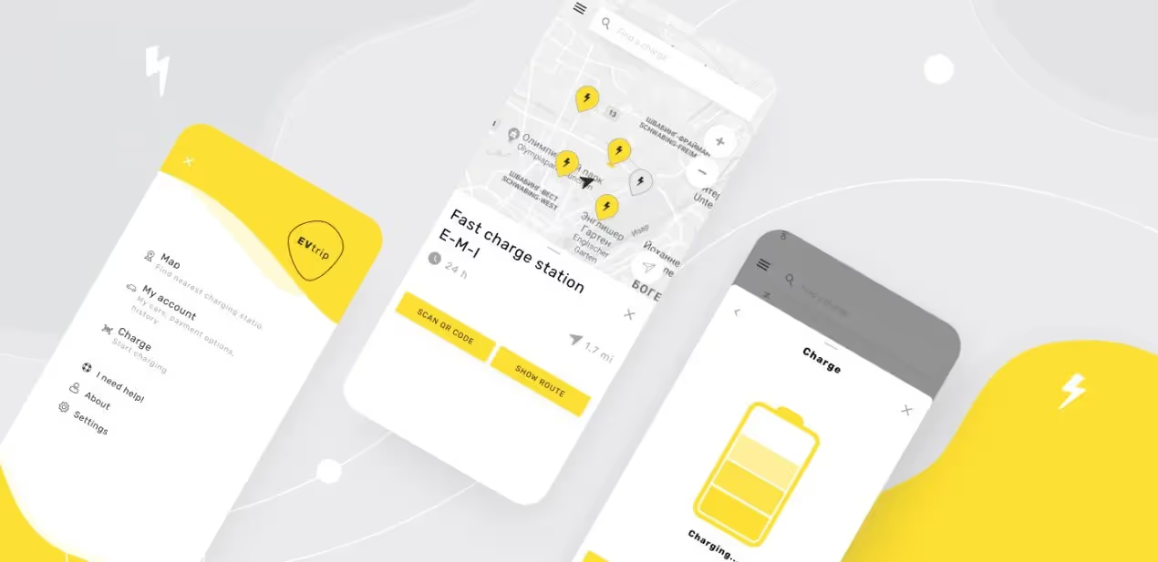
EvTrip is an app for Europeans who own electric cars, motorbikes, and scooters — it helps them find the closest charging station.
They hired us to create the UI/UX design for the mobile app. It was in the very beginning — our client had just received investments and started working on the first product version. They had a team of developers responsible for the coding and already implemented all the features needed, plus they made basic screen layouts. It was supposed to act as a focus for redesigning the interface — in reality, it turned out to be pretty much useless.
The UX part was far from perfect. It took the user 5 steps to accomplish the goal (find a charging station), while it should take only 3:
That’s why we decided to rebuild the design system.
We started with defining the core functions for the user — searching and booking a charging station. There were no problems with that, but we faced difficulties displaying the types of charging stations.
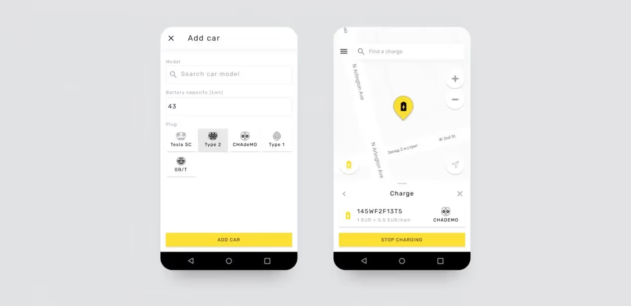
EvTrip has 5 types of stations with different plug types. They needed to be properly designed so that every plug was visually recognizable. Drawing on personal experience was quite a challenge. It appeared that none of us had ever driven a Tesla 🙃 We worked hard, studied pictures of chargers, and in the end, we made it:
The next step in the plan was a competitive analysis: it let us understand what would differentiate the EvTrip app from similar services and what it could adopt from them. As a result of thorough research, we suggested to add:
The client agreed.

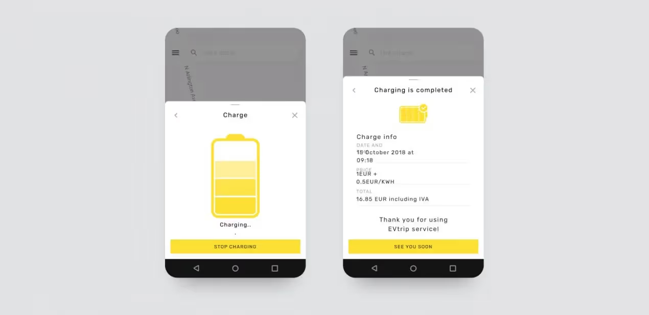
When we defined the feature set, we started working on the EvTrip app’s visual design. What you see now are screenshots of the finished app, but in the beginning, the colors, fonts, buttons, and other brand elements were different. We just couldn’t find the original version 🤷♂️
So, we decided to use two core colors: black and yellow. Yellow is always associated with energy and black creates a strong contrast.
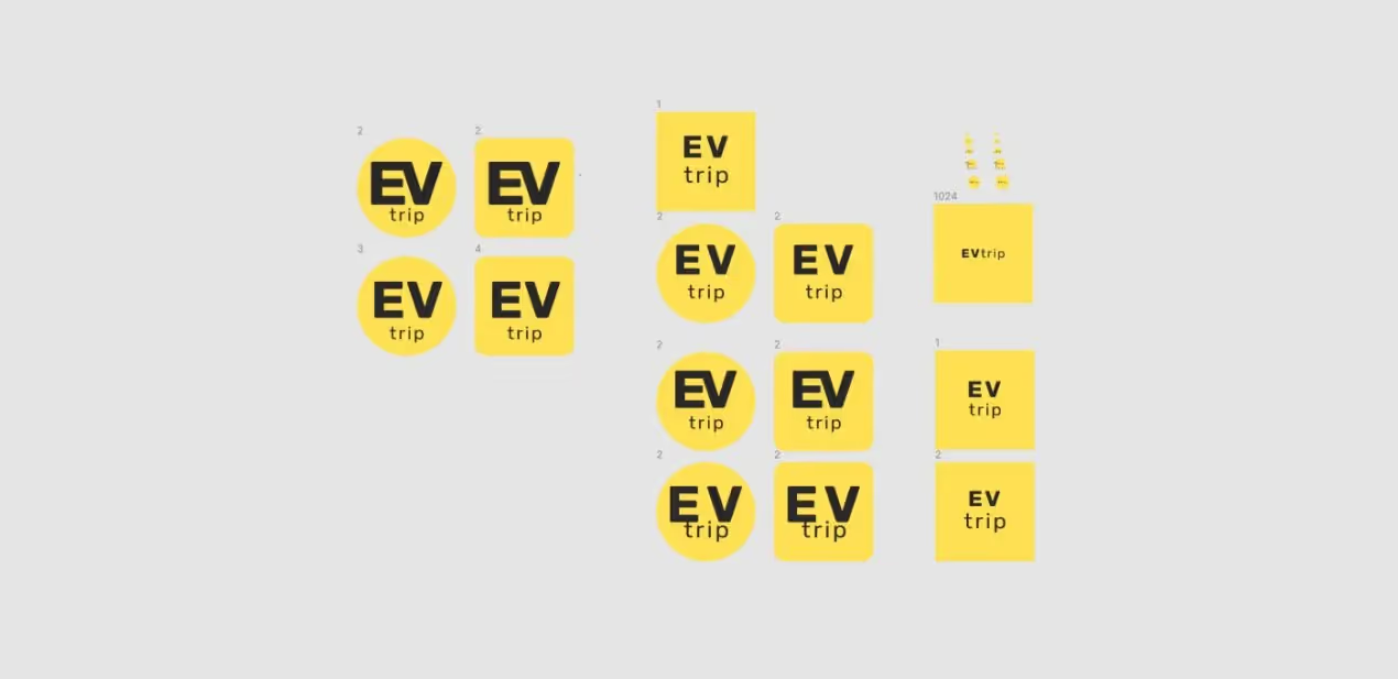
The client didn’t have any specific requirements regarding the logo design, so we relied on common sense and personal preferences. We tried applying different tones of yellow, different fonts and sizes. The EvTrip team was happy with the results. We also created a new brand identity for the company — it was necessary for maintaining UI consistency.
We made the templates in Figma and handed them off to developers — our part of the work was done. The client was extremely happy with the results. They didn’t want to change anything and left positive feedback. His developers said they had all the necessary design files and started coding.
A year later, we met again — they asked us to develop the EvTrip mobile app. We were surprised to find out that rather than building a mobile app (which we made the design for), they developed a web app.
It turned out that their team only consisted of a web developer and a Java developer who worked part-time. The Java dev even made the first version of the product, but then just disappeared. We don’t know why they decided not to search for a new developer. Maybe they wanted to take the easiest route — that’s why they developed a web app. The design was as close to our templates as possible.
Anyway, they promised investors to develop the mobile app, not a web one, that’s why the investors didn’t want to submit a new tranche. It was a classic tale for us: time and money are running out, and the app really needs to be done.
At first, we suggested using React Native to develop a cross-platform app — it would take 2 months. However, it didn’t fit into the client’s schedule: they had less than a month before the investor report, plus the investments were already running out.
We offered a workable compromise — reusing the web version and wrapping it in a mobile-like app. WebView helped us do it.
How it works: we install a WebView component in a mobile app and put a link to the web version. When a user signs in, the mobile app opens an inside ‘browser’ and the work goes on there. Users won’t even notice that — they think they’re in the app, which is actually a browser 🙂
In theory, we could turn the whole app into the WebView form. But we were worried that the App Store and Google Play wouldn’t approve it — usually, they quickly spot inventive devs like us and ask them to code a ‘decent’ mobile app. That’s why we built registration and authorization forms in React Native, and enabled native push notifications — the rest was technically a web app.
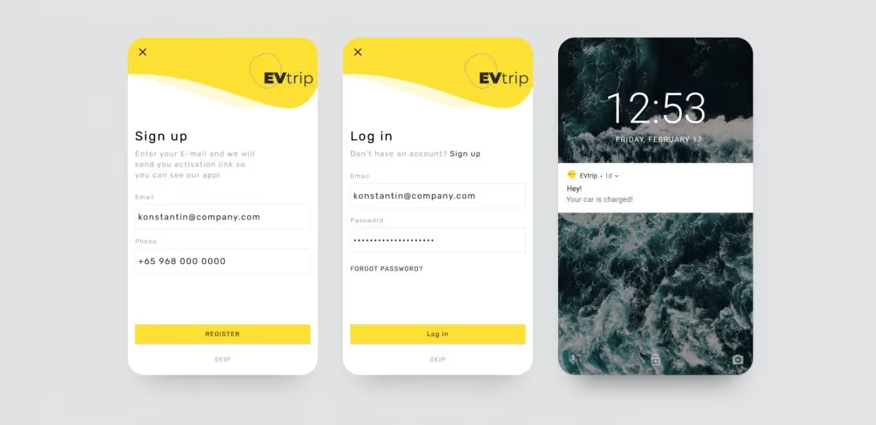
The hardest thing was to connect React Native with WebView — when a user signed in to the mobile app, we needed to throw an access token in the web version. Practically, these are two different frontend architectures, so it took some effort.
After the WebView app was successfully released, EvTrip decided that the charging points needed the same visual style.
EvTrip asked us to create a 3D model of a charging station that they will produce and set up at charging points. Actually, 3D is not our specialty, but it’s a completely new experience for us. We modeled 3D objects for AR projects and interfaces a couple of times, but this time, our task was to model an actual device! We were honest with the client and told him we’d never done that before, but we could if we had enough time. They relied on us and gave us a green light.
The first version impressed the client: it had a screen with information about the charging process and all wires were hidden under cable channels.
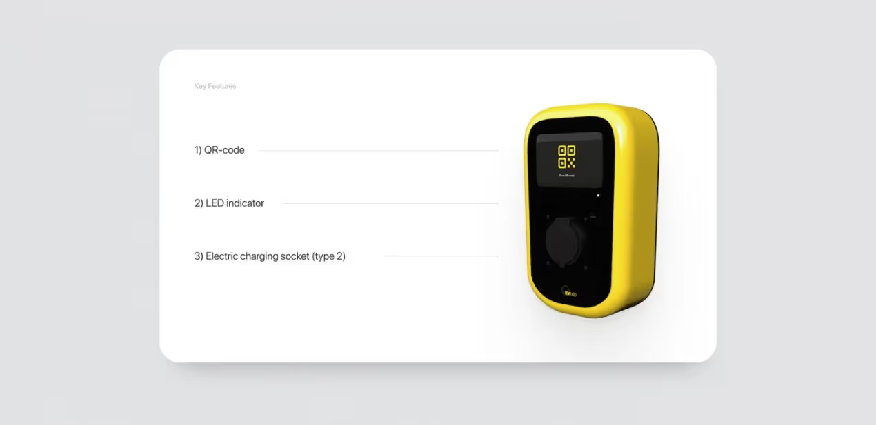
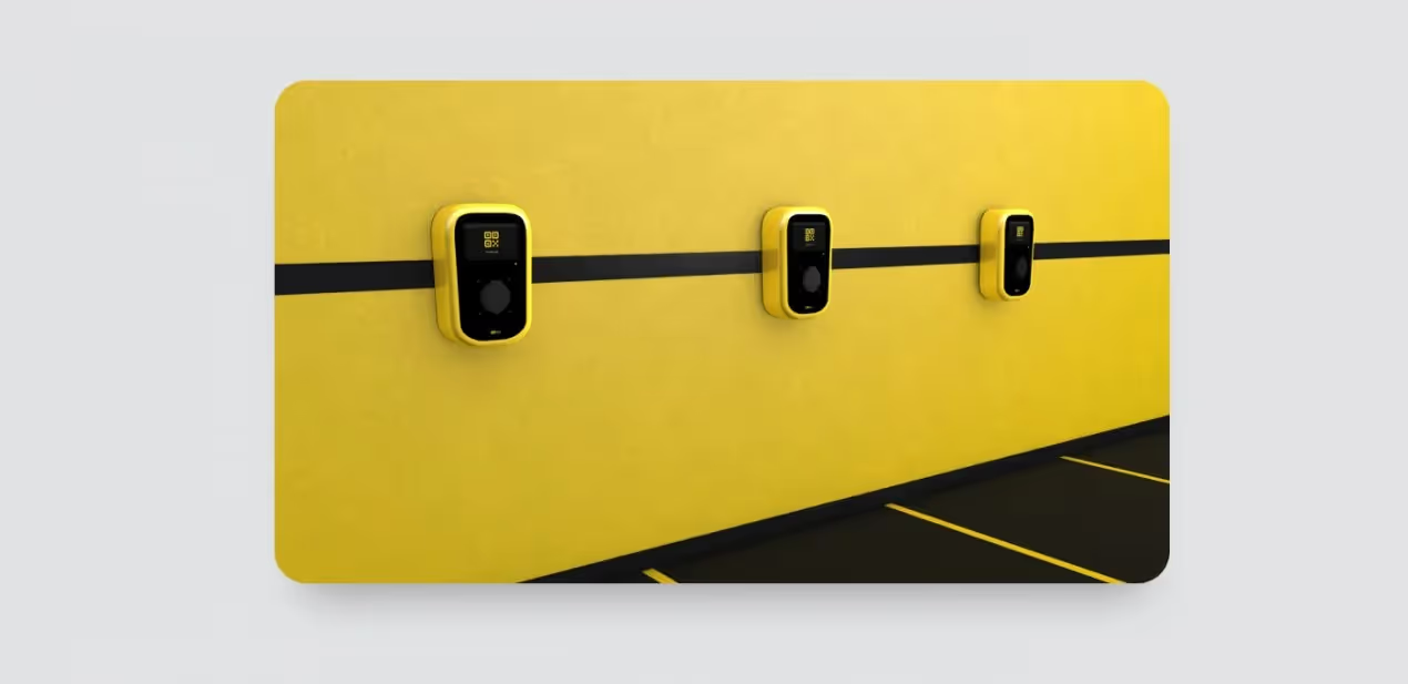
Yet, it turned out that such stations would be too expensive to produce. We offered to make the model cheaper: cut out the screen, reduce the station size, and add wires. That’s what we made:
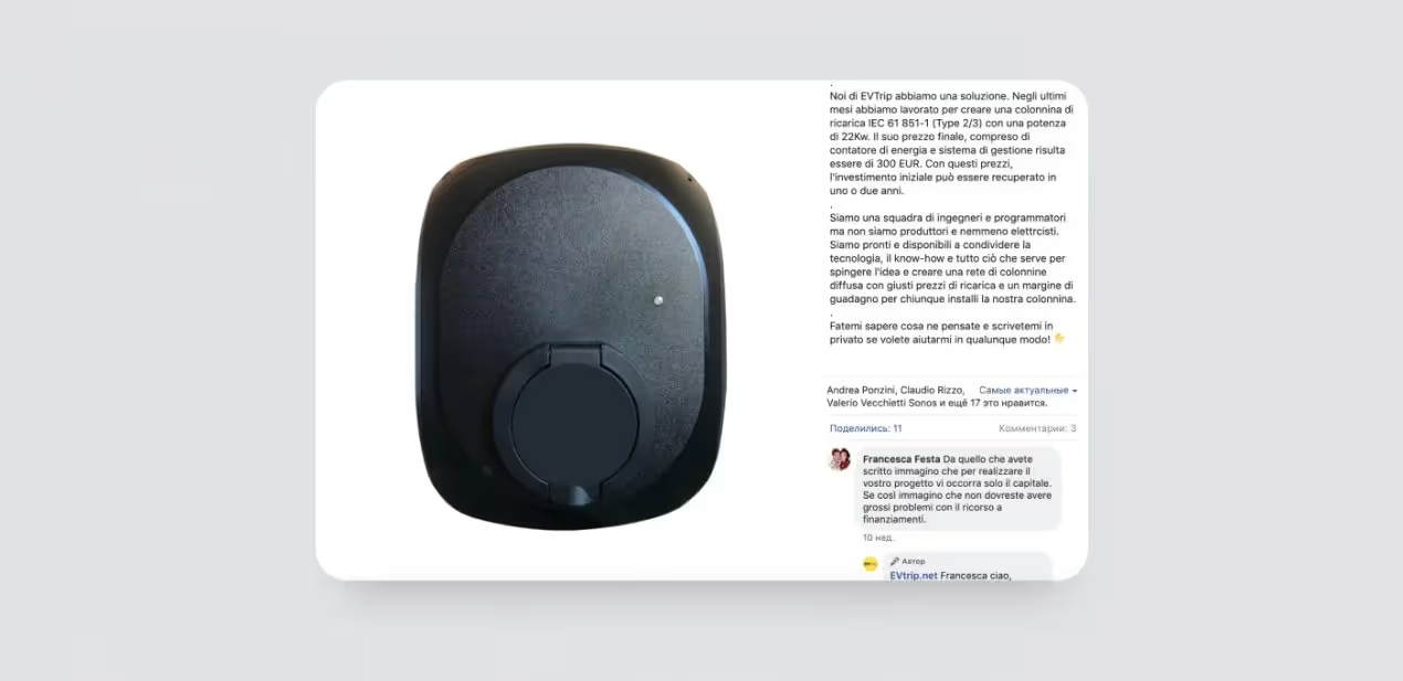
It doesn’t look as hi-tech as the first version, but producing a charging device like that is economically reasonable. EvTrip promotes it as an innovation in the field of charging devices for private use.
Another task was to design a banner explaining how to use the charging stations. We only had 24 hours to do that. Our client needed the banner almost ‘here and now’ to place it next to the first station.
You may ask me, ”Why would an MVP development agency design banners?” The answer is simple: during the production stage, we try to solve most of the client’s problems. We have amazing graphic designers who design marketing materials for the internal purposes of our company. We had to mobilize one of them urgently — the working day started at 7 a.m. instead of 11 a.m.
To create a template, we used the colors required for printing. It was important to take it into account, or else we’d get a banner with completely different color tones that don’t fit with the brand identity. Our client wrote the text himself and it greatly sped up the process.
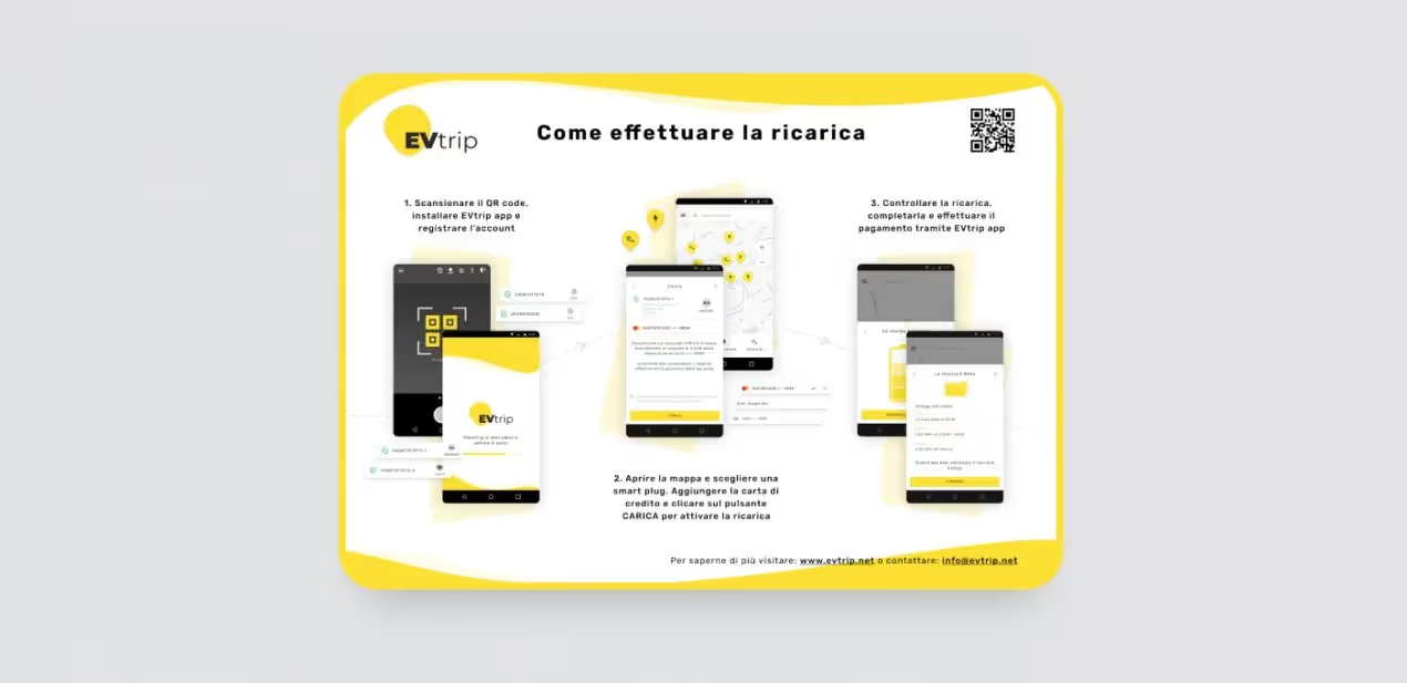
So, that’s what we’ve done for EvTrip:
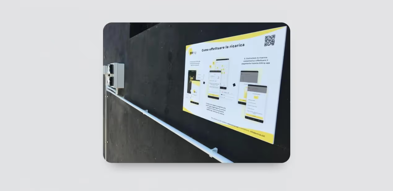
Nowadays, EvTrip successfully works in Turin, Pinerolo, Tuscany, and other regions of Italy. They develop a chain of charging stations with the help of partners and private offline businesses with parking lots (cafes, restaurants, shops, etc.) They keep covering more and more of Italy and, possibly, will once appear in other European countries. And here is our banner!
A reminder for startuppers: even if time and money are running out, it’s always possible to find a way out. Create an MVP that will convince investors that the idea is worth pursuing and turn it into a profitable product and business. By the way, the Purrweb team is waiting for you on the website and Facebook. 😉