


In this case, we’re not just talking about business. Blue Social is a family startup from the USA, which means it's deeply personal. That's why we approached the project with the utmost attention; we listened a lot and suggested successful solutions. And also — we stayed within the limits of a modest budget.
Result: we created a relevant design for a project with a seven-year history, thought through the UX logic, and fit into the limited budget. Let's tell you more.

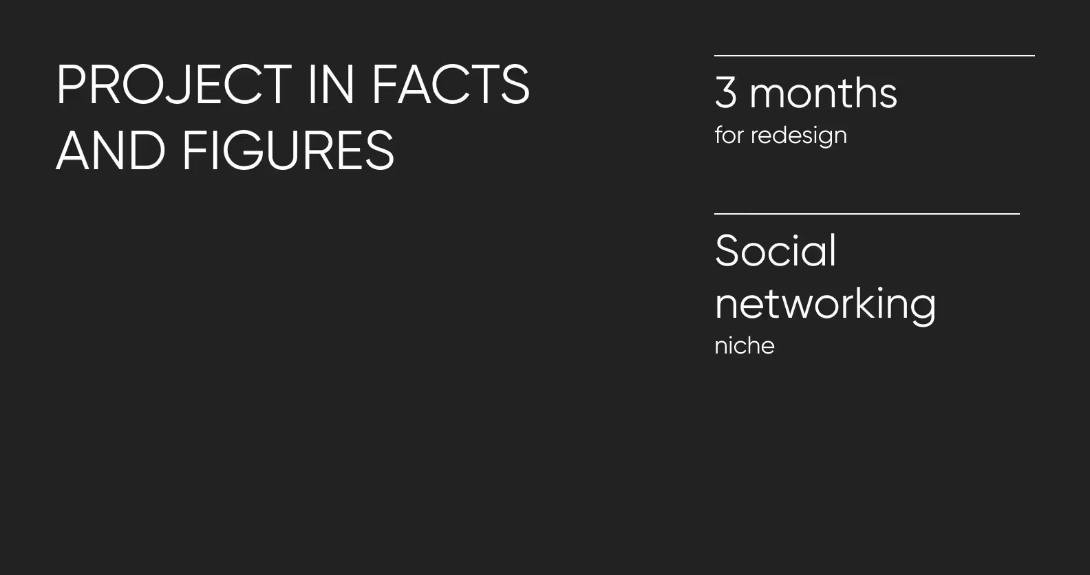
At the time of contacting us, the Montero family had already been developing the Blue Social startup for 7 years. Like all brilliant ideas, their project concept is simple: networking anywhere. The application, through a Bluetooth tag, allows users to connect with other nearby Blue Social users. For example, imagine you’re at a conference…
Situation: You’re at an international conference with top-notch experts. The purpose of such events is networking, and you also want to leave the meeting with a bunch of useful connections. But how do you take the first step?
Solution: Open the Blue Social app, find nearby users, and break the ice.
“Icebreaking” is the killer feature of the application. It allows you to make the first contact with a simple action. For example, sending a notification.
Taking the first step online is easier. Moreover, with the application comes a plan of action. First, break the ice, then meet in person — Blue Social will guide you to the interlocutor. Convenient and useful for business networking like LinkedIn, but with offline capabilities.
However, participants of formal conferences and professional meetups are only a part of the potential audience for the service. The clients decided to focus on the generation of Zoomers. For this, the application needed a fresh design and a scheme for implementing a new feature — decentralized monetization.
With this task, the client turned to Purrweb. Initially, the founders of Blue Social liked our cases. Then, we showed the project estimation and disclosed the work plan — and the choice was made. The Purrweb team knew from experience how to approach the project.
We had already developed a clear design for a decentralized service, helped find their style for the trendy MyWard application, and proposed a redesign for the Zeroney educational platform. Therefore, the team knew what to do first — listen.
The first step in any project is to carefully listen to the client. Who else but the founders know how the business logic of the project is structured? That’s why we constantly held meetings, asked a million questions, and together dissected many screens.
The task was not easy: we needed to figure out how to correlate the client’s current wishes with the logic of the application which has been on the market for 7 years already.
We listened to the client, delved into the complex navigation, and made changes to the old connections, all to ensure that the new design addressed both current tasks and new ones.
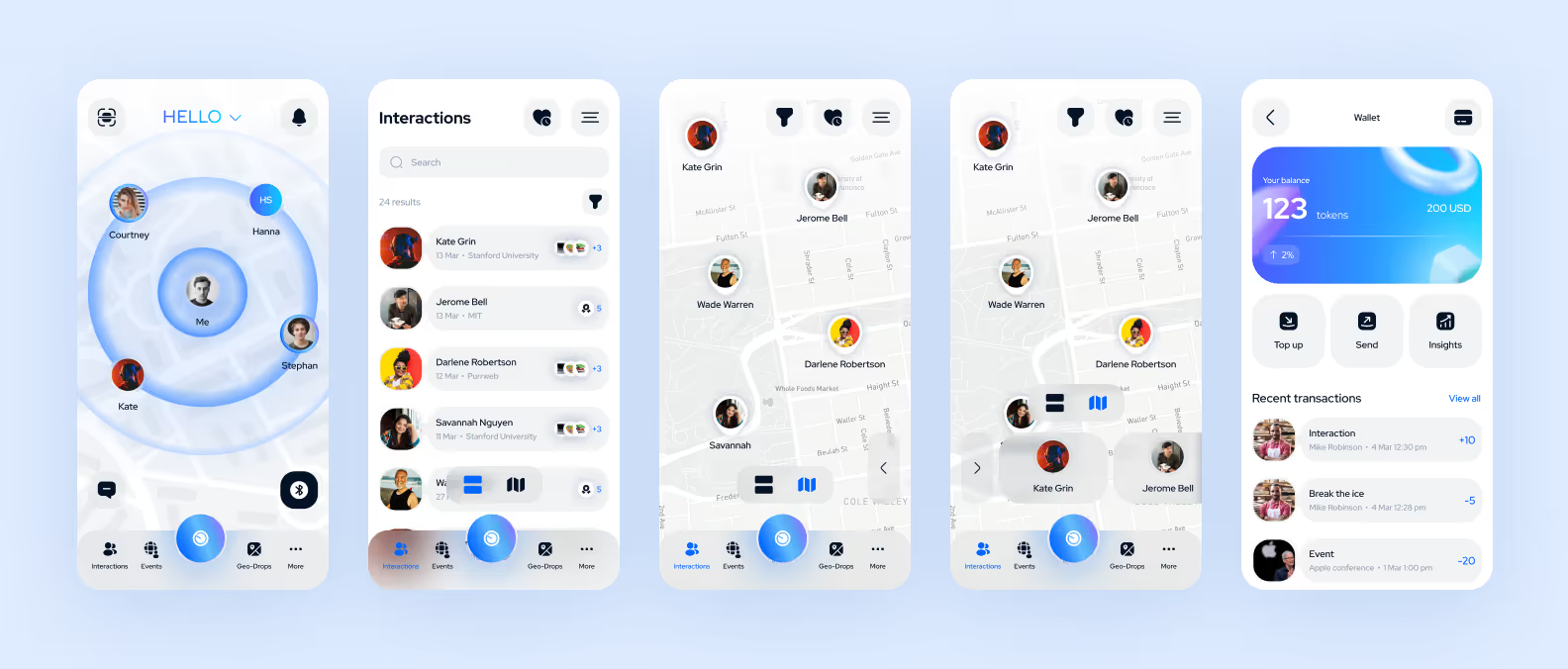
The second step is working with the target audience (TA). In the redesign, we pay special attention to understanding the pains and needs of the TA to more accurately meet their needs, expectations, and consumption patterns.
According to the client’s intentions, the fresh design should attract Zoomers. What do you need to know about this generation?
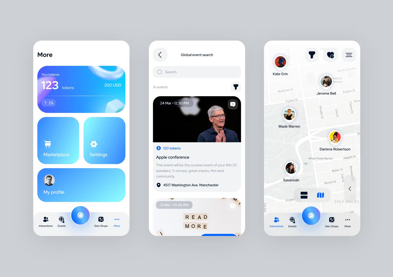
After analysis and data collection, it’s time for the “small” stuff — choosing fonts and colors.
We settled on the Red Hat Display font. It has a modern and minimalist design. The font is perfect for interfaces: it’s easy to read, and the rounded letter shapes support the concept of a smooth visual language.
The colors are clean gray, black, and white. For accents — blue. This shade is commonly seen in the design of social networks. Additionally, the blue tone continues the concept of the previous version of Blue Social.
Over three stages, we assembled a new visual style for the service. How does it differ from the design of the old version of the application? See for yourself.
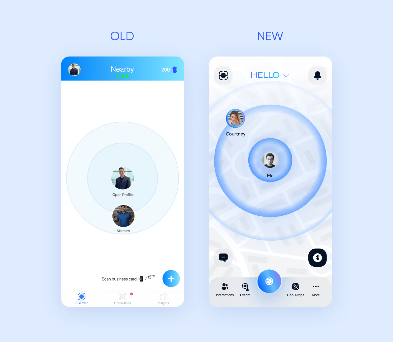
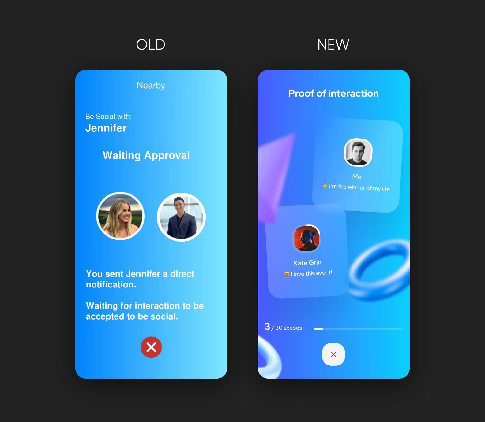
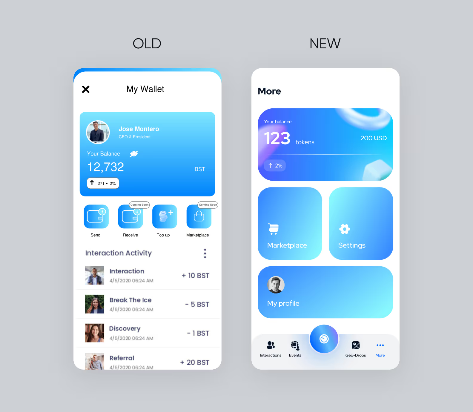
Three months after the kick-off, Blue Social received an up-to-date and well-thought-out design. The entire project cost exactly $12,495. It was important for the client not to exceed the budget and for us to implement all the client’s wishes and stay within the constraints.
The client was satisfied with the result. The client has already updated the app and started testing a new version for its users.
— We’re confident Blue Social, with design contributions from Purrweb, will be well received and begin its journey to become a unicorn in 2024.
The Montero family, founders of Blue Social
If you need to refresh the design for your project, fill out the form to contact us. We will carefully listen, share our experience, and estimate the prices and deadlines.