


Using Cargo on-demand delivery app as an example I’d love to describe the problems that teams encounter when product development begins only after signing a contract with the client, and how to handle them.
Which startup founder didn’t dream of getting the first customers before even launching an on-demand delivery app or service? It seems to be a much more reliable and promising approach than releasing it in the conditions of total uncertainty, however, it’s not that simple. For example, in the B2B segment, this strategy requires very competent product management, otherwise, there is a risk of failing to meet customer expectations.
In the Western world, selling IT products at the early stages is a common story. If a startup founder has identified the market pain points and is ready to offer a decent solution, he has good chances to attract the first customer’s attention even before writing the first line of code. Who can potentially be your first customer? Not only the investors who are willing to fund promising IT solutions, but also product owners, since there are many advantages of acquiring digital products at the concept stage. The main one is the ability to get a custom service at a minimal cost.
The sale of an unfinished on-demand delivery app comes with the help of design concepts and clickable prototypes that demonstrate how to effectively handle the pain points of the market. However, unlike investors, customers are not ready to take risks and wait years for the release, so they will only buy a service that can at least prove its concept in 2-4 months. The most efficient way to achieve it is to develop a stable MVP (Minimum viable product).
Our case began when the startup founder Gurpreet Jajj from the United Arab Emirates contacted Purrweb to buy a design concept for an IT service that optimizes logistics for small and medium-sized businesses, like online stores, restaurants, and laundries. This on-demand delivery app supposed to become a White Label application, which could be seamlessly integrated into customers’ business processes, making city delivery transparent and efficient.
An obvious benefit of this scenario is a clear understanding of the service’s tasks. However, building an already sold solution means working in a hardcore mode due to very tight deadlines. Plus, our client was obliged to pay penalties to his customers for each day of delay, so the deadlines were crazy. In such a case, violation of agreements is unacceptable, which means that even minor mistakes in managing on-demand delivery app development processes can become critical.
How to prioritize on-demand delivery app development
When working in the ‘sale first — product later’ mode, proper planning and prioritization are vital. And for this scenario, priorities are more important, because even perfect planning won’t save you from situations when the client comes up with new ideas and wishes in the middle of the sprint. Dilemma: you can’t move the deadlines; ignoring wishes is not an option either.
To keep within deadlines, we’ve set our first and constant priority on the main flow, i.e the core functionality that the app couldn’t work properly without. Meanwhile, we kept noting and assigning clients’ priorities and put them into production in a way that didn’t affect the main flow development deadlines.
At the release stage of on-demand delivery app development, the lack of extra features is not as painful as the main user flow being crooked
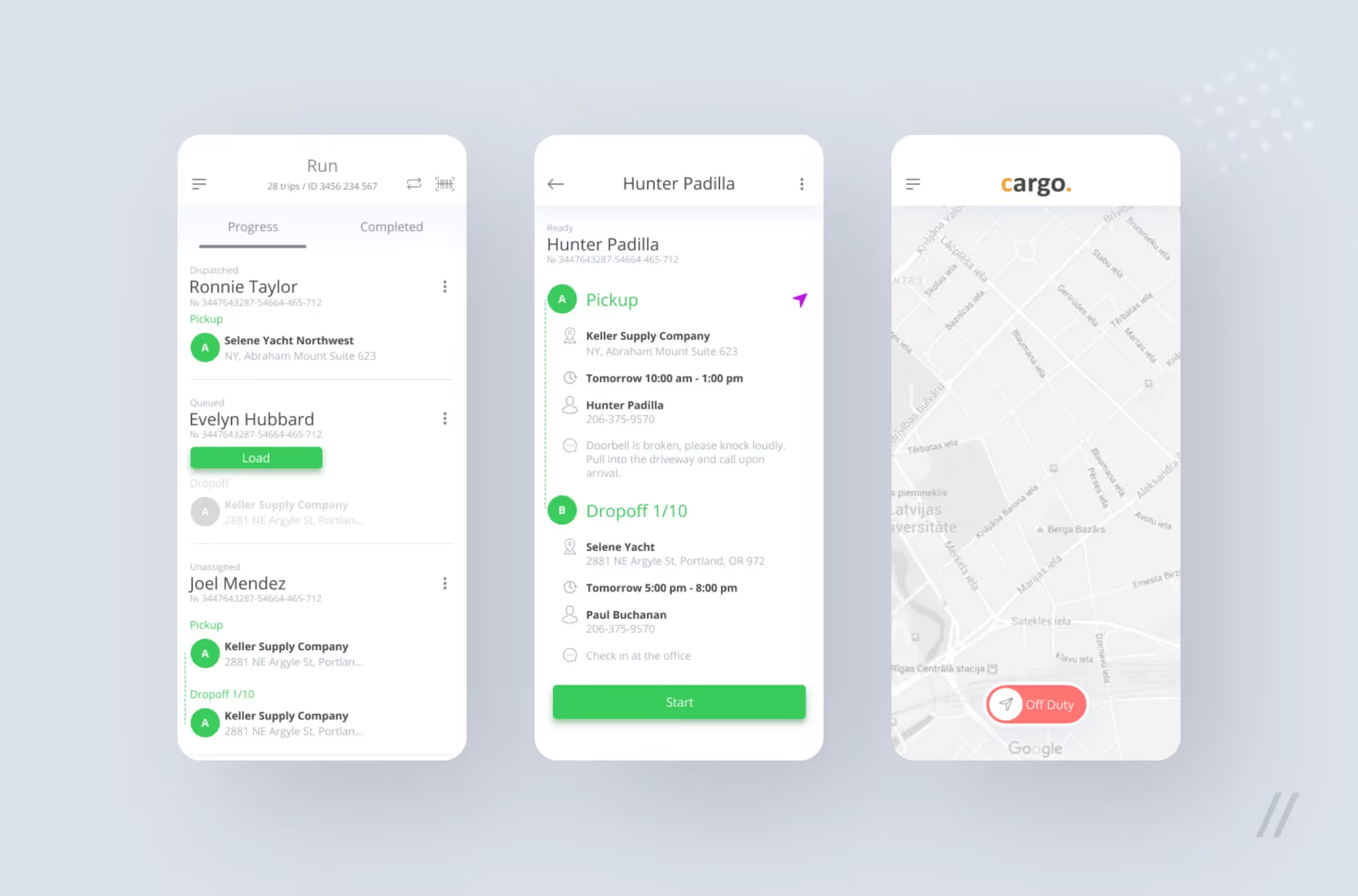
Here is the main flow of Cargo app. The courier arrives at the warehouse, opens the application, notes his status and gets to work. The second screen displays a list of packages that should be delivered today. The courier finds them in the warehouse, then scans their barcodes or manually enters the packages’ codes: this procedure means that the parcel is now under the courier’s responsibility. As soon as all the parcels are loaded, the courier receives a route list in which the recipients are sorted in the most convenient way. Since couriers usually move around the city by car, we integrated the GPS navigator into this on-demand delivery app. When the courier hands the package to the recipient, the parcel must be scanned again, and after that, he can proceed to the next point.
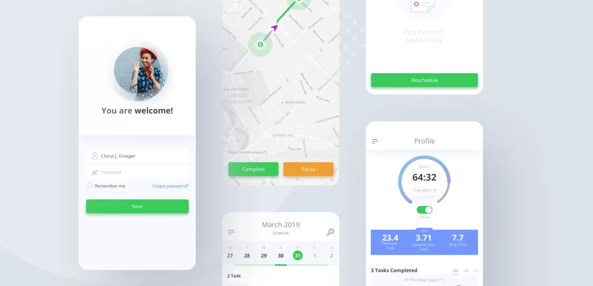
For the sake of delivery drivers’ convenience, we made the main flow linear and came up with the simplest possible interfaces: no more than two actions in one screen. The second priority was given to features, such as the recipient’s electronic signature, polls, a courier’s profile with statistics, the ability to cancel delivery or move it to another day.
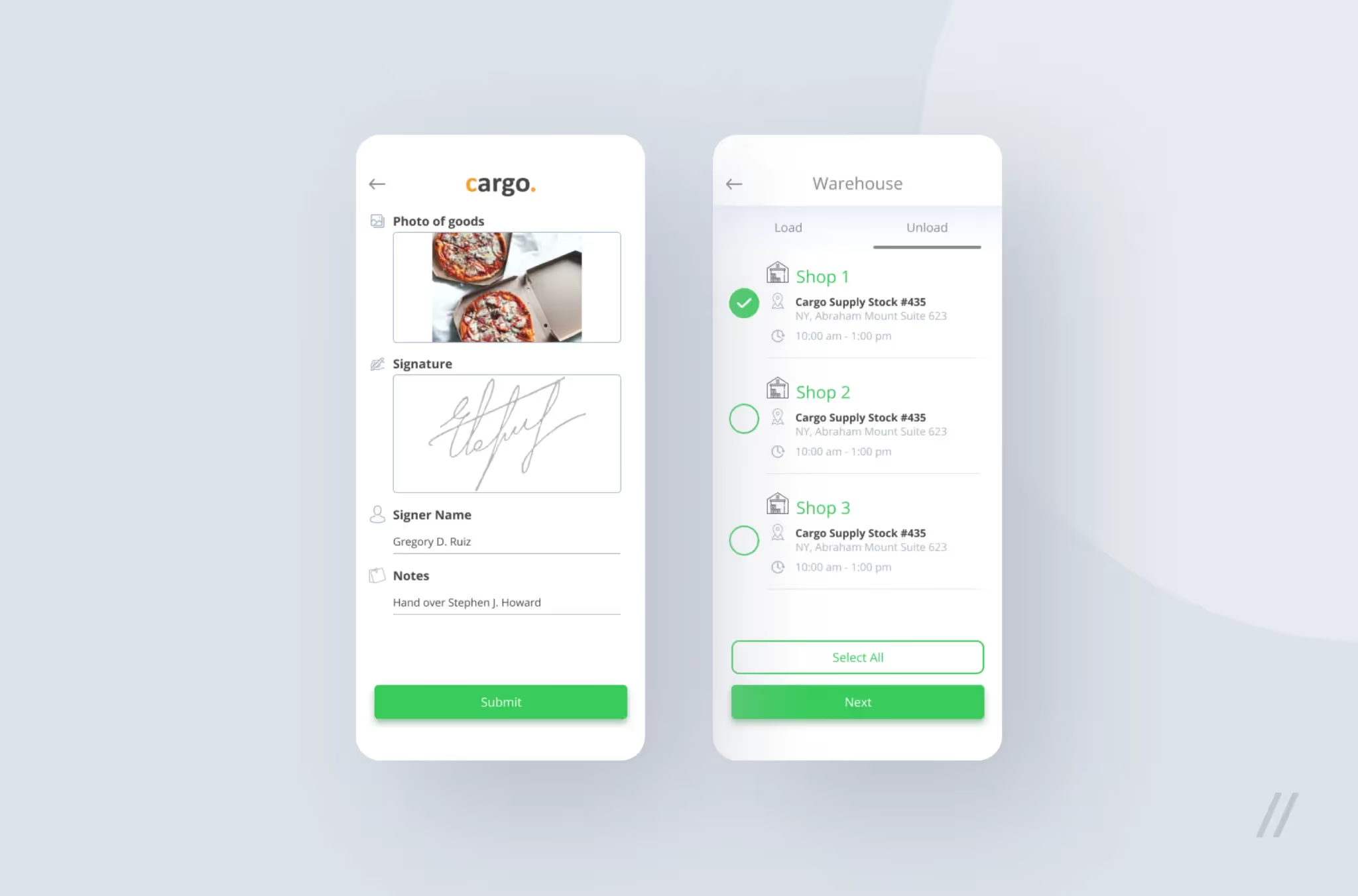
It would seem that electronic signature is a must for this service because it ensures that the recipient is satisfied with the delivery and the courier hasn’t messed anything up. However, the application would still work and can go through the first operational tests even without electronic signing, so this feature received the second priority. Thus, even considering risks (e.g. the courier didn’t deliver the order, but scanned it), we didn’t backtrack our priorities and kept the main flow as our main focus.
It is worth noting that under such conditions on-demand delivery app development and management processes should be as transparent as possible. Clients need to see regular progress according to the agreed plan to trust the competence of developers in case of contentious issues. There is no need to reinvent the wheel: we worked using Scrum with two-week sprints, and our client was completely satisfied with this framework.
Our team worked only on the frontend part, the backend was built by the team on the client’s side. This significantly slowed down the project, because we weren’t able to quickly figure out where errors occurred: whether it was at the front- or the back-end. Taking into account tight deadlines, we understood how risky it was to waste time on such inefficient communication, but we had no choice. Plus, no external difficulties could become an excuse for delaying the final and interim releases.
To streamline communication with the back-end development team, we decided to stick to the ‘frontend-driven’ development’ principle. Since the main advantage of the application was in the user flows, we developed the client-side first and only then proceeded with the server-side. So, deciding when and what to request from the server, as well as determining the response structure — this was exactly our zone of responsibility.
Route planning is one of the most challenging features in on-demand delivery app development
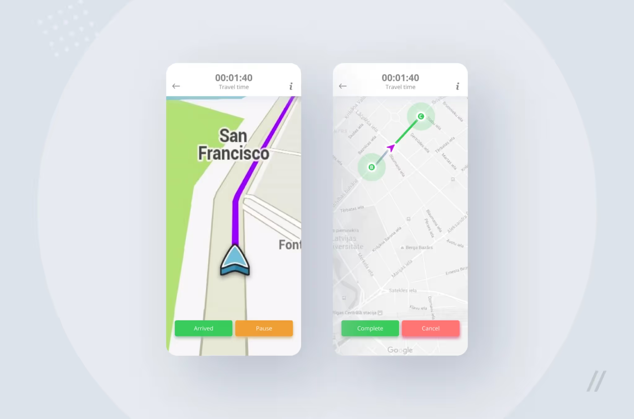
The route list, which was a grouped list of destination points, was calculated on the back-end, and then a route-of-best-fit was built on the front-end based on it. Plus, the navigator not only showed the geolocation but also took traffic jams into account.
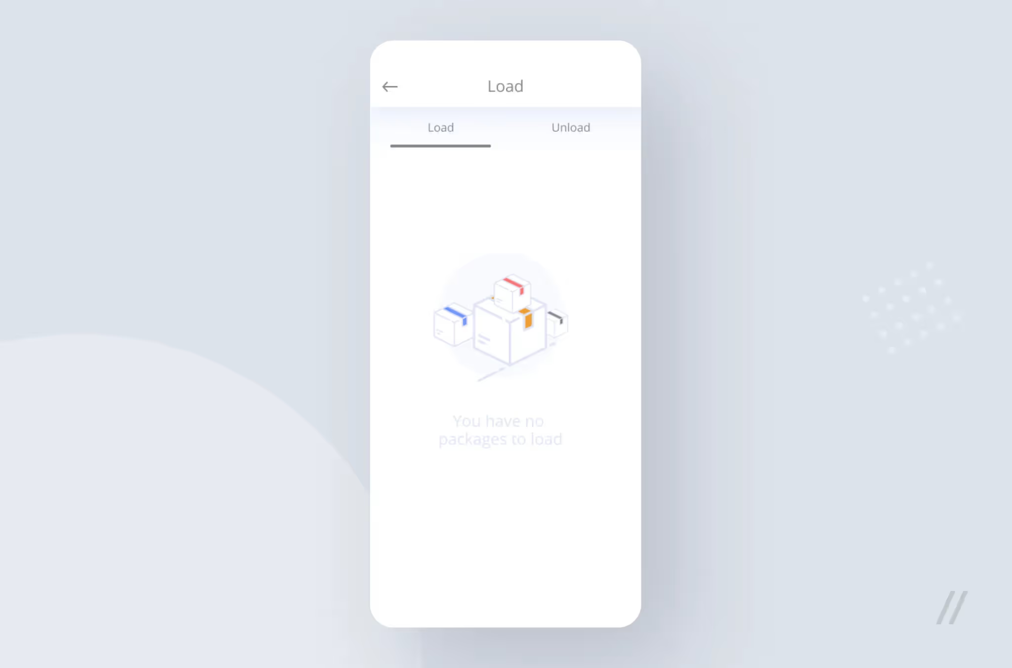
When designing White Label application interfaces, it should be borne in mind that the service should easily adjust to any branding. A White Label application is an application template, but this should not affect the design since there is no way a tight deadline could be a reason to sacrifice the visual component. To prevent the interfaces from looking like a half-stuff and make the whole application feel lively and vibrant, we paid a lot of attention to details. For example, we’ve placed a neat icon on the non-informative and half-empty ‘No tasks left’ screen to bring harmony and balance to it.
There are other nuances of working with White Label applications: they relate to the color scheme. The traditional solution is to create a system of primary and secondary colors, which will change to corporate colors from the client’s brand book.
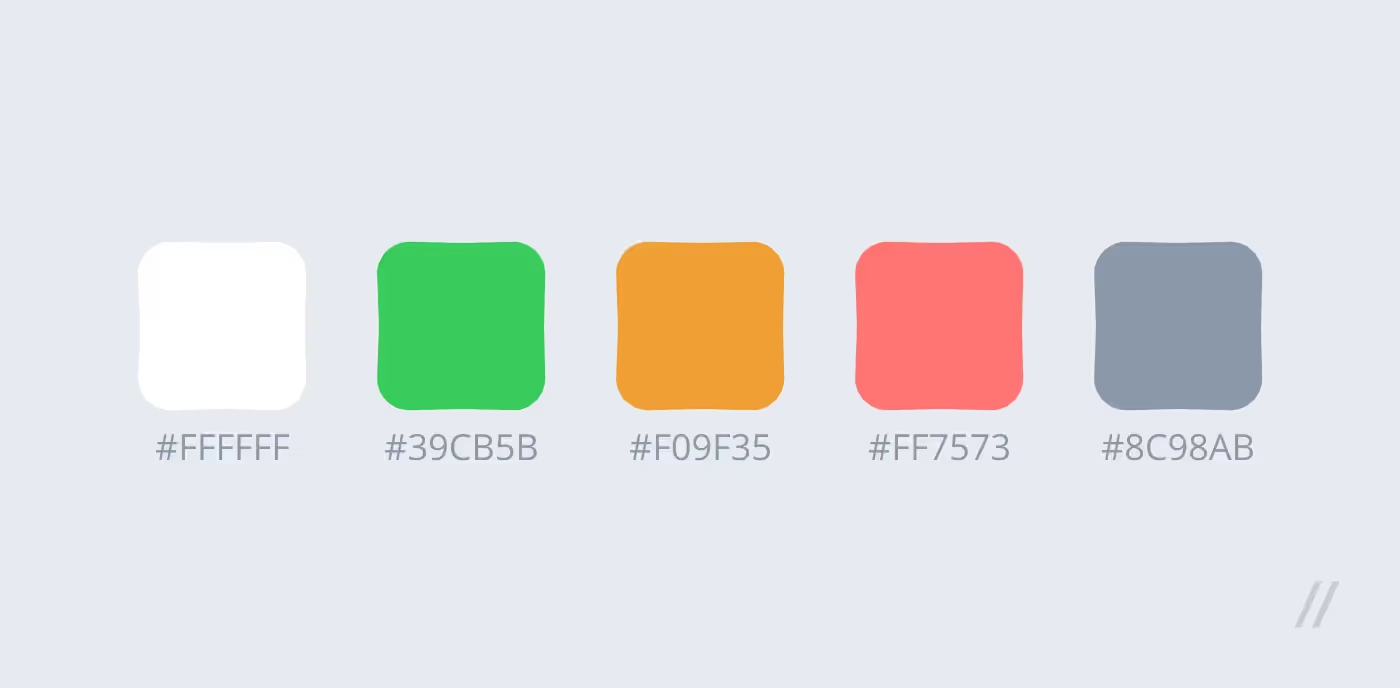
But due to tight deadlines, we chose a simpler path and formed a very universal, yet logical palette. We’ve set accents using ‘traffic light’ colors, which are intuitively clear to each driver. Green — the operation was successful, the action is approved. Red — errors and inaccessible elements.
With tight deadlines there is no time and opportunity to cover the code with tests, so you need to approach the testing in the most responsible manner.
In our case, the main difficulty was in the navigator again: to check it, testers had to get out of the office and walk around the neighborhood many times. To avoid bugs, we allocated additional resources to this task and spent more overall time than usual. However, still less than it would take us to write tests.
The fact that we kept our focus on developing the main flow allowed us to release the first stable version as planned, which means that we had enough time to test the application in conditions as close as possible to the real ones. The client helped us a lot: he traveled with the pioneer drivers and described bugs and errors in detail.
To hit the deadlines and ensure that the application is stable, the speed of bug fixing is extremely important. That’s why we decided to build the whole front-end on React Native: despite all prejudices, this framework has practically no equal in creating cross-platform applications with beautiful responsive interfaces in the shortest possible time.
React Native has a lot of complaints from developers due to some difficulties with supporting libraries and dependencies. However, we’ve been using this framework for a long time and have learned how to overcome its limitations and shortcomings. In this case, for the navigator, we used the existing open-source MapBox library, which worked accurately after a few adjustments.
Even all precautions couldn’t save us from periodic fixes, but I’d be a liar if I was to say that the release was a permanent all hands’ job. As a result, the project was delivered on time, and this was just the beginning: shortly after the first sale, the application attracted two more customers. We had to customize the main flow to their requests and create additional scenarios: for example, the couriers got the ability to pick up parcels not only from warehouses but also anywhere in the city.
Our MVP survived the test of scaling: the selected technology stack (React Native, Realm, Mapbox) allowed us to successfully develop several versions of the application at once. And the service itself has become a popular solution, which is now offered as part of the Illuminate Software Solutions IT-product line.