Hello! I’m Kristina Spiridonova, an account manager at Purrweb. Using the copy-trading platform Fintarget as an example, I will tell you how UI/UX design can simplify investments for newbies.
Investment is complicated. If you don’t want to waste money, you need to keep yourself in the picture. You need to know which stocks to buy, which to sell, and be overall familiar with financial data. This is how investment looks for newbies. They’d love to go ahead but are scared of it. While they’re holding over, banks and brokers lose prospective investors. Yet you just need to put existing financial tools in a super simple way.
We found a perfect balance between deadlines, complicated topics, and agreements — this was the block-by-block UI/UX design for MVP. As a result, we released an investment platform within 1.5 months instead of the predicted 3. And managed to keep it simple, stupid.
This case study is helpful for:
- Product managers and marketers of large companies — as an example of productive work with contractors when both sides understand what is going on and give timely feedback.
- Heads of agencies, account managers, and freelancers who specialize in UI/UX design — as a good example of how project work can be organized.
Now let’s get straight to the point.
Who is the client and what were we working on?
BCS-broker is one of the largest companies in the Russian stock market.

Back in the days, there were only ‘seasoned’ investors among clients — who could work on their own. However, BCS had a perfect tool for newbies — auto-following. The tool automatically executes trading orders based on the selected investment strategy. The service was popular among current BCS clients but no one from the outside world knew about it.
The BCS team suggested the hypothesis: the company will attract more customers if it proves that investing is easy — even for those who don’t have any experience. To quickly test the hypothesis, the BCS team decided to get started with an MVP.
The task was to create separate pages for the personal account and the auto-following service to convert prospects into customers.
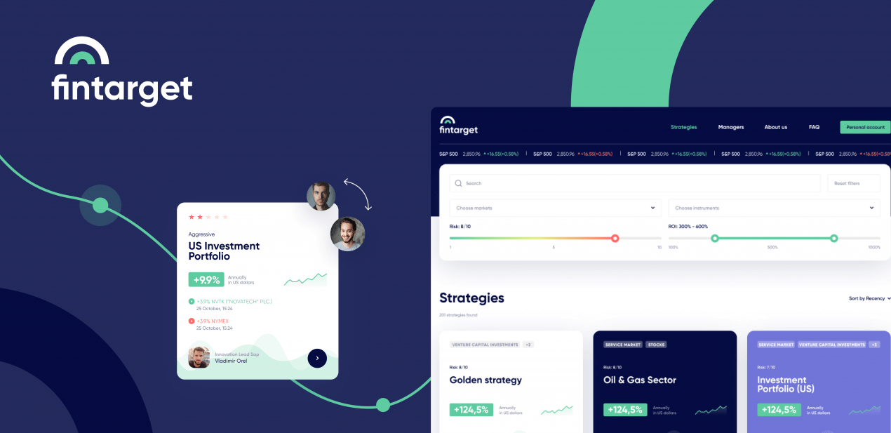
The product got a name — Fintarget, a store of investment strategies.
How to efficiently split the project work between two sides?
BCS had its own development team but it lacked MVP UI/UX design expertise required for launching. We got used to developing the entire product — including going deep down into all details at the very beginning and dealing with UI/UX design and development part by ourselves. On this project, we had to change the approach and split the process of product building. Cooperative mode brought changes in the workflow, so we got a new approval stage with the dev team on the client side.
A few words about sharing the project work between two sides: the larger the company is, the more people influence the final decision. That’s a general rule. Stakeholders evaluate the intermediate results and make a list of edits. There are a lot of people, everyone has a busy schedule — so it can take weeks to get feedback — which, of course, only delays the project completion date.
Fortunately, we had just two people to discuss the project with — a project manager and a product manager of Fintarget, which is unusual for such a large company. From the very beginning they established internal communication and aggregated edits in a single list — as a result, we communicated only with the project manager. And this worked out well: we had no problems when it came to solving issues.
Note for clients: choose one person to communicate with the contractor. Let him/her handle the approvals within your team. This will dramatically speed up the work process.
Development and UI/UX design went in parallel, so we followed this plan:
- Build new screens
- Agree on each of them
- One designer works on a new screen, while another adapts the approved design to all screen sizes and resolutions
All in all, this approach may be applied even if both UI/UX design and coding are up to an agency.
Decompose the task into blocks
So we’ve got to design a snazzy interface for a financial tool — based on the Fintarget’s brand guidelines and paying special attention to the strategy card so even a newbie investor could get it straight.
The time was limited: we were to release the product within 3 months. That’s why we agreed not to design the whole interface at once but to progress in small iterations, block after block:
- First off, we designed strategy cards and screens
- Then we moved to the user’s profile
- After that, we took on not urgent yet important web app parts: FAQ and About the project
Evolution of investment strategy cards
The first iteration is always about testing the waters: we make sure that we are working in the right direction and understand principal points. It’s easier to determine the client’s preferences from the design concept stage rather than create one based on just gut feelings.
As for the creation of investment strategy cards: we used the technical specification of the client but already knew that it can differ considerably from the implemented result. Look at the result:
It was the fundamental mistake to skip guidelines and use ‘not proper’ colors, fonts, and styles. We spent much time discussing the information placed on the cards though. The main task for us was to understand what should be emphasized — I mean we’re working on the platform for those who don’t have a clue about investment. We studied competitors, involved analysts, and agreed on decisions related to the information before integrating them into UI/UX design.
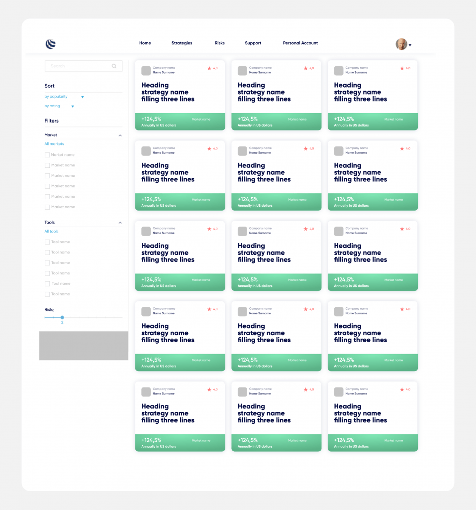
In the end, neither visual nor informative parts caused any complaints on the client’s part. We managed to utilize colors, fonts, and other brand elements and present the most important information for a novice investor: profitability, strategy rating, strategy author, and market name. A little later, the numerical rating of the strategy was replaced with stars — there were enough numbers in the interface. Check out the result ↓
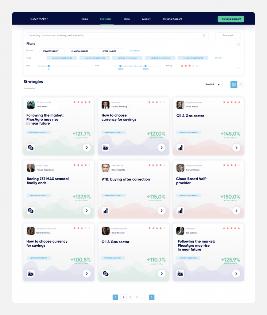
We didn’t reject the idea of color emphasis on the cards yet made them paler and in the form of graphs, which resulted in the less strict look: the page reminds a game. This is exactly what we were trying to achieve — since we developed a product for beginners. We also added an arrow key to the cards that encourage users to check the details.
At this stage, an approval process went smoothly — the client quickly confirmed the layout. But we still wanted to ‘play’ with it.
This is how we designed the layout:
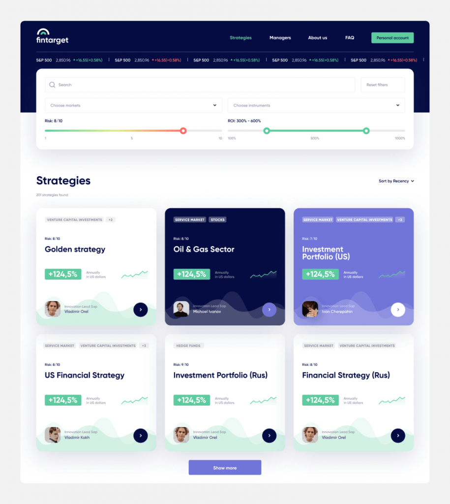
We left part of the cards colored, emphasized the strategy’s profitability, and added tags that briefly describe the details.
We also added gradients to the slider that users see when selecting a risk: green means the least risky, and red — the most risky. Plus, we integrated a running line with financial indicators — according to the client’s conditions, it’s to be embodied in each page of the site.
Then it went off without a hitch: we learned the format and nevermore got piles of edits. There were minor comments that were easy to correct without breaking the concept — this is a common flow of work.
For example, the Strategy page was approved really fast:
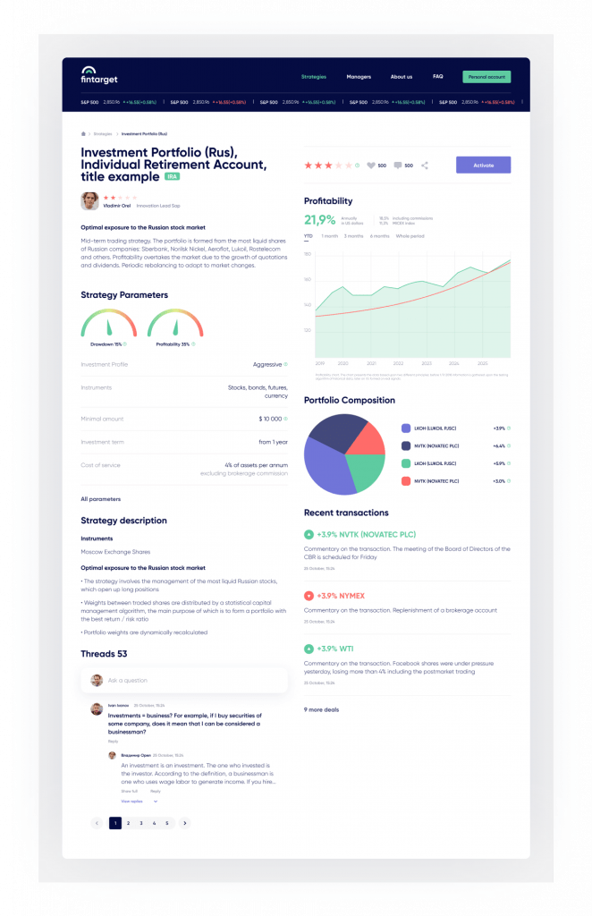
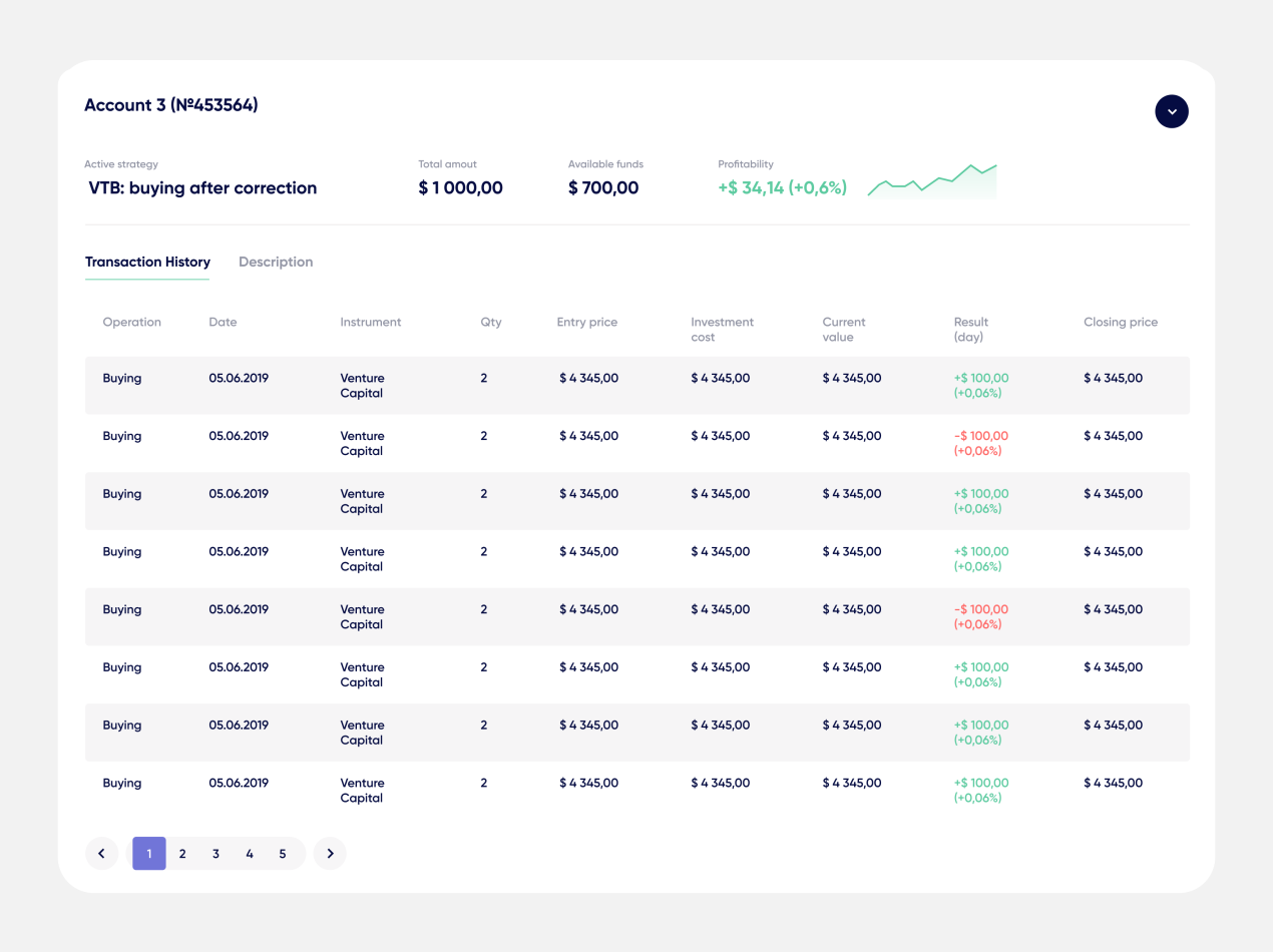
The page contains all information that is important for making a decision on linking an account to the strategy: dealings record and the result of each, portfolio, characteristics, and details of a strategy plus chat with other investors (to ask for advice, if you need it).
Setting up the personal account
What is the main point of a personal account? It’s an answer to the user’s ‘how am I doing?’. In other words, what is the profitability (highs-lows) of the connected investment profile? This was how we understood the goal, hence how we designed it.
This page was created in several iterations. The details we got from the client’s analysts and marketers helped us grasp some nuances and restrictions.
For instance, now users cannot connect multiple strategies to a single investment account yet can open several accounts and compound them with different strategies. We were to translate each strategy and its details into the design. And we did it — taking up as little space as possible. Thus, we ended up with the drop-down cards:
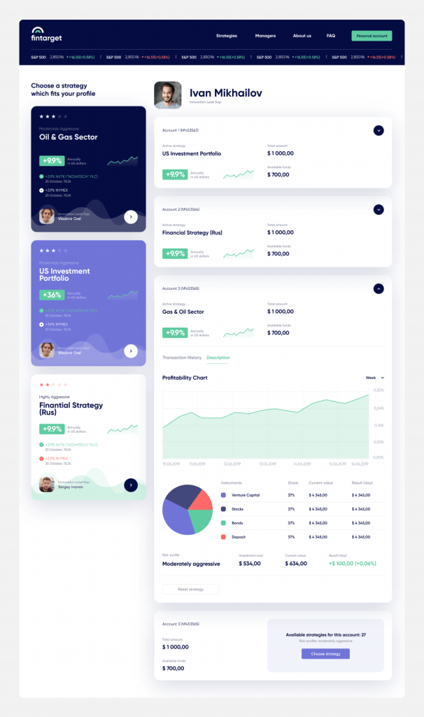
To tell the truth, initially, we completely forgot to display the option to unlink an account from a strategy. As a result, we had to seek a place to display the button without drawing too much attention — the client agreed with that. So we put the button at the end of a drop-down card and made it pale-gray.
This is how we designed the billings for each account:
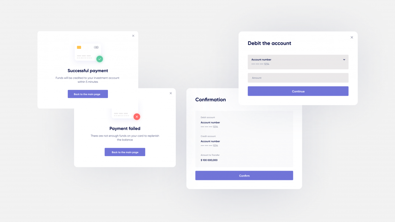
For managing an account, we chose simple forms with large buttons and short informative notifications about completed actions:
Adding knowledge database (and missing pages)
Knowledge database is crucial for newbies. With this thought in mind, we decided to divide all possible questions into specific categories, and placed the most popular ones right on the first screen:
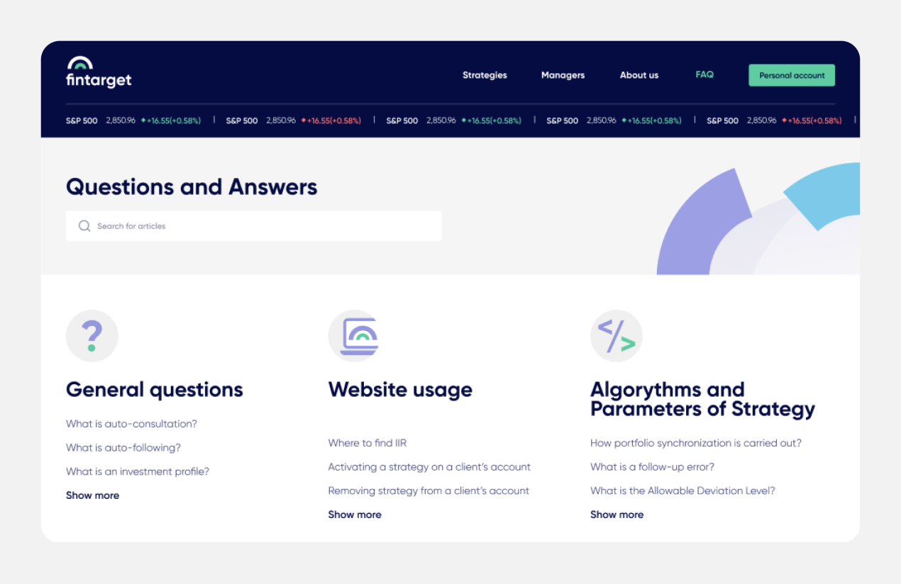
We also enhanced Home and About pages.
Since Fintarget works as a web-application, we made implementations not only for 1280 and 320, but also for 768, 1024, and 1440. We usually skipped in-between states — especially 768 and 1024 — and left it to the developers. But here the client demanded detailed consideration. In general, it’s really cool (we didn’t expect this though 🙂). Now we’re trying to establish the practice of working out all sizes and offer it to all clients. Not everyone agrees (because designing all sizes means extra time and extra budget).
The task is completed!
The project was successfully released, so now you can examine the result of our collaborative efforts here — fintarget.ru.