


After reading our article on Arabic design, a new client approached the Purrweb team. They discovered a new market opportunity in the Emirates and partnered with us to develop an app for remote home renovations. This article highlights how our UX design makes remote home renovations more manageable, how we saved $12,000 on technologies, and why the client ultimately decided to pursue in-house development.
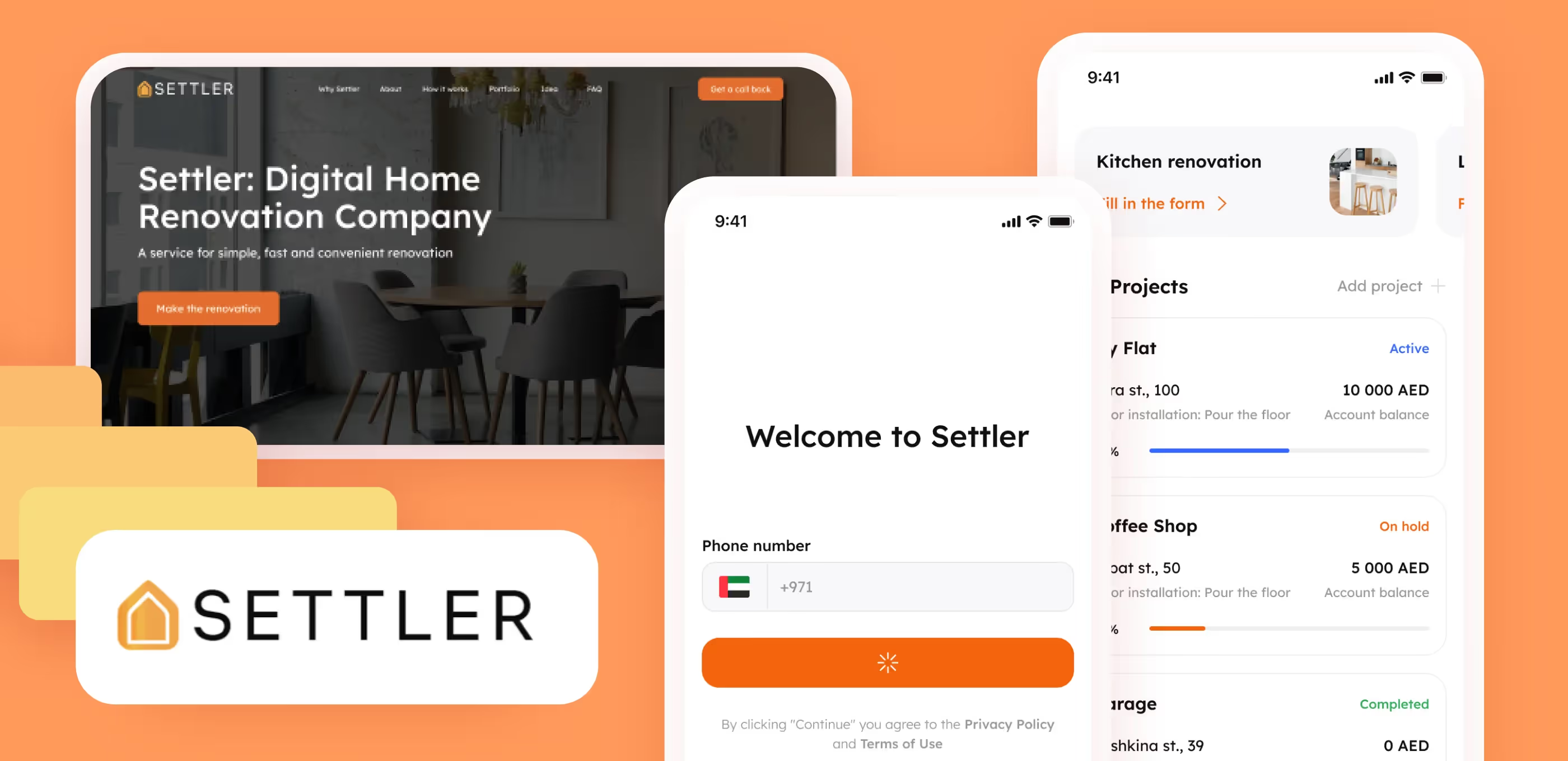
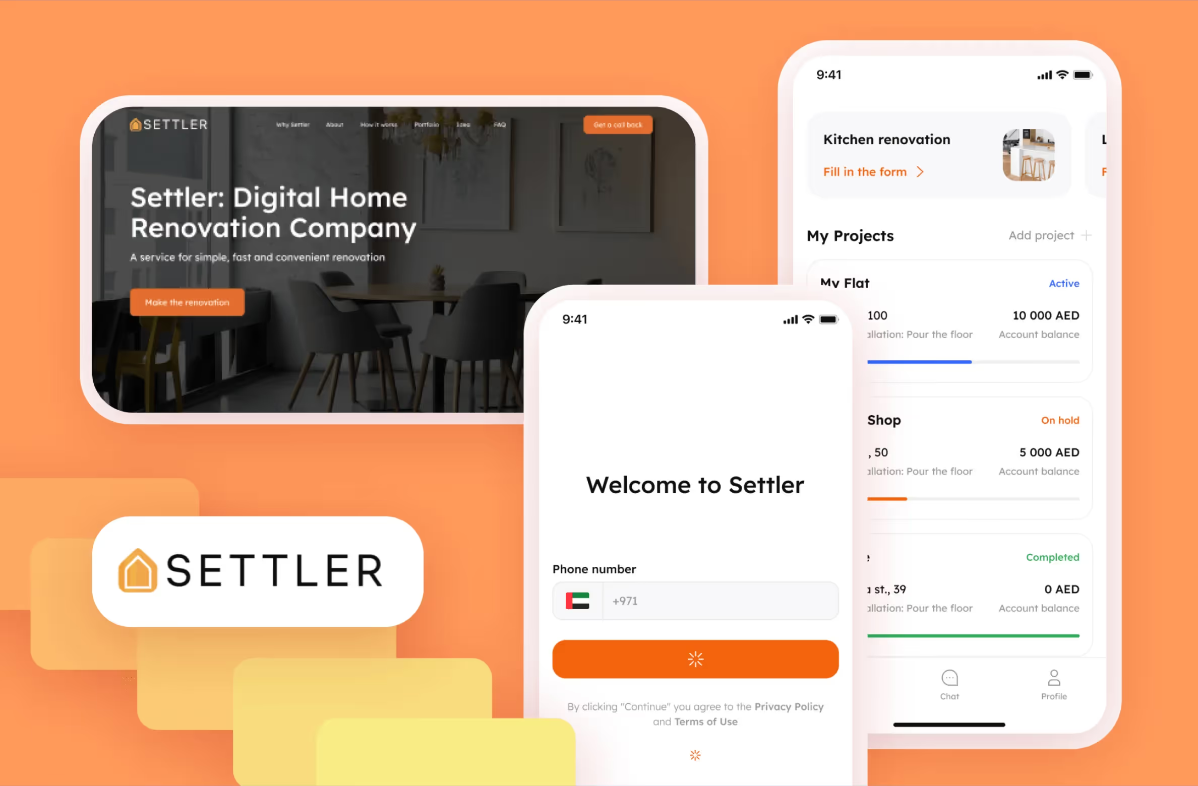
Renovating an apartment is a tiring process as the owner must find contractors, purchase supplies, and stay in touch with a foreman. It becomes even more difficult when all of this must be done remotely. Our client knows this firsthand, and they are not alone in this struggle. Many owners of apartments in Dubai either reside outside of the country or have busy schedules. Additionally, some people invest in real estate but are unable to oversee all of their properties. Our clients decided to create a service that lets users monitor construction progress from afar.
Settler is meant to help users manage renovations for their Dubai property from anywhere in the world. Users only need to fill out a request form, provide their requirements to the contractors, set a budget, and hand over the keys. The Settler team will handle the rest.
We at Purrweb have already developed real estate services such as Pad for finding neighbors and Post-a-Room for gathering information on the London housing market. So, we understood the specifics of this field and knew what was in store for us.
We had to digitalize the entire process of renovating and combine everything in a single app
During this major project, we were supposed to make:
We had to meet a deadline set by our client, who approached us in September and requested that the application be released by New Year’s. The goal was to showcase the service to their friends and seek investors in a calm environment. It was important to consider that stores could take up to two weeks to review the application, so it had to be completed with some time to spare.
To meet our deadline, we opted for the versioned approach. To do this, we prioritized all the features and planned 5 app versions.
First, we compressed the feature list as much as possible and made an MVP, so that we could publish it to stores in time. Afterwards, we worked on updates and expanded the service over time.

The versioned approach modified the development process. After every two-week sprint, we updated the app in the stores. Thus, everybody could see how the product was evolving gradually.
Besides, this method allowed our client to revise feature priorities — they could determine which features to include in the next version of the app.
During our briefing session, the client shared their design ideas with us. Some of the references they sent included our projects, so we quickly found common ground.
We went for a minimalist design to help users focus on the main objective — renovating their place. The clients wanted the app to evoke a warm and cozy atmosphere, so we chose the color of Spanish oranges as an accent color. And yes, you guessed correctly, it’s indeed called Spanish Orange.
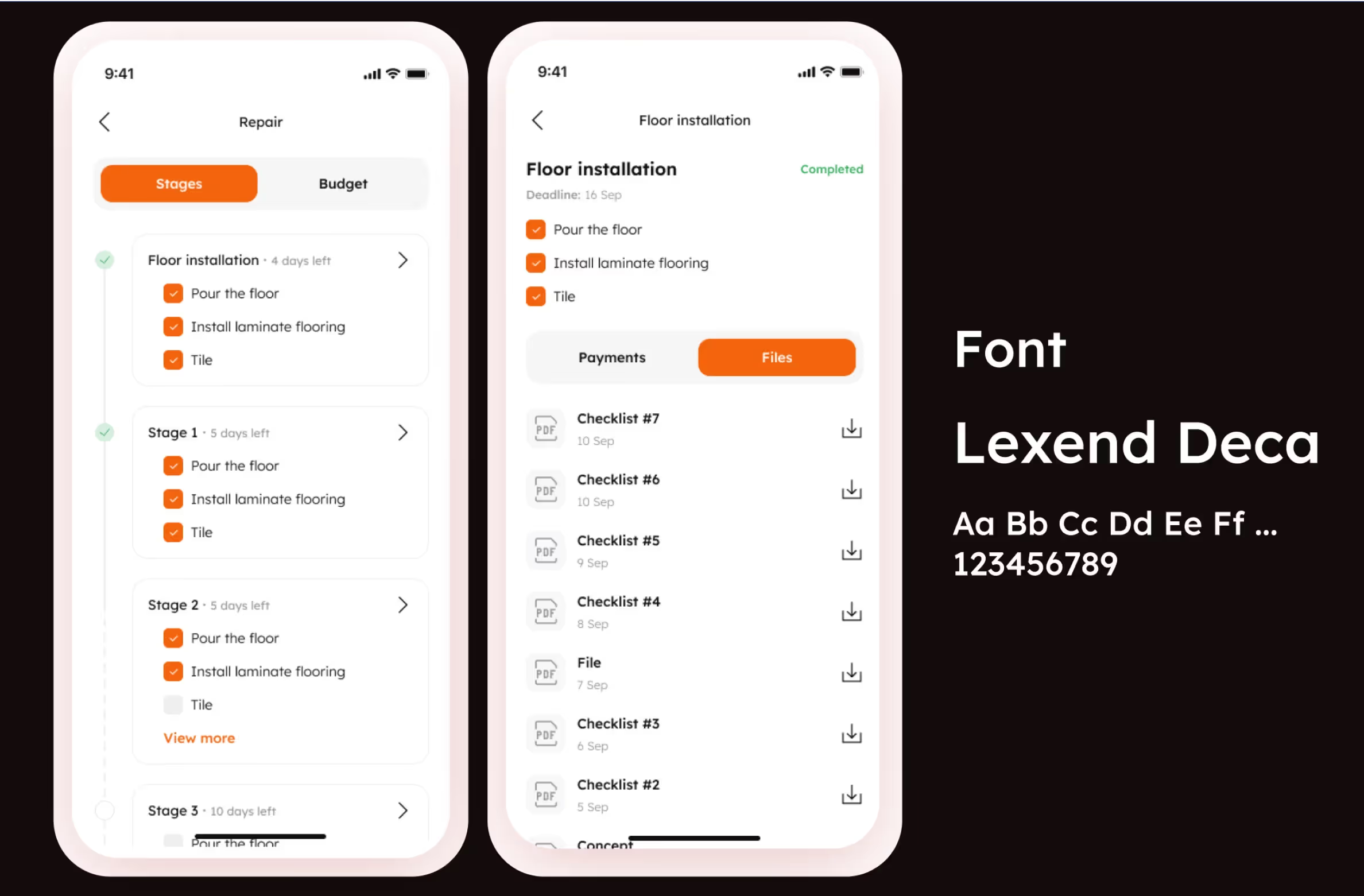
We chose Lexend Deca as the ideal typeface for the Settler app. This rounded sans-serif typeface looks friendly and gentle. Its readability makes this typeface a perfect fit for mobile UIs. Plus, it was free which was a nice bonus for our client. Little things can make you happy, too.
To design the app, we determined the main renovation stages and used UX design to provide the best possible user experience.
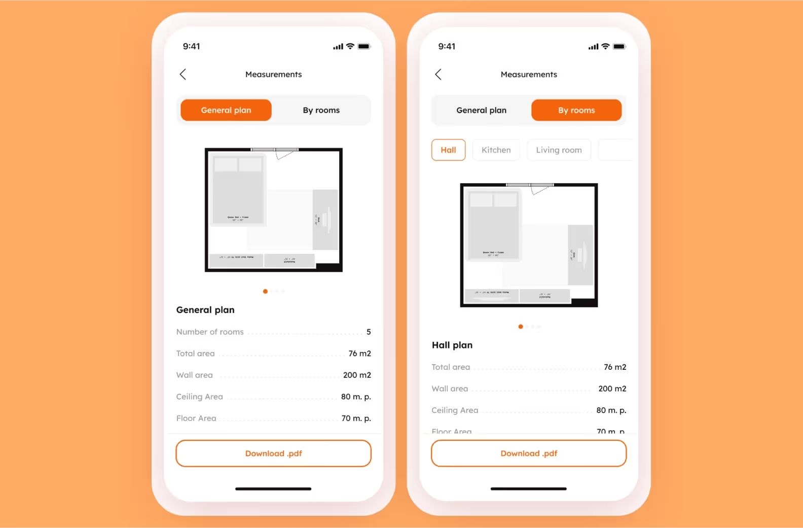
Measurements are an important part of the preparation stage. If something goes wrong during this stage, workers may run out of supplies, such as tiles or wallpaper.
To eliminate the user’s worries, our client decided that the measurements would be taken by a specifically trained person, and all the information on the layout would be stored in the application. In addition, the measurements themselves will be taken in 3D using a third-party application and uploaded to Settler via the admin panel.
We created a feature that allows users to upload photos so that all the nuances of the apartment can be taken into account. Additionally, a feature we added lets users view the layout of each room if they want to check specific measurements.
Settler was meant to be an interaction tool for a homeowner and their contractors, including an interior designer.
From our own experience, we know that briefing sessions can simplify and speed up a designer’s workflow. That’s why we integrated design briefs into the onboarding process. To make it as visual as possible, we decided to offer ready-made interior images for users to choose from. This makes it easier for users and designers to communicate and saves time on initial calls.
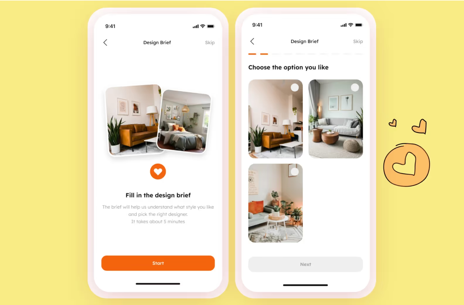
In the end, the user will get a design project right in the app and will be able to discuss it with the designer via chat if necessary.
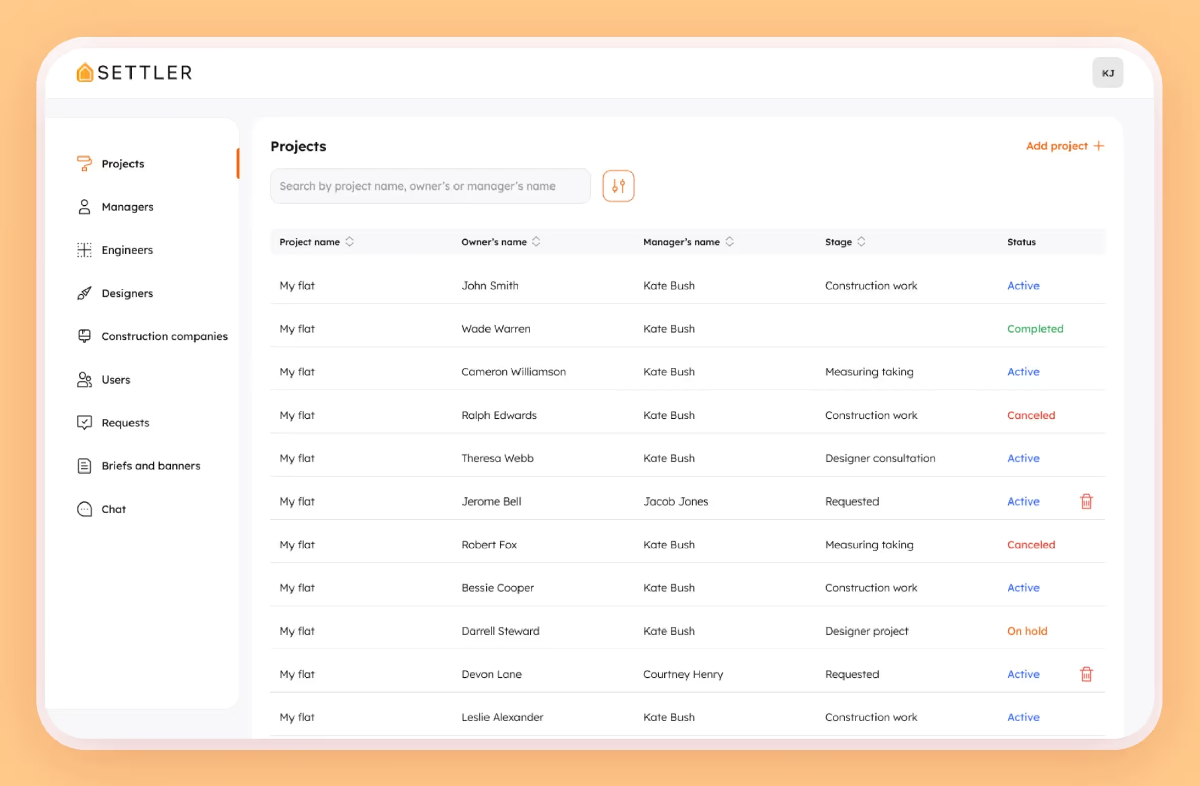
Settler is supposed to allow users to monitor the renovation process from anywhere in the world. So we focused on the Stages block, which shows the important renovation stages: completed, being renovated, and to-do.
To ensure transparency of the renovation process, we:

This way, users will always have the latest news on the renovation of their apartment. If necessary, they can always contact an administrator and ask questions.
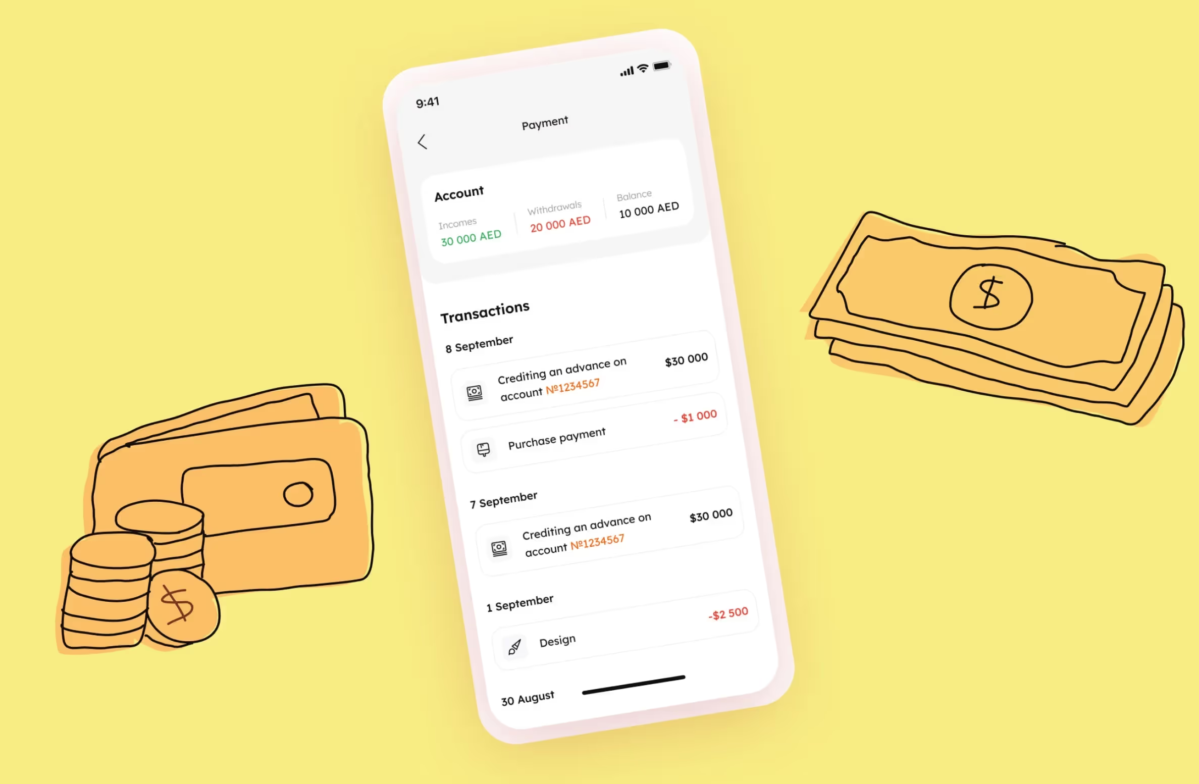
Renovations require expenses. It was important to the client that the users could keep them under control with Settler. Therefore, we included features that allowed:
During development, we used our usual stack: backend on NodeJS + Nest, mobile app on React Native, and admin panel on React.
We decided to make a single React Native app for Android and iOS. This cross-platform approach allowed us to save up to 30%, compared to native development. To learn more about the pros and cons of these two development methods, read our article.
We made a custom admin panel instead of using the React Admin framework. This way, we can easily scale it if needed.
As we develop an app, we always strive to find simple ways to implement features so that we can quickly test and improve them in the future.
Check out a few examples of solutions that helped us save money:
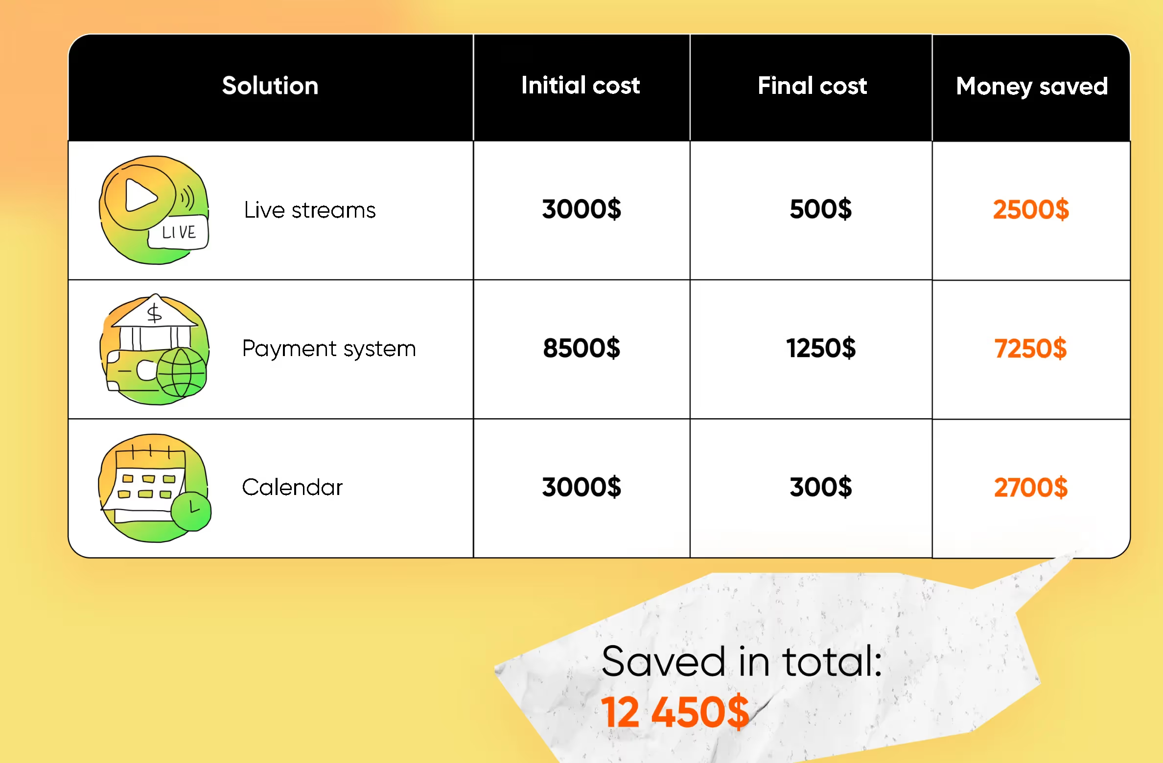
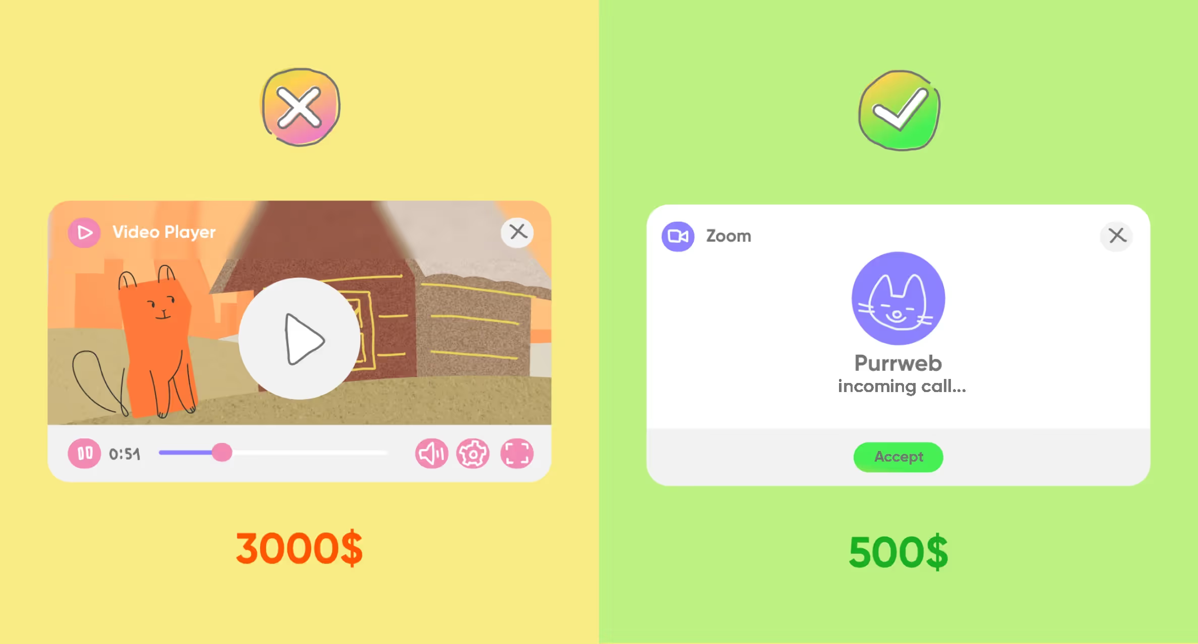
📺 Streams. The client proposed adding live streams so users could watch the renovation process in real time. We searched for a suitable tool. At first, we aimed to use webcams, but we discovered a more affordable and simple option —linking to an active broadcast. Admin adds a link to the stream, and a user can tap it to watch it on a third-party service. This option was six times cheaper to implement, costing only $500 instead of $3,000.
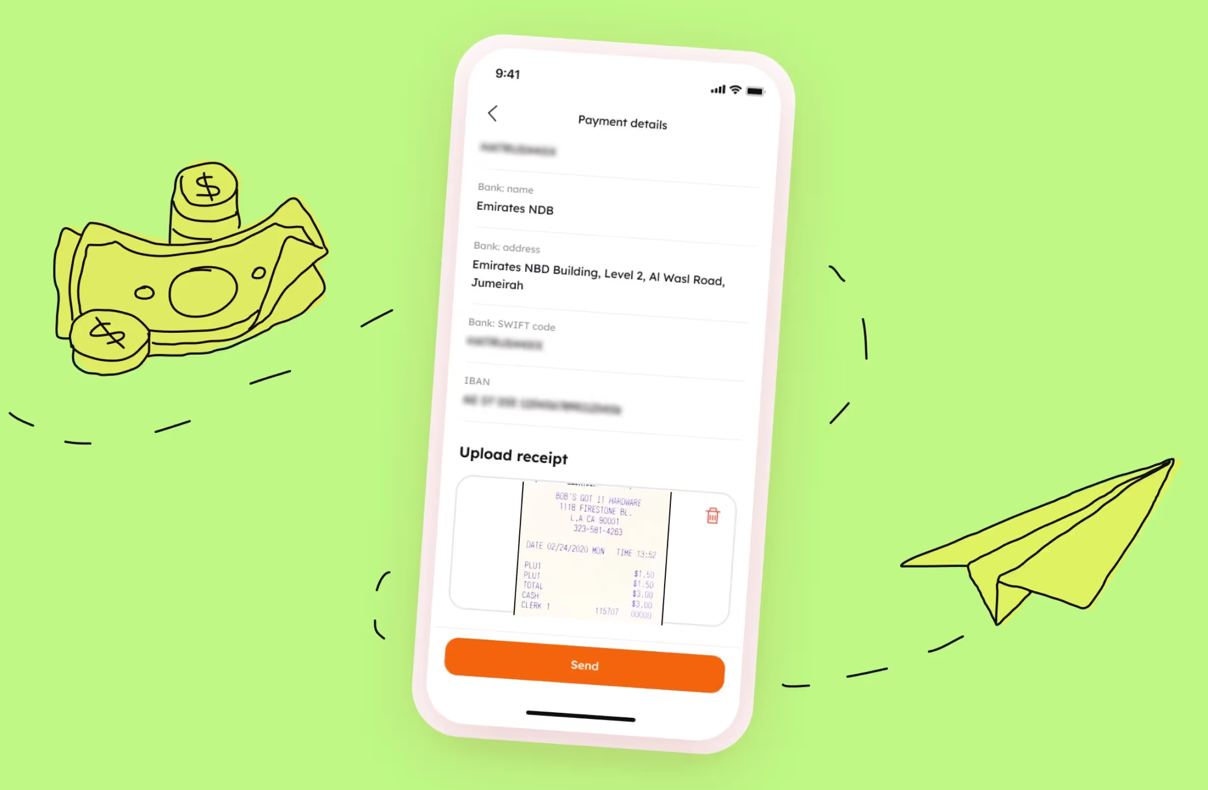
💸 Payments. To save on payments and speed up development, we came up with this payment option: users receive payment details when transferring money through a banking app. Then, they take a screenshot of the receipt and upload it to Settler. This solution was 7 times cheaper, so we saved $7,250 for our client.
📅 Calendar. A user needs a calendar to plan and schedule calls. At first, we wanted to integrate it into the app, but later decided that a third-party app would be a better option, and chose Calendly. This solution cost only $300, so we saved $2,700 for our client.
We planned to work on the project for almost a year, but after a few months, the client thought about switching to an in-house team. He liked the speed and quality of our work, but he wanted to save money because he had no investors yet and was spending his own money.
Initially, a large team of 10+ people worked on the project to meet the tight deadlines. We offered the client to reduce it — yes, the development speed decreased, but we saved about 30% of the monthly budget.
The client was uncertain, so we had a few more meetings.
First, we discussed the advantages of working with our studio. For example, we take on risks like if someone falls ill, we can always find a replacement. Also, our processes are transparent and we always meet deadlines.
Second, we devised another way to minimize costs — the client could let us develop the app and assign their in-house team to develop the administrative panel.
Still, our client needed to reduce the budget dramatically. They were ready to spend time and energy to find and coordinate freelancers in order to save money. Besides, they knew how the product would function and what was necessary for its further development. By then, we had already made the project’s foundation and planned its development. Eventually, they opted for an in-house team.
We did our best to make this transition as seamless as possible. That’s why, we:
1️⃣ updated all the documents, created a file with access data for all the services, and made a special list of all the non-priority bugs.

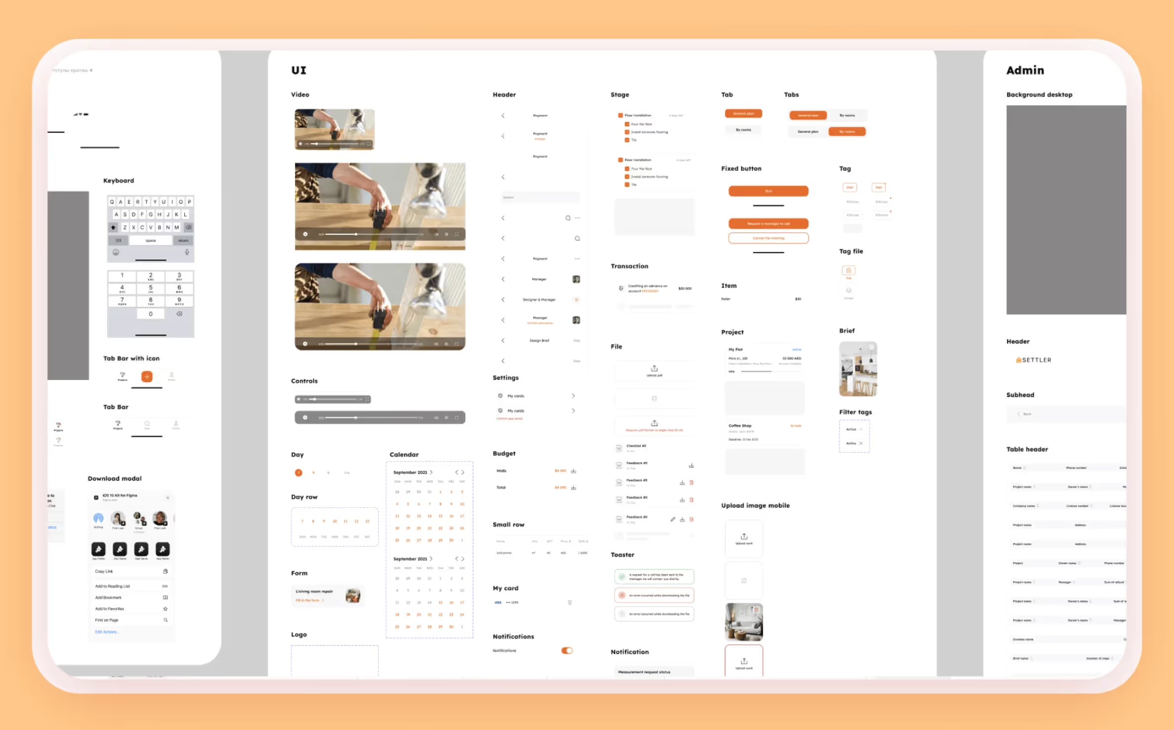
2️⃣ updated the UI kit and included all the styles, options, and states we used during the development. We also created a Figma file with all the screens and developed user-friendly navigation for various scenarios and roles.
3️⃣ made a file with all the plans and ideas we had discussed with our client.
There was a product manager on the client’s side — we made a document for him in which we described all entities in the admin panel, roles, and basic flows. Also, we gave advice on team selection.
4️⃣ had calls to discuss our internal project processes and held an onboarding session with new employees where we explained the internal processes, the code structure, and the tools we used. Then, we answered their questions and passed on the code.
5️⃣ made a general chat with new developers so we could help in case of difficulties.

In many aspects, the process resembled our typical final stage whenever we hand over a completed product to a client.
We at Purrweb made the first version of the service: a user app, an administrative panel, and a landing page. We laid the foundation for further development and still keep in touch with the team that is currently working on Settler.