

How do you create a product that users will definitely fall in love with? Take a thing that everybody uses and make it 10 times simpler. That’s exactly what our clients did — they decided to create a modern equivalent to vending machines with convenient payments and simplified work principles. My name is Kristina Spiridonova, I’m an account manager at Purrweb, and I’m going to tell you how we helped the client achieve the goal through mobile app development.

In November 2020, clients from Latvia requested that we develop an app for them. Maksim — an experienced backend developer, and Aivis — an entrepreneur who finances the project. The idea was simple: sell products via smart fridges in offices and hotels. The product is healthy and fresh food that customers can buy and microwave or eat on the run. For our client, it’s also an opportunity to partner with large food suppliers.
Traditional vending machines frighten people — they look scary and not cool. It’s inconvenient to pay for products, you can’t check the expiration date before buying and can’t return the products. All these things don’t look credible. The client’s fridges are made for people — you open the door, take any product, touch it, smell it, check the expiration date, put it back, or take it with you. To make the payment process convenient, the clients decided to create a mobile app.
There were no similar apps on the market, so the clients wanted to create an MVP as fast as possible, validate it, and move forward to the European market.
They’ve been constructing the fridges themselves, and the backend part of the app was also on their shoulders. What they needed was a proper UI/UX design and development of the frontend part. There were three reasons to choose Purrweb:
The terms suited both sides, and we started the development off. We gathered a team of a project manager, a UI/UX designer, and two frontend developers.
We started the project as usual, with design. The clients had a corporate identity and ready-made brand book — it simplified our work a lot since we didn’t need to create a mood board and design concepts.

There aren’t many screens in the app: the clients came to us with thought-out app logic and even sent us self-made wireframes. We expected it all to go like a dream — we only needed to design the screens, create the layout, and connect everything to the finished backend.
User flow in the app:
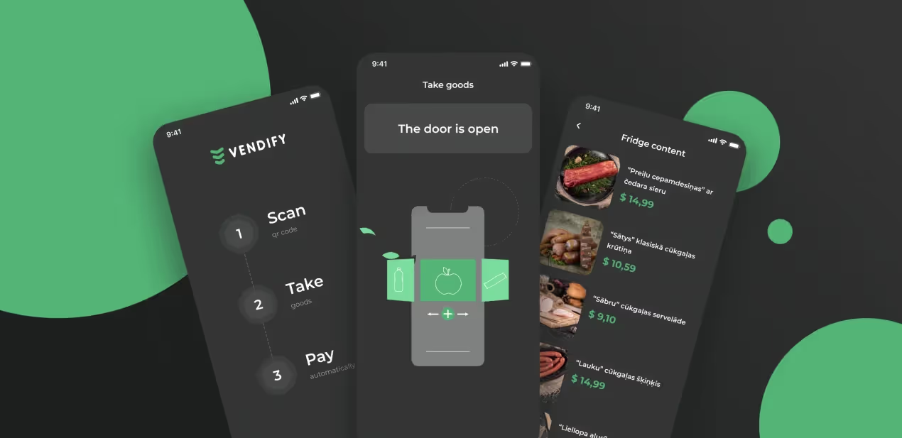
We designed the interface concept with a dark theme — to match the fridge. Pictures of products that we used on the screens are actual products that users can buy from the Vendify fridges. The concept impressed our client.

To solve the problem and eventually finalize the design, we decided to connect the designer with the client. Usually, we avoid involving creative people in the process of communication but in this case, it was reasonable. We agreed on all changes in real time, and the work went without any helter-skelter.
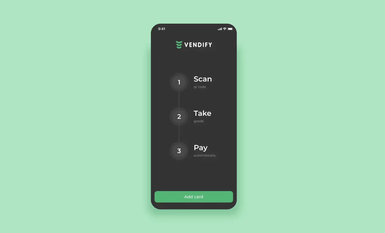
Initially, the clients wanted to make illustrations for onboarding but we then changed their minds in favor of a simple list on one screen. Why? Because it’s MVP and it’s better to be budget-conscious.

One of our design references was Bolt — an app for renting scooters. The client really liked their QR code screen and wanted us to make something very similar. The point is, that the service works only in Europe so we couldn’t access this exact screen. We designed the QR code screen with a blurred background, of course, it didn’t look like the Bolt’s at all. During the design demonstration, the client specified that the background must be darkened, not blurred. We found an article with a screenshot of that screen and accommodated the client’s request.

The app doesn’t require users to sign in — just link the bank card and go. It was done on purpose not to scare users away and not create obstacles on their way to the target action (buying a product). But how will the company collect user information and send them messages about special offers? In the future, we plan to allow users to add their phone numbers and email addresses. For example, to get a discount on the next purchase. Now, the sign-in screen looks like that:

When the fridge door is unlocked, we start a timer — during this time, users can choose the products. If the time is out and a user doesn’t take anything, the app returns to the QR code screen. We decided to add animation with a hand opening the fridge, this way users won’t get confused and will know what to do. The client chose the linear style, so we made an illustration, added Vendify’s brand colors, and animated it. That’s how it turned out:
The animation makes the app unique and demonstrates how to use it.
Our clients chose the tech stack for Vendify themselves. They had Ruby on Rails for the backend, we had React Native for the frontend. Maksim already wrote the API through which the fridges were supposed to ‘communicate’ with the backend. Our task sounded like ‘create a client for the backend to communicate with the hardware and the backend.’ In fact, we needed to develop the frontend part of the app using React Native, connect Stripe for payments, and create deep links (links that lead users to the specific screen of the mobile app) — the clients wanted users to scan the QR code right from the smartphone camera.
The scenario was super clear: React Native development, a Stripe integration — we did it all a hundred times. IoT development wasn’t something new for us too, we developed a similar app — EnerGO. It had almost the same flow: scanned QR code, opened-took-closed, money charged. Moreover, we created EnerGO from scratch, developed both the backend and the frontend and integrated it with the hardware. So, Vendify seemed as simple as possible.
We wrote the back and front in parallel — and discussed the workflow and technical decisions with Maksim in Slack or Zoom. The first problem started with Stripe. The thing is that it integrates well only with web applications and native iOS and Android apps, while an official React Native library for Stripe didn’t exist back then.
There are 2 ways to integrate Stripe with a React Native app.
In the first case, we would need to create our own library, which is time-consuming and doesn’t make much sense. We decided to choose the second option and took a ready-made solution: tipsi-stripe. Though no one knows how exactly it works and who supports it, there was no other way for us.
Stripe recommends using their payment form which is built specifically for iOS and Android. Why it’s important: firstly, it validates bank cards, secondly, it supports SCA — card authentication required for most online payments in Europe. It can be customized to fit the design while with a custom form, we could have had problems.
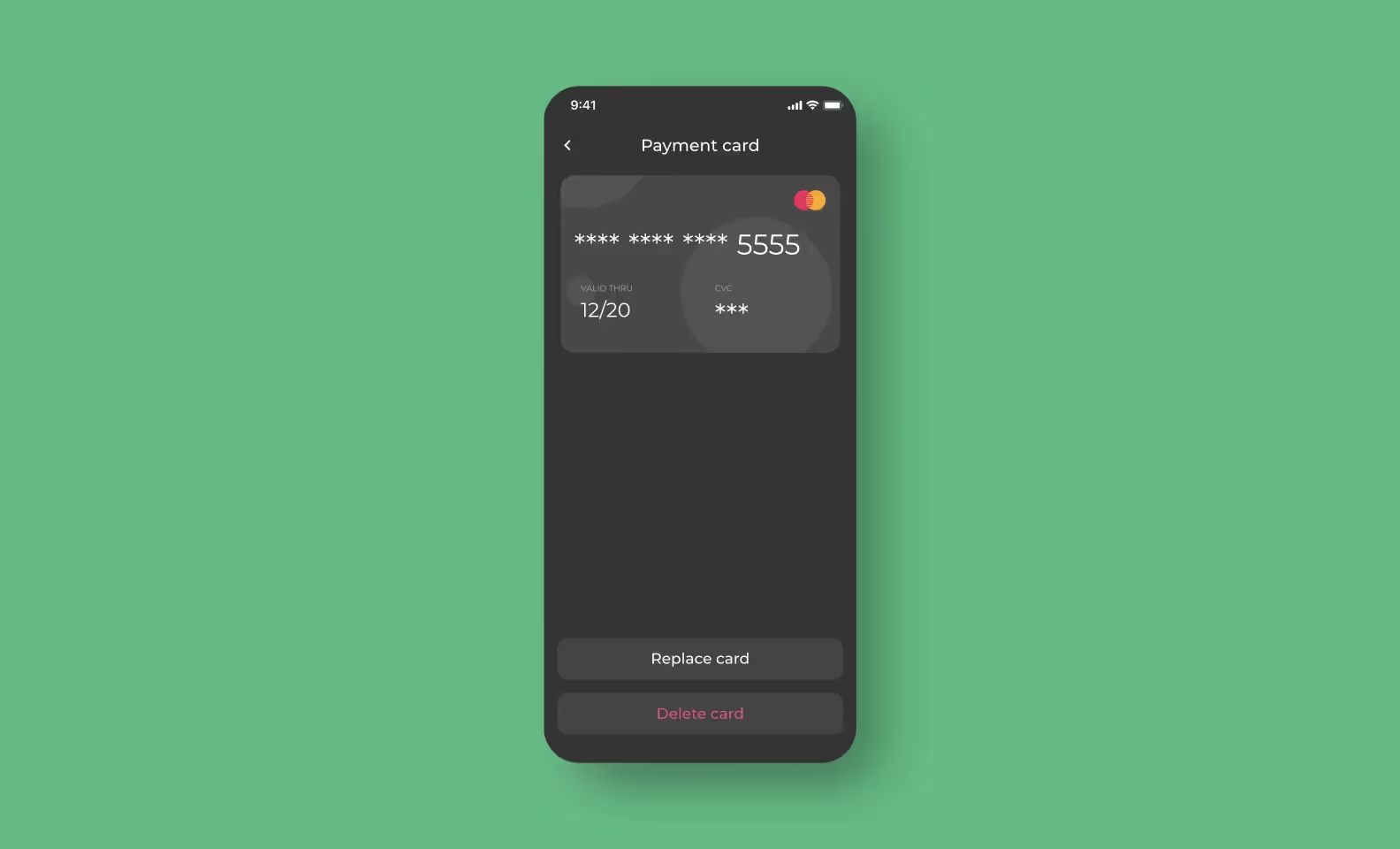
Of course, we wanted to use Stripe’s form. But then, it turned out that tipsi-stripe doesn’t support native fields for payment cards, so we had to design our own form and get the card details with it. We put off SCA support until the tipsi-stripe updates or the official RN library appears.
Push notifications are vital for the app — if users don’t allow notifications, they won’t be able to use it. It’s the same if notifications don’t show up for some reason. There were 2 questions:
Amazon SQS only allows us to send background push notifications, we wouldn’t be able to send them to the notification bar. It means that if a user closes the app, they won’t receive any notifications. Native push notifications looked like a more reliable solution but Maksim wasn’t sure about them. He was afraid that some percent of notifications would get lost or delivered late, which would be unpleasant.
We discussed everything and came to the conclusion that SQS users will be confused — decided not to overcomplicate and use native push notifications. Plus, since we work with hardware, notifications can also be lost if a fridge breaks down.
To avoid that, we made additional regular requests to the backend to check the current state of the fridges.
We handled the technical part, then we needed to get the users’ permissions. You can request permission right away but it doesn’t guarantee that a user will allow anything — what is the value of notifications? We decided to inform users that we will ask for permissions and the app won’t work without them. Together with the client, we thought that it would more likely convince users. We’ll find out if our theory is right after the release.

The system that tracks products in fridges is implemented in the backend — every product has an RFID tag on it, which allows the backend to know which products are in the fridge and which were taken out. So, theoretically, no one can steal anything from a Vendify fridge: if a person closed the fridge door and didn’t return products, the backend would know about it and charge money. It will be a usual purchase. But what if the door breaks or someone braces it or the fridge shuts down? We needed to consider all these options.
If the fridge works normally, it will inform the backend about the door_locked event, and the backend will ask the fridge for a list of products. We couldn’t finish the purchase with an opened door because then, the fridge wouldn’t understand which products were taken. To solve the problem, we added a 300-second timer — when users open the door, they can choose products during this period. When the time is out, we finish the purchase and the backend asks the fridge which products are taken.
The app’s not yet released — the clients don’t hurry because they have decided to change their business model a little. Now, they negotiate with partners and slowly develop the product themselves. Our work was done by January — we met the deadlines and finished the MVP in 6 weeks. The clients are happy =)
‘The result is great, we liked how the team worked on the design, as well as the solutions they offered. The work process was flexible: we could complete tasks in either a common or unusual way. For instance, we met online to discuss and make changes on the fly.’ — Aivis Ruza, the client.