


Mess in CRM = lost deal — a rule of life for any sales manager. But what can they do if there is no work laptop at hand and the meeting is scheduled to take place in the open field with zero Internet? Agricultural machinery sales managers work in these kinds of conditions pretty often, and we at Purrweb have developed a mobile CRM system specifically for them. In this case, we’ll tell you which sections a sales manager can’t live without and which typeface is easier to read when the sun is shining the brightest.

Koblik Group is a major manufacturer of agricultural machinery which includes four agro-machinery factories and a network of dealer centers. The company’s employees handle business operations in a corporate CRM system, but the company asked us to develop a mobile version. And, here’s why.
Although our client has 50 dealer centers in different cities and countries, the deals are often made outside of the comfortable offices. Sales reps visit different agricultural expos, stop by their clients’ properties, and often have to make deals right in the field. This is where the problems begin.

A corporate CRM system works only on desktop computers and only via the Internet. Catching a signal waist-deep in wheat with a laptop in hand is not that convenient. It was much easier for employees to write everything down in their paper notepads and then transfer the information to the CRM system, when they got to the office later. It was very time-consuming, and important information could get lost amidst other notes and markings.
To solve this problem, they needed a mobile CRM app with access to the company’s database and note synchronization. It was an information-heavy project with a complex backend, and it was vital to make it simple and stable. We already had the experience of working with the backend made by our clients when we developed a crypto wallet and an app for smart fridges. We were confident in our expertise and started working on the project.

Our client had several requests for the project:
Based on the client’s wishes, we estimated the scope of work:
Over the years, sales managers have become accustomed to the CRM UI and learned to navigate dozens of sections, charts, and lists. The client’s software offered a wide variety of features, but some were useless on business trips and would only complicate the app. Hence, the first problem: which features should stay in the mobile version, so we don’t disrupt the already established workflow?
Our system analyst answered this question. They talked to the client, figured out the managers’ needs, and their usual work patterns. Without the unnecessary features, the CRM was reduced to three main sections, which we were going to focus on:
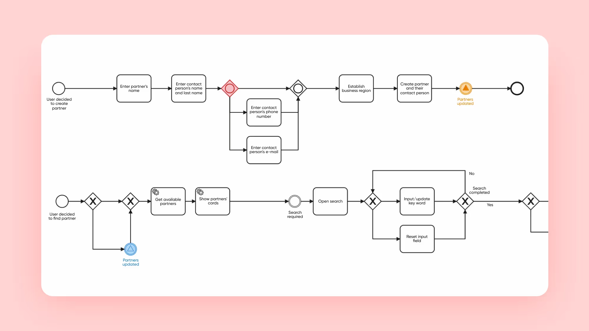
Having decided on the structure, the system analyst developed a BPMN chart, where they described all the elements of the app and how the users would interact with them. The mobile CRM system now had its logic and we managed to start working on the design.
The client already had their own brand identity: the brand logo and brand colors. We took them as a basis but adapted them to the specifics of the application.
The company’s colors — black, orange, and white — were aimed primarily at the printed products, so they looked a bit bland. We made them bright and contrasting so the UI would be readable and recognizable, even under the bright sun.

We selected Noto Sans for the main typeface. It’s a popular sans-serif typeface with multiple font options. The rounded shapes make this typeface look friendly, so it’s perfect for our age demographic. Also, we made all of the text in the app large, making it easier to read outdoors.

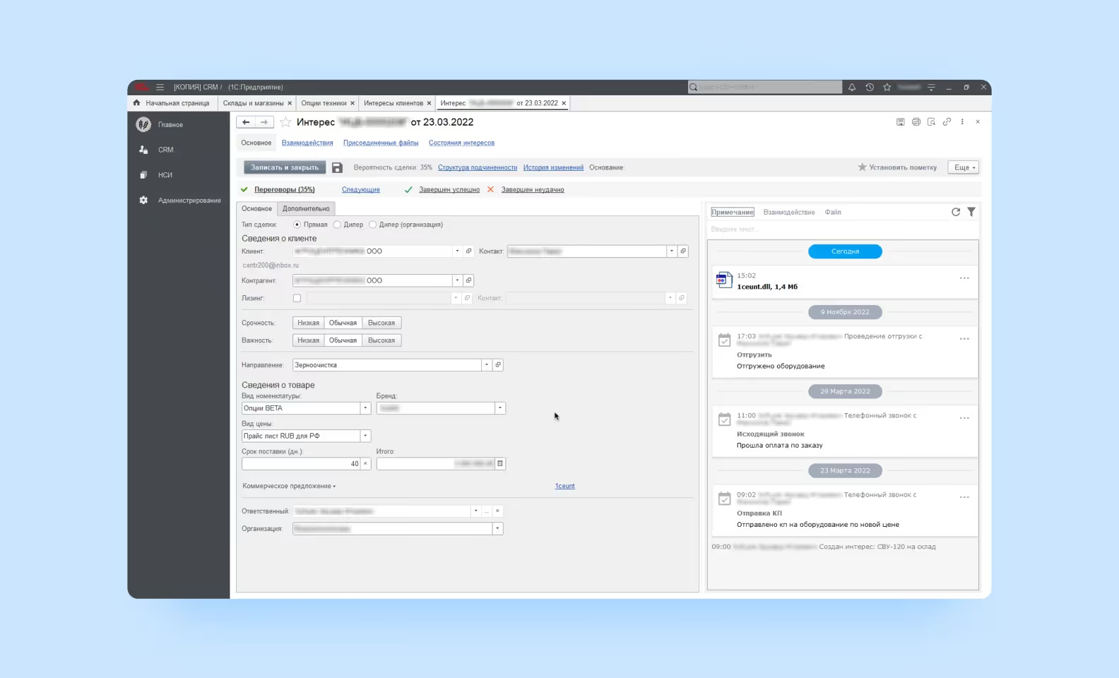
Although we aimed at the client’s existing CRM when creating the application, it didn’t suit us in any way. The existing CRM functioned only on desktop computers. To adapt it to smartphones, we had to reinvent the design. Let’s start with the “Interests” section.
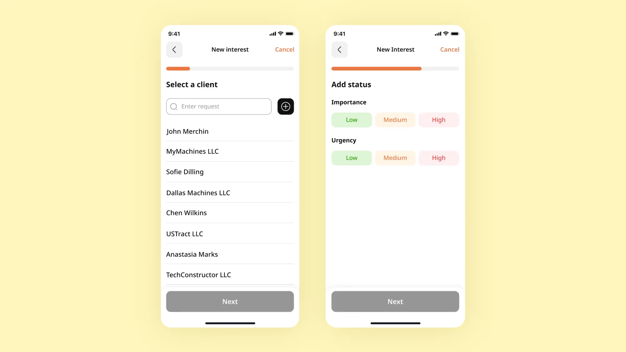
When a manager is negotiating a deal with a partner, an “interest” appears. Although it’s not a closed deal yet and just an intention to cooperate, it already gets described in detail. To keep a better track of interests and lead them to sales quicker, the manager enters them into the CRM.
The process of creating interest is never quick — a manager enters information about the client, the transaction type and status, machinery nomenclature, etc. into the app. To save sales managers from getting lost in the process, we added a progress bar to the app. Now, sales reps enter information about interests in the form of a survey and can track their progress on the indicator in the top part of the screen.
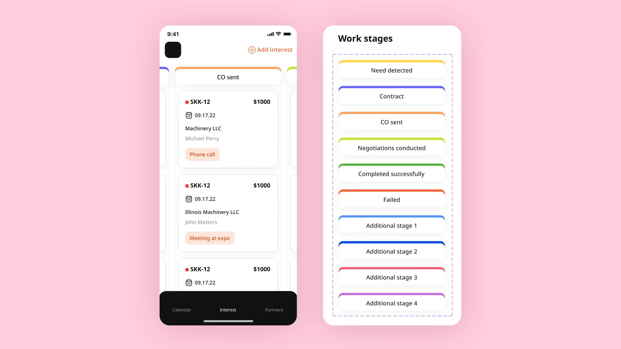
The “Interest” section was implemented as a Kanban board. The sales process is divided into stages and the interest cards move among them — from the beginning to the end. It is convenient to monitor the work tasks in this format, which is why it is often used in CRM systems.
Also, we optimized the Kanban board for a smartphone: we made moving between stages with a horizontal swipe and the in-stage view vertical. To make it easier for the user to navigate on the board, color coding was introduced. Each stage has its own color.
Interests can last several months and contain up to 30 interactions — that’s what salespeople call meetings with the client, calls, and letters. The most convenient way to keep track of them is through a calendar.
In our calendar, there are two view modes: a month and a day. In the first case, we can see all the days in a month, and the workload for every day is represented by dots of different colors. Managers are used to checking the level of workload in the calendar, so we kept this feature.

If you tap on a date, you can browse interactions for this day in detail. Moreover, in the top part of the screen, there is a scale with the other days of the week, and a user can easily move along it.

A list of partners is always available for a manager in the app. These can be either buyers or equipment vendors with whom the company works. If a manager creates interest and the partner is not in the base yet, they must be added to this base — this will speed up creating future deals and save contacts from being lost.

Buyers and vendors are very different — legal entities or individuals and dealers or lessors from different industries and regions. All these details about the partner need to be specified in the desktop CRM system, and the customer planned to transfer this approach to the smartphone.
Extra information added several branches to the flow, and the development extended to dozens of hours. The project was becoming significantly more expensive than anticipated.
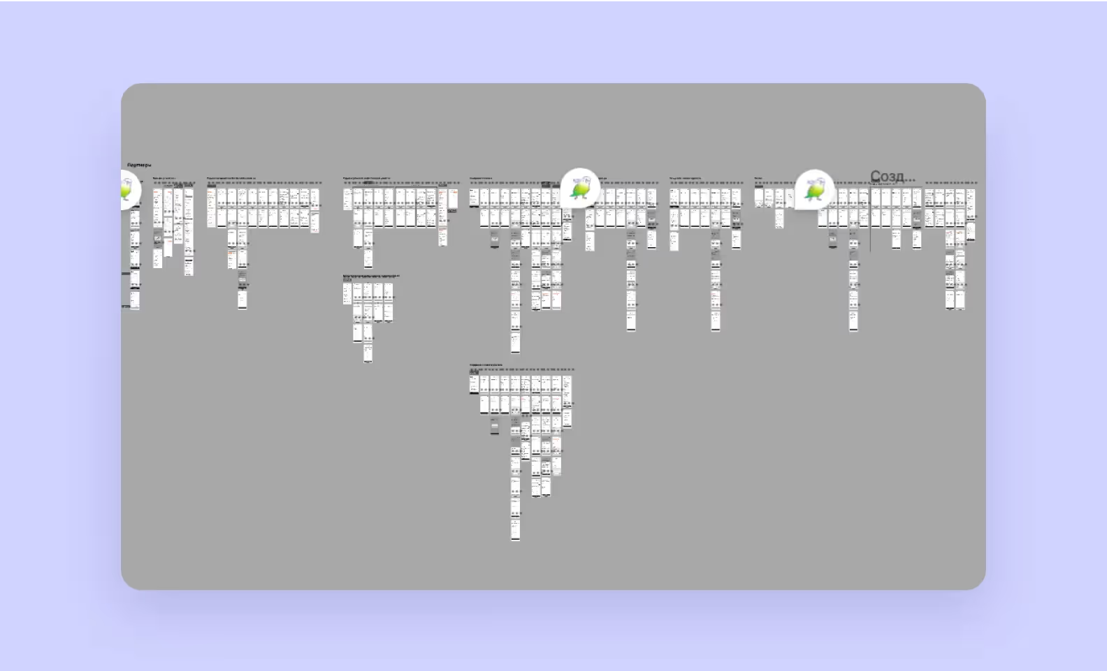
Together with our client, we shrank the “Partner” flow and met the initial budget limit. Most details were unnecessary “in the field” — users could add and edit them at the office.

We started development with massive project planning. At this stage, together with the client, we discussed the technical requirements of the project, analyzed the logic of the large CRM system, and looked for ways to make it work together with the app.
This process was made even more difficult by the workload of the developers on the client’s side — in parallel with working on the mobile app, the company was improving its CRM system. Nevertheless, the daily communication in chats and calls, paired with consistent mutual support, helped avoid bugs and sped up the development process, as a whole.
The project planning resulted in an API contract — a set of rules regulating the interaction of our systems. It described the types of data supported by the app, the requests that would be sent to the server, and what was expected in response. The API contract allowed our frontend and the client’s backend to exchange information seamlessly, so at that point, we could start developing the offline mode.
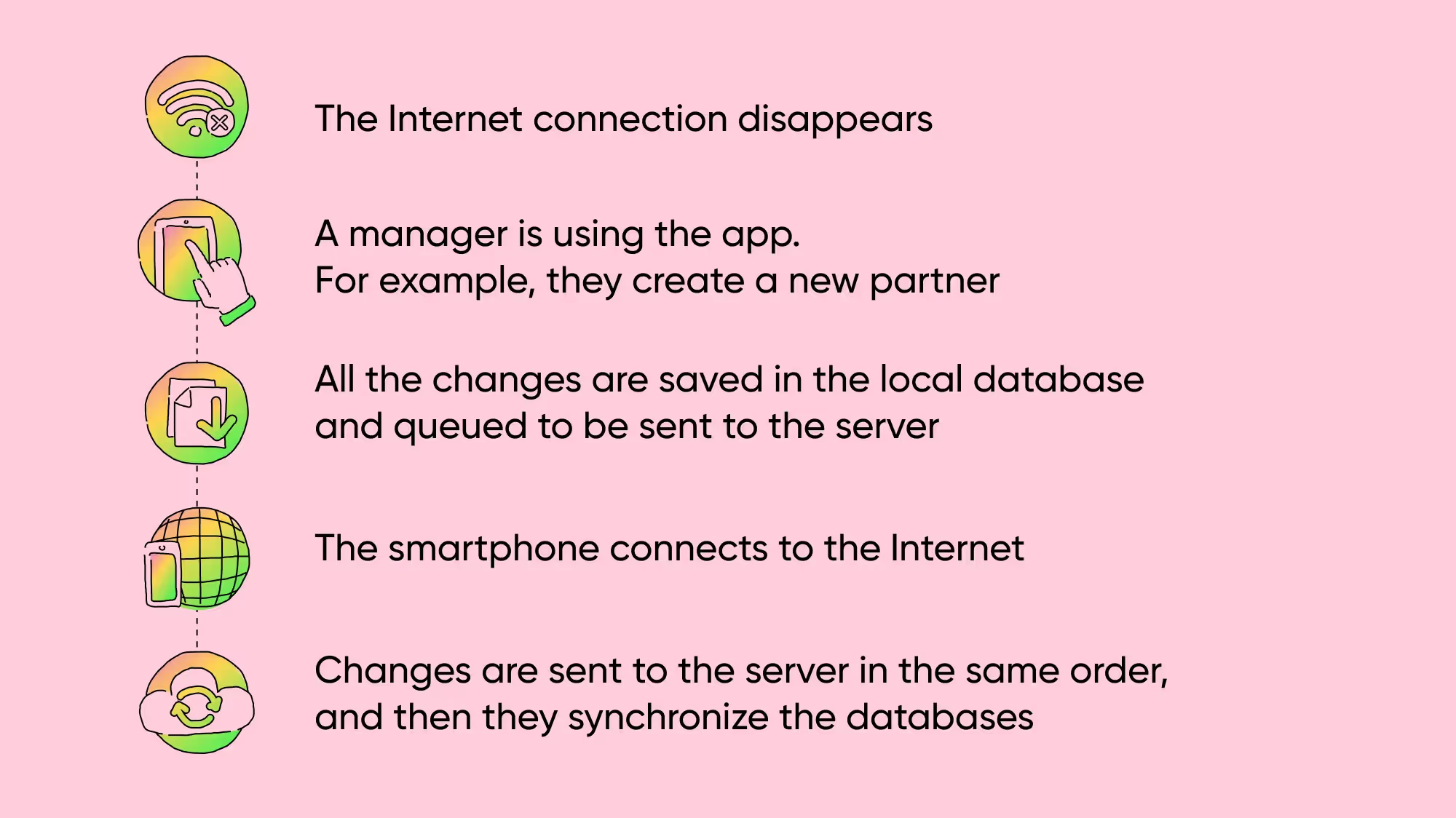
The client databases on the smartphone and the server must be identical and constantly updated.
To make the app work properly even without the internet, we created a feature that remembers all the manager’s actions and sends them to the server when the connection is re-established. A similar scheme works on the client’s side.
We developed the app on React Native. This framework allows creating code for both iOS and Android at the same time, which saves 30%-35 percent of time and budget. Our client got exactly what they wanted in a short period of time. The CRM was ready two weeks earlier than planned.
The feedback from the client was tremendous. They were actively involved in discussions and explained what they wanted to see in the mobile app. It was largely due to them that the design was ready in 2 months and development took only 2.5 months.
The CRM is released in the App Store and the Android version will be distributed as an APK file 🎉