


Since the beginning of the pandemic, the profitability of mobile health and fitness apps has increased by about 280% worldwide. These apps help people solve two problems in lockdown: lack of physical activity and increased level of anxiety. Let me tell you how we developed a breathing app for the second wave of COVID-19 with our client.
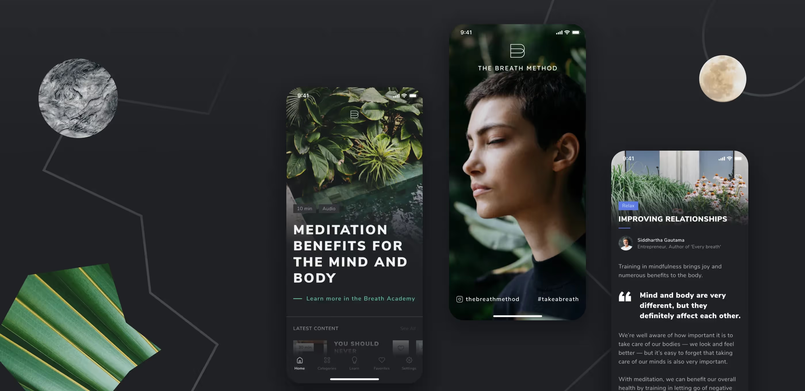
In May 2020, Caroline and Dominic from Singapore requested us to create a UI and UX design for an app with breathing exercises. They had the expertise and a client base since Dominic was a fan of breathing practices, while Caroline was giving yoga and breath classes, and with the beginning of the pandemic she moved her classes online. We were a great match because of our past experience building a similar app for sleep.
Every new mental health app has two giant competitors: Headspace and Calm. However, these apps are focused on meditation and sleep monitoring. Breathing exercises are a part of meditation and are quite important: breathing affects mood, health, and overall condition. Proper breathing can calm you down at a critical moment, that’s why, it’s better to create a mobile app for such courses to be always at hand.
Most of the competitors lacked breathing courses. Moreover, the content in our app was original, and some exercises were unique — for example, the ‘breath pendulum’. The original content really motivated the client to develop the app.
The project budget was $30,000 funded from the client’s personal savings.
Dominic and Caroline asked us to create UI and UX design. Initially, they planned to hire another company for MVP development. However, during phone meetings, we agreed that we could complete the whole project. What we included in the MVP: registration, watching courses, pendulum breathing, push notifications, admin panel, and background playback. The users’ profile pictures, referral system, watch history and offline mode were cut from the MVP scope.
Caroline and Dominic had design preferences but had no idea how to bring them to life. They wanted to combine lush green, gray concrete, and light wood. Photos became the core part of the design. The clients strongly opposed the illustrations because they were sure it wouldn’t work for the target audience. To make the app look more lively, we used images with natural patterns of water, plants, and rocks. We suggested two design options and the client loved one of them.
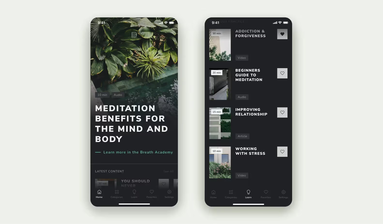
At the MVP stage, we included three types of content:
The app creates general mixes and special daily playlists. They include lessons and exercises that are updated every day. All these sets are meant to solve three problems: deal with anxiety, recover muscles, and set the right mood for a positive day.
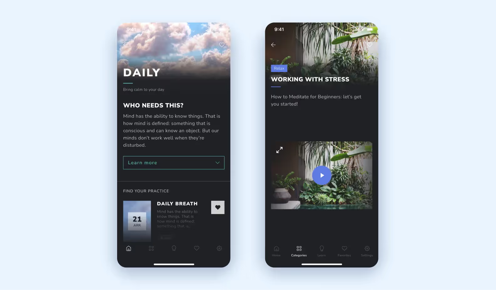
We paid a lot of attention to the audio lessons. In the app, they are divided by problems the user wants to solve.

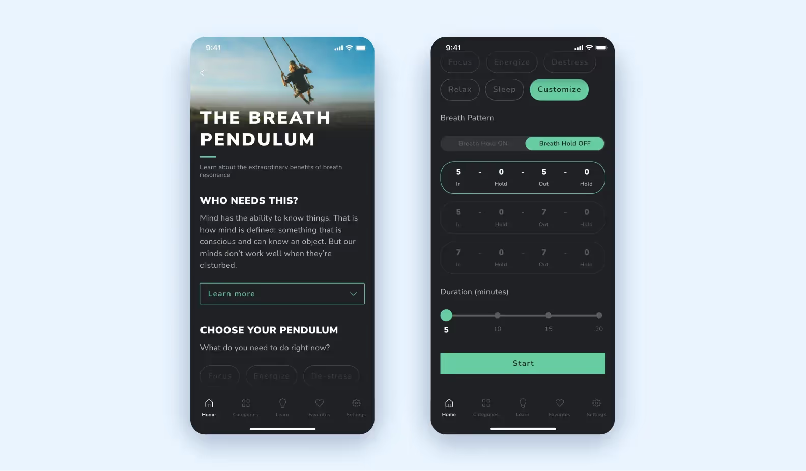
We developed the Pendulum mode. It’s a builder that allows users to customize practices for their needs. When users want to practice, they can create a custom exercise (choose breathing intervals: 5, 10, 15 seconds and duration of exercise), and the system will generate a soundtrack for the users so that they breathe in the beat of it.
Our team consisted of three developers, a UI/UX designer, a manager, and a QA specialist. We used our usual technology stack — React Native + Nest.js. React Native is great for mobile app development, especially for an MVP. We used the React Admin library to create CMS — there were a lot of ready-to-use functions for creating an admin panel. But you have to be careful with this library as it requires perfect understanding, and not all the features work as stated in the documentation. As usual, Stack Overflow and GitHub issues can help with it. However, it wasn’t the first time that we used this library, so we were ready for that.
To speed up, we took the best parts of the library and wrote some features by ourselves. We combined the parts — and it worked great.
At the development stage, we were worried that it would be difficult to play audio when the screen was locked. It’s important since we claim that the app allows users to ‘practice breathing on the go’ — the users should be actually able to go. It was another time we were happy with the chosen technology stack: it was easy to implement the feature thanks to parameters in the React Native video library and we didn’t need to reinvent the wheel.
For the app launch, we needed to build a landing page to let users enter the store and download the app. We decided to use Gatsby — it helps load websites 2-3 times faster compared to WordPress or Wix. We wanted to upload posts from the Breath Method Instagram account to the landing page automatically. For that, we decided to use a Gatsby plugin — ‘gatsby-source-instagram’. But when we started coding, it turned out that the plugin only helped to get the list of posts, and it wasn’t enough. We wanted to integrate the full posts and keep the feed up-to-date.
Then, we used the plugin to access the Instagram posts, created an algorithm that sorts the last 10 posts, and implemented a slider. Then, we connected our repository with the landing page to Netlify (a service for hosting web apps) — it supports dynamic apps built with Gatsby. The problem is that Instagram doesn’t have webhooks that would inform Netlify of changes in the feed (there are changes, but Instagram has reduced functionality of the ‘gatsby-source-instagram’ plugin to fight with fakes — so we couldn’t monitor the new posts automatically). That’s why we used Zapier, a service that helps to automate Netlify’s deployments. This way, we update the Instagram feed on the landing page on a daily basis and keep it up to date.

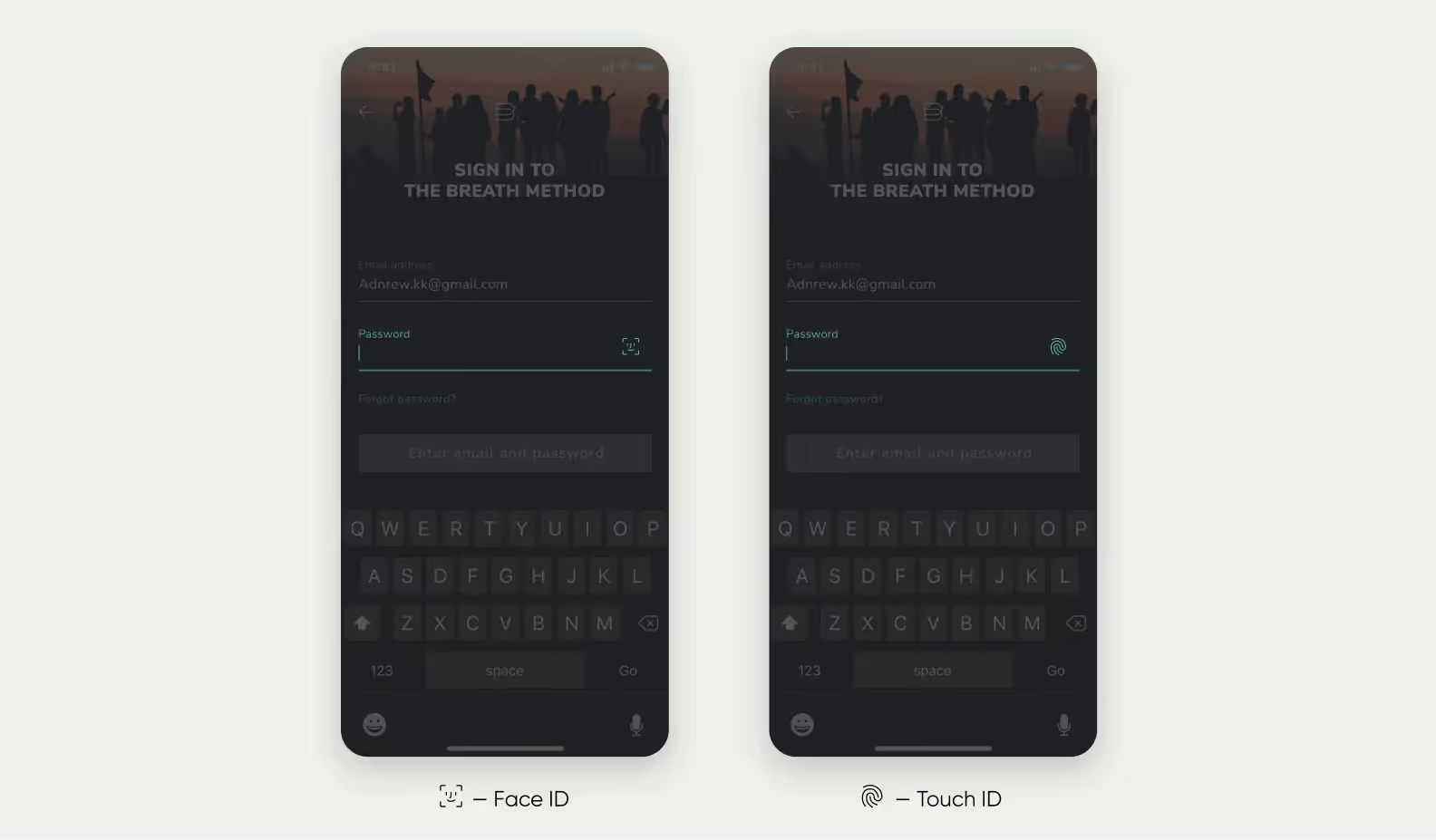
It was the first app that we needed to integrate signing in via Face ID, so we thought it would be challenging. We wouldn’t call it a must-have feature for a breathing app, but the client insisted on adding it. We scheduled the work for two full days but managed to finish everything in one day as it turned out to be a lot easier. We made it so that the app can scan a device to find out whether it has a Face ID/Touch ID, or not. If the device has Face ID — the app will offer to use it, if the device has Touch ID — the app will propose using the user’s finger instead, or if the device has nothing like this — it will ask the user to think up a simple code.
In the end, we had trouble with another detail that wasn’t taken into account: the client wanted to receive money from the subscriptions in US dollars. But their Google Developers Console account was connected to a Singapore bank account — that’s why all income was converted into Singapore dollars. Creating a new account and linking it to the app might have taken time that we didn’t have. After the release, Dominic and Caroline changed the account at an easy pace.
We developed a stylish and minimalistic app that is delivered through the SaaS model. The app has a trial version for one or two weeks and a subscription for a month or a year.
The app is now available on the App Store and Google Play, but we had to fight for publishing with Apple. For several weeks the store claimed that the app has no subscriptions. It often happens to apps with payments inside. We talked to App Store support multiple times and sent a lot of screenshots to prove that the app meets all the requirements.
We planned to release the MVP in three months but finished the work in five months. We ran out of schedule because it took the client a long time to prepare the content. Streaming in Zoom and improvising is one thing, but creating content ‘to last’ with professionally recorded video lessons (placing light, framing, editing) is different. We plan to further develop the app for Apple TV because our technology stack allows us to reuse the existing code and make a TV version of the app fast. If Caroline and Dominic decide to make larger improvements, we’ll develop the users’ profile pictures, referral system, watch history, and offline mode.