

Even people who haven't heard of dashboards and don't know what they are have used them at least once in their lives. This is because a dashboard is just a way to present information visually using graphs and charts. Such visualization tools are often used in mobile and web applications in various industries.
To help you detect the difference between a good and bad dashboard during the UI design development of your app, we wrote this article about how to evaluate the design job.

90% of the information our brain receives is visual. That is why we have learned to process it 60,000 times faster than text. To handle even bigger chunks of data, people came up with the idea of presenting it through tables, graphs, and diagrams. It helps to more easily understand numbers, such as the company’s monthly expenses or department performance indicators. Dashboards appeared in software programs, applications, and websites where it was necessary to reflect this information.
A dashboard is a tool that presents analytical data through charts, graphs, and tables. The main kick of UI dashboards is that they are interactive and updated based on the collected information. Dashboards are used both on corporate platforms and in mobile applications for individual users. For example, in bank apps, the dashboard shows you your monthly expenses. Based on the history of transactions, such apps display information about how much money you spent and for what: travel, shopping, food, entertainment, and others.
.avif)
In many industries, people work daily with a large array of information that is difficult to process and understand in text form. Let’s take a look at the same example with banks. Imagine you want to see how much money you spend on food per month, but the app only gives you a history of all transactions during this period. To get to the desired data, you must go through every charge manually and calculate the total amount spent on groceries. Sounds complicated and tedious, right? What if the analyzed numbers are even bigger? For example, you analyze the expenses of a small business.
UI dashboards not only simplify your experience but also save time and make your work more efficient. Dashboards are essential in many fields:
For a dashboard to help you work, it must be visually clear. What other characteristics should a good dashboard have? And how do you know you are looking at a high-quality interface? Let’s find out.
First things first, let’s focus on the “why” — why should designers spend time and effort on making the dashboard high-quality?
Let’s imagine you are a social media marketing specialist in a company, and your role is to collect analytical data, adjust advertising campaigns based on the analytics results, and set the launch dates of new products. You open an app that collects necessary information: analyzes users’ needs and interest in the product, calculates the numbers, and presents them on the dashboard. At first, everything seems to be in order — there are a lot of bars, graphs, and other UI design patterns. The colors are nice and contrasting, but none of the indicators are titled. As a result, you can’t interact with the dashboard. Moreover, the last time the stats were updated was a month ago. The page is beautiful but absolutely useless because old numbers can’t help improve the performance of advertising campaigns.
The main goal of the UI dashboard is to reflect up-to-date information. At first glance, a user should be able to read and understand all the indicators to quickly react to their fluctuation.
There are three signs of a high-quality UI dashboard.
If you can quickly assess the situation based on the dashboard data and make changes to achieve the desired result, then the screen works as it should, and pulls it off.
Dashboard users face a challenge to interpret visual elements and assess a large amount of information. Therefore, all elements and numbers must have a meaning and a purpose. Also, there should always be space between the blocks and bars, so the brain can easily read the UI design patterns. Moreover, dashboards should avoid distracting effects such as background gradients and 3D graphics.
The correct colors in the dashboard are just as important as numbers. The color palette should be a visual cue that helps you connect information and sections. A little tip from us: if you don’t want to confuse the user, the dashboard should not use too many colors, the ideal number is 3-4 contrasting colors and only one font.
To support these statements with examples, let’s look at some real cases and break down if they have good or bad dashboards. This will help you to independently evaluate dashboards in the future, for example, if you need to create mobile app design and supervise an outsourced UI UX design agency.
To evaluate dashboards, we will again call our fictional assistant Max, a startup owner, who helped us judge UX portfolios. He will frankly say what is wrong with the examples of failed dashboards and how to fix them. Meanwhile, our lead UI/UX designer Zhenya will comment on high-quality screens and break down their key features and advantages.
The mobile apps have less space than the desktop screen but it is still possible to create a mobile platform with a good UI dashboard.

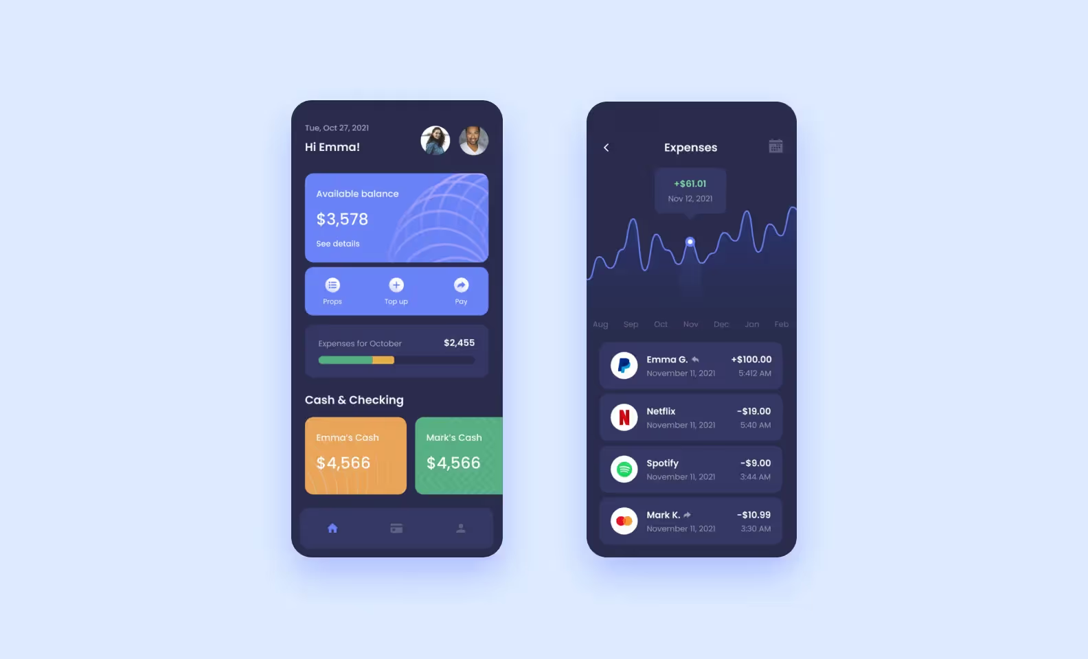
Look at the example. Each partner’s account is highlighted in a different, contrasting color. The same colors are used in the expense scale, so even without a description, it is clear who spent more in a month. The screen on the left shows the expense ratio over several months and displays a list of approved transactions and transfers. By analyzing the comparison graph, a user can easily adjust the budget for the next month.
Unlike the examples below, the interface background is dark, which makes the bright colorful bars stand out even more on the small smartphone screen. There is also a good balance between graphic elements and UI design patterns, and information is grouped into logical blocks. The first screen contains data about balances, and the second one shows transactions. The dashboard is intuitive, and this is one of the keys to a high-quality product.

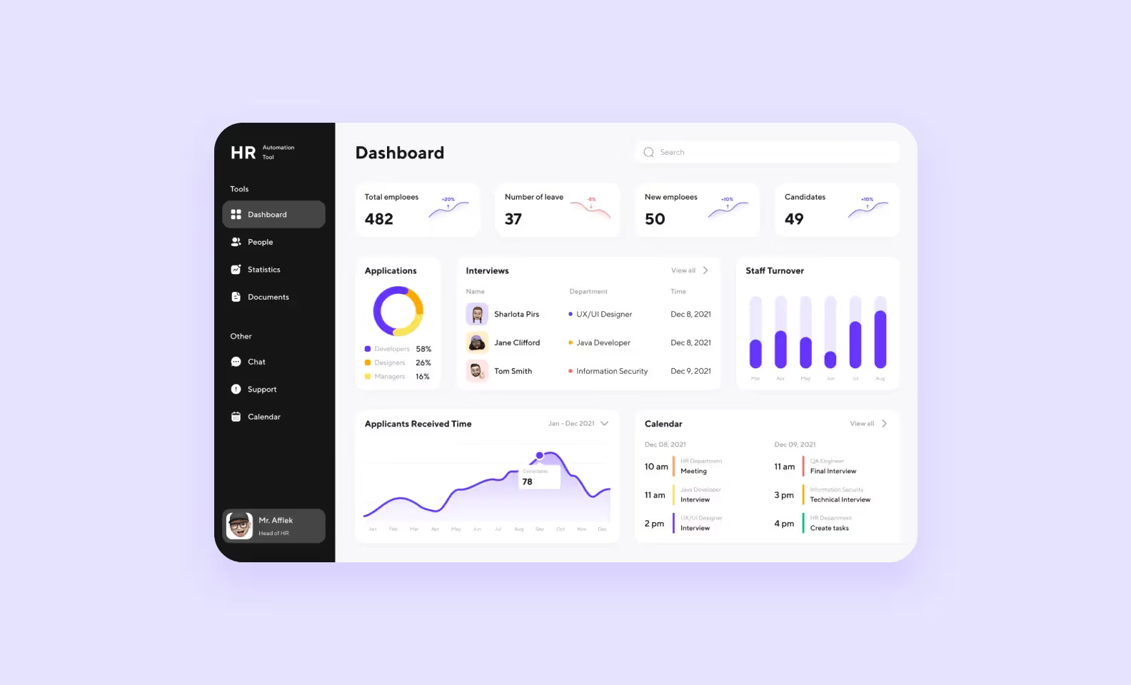
This minimalistic dashboard displays all the data an HR needs on a single screen. There is no visual or informational overload here: only 3 colors and bold numbers that immediately catch the user’s eye.
Using a pie chart, an HR specialist can understand the ratio of candidates and quickly react if there is a shortage of candidates in one of the application categories. In the bottom right, there is a calendar with scheduled interviews, exact times, and desired positions.
Here users have everything they need at arm’s length: from indicators of the company’s HR situation to their current tasks. To get more information in each section, a specialist can click the “view all” button and open the full data.

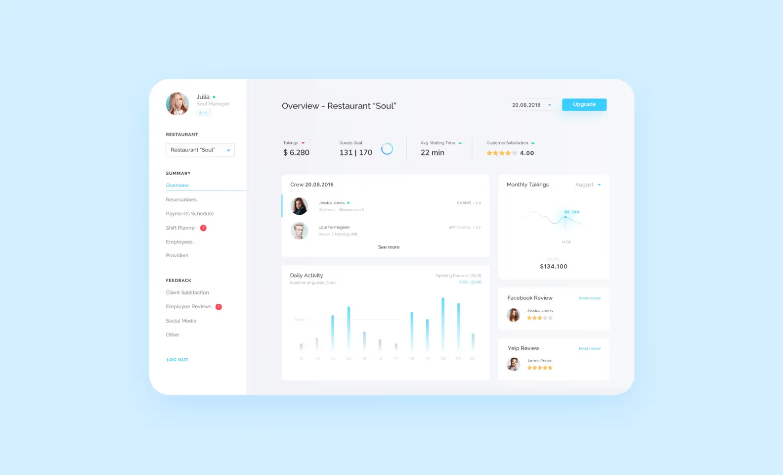
The platform uses a minimalist color palette, so UI UX design doesn’t distract a user from the numbers. You can notice the space between each block and the lack of extra elements, it all helps the brain focus on important indicators. At the same time, information posted on the dashboard is quite detailed and extensive: reservations, restaurant employees, the number of guests, and their activity.
The dashboard provides the restaurant manager with real-time information, so they can quickly assess the situation and adapt. For example, the number of waiters in the restaurant depends on how many tables are reserved and how many guests are in line. These indicators are emphasized with the help of UI UX design.
If it is a chain, the manager can also switch between different locations and see their key indicators easily.
Let’s begin with something topical. Now, many regional governments create websites with dashboards to show statistics about COVID-19 and keep residents informed about the epidemiological situation. Some of these UI dashboards are designed well, while some are not. For example, the web page of the City of Chicago, unfortunately, turned out to be in the second category.
.avif)
In this UI UX design, there are no visual accents at all. There is nothing to catch one’s eye: no colors, except green and red but even they are barely noticeable. The blocks are monotonous and very small, and difficult to single out which indicator is the most important one.
Startup owner Max jumps in:
Also, this board lacks interactivity. To interact with charts you need to click anywhere on the graph. A dot will appear there and a date bar will open. But you can call for this indicator only at one graph per screen. Click on another graph, and it will move there.
Moreover, it takes several seconds to load before the dot changes its location. In general, this dashboard does not perform its functions. It gives a person figures that are difficult to understand and does not simplify their analysis.

The logic of the elements’ layout is not very comprehensible. Two large central circles distract users from the numbers. It would be much better to recompose the blocks and insert something useful, for example, a visual graph comparing today’s and yesterday’s activities.
There are also doubts about icons and the pie chart. It is not entirely clear what each indicator means exactly, although everything should be intuitive on the page. This dashboard definitely needs to be updated.
.avif)
On the left side, there is a block with a horizontal scroll. Adding such elements to the dashboard seems to be a dubious idea, it is better to rearrange the indicators so that they fit on one screen. In situations when all the data should be in front of your eyes, it’s infuriating having to scroll through the screen. This may fit a mobile app design because of the lack of space on the screen but it cannot be accepted in a desktop like in the example above.
The biggest and most common problem with dashboards is incomprehensibility. As we saw in the examples above, the screen can be unclear for many reasons, but all of them lead to the fact that the dashboard becomes useless.
Let’s summarize what characteristics are especially important for a good, easy-to-use dashboard.
1. Up-to-date information
To quickly respond to changes in performance indicators, for example, make up for the lack of personnel in the department or adjust expenses.
2. Built-in logic and correct accents
To easily navigate through the data and not waste time searching for the necessary information.
3. Easy to understand
To quickly highlight the main idea and not get distracted by colors, patterns, and bars.
These criteria will help you evaluate the dashboard from both a user and professional point of view. Now, you can’t make a mistake and approve a low-quality product if you hire a UI UX design agency to create a web platform and mobile app design.
➡️ If you already have an idea for your own project, get in touch with Purrweb. We have experience developing dashboards. For example, we did one in the Cargo app for shipping companies and another one for the Fintarget copy-trading platform. It’s easy to reach out to us — just <a class="blog-modal_opener">fill out the form</a> and our teammate will call you back to discuss the idea.
