Need help with your project?

Oops! Something went wrong while submitting the form.


Imagine this: you have a designer join your project, but the moment they open your design file, they’re shocked. They see a content card skewed in one part of the file. Meanwhile, on the other part of the project, the colors are off — they’re not related to either Primary or Secondary choices. Icons are mismatched, and they look different on each page of the file.It’s a mess. In this article, we’ll tell you how to avoid situations like this.

At Purrweb, our designers use Figma, but the tips listed here are universal. They’ll work, even if your program of choice is Sketch or Adobe XD.
First, we’ll tell you what a UI kit is and why companies use it.
Sometimes, companies confuse UI kits with design systems. A design system has everything related to the look of a project. It even includes style guides, which seemingly have nothing to do with design.
Let’s compare a UI kit with a design system.

The UI kit is a set of components that are used to create an interface. It includes both visual design elements and related technicalities: HEX color codes, font sizes, line height, etc. It’s only used to develop an interface, nothing more.
The word “component” reflects one of the main purposes of the UI kit — developers use it. This word came to the sphere of design from coders.
Developers used to assemble and utilize components themselves. Now, new software has come along which makes it easy to visualize components outside of code. With Figma, Sketch, and Adobe XD, designers could work with developers much more easily.
UI kits are made with components, and because of this, it’s easy to change design elements in a whole project. Just find the master component in the UI kit and add changes to it — every other component in the project will update accordingly. No need to manually change the width of a button on every web page and you won’t have to worry that you missed one of the elements.
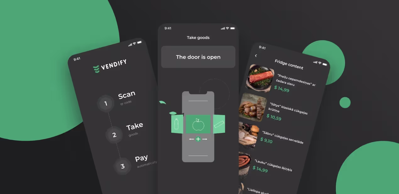
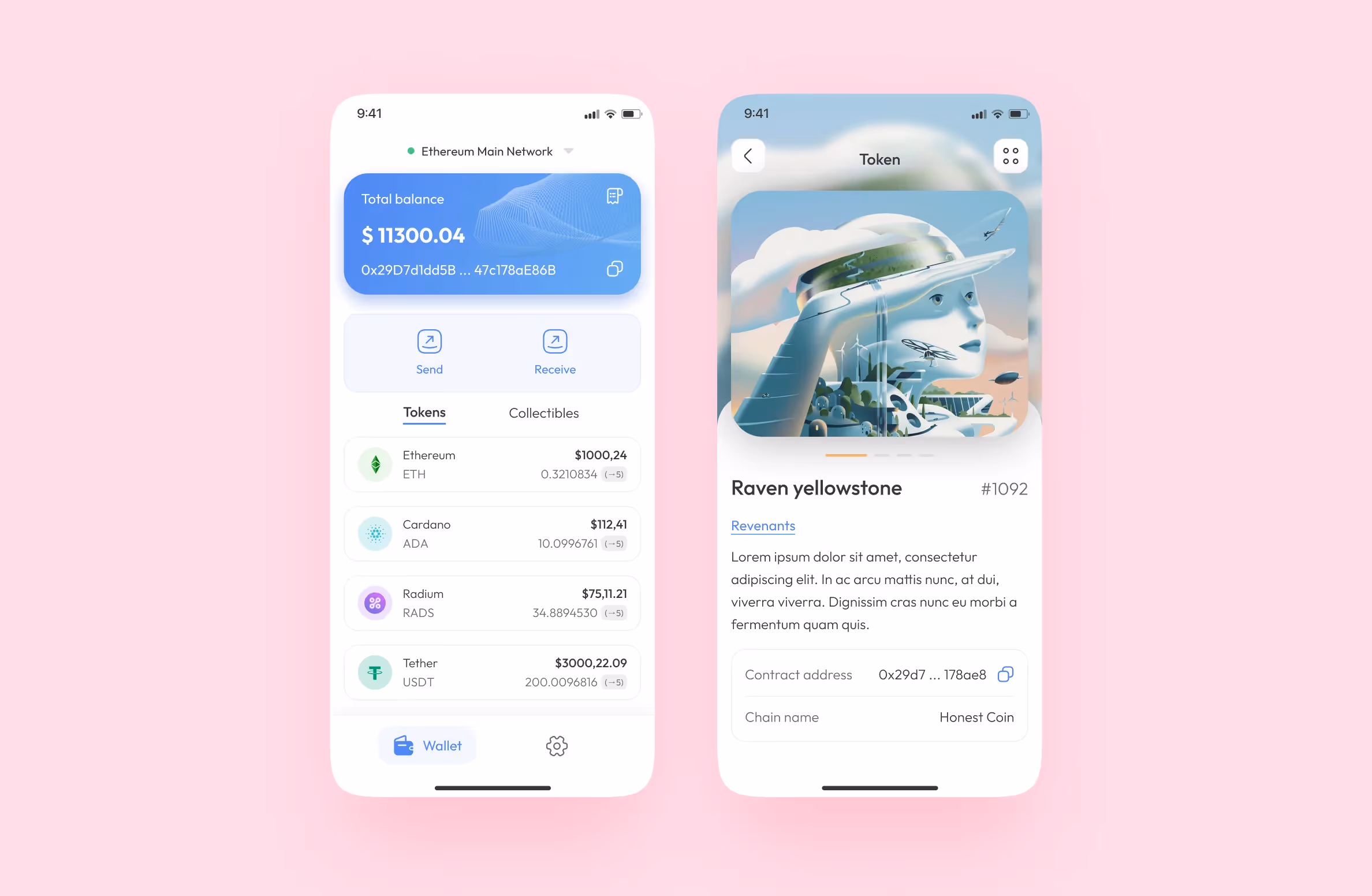
There’s a common misconception that only large platforms and apps can benefit from a UI kit. In fact, the only projects that don’t need a UI kit are micro projects, e.g. a landing page that you’re not planning on scaling.
The UI kit guarantees that your interface stays consistent. Each project must have a set of basic design elements and their states, even if it’s small.
Logically, you should create a UI kit at the beginning of the project. This way, you’ll be able to create an interface quickly from ready-made parts.
Now that we talked about what a UI kit is, here’s how we create it at Purrweb.
We start making it the moment we’ve approved the design concept: the app’s main page and 1-2 secondary sections. We enhance them with as many details as possible. Thanks to this, our clients have a clear vision of the final project.
By the way, we have an article on our blog on how we create concepts, with a real case as an example.
While we’re working on the project, we delegate the creation of a UI kit to a single middle senior designer. They choose colors, fonts, and icons. Later, they ask their client for feedback. This guarantees that the design has the stamp of approval.
After approving and refining the design concept, the designer chooses some elements that are used multiple times in the interface. They transfer these elements to the UI kit. Regardless of the project, we’ve noticed that all UI kits share the following elements:

Then, we connect other designers to the project — they also start working with this barebones UI kit.
We update the UI kit during the course of the project. Oftentimes, one of our designers creates additional elements that are reused. Here’s how that happens — they:
If a designer has to draw several states of a single component, they’re created in the same fashion. This way, we make sure that no element is lost or not accounted for in the UI kit.
Now that we’ve told you about the process, let’s look at a finished UI kit. We’ll also provide an explanation of how to assemble each of its individual blocks.
Let’s go over each type of component separately.
We move several elements into this block:
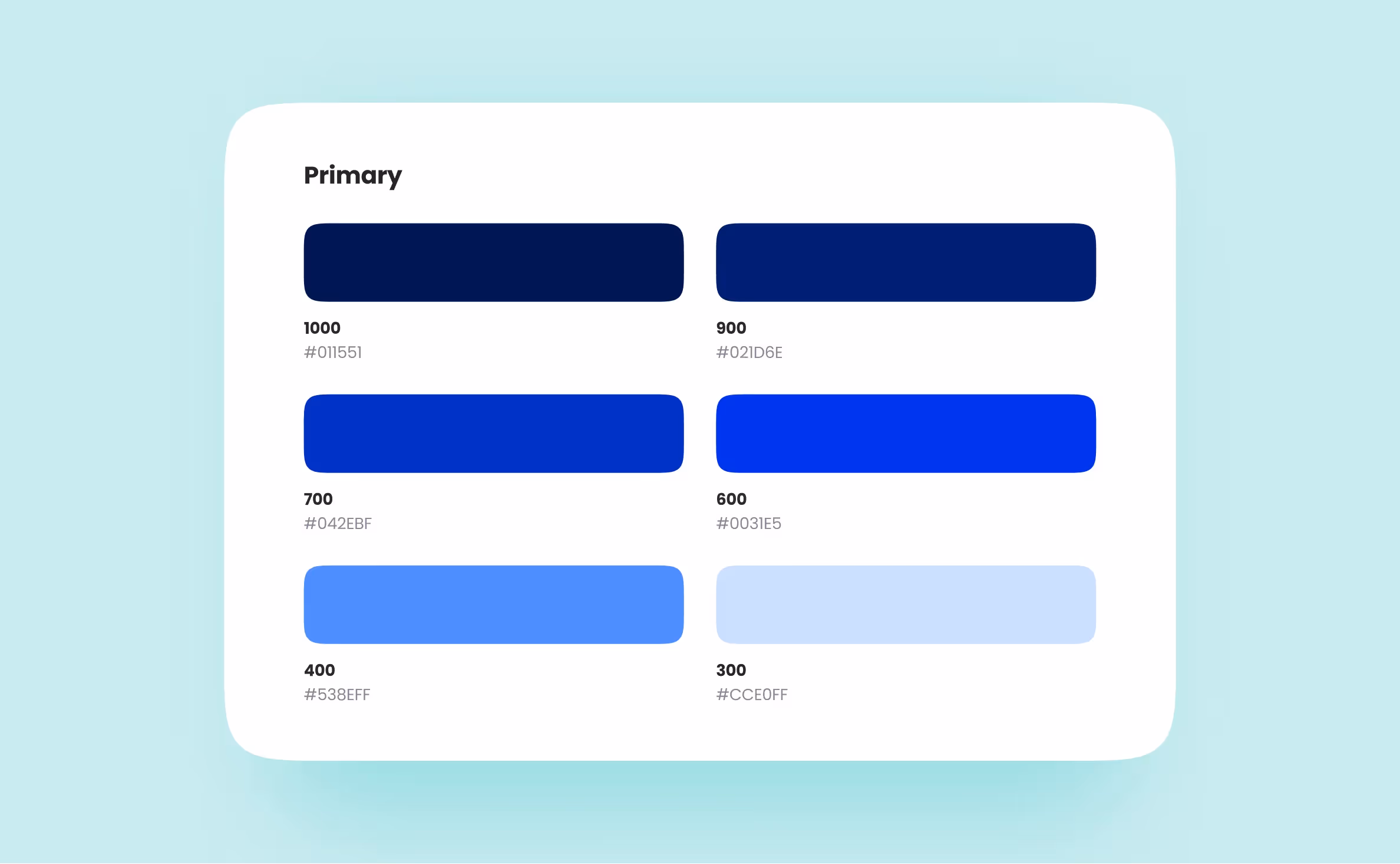
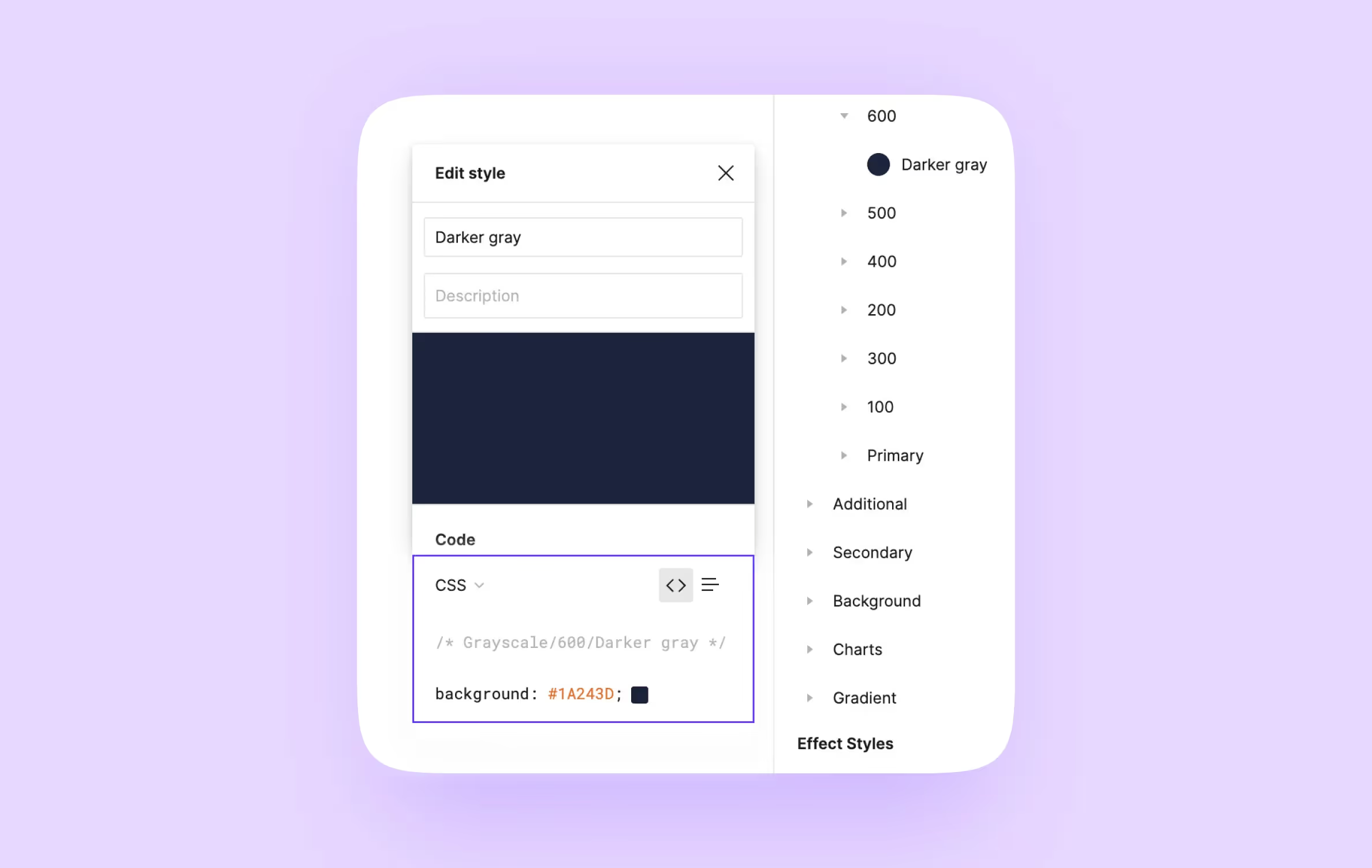
Each color must be assigned a HEX or an RGB code. This way, there are no shades that look visually indistinct but are still different from approved colors.
Designers utilize it to highlight text fragments. They also use gray to separate cards or buttons from the white background.
If your interfaces have many bright colors, we suggest using only two shades of gray. There’s no point worrying about grayscale too much in this case.
However, if the main color scheme of the interface is closer to monochrome, choose a dozen or more shades of gray. It’s convenient to name these shades with numbers ranging from 00 to 100 (or 000 to 1000, depending on the number of shades).
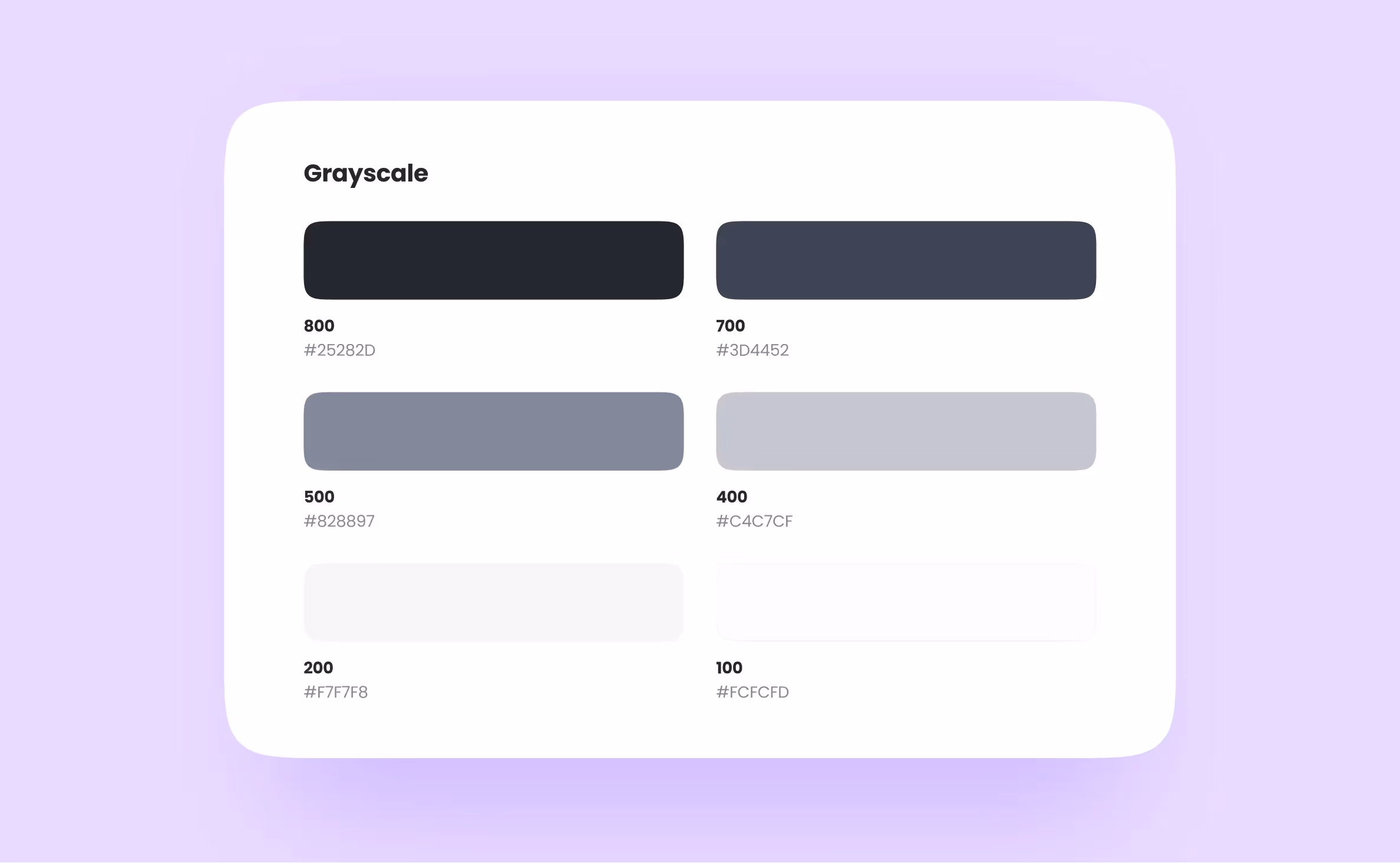
After all that, a different designer can work easier. They just have to choose an element, look at the number of a shade, and apply it to their new component. Naming your colors is important — if you don’t, you’ll have to write the HEX code down each time you want to use it.
If your app has a dark mode, you need to make sure your greyscale is correct. When the app is in dark mode, it’s better to invert monochrome colors. Here’s a table on the different behavior of gray during both light and dark modes.
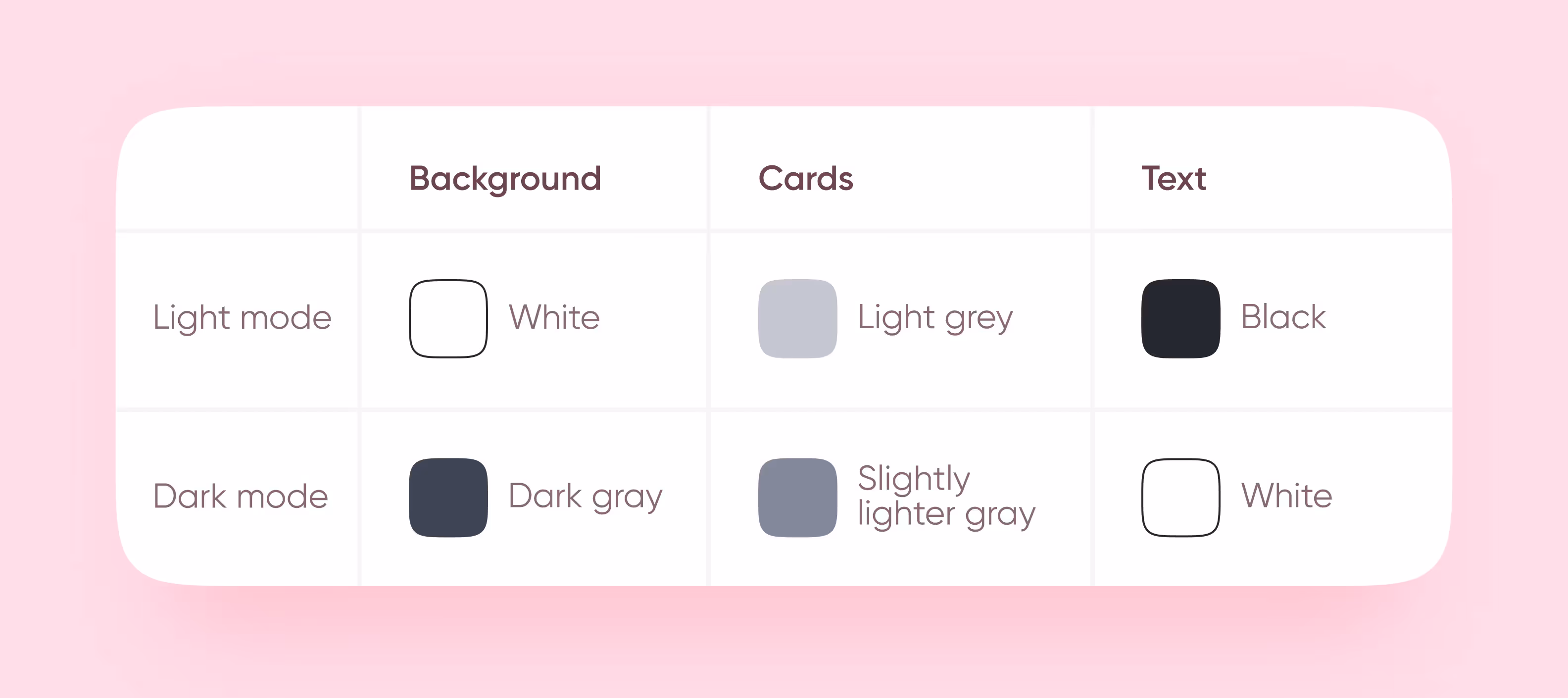
Keep grayscale in mind when naming these colors. If the darkest shade of gray is called 100 in light mode, then in dark mode it should be called 00.
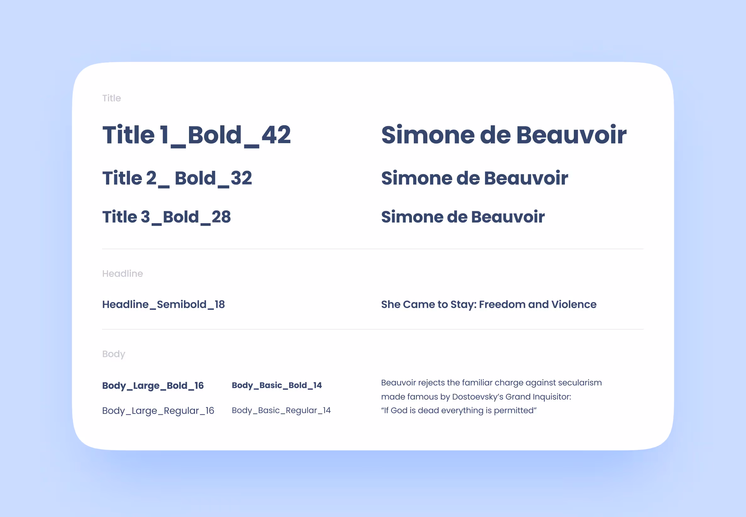
We put all types of text into this block: headlines, titles, footnotes, etc. For each type of text, we set the following parameters: font, font style, size, and line height. It’s simpler to organize than colors.
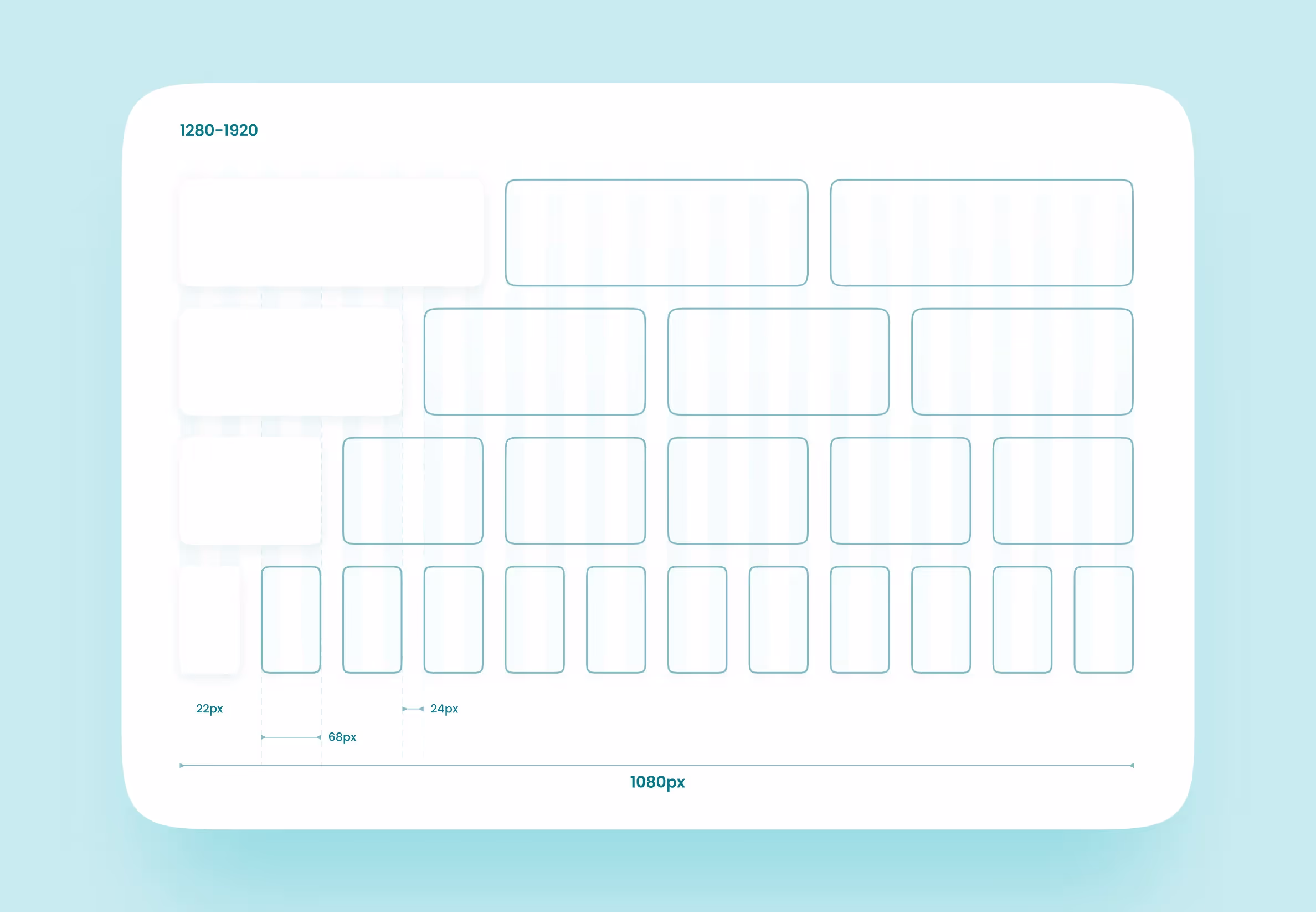
When talking about interfaces, designers often use 12 or 24-column grids — this way, it’s easier to divide frames equally. You can set your grids in pixels or with fractions, but it’ll make your developers’ lives harder. They probably won’t thank you for this 🙂
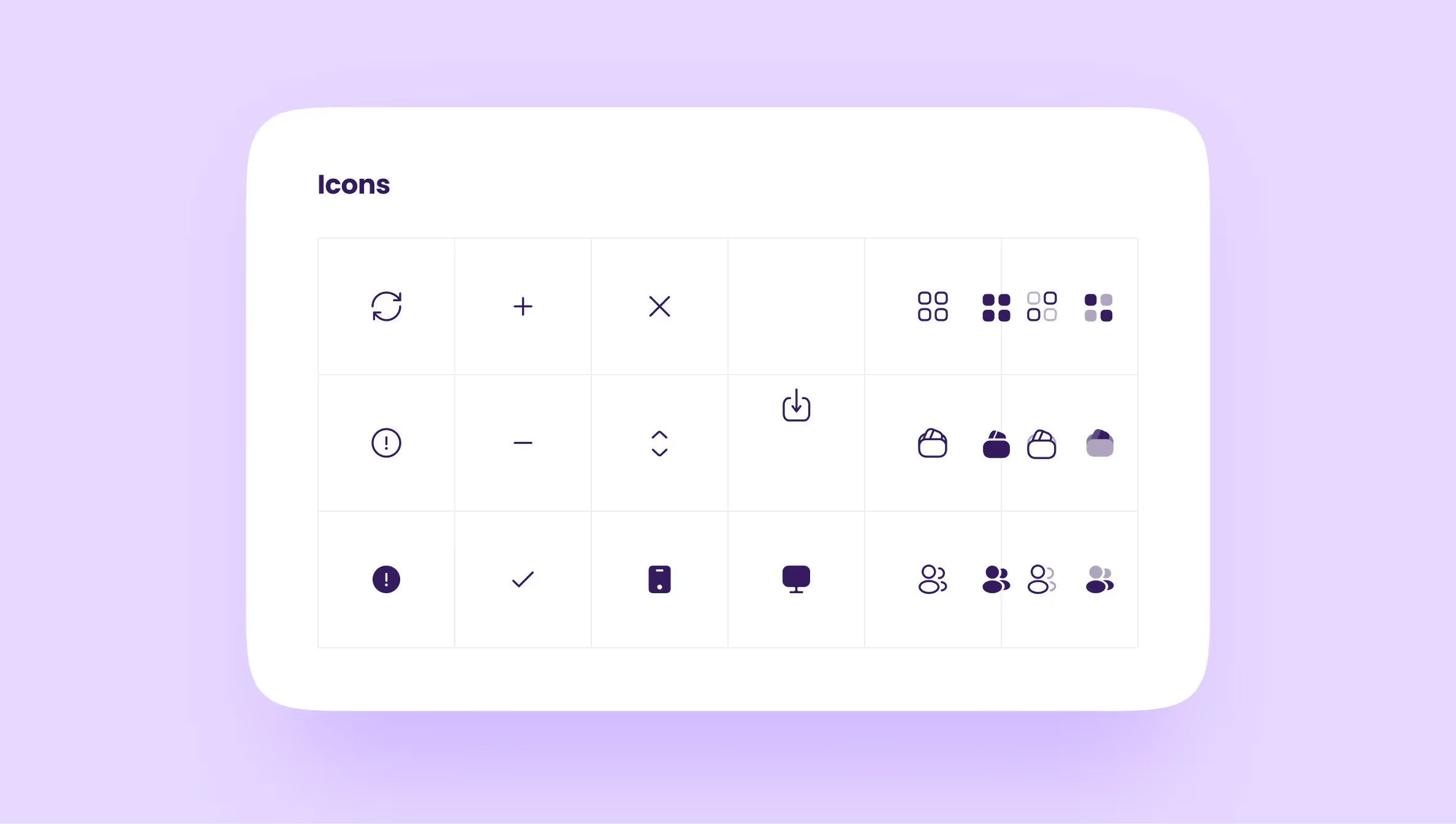
We transfer every icon from the interface to the UI kit.
For vector icons, make sure to add a bottom layer that’s the size of the icon’s container. If you don’t, these icons will remain as vector images. When developers begin writing code, it won’t work properly, as there’ll be a large chunk of text in it. Too much text in the code makes it difficult to work with.
If an icon has a different size or color on some pages, move it into the UI kit as a new element.
We combine these components into one large group because they share similar purposes. Here are some components included here:
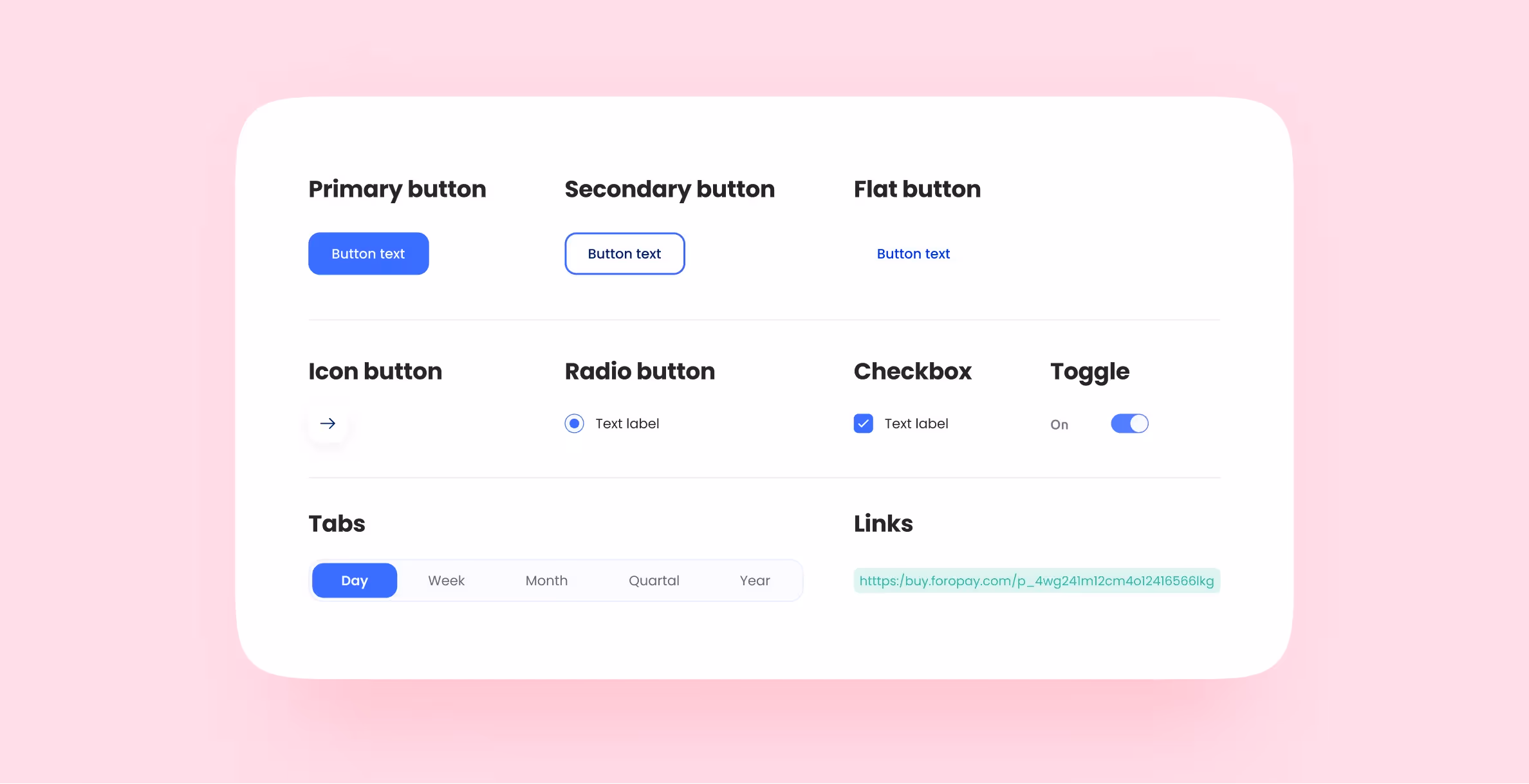
If you’re working on a large-scale project, it’s best to draw all possible kinds of buttons and their states early on. It’ll work nicely if you’re making an interface for a food delivery app that has several user roles: client, courier, and kitchen staff. Or if you’re creating the UI of an online psychotherapy service with roles like psychologists, administrators, and clients.
Don’t forget about drawing buttons in different states:
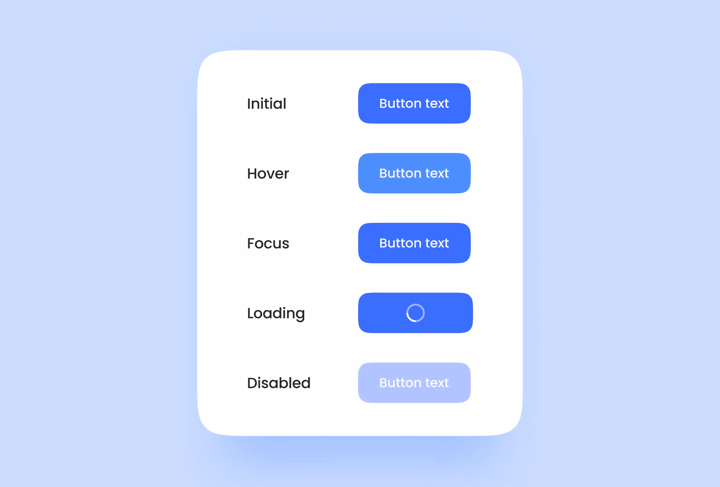
Draw the full set of states for each button when working on the desktop version of the app. But if you’re making a mobile version, you don’t have to include hover and focus states — they don’t exist in smartphones.
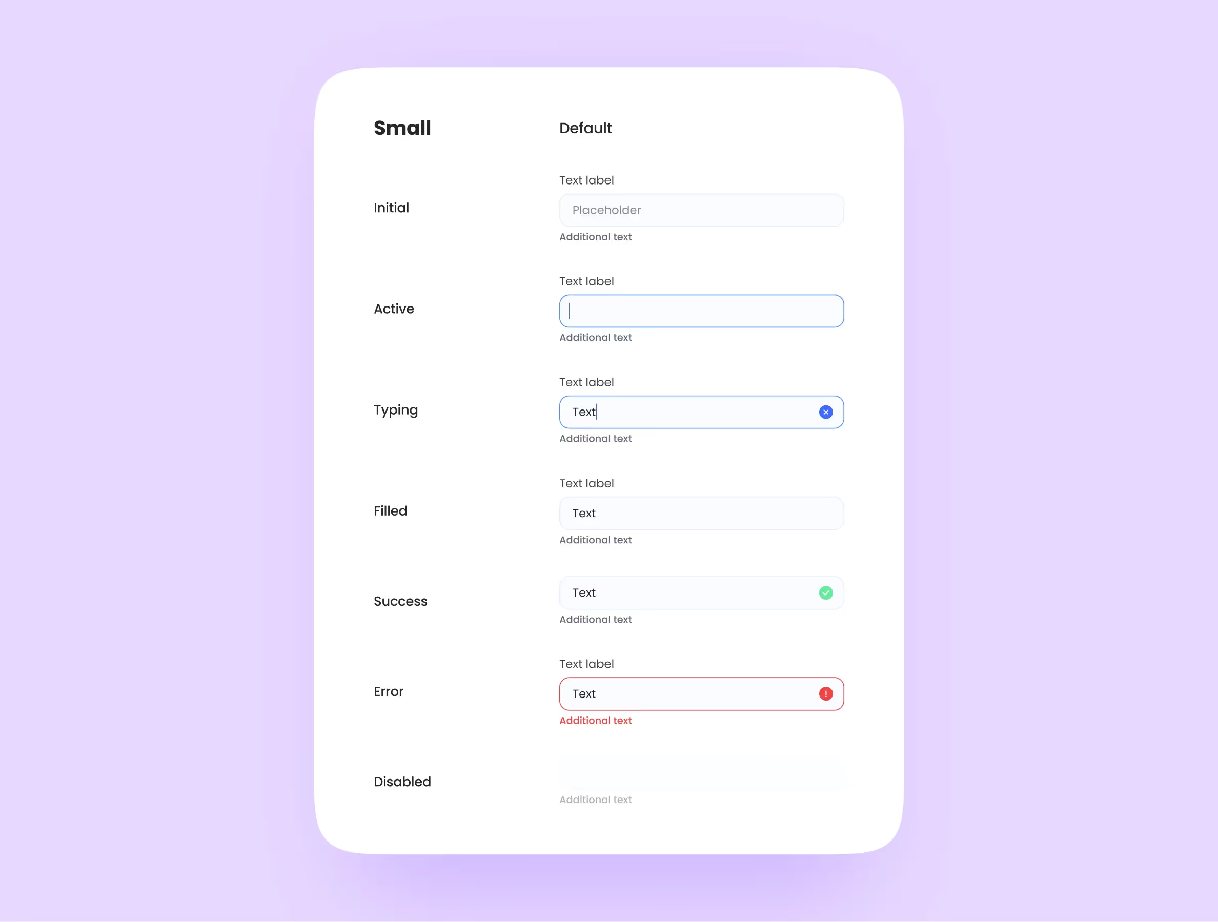
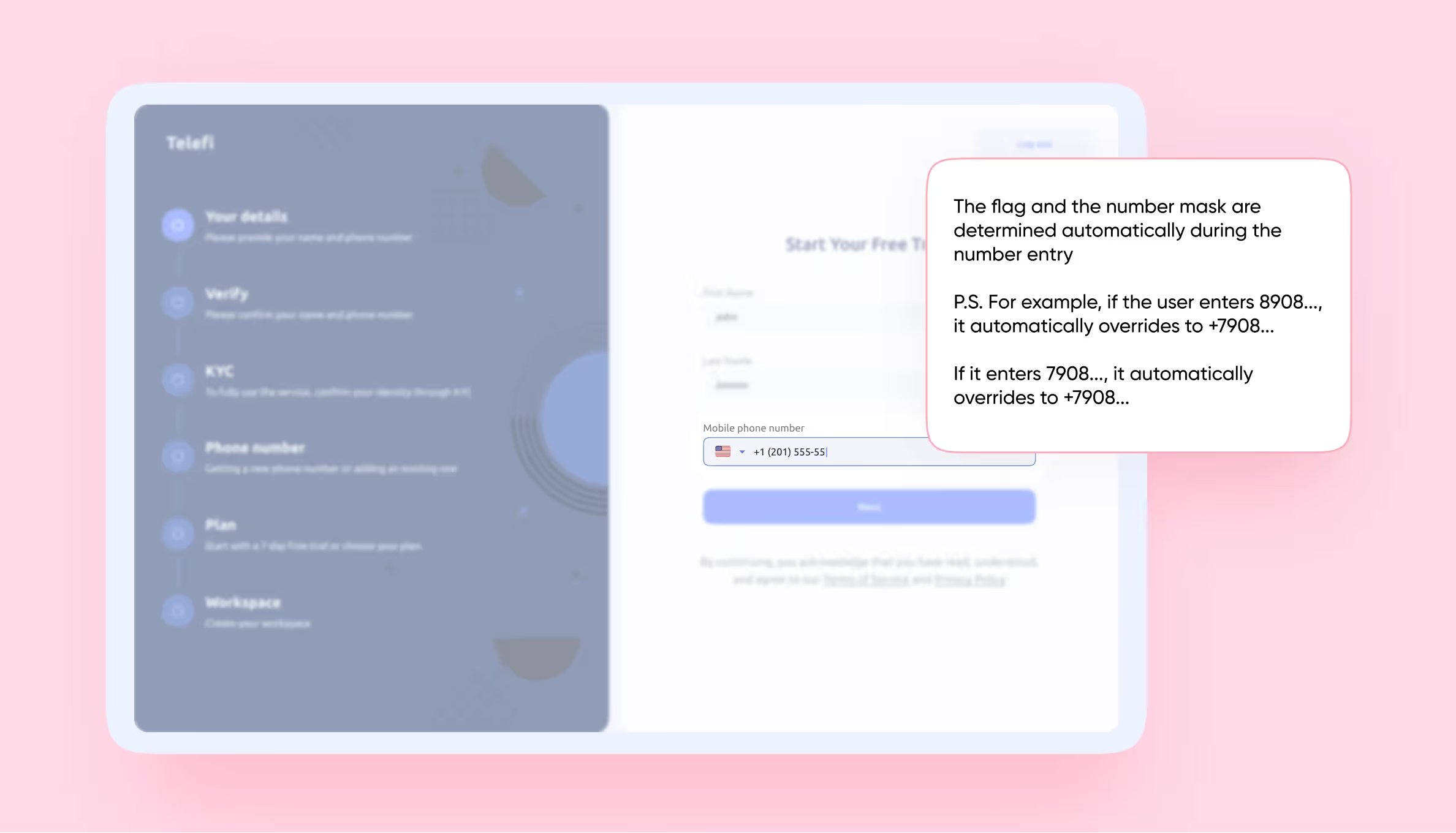
It’s best to make every field where you have to input a certain type of data a component. For example, a field where a user has to enter a password or a phone number instead of plain text.
Fields for entering a debit card number or attaching a file are different components. This distinction is important for developers as these types of data have different properties and are written differently in code.
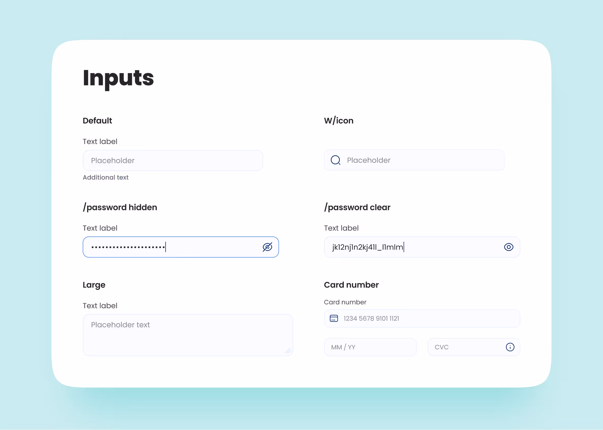
Here are some input states:
Here, you should include each type of state in every version of the project. No matter if it’s a desktop or a mobile app.
We work exactly the same way as we do with inputs. It’s important to make a new component out of each unique dropdown.
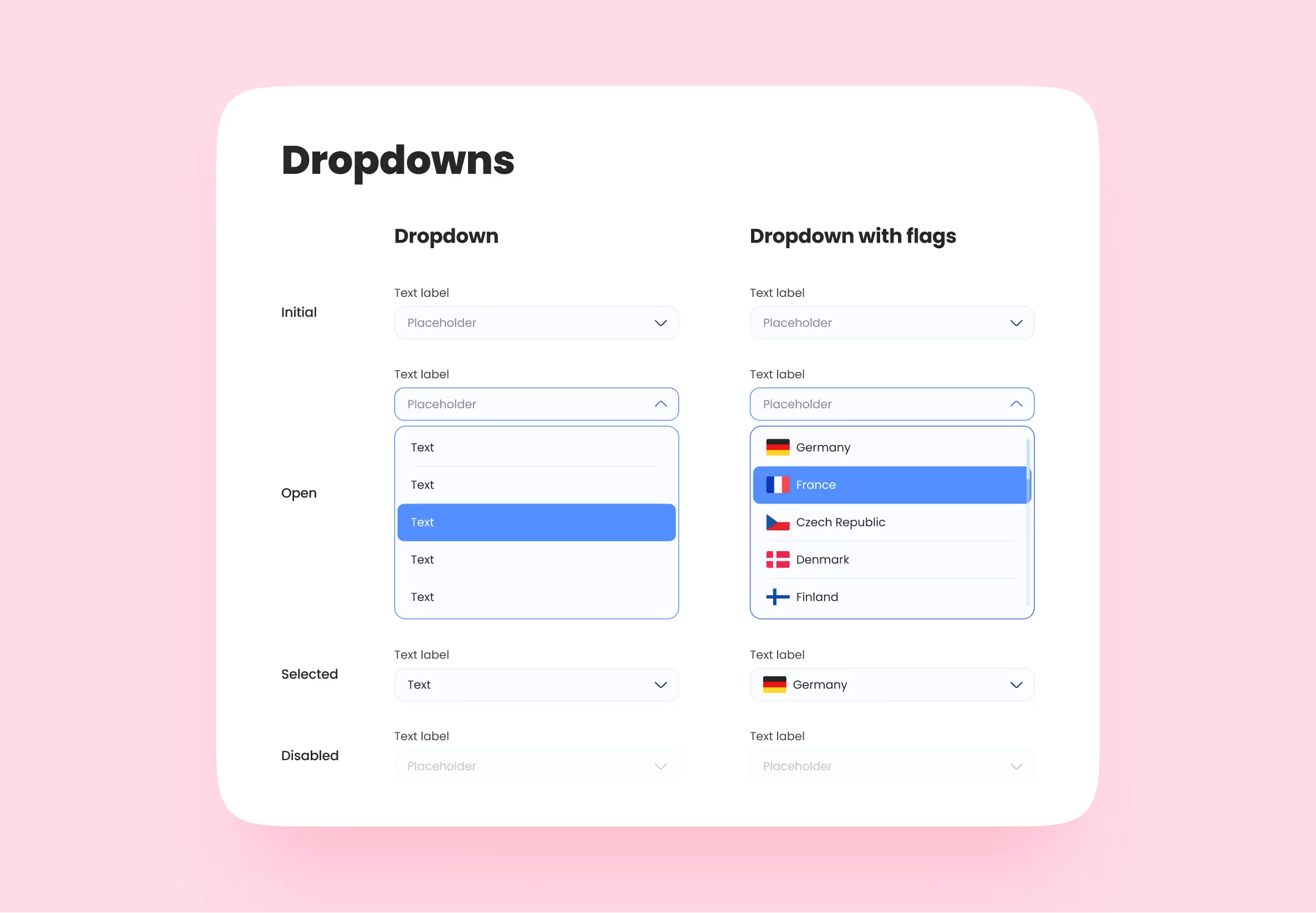
Lifehack: try not to use desktop dropdowns in mobile interfaces. It’s inconvenient and doesn’t look good. If possible, replace dropdowns with backdrops, hamburger, and action menus.
Let’s move on to the compound components. When working with them, it’s important to consider the rule of consistency. Each card should be flexible.
For example, if the headline doesn’t fit into the card, how will it behave? Or what if there’s an action menu at the upper-right part of it?
In the latter example, each time you change the card or its content, an action menu should stay in place. If the card stretches vertically, the position of the menu shouldn’t change.
In Figma, we use frames and auto-layout to do so. Other design editors have their own ways of making sure components work as intended.
We combine headers into a single compound component, just like we do with the cards. They have different states depending on the screen they’re in.
For example, after registration/authorization, the header should be updated. A user profile icon and privacy options should appear in its corner — now, it’s in a different state. The same goes for drop-down menus — if they change, it’s now a separate state of the header.
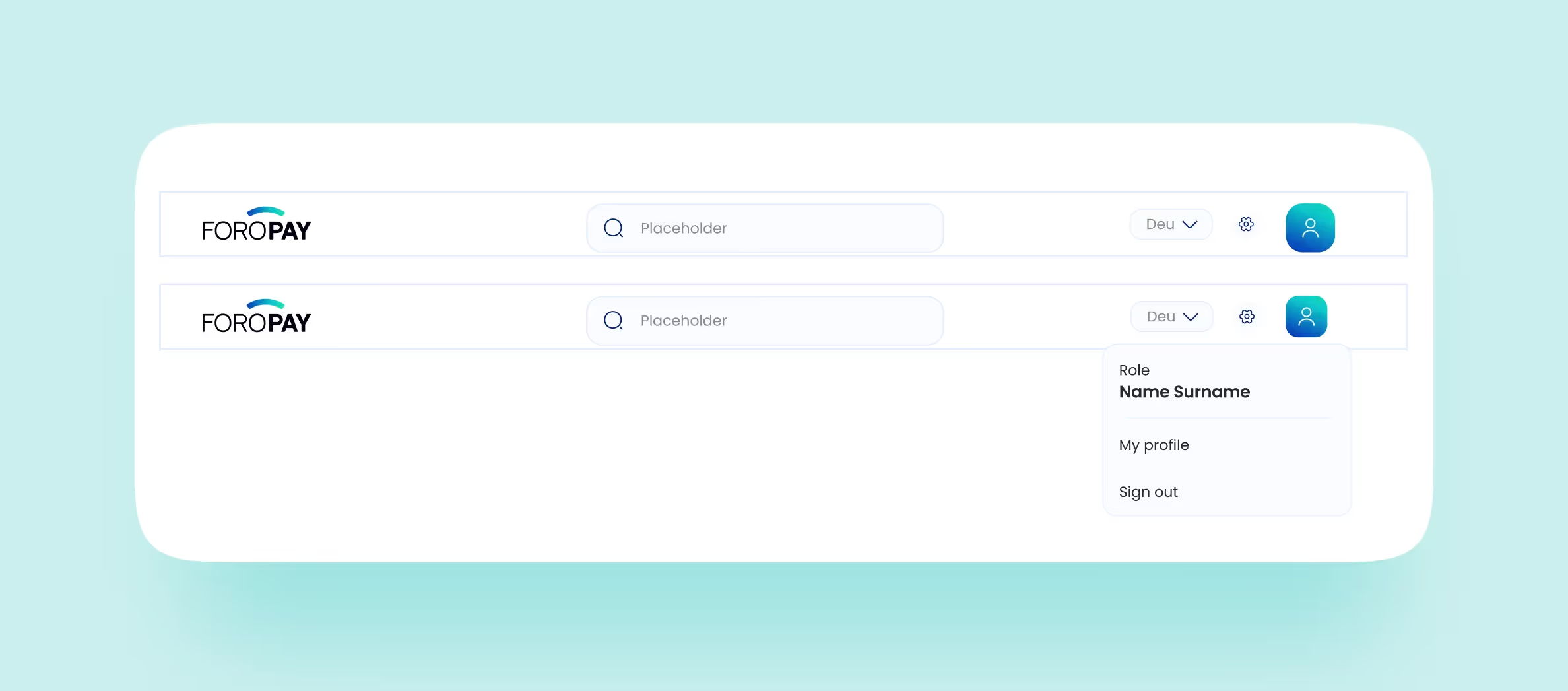
Making different states beforehand will come in handy if you need to make quick edits to the header. Instead of changing it on every screen, you can just make changes to the main component.
In this case, if there’s a button in the header, it will be a separate component.
Here are two universal tips that apply to all components with no exceptions;
These two tips alone make life easier for our designers.
The important thing here is to name the components and styles correctly. Every component, color, and font has a standard name that is used by designers and developers alike. Call things by their proper names — other people who will work with your UI kit will thank you.
It is also important to give detailed comments on some invisible interactions of components. For example, think of a text field that stretches when you input more content. When the user inputs more than six lines of text, they’ll be able to scroll inside the field. Trying to draw a component that behaves this way is almost impossible.
Adding comments that can help developers and other designers understand what you mean can help. Also, we suggest that you put these comments next to the referred component in the UI kit. This reduces the chance that your comment goes unnoticed or deleted.
That’s pretty much it. You can also look at our internal sample of a UI kit. And if you have some other tips on how to create a perfect UI kit, don’t hesitate to tell us in the comments.
We tried to make all the tips as universal as possible, yet we couldn’t resist giving a couple of tips for Figma users.
We can say from our experience with interns that most newbies don’t know how to use Figma efficiently. In a separate article, we’ve gathered a couple more tips on how to build a UI kit in Figma for both beginners and experienced designers.

.svg)