


At Purrweb, we have several scenarios of working on startups. What we will do depends on the client. They can come with:• an idea — we deliver both design and development• an idea + an internal dev team or agreement with another company — we craft the design• an idea + a ready-made design — in this case, we carry out the developmentToday we want to talk about the first two scenarios. Let’s leave the development processes for another article and focus on the design development. So, when the client comes to us with an idea, our task is to work out a design concept and an interface based on it.
Sounds easy, right? If it had been like this — there wouldn’t have been this article. We tinkered, tested, and tweaked until coming up with effective processes. We gained priceless experience that helped us to better all steps of the design process. In this post we want to tell you about our past, present, and share plans for the future.
In the old days, we had neither a great portfolio on Dribbble nor cases on Behance. That’s why we offered to prepare a design concept for every client addressing us. The concept cost a little money but could prove to the client that we’re able to deliver a top-notch design.
It worked like this: an account manager came to the designer and said ‘Houston, we’ve got a project, you have 2 days to come up with the result’. Over these 2 days we had to rapidly handle these steps of the design process:
Nope, it’s not a plot for a new part of ‘Mission impossible’. The designer was time-bounded yet had to bring about a great result. Although we always managed to meet the deadline, it’s hard for the designers to delve into the project so that they could slice and dice the interface. 16 hours is enough to create a great concept, but you cannot work out the logic of the future app.
We came up with amazing yet not always feasible concepts — you could compare them with concepts of a new Lada XRAY car. You probably have no idea what changes the model went through. Look, here is the original concept:
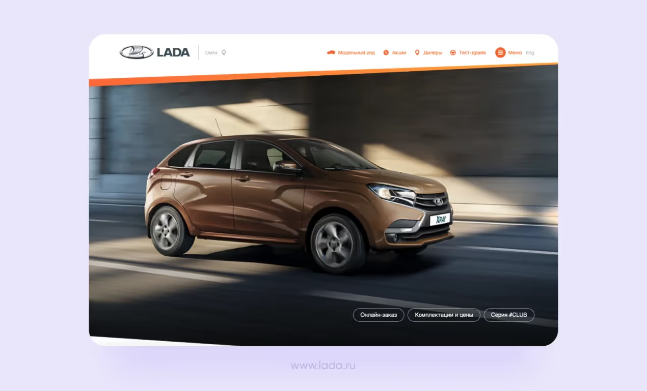
Fancy shapes, LED indicators, high-end fabric inside the car. Such a car wouldn’t disappear into analogs presented in the market. However, the automobile that came off the production line has nothing in common with the concept.
The reason why the manufacturer put the concept aside was simple: they would have spent x10 more money if had tried to produce the car shown on the concept. It worked for us too. We didn’t have enough time to go through the app logic in detail: how the navigation would work, what steps would the user take to achieve the goal, and so on. As a result, the client got an admirable concept that would have taken a lot of money and time for the implementation.
This way, the main goal of the design concept was to impress the client and prove that we can handle the task. Let me give you a side-by-side comparison. The concepts we made worked like covers of books in a bookshop: when you go to the shop, the first thing you pay attention to is bright pictures. The client saw beautiful screens, which made it easier for them to go in for the full service. In the old design process, the concepts were more about showiness than effectiveness.
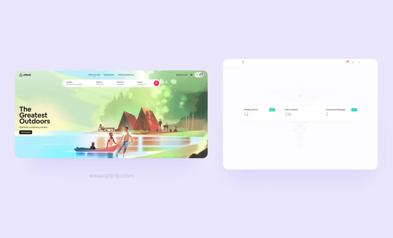
Another problem was related to references. The designers asked the client to provide them with references that showed the look they liked. I mean, references are a good tool that can help you design in the right direction but when every client says they want an interface ‘just like AirBnB’ it becomes your problem. It’s not hard to create a top-grade concept, but it’s hard to make this concept relevant to the target audience.
The presentation fell below the desired level. The project manager met the client to present the designer’s solution and show the results. It included 2-3 screens in Figma, which worked but wasn’t perfect. It happened that the client didn’t understand the idea and started bombarding the manager with questions.
Again, 2 days is quite a short time to work out the concept in detail and prepare the presentation. If the designers had new ideas, they didn’t have time to think them through. Most of the ideas remained unrepresented. The project managers tried to communicate the designer’s idea, but it’s hard to do when showing just several screens. Even the best concept might be little understood.

In a best-case scenario, the client came back in a week and asked us to polish up some of the elements. However, most often the clients needed more time to decide — they might come back in a month, half-year, a year. The designers didn’t get any feedback, the design concept remained unaddressed. When the client came back, the designers had to rework the concept from scratch: if it took the client too much time to make up their mind, most of the concepts were lost.
If the client liked the concept and decided to continue developing the product with us, the developers got ‘something’ that the designers had made at the very beginning. Every project was unique, completely different from another one. In the old design process, we didn’t have a framework that would help designers and developers be in sync about the layouts.
There were problems with the handoff stage of the design process: every designer prepared the final file as he thought it would work the best, and the process was chaotic. At the development stage, we often faced issues with the design: sometimes the developers found out there wasn’t one of the screens or some of the user flows were not finished.
If the client had an internal dev team, they came back and asked us to design missing parts. How did it happen? Well, somehow. 🙃 However, we always set up to work and made it quick.
The developers had tough times: they had to spend extra time to figure out how the design worked and export components by themselves. Of course, we provided them with a UI kit, but it wasn’t as detailed as it is now. We placed all components on a separate page in a Figma document — that’s it.
Now and again, the developers had to think up the logic of the product or make up screens of the ready-made components. When they struggled to do it, they went to the designers and asked them to point out the logic or finish off the design (e.g. draw a missing icon).
The process was not the only thing suffering from such a mess — the design team suffered too. To be more exact, not the design team but the designers because the design team was nominal. We didn’t have a real one: 1 project = 1 designer. In the old design process, the designers couldn’t share their expertise nor experience.
We never gave one project to 2 designers. The team met one time a week for planning — that was the only team process. For the rest of the time, the designers worked on their own. The planning wasn’t easy: we never knew how much time it would take to complete a task because every designer worked at their own pace. One could deal with the task in 5 hours, another — in 3 days.
After the concept was ready and approved, we began designing the whole app’s functionality. Sometimes the task was handed over to the designer who didn’t develop the concept. It was a problem resulting from another problem: wrongly planned resources. The designer could finish all tasks faster than planned. In this case, they moved on to help on other projects. So the designer could either work on design concepts or finish others’ projects.
Nothing would have changed if there had been 4 people with more or less the same level of expertise. Yes, it was difficult. Yes, we had problems. But we still performed great results. We realized that we needed to structure all the steps of the design process. We knew there must have been innovations that would simplify our life. But it didn’t press for changes. However, it changed soon — the design team became bigger.
Within 3 months our team expanded by 3 times. We hired 16 designers — all with different levels of hard skills. We had to evaluate their works to understand what they were good at and what not.
The evaluation process wasn’t flawless too — initially, it was taken up by the project managers. As if an artist’s painting was assessed by an engineer who doesn’t understand all the subtleties of the maestro’s work and can only say ‘Make it better.’
It may seem that all project managers are harsh, but it’s not the truth. Some of them made allowance for the new designers: it was difficult for them to quickly complete tasks at the early stages. We needed to establish an effective approach that would help to give objective feedback, properly share responsibilities between the designers, and enhance the design process.
We started holding project retrospectives. Every retrospective took too much time — we didn’t have enough working hours. Some of the designers timed off, some had to work overtime. Back then, many of us were stressed out.
The process that didn’t seem a big problem became the pressing one really fast. We fell through the ice and got into a panic. It was hard but we managed to pluck up the courage and escape from cold water. Our design team got an important part — a lead designer who:
At Purrweb, the lead designer works on improving design processes. We had to put a lot of effort to find who can become a leader. The result came up to expectation: leaders helped both the lead designer and the newcomers to quickly start doing amazing design and flow into the design process.
A lead designer is a person who leads the design process. They lead all the steps of the design process and have a general idea of every project: makes edits and handles the feedback. All the projects are controlled by the lead designer.
The lead designer was our first step to improvement. Over time, we managed to build a large portfolio and establish great credibility — that’s why we decided to opt-out of the design concepts prepared within 2 days.
The work on the project now begins with a kick-off call: the account manager introduces the PM to a client. The PM schedules a kick-off meeting to communicate the project idea, objectives, and goals to the team. Then they hand off the user stories which were compiled by our business analyst to the team, and the lead designer sets the project to work. The presale process has also undergone major changes — check out the article about it.
We went ahead with the references — now the project managers ask the clients what they don’t like and don’t need in their interface. It allows us to get rid of the limits and keep options open: formerly, when we asked the clients what they liked we boxed ourselves in by constraints. We looked at 2 pieces of a big pie instead of chewing over the whole dessert. Now we are trying to do it the other way around. However, if the clients have preferences, we will take into account colors, fonts, and some elements (but won’t copy the structure).
The upstream stage lasts not 2 days, but 2 weeks. At the first sprint, we prepare a mind map: the designers dive into the project, study through the tasks, look for pitfalls — whatever they need to understand whether it is possible to implement the client’s proposals.
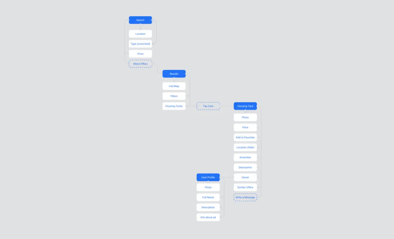
On one of my projects, the client wanted an animated spaceship in the app. We added the task into the backlog. However, later on, it became clear that such a feature would have exceeded the project’s deadline and budget. We made the mind map and explained everything to the client — he decided to put away this idea.
When preparing a mind map, the design team works out all the logic of future products: thinks through the project’s features, blueprints the steps users will take in the app, and lays the navigation. The mind maps help to avoid the situation when the client says ‘this is not what I want’ and it takes only 8-10 hours to create.
The manager calls the client and presents the finished mind map. The details are discussed from the get-go, and the designers get a chance to make edits straightaway. For example, when:
The mind map is a 2-in-1 solution: 1) an inexpensive way to pave the way for a full-fledged UI/UX design to avoid any problems related to the interface at the development stage, 2) a simple way for the lead designer to quickly get the project’s idea, for the client — get used to us as a team.
During the second sprint, we are working on the concept. Now it’s not just 2-3 screens in Figma, but a detailed presentation on Readymag. This page helps the designers present the results to the client: they show him or her all the screens they’ve prepared and explain how the app will work. We also like to make animations and video demonstrations — if have enough time, we’ll surely do some.
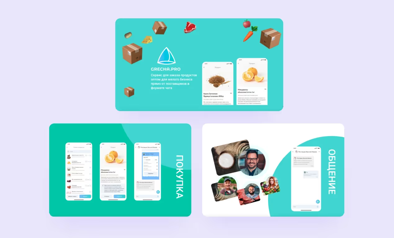
The animations allow us to illustrate complex elements that are difficult to explain in words. Again, when we prepare the concept faster than planned, we pack the video into the presentation. This is not necessary, but if the team has ideas that go beyond the concept, we’ll do it. One day the team came up with a logotype for an app while making a video for the presentation. It’s like a cutdown version of branding. 🙃
The client receives a link to the page with the concept. It’s always nice to show because it demonstrates how much work has been done. The presentation of projects became much clearer for both us and our clients, which helps us convey ideas to the clients.
Such presentations wrapped in the landing page isn’t yet a well-thought-out product, but it’s not a project at the idea stage. The presentations we make can be demonstrated even to investors. If the client likes the concept, we involve a second designer and start working on the whole interface.
The concept we prepare now is not a bookstore, but a library. We are visited not by customers, but by readers who see shelves with books that are sorted alphabetically. The reader clearly understands which book he wants to take, and the librarian can easily find it. A concept is made for the sake of effectiveness, not showiness.
As soon as the designers work through all the screens, and the client is ready to move on to the development — no matter whether they continue working on the project with us or with their internal team — we start preparing the design for the handoff. Our task is to convey the logic of the app to the developers.
We want the project to be developed as the designers planned — that’s why we think through the user scenarios and pack a rich UI kit according to our framework. It’s much easier for the dev team to develop the app the way it was outlined during the design development phase. As a result, we managed to cut down so-called ‘design bugs’ and decrease the level of uncertainty at the start of the project.
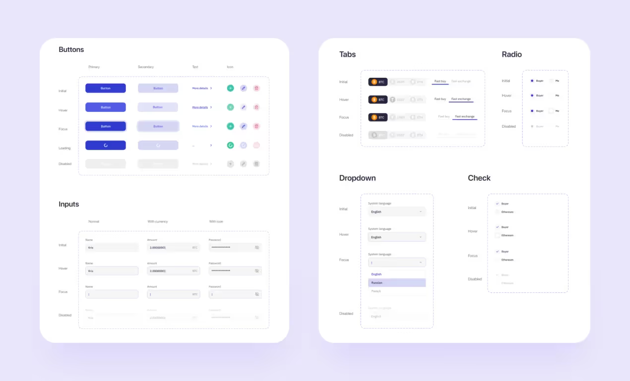
Another change — the lead designers began supporting the development. We agreed with the developers on the process: we write reports to understand who stumbles upon the same flaws (detected during the development) over and over again. These reports help the designers to improve their understanding of the development process and eliminate weaknesses from the interface.
We try to make clickable prototypes as often as possible. Clickable prototypes allow the clients to try the interface on a real device — as if it was a ready-made app. However, the prototypes are useful for designers too — they help us find flaws in the design and fix them right away. Developers don’t need clickable prototypes to start coding the app (all they need are a layout and a UI kit) yet they can run the prototype if something is not clear.
Now there are usually 2 designers working on the project at the same time (sometimes even 3 or 4). It’s not always reasonable to involve more than 2 designers — it will be more difficult for the lead designer to review the work. Of course, if the client wants to get the result faster, we will bring more people into the design process.
Two designers are already a real team. The designers can share their expertise and experience when working together on one project. The exchange of information goes in all directions: the lead designer teaches the newcomers, the newcomers share their thoughts with the lead. In addition, the designers usually work on several projects at the same time, so it becomes even more useful. We managed to create all the conditions for effective communication.
We began mixing the teams so that the designers could share their expertise and experience. We launched a beta version of competency maps, which helped each designer to understand what they:
The map gives a start for a conversation about the personal growth of the designers. It helps to reveal the bottlenecks in the personal vision — fuzzy situations and subjective assessments that then will be discussed. For example, the lead designer might misjudge another person because of a single mistake.
Thanks to the changes, we sped up work on projects. Previously, it was limited to the working hours of one person, now we can complete tasks that require 80 hours in a week or even faster because the designers can be working on one project at the same time.
There is no problem with resource planning. We started planning tasks for each day — now we understand when the designer will work on a particular project during a week. Together with the business analyst, the lead designer estimates the scope of work per project at the presale stage. Now we can manage expectations and meet them, and the designers don’t face situations when they have no tasks and don’t know what to do.
We made it almost from scratch: organized work processes and made them transparent. We managed to build an efficient system that works great with project management, helps the designers to exchange their experience, and provides the clients with clear communication. We prepare everything before the start of a project and know what result to expect. We set up the framework and apply it to the design processes.
The lead designers review the works of the others, give recommendations, and approve the results. It helps us monitor and control all tasks on all projects. We hold retrospectives to find points of growth at the moment and come up with action steps to improve performance. Every designer knows what to do and takes up responsibility for his or her actions. We don’t go around in a circle and learn our lessons.
One day lead designer took a vacation. The project they were working on at that time was passed to another designer who wasn’t in the picture. As a result, the designer changed something that couldn’t be changed (according to the client): added a gradient to a button, which upset the client.
If the lead designer wants to go on vacation, they need to hand over all the details and explain all the tasks — it helps to keep records and design the project as it was intended even without the lead.
Until recently, we used Trello — each designer had their own board in the task manager. All the tasks were tracked there. We had been planning to shift Trello to something else for a long time. When we started evolving several designers into one project, Trello turned out to be rubbish at it. It was difficult to keep track of tasks and pass them on to other project managers without any problems.
We are currently using ClickUp. Trello and ClickUp are incomparable tools. You cannot customize the Trello board, and there are no statuses for different states of tasks. Trello is a very basic tool that gives you a simplified Kanban board.
ClickUp in its turn offers various features. One we get the most of is the opportunity to keep a project wiki. Now, when we need to transfer the project to another designer — we are no more afraid of losing materials or information. We are sure the new task manager will serve us faithfully for the next year or two.
We took our knocks and continue to do it. So, what’s next?
— To grow up new lead designers, so that we could scale the process and help newcomers join the team faster
— To work out mind maps in detail: we want to add them up with information architecture
— To introduce 2-week planning into practice. We couldn’t make it before as it was hard to predict how fast the designers can work
— To begin keeping records about each project: as soon as everyone gets used to ClickUp, we will get a chance to save all the information right inside a project
The path we took wouldn’t have given such a result without great people. Some of them are still with us, some — decide to get a new start. We managed to make up a rich portfolio on Dribbble and create many strong cases on Behance — now our designers practice developing interfaces for various niches and polish up their skills. We took a long way and decided to relax for a little while in a roadside bar to tell you our story. Now it’s time to hit the road — we’ll see you next time!