


TVs are getting smarter, and we at Purrweb try to keep up with them. Not long ago, we made our first project for a smart TV, where we were responsible for the design and development. Now, we want to share our experience: what UI the TV giants advise us to make and what you won’t find in their guidelines.
Recently, our client came to us with an idea to make a cross-platform IPTV cinema for the European audience. They wanted us to develop a mobile app, its web version, and most importantly, a smart TV app for Android TV, Apple TV, and other popular platforms. It was our first project to develop a design for TV operating systems. In this article, we will tell you how we managed this, what we read, and what hidden pitfalls we faced.
For a start, let’s give some context. To get the idea of our app, you need to know the conditions in which Europeans consume TV content.
In Europe, subscriptions to TV services cost quite a lot. On average, the Europeans spend about €130 per month on them. About €30 from this sum goes to streaming services. Impressive, isn’t it?
Also, Europe has strict rules regarding copyright violation. There, you can’t just watch a movie without paying for it. For example, watching some pirated series in Germany results in a €155-1000 fine. Even minor viewers are not an exception — they get fined as well.
One of the ways to save money on content without risking getting punished for piracy is to turn to IPTV playlist resellers.
The content in Internet Protocol Television (IPTV) is broadcasted via an isolated IP network. For it to work, a user must upload a playlist with links to the content.
Resellers distribute such playlists. They sell access not to the entire service, but to specific series, movies, broadcasts, or radio shows.
IPTV playlists are text files with links, and our app was supposed to pack them in a format resembling an online cinema. Users get a playlist, upload it right into the app, and get a nice UI with a functional video player instead of an illegible chaotic text. All these manipulations should be available on various devices including a smart TV.
You can find many insights about TV apps on the Internet. In our work, we focus on official guidelines from the major smart TV producers. Due to them, we identified some patterns about how a smart TV UI design should look like.
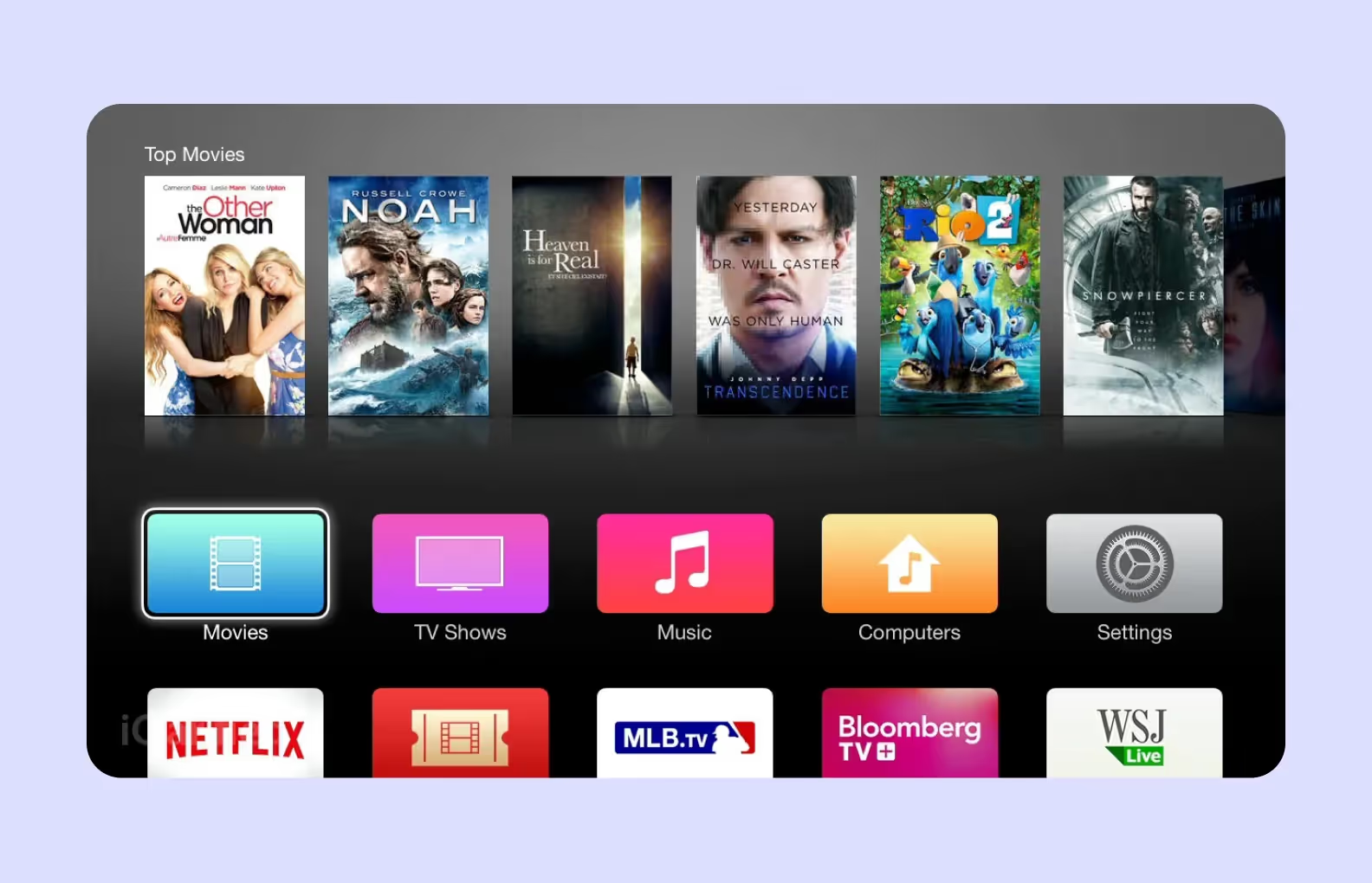
As we had an Apple TV console in our office, we started developing an app for the tvOS, so that we could test updates right away. However, our app was supposed to work on various TV operating systems: Tizen, WebOS, and Android TV. That’s why we additionally studied guidelines from Samsung and LG.
We summed up the TV UI design principles we studied for the project and added a few of the less obvious insights from our practice. This is how we got the seven-point list below.
Keep in mind the viewing habits of people. The distance between a viewer and a TV is far longer than you might think. On average, it equals three meters, but usually we lean back into the backrest or, sometimes, can keep watching while moving around the room. So, the distance gets longer.
Although TV screens are much larger than PC and smartphone monitors, some user interface elements can be illegible at a distance. This mainly impacts our perception of texts, navigation icons, and marks.
This is why all the UI elements must be big enough for a user to be able to see them from afar. It’s particularly important in the case of the elements users must interact with.

To make a TV UI big enough, start testing your design on devices as early as possible
When we were making mockups on small Figma Frames, it was challenging to understand the scale of a TV picture. Our team got used to working with desktop and smartphone screens — we had no experience with 50-inch TVs.
At the stage of the first tests, we understood that the typefaces we found big enough were hardly readable on big screens. Due to the early compilation and close cooperation with the development team, we noticed the mistake on time and increased readability.
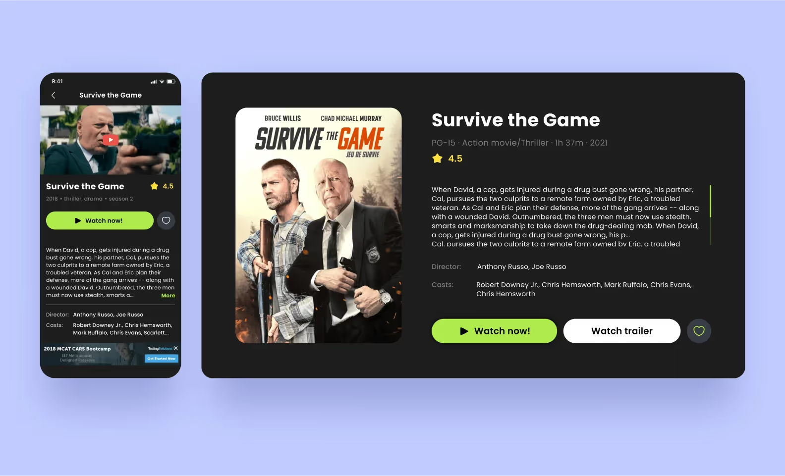
The state of the focus element indicates the user’s current location on the screen. This can be a bright stroke, fluorescence, scaling up an object, and dimming or blurring the rest of the UI. Though focus is often used on other devices, it must be especially vivid on a TV screen because of its size.
The focus state is the most crucial part of TV interfaces. It is mentioned in all the guidelines without exceptions.
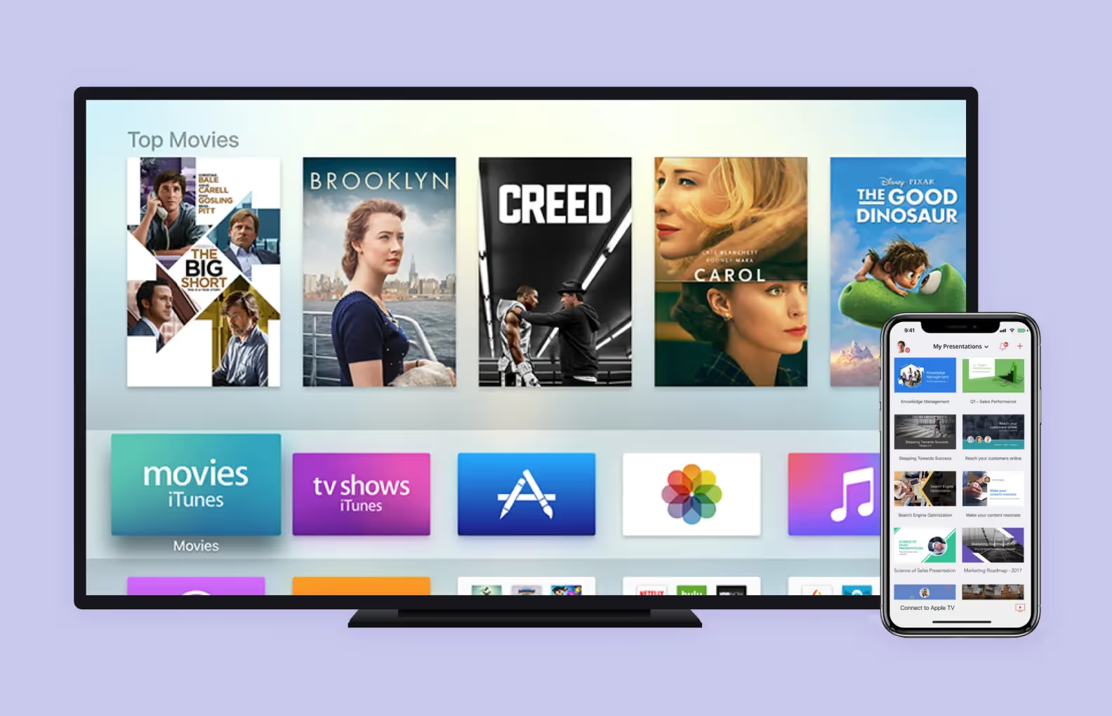
It’s better to make a focus by increasing a preview and adding a shade. It turned out that this approach doesn’t work with a dark background — a viewer can’t see a shade, the fluorescence is hardly perceptible, and scaling up alone is not enough to emphasize content distinctly. A perfect solution would be to add a contrasting line to all the cards with previews.
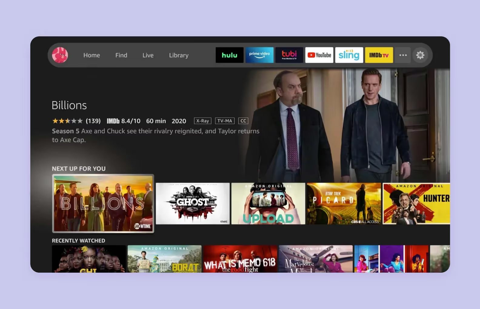
A remote control is the main way to manage a device, but its capabilities are utterly restricted. We must use this fact as a basis when building the entire navigation logic in the TV application.
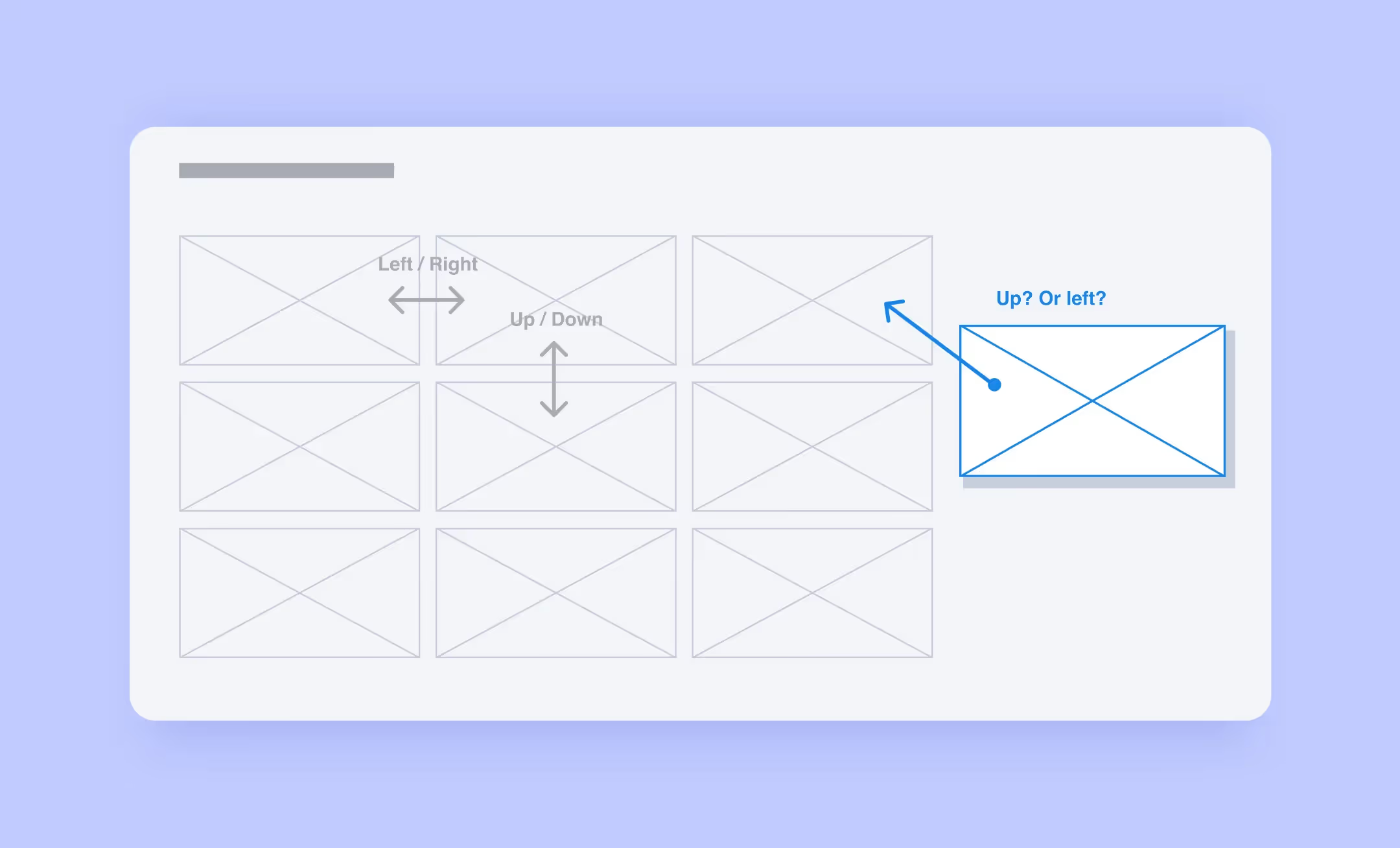
As a rule, the navigation via remote control is managed with these elements: vertical and horizontal navigation, return, and exit. Sometimes, a cursor, touchpad, and voice input are added, but not all devices have them.
Navigation must be simple and predictable to make it easy for a user to find their way through the app even with a simple remote control. For this reason, all the smart TV content is usually laid out on a strict rectangular grid.
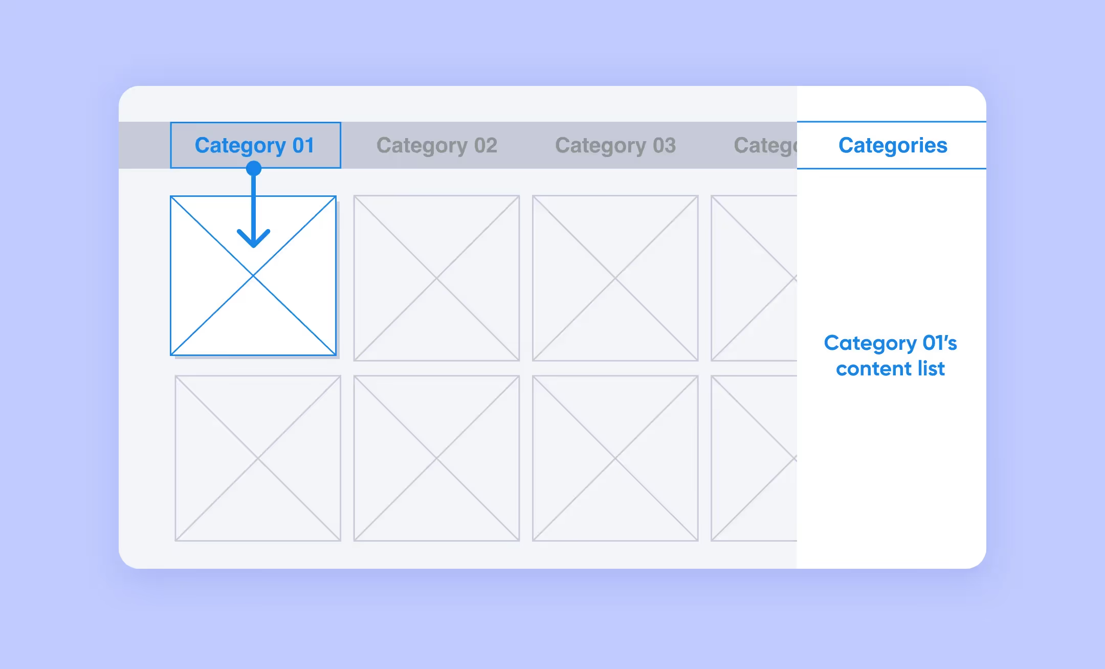
💡If your app has features with complex control, you can cheat and transfer navigation to a smartphone or desktop
In our case, it was impossible to manage without additional devices since IPTV apps are more complex than usual streaming services. As mentioned, for our app to work, a user needs to upload a list with content links there. Trying to manage this with a five-button remote control would be a true challenge. We decided to solve this problem by linking all the devices into a single system. This way, if we change a playlist on our phone, it automatically updates on the TV.
A man in front of a TV wants to lean back and relax, not read a guide for the app users. Complex screen mockups and control elements with unclear functions confuse users. This is why a smart TV UI must be user-friendly and have clear and accessible functions with minimum navigation across different levels.
<div class="post_divider"></div>
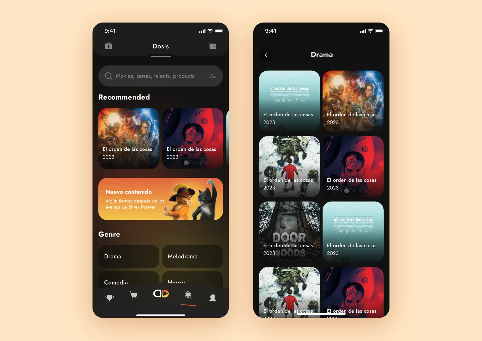
In this article, we focus on TV interfaces, but we also have experience in mobile TV UI.
For Dosis, a streaming platform featuring movies and TV series, we used a dark color scheme with a subtle gradient and one accent color — orange. This design helps users focus on catalog content. We also created filters so that users can quickly find the content they want based on genre or show cast.
<div class="post_divider"></div>
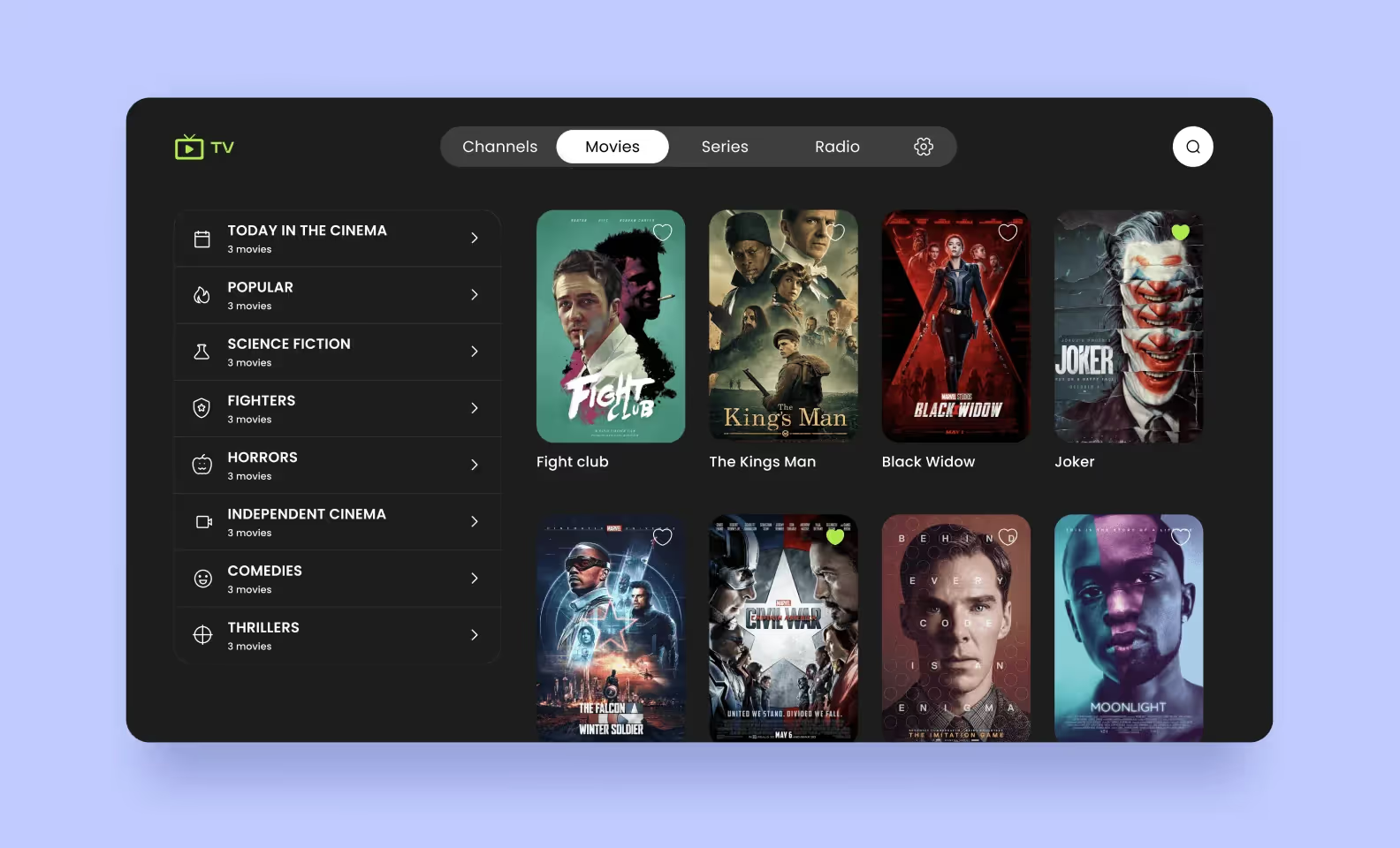
A dark theme in a TV interface is not an extra feature but a necessity. Users often watch movies and series in dark rooms, and the shows themselves can be gloomy. A light UI is going to burn users’ eyes in such conditions. Trust us, we checked this.
<div class="post_divider"></div>
In our IPTV app, the dark UI creates a cinema-like atmosphere. It immerses the user in the story and enhances the viewing experience.
We chose the Roboto font for its clean letterforms and multiple weights. The text is easy to read on small screens and at smaller font sizes.
<div class="post_divider"></div>
Don’t forget that TV attracts quite a few people. Often, they are family members with different interests and likings. If an app contains a user’s personal info, it must be hidden on the initial screens.
For this same reason, users must be able to create their own profiles and switch between them quickly.

In their guidelines, the major producers prefer to show the most recent models with big screen sizes. But people don’t buy a new TV every two or three years like they do with smartphones. Some devices your users may have can be considered outdated.
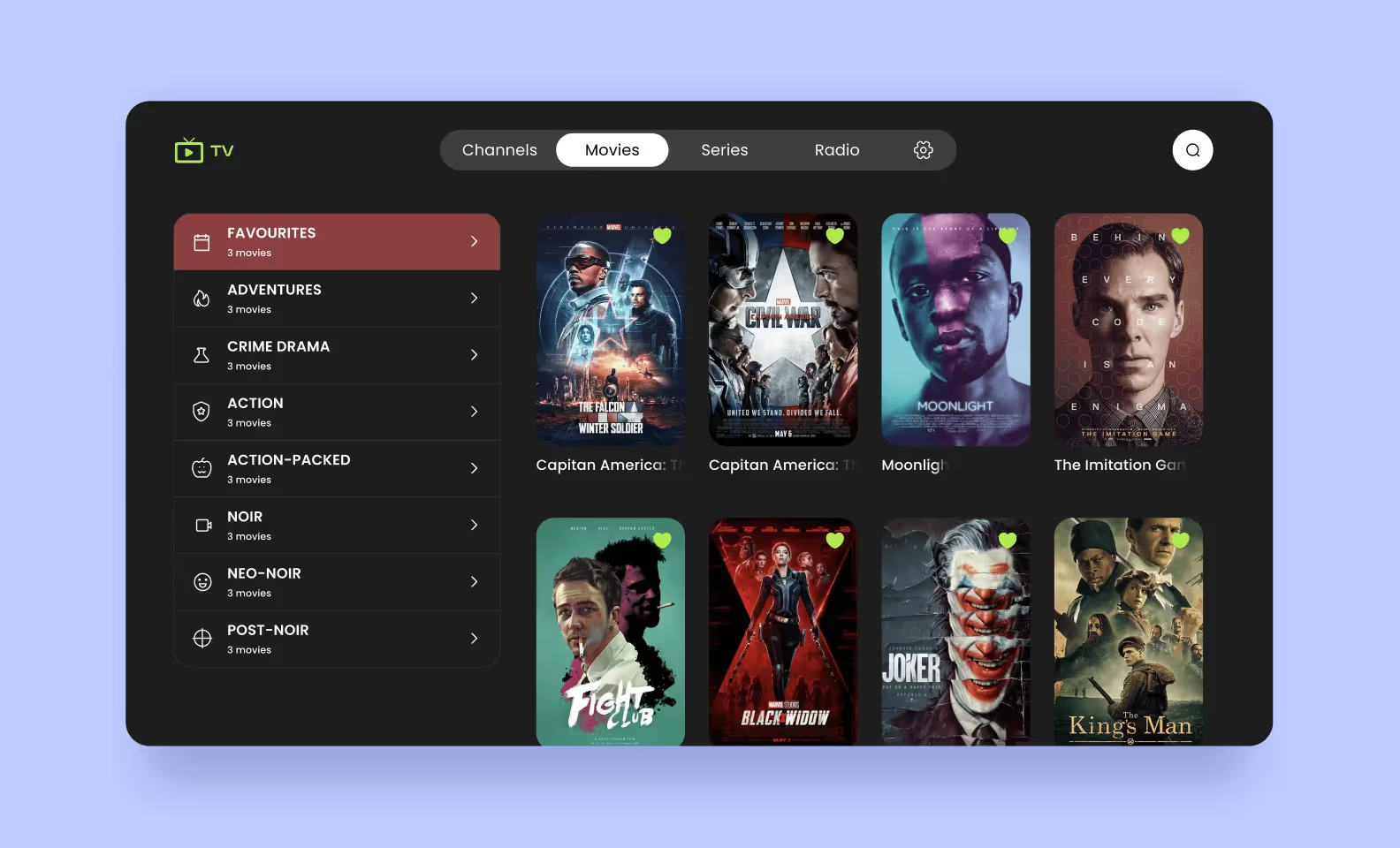
We noticed a UI peculiarity typical for old TVs. The colored stroke looked good on big objects like movie previews, but the graphic quality got much worse for small buttons and tags. It’s better to change their colors in the focus state entirely.
Even if you know the rules of making the perfect app design, they are meaningless without practical testing. Before the development starts, designers create prototypes to mimic the final product and test the design’s viability.
If any flaws are found, try to fix them at the prototype stage. Changing the design, when the development is finished, can be rather painful and costly. Not to mention that they postpone the release.
Here are three different kinds of prototypes to refine the design of your TV application.
When used: early stages of the project to prove the concept
Lo-fi prototypes, or wireframes, are the first static drafts of the smart TV app. Designers make them to quickly validate the basic structure and navigation patterns of the app.
These prototypes typically look like black-and-white sketches with simple figures instead of real content. This has a reason: clients can focus on the user flow without thinking about visual presentation. After discussing the lo-fi prototype with the client, designers make the necessary design adjustments and start to add detail.
When used: mid-stage development to refine specific elements of the design
Mid-fidelity prototypes add more detail and functionality to the lo-fi version. They help assess how users engage with specific features. Unlike lo-fi prototypes, they are clickable and contain core visual elements and interactions for the main action steps.
When used: the final stage of development to discuss and test complicated parts of the app
High-fidelity prototypes present a near-final version of the user interface. They have detailed visuals, interactions, and realistic data to show how the actual smart TV application will look and feel.
With a hi-fi prototype, you can evaluate even the most complicated functions. For example, you can test the responsiveness of gestures and voice commands, vivid focus state functioning, or the way the D-pad on the remote interacts with your app.
Of course, it depends on your project and budget.
Lo-fi versions need more detail for comprehensive solution testing, so they can’t be the only ones you use. On the other hand, hi-fi prototypes are often too costly and time-consuming to develop. Most projects usually require mid-fi prototypes, as they provide a compromise between time, cost, and the level of detail.
Like any digital product, smart TV apps have their specifics. By knowing the nuances of creating TV interfaces, you’ll make the hard work of building an app much easier.
A skilled development agency knows how to translate UI/UX principles into practical solutions. At Purrweb, we specialize in creating user-friendly smart TV apps for Apple TV, Tizen, WebOS, and Android TV. Our team does everything to create a flawless app that meets the client’s needs.
Ready to create your smart TV app?<a class="blog-modal_opener">Fill in the form</a>, and let’s make it happen!