On the example of the Clearstep company (formerly Lytic.Health), Purrweb Managing partner, Alexandr Shulgin, explained how to spend $1.5K and just a couple of weeks on app design that has the potential to become Uber in healthcare.
Design and production companies usually avoid working with first-time entrepreneurs and small businesses: both happen to ask for too much without giving much. Despite this harsh reality, Purrweb, an agency that specializes in healthcare app development, claims that little budget doesn’t necessarily mean poor outcome. If the product team clearly understands clients’ pain points and builds working processes around their requirements — that’s a win-win.
From the first meeting to task setting in just 30 minutes
In 2017, two students, Bilal Naved and Adeel Malik came to us. Before they founded Clearstep, a very perspective IT-company that streamlines communication between doctors and patients, there was nothing but a project idea and $1500. Although this budget was incomparable with the average MVP budget, we decided to get to know them better.
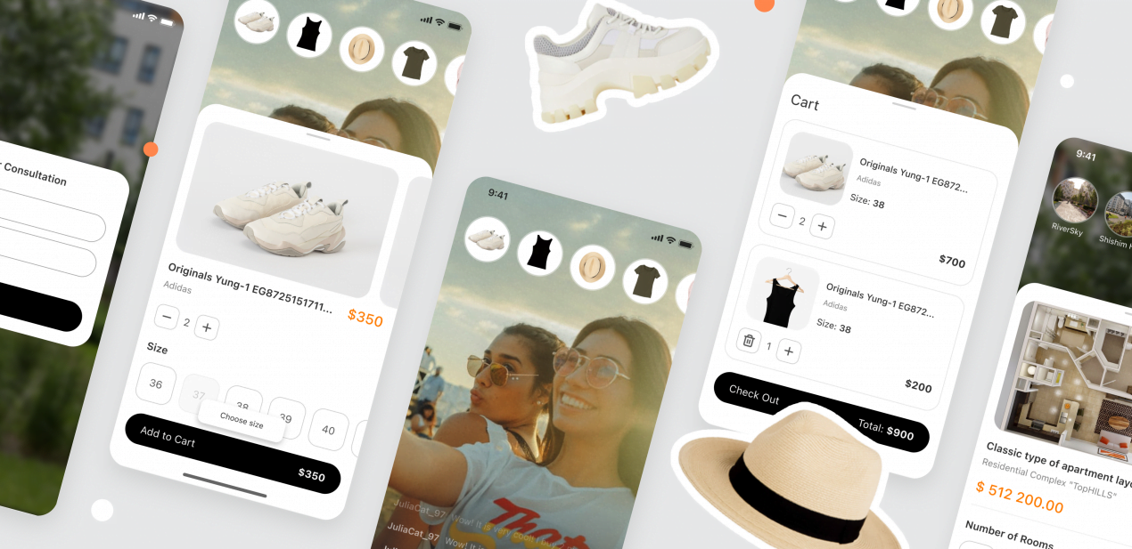
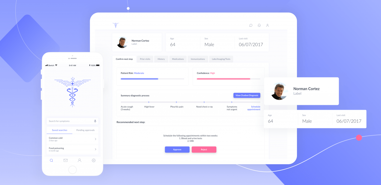
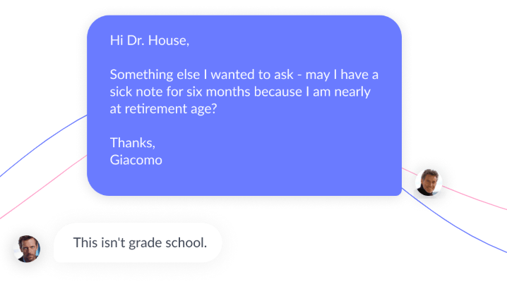
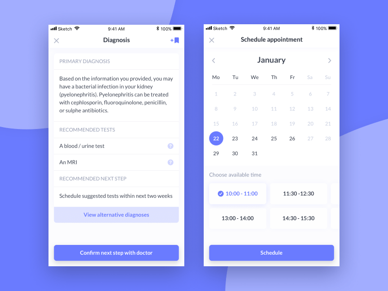
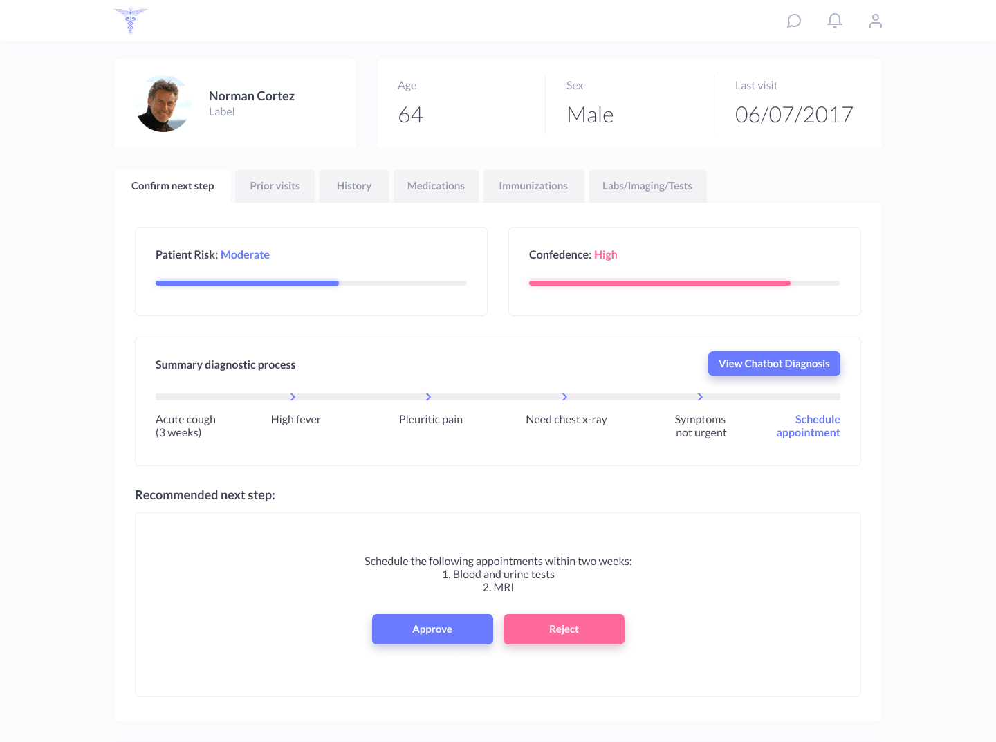
Their project idea was the following: when people start worrying about health, they write down all the symptoms in the app, then chatbot asks them some clarifying questions and provides hints on the causes of feeling sick. Right after that, they get recommendations about analyses to undergo and the ability to schedule appointments with the doctor based on the preliminary diagnoses.
Founders mainly wanted to attract initial funds, so rather than developing a working app version, we proposed them to opt for a clickable prototype. Why? Because getting the idea prototyped would help them illustrate core app mechanics and basic user scenarios, understand the way the app will look like in future. Investors heavily rely on impressive designs, so the latter was crucial.
Once we agreed on the outcome, we needed to gather initial data we could put into work. At Purrweb, we never ask clients to fill out huge briefs: instead, we propose them answering just 2-3 questions during a quick video call. It gives us a better understanding of the project idea and the client’s goals. To launch the working process, all the details we need are the product concept, key competitors’ names, and visual references.
Filling out briefs with endless questions sucks even for big companies. As for startups — this is just a waste of time. Early-stage founders have nothing but the idea and a strong desire to bring it to life asap — along with this, most of them barely know the answers to “What is your target audience?” or “What are your core values and brand mission?” Answers to all these questions are just founders’ hypotheses that should be validated — there’s no sense in using them as the basis for “well-thought-out” designs.
Without proper research, there’s a risk that a healthcare app UI design concept turns out to be wrong. In the early stages, it’s important to know that your main targets are investors. If they fall in love with the concept, you’ll be able to test out and refine the rest.
This is exactly what happened to Clearstep: founders initially defined targets as young, technologically savvy, and health-conscious individuals. Knowing this allowed us to come up with the main app features and start implementing the design concept. We’ll tell you more about this later, right now let’s consider the next working stage in more detail.
From brief to design concept within 2 days
When dealing with clients, most product companies prefer sticking to the traditional approach: first, come briefs, then mood boards, then prototypes and, thank God, finally comes the design (UI/UX). We initially used the same approach, but then it turned out that this process has a systematic error. The biggest disadvantage was that the main conflicts and unproductive debates occurred after the biggest part of the work was already done. Subjective discussions were time-consuming, sometimes neither mood boards nor references helped us meet the client’s expectations. We began to experiment: alongside with mood boards, we started sharing separate parts of “done” designs. These “already designed” elements gradually formed several app screens: we used them to demonstrate the final “done design” version.
Such an innovative strategy has led us to drastic changes in working processes. Aligning the team around the client’s vision wasn’t that time-consuming anymore, we started getting meaningful feedback right away, there was no need to worry about “out of nowhere” weird design requirements occurring after a few months of working with the client. In case we failed to sync our visions either the first or the second time, we fell apart on a good note. Turned out that clients also found this working methodology very helpful: getting started with design concepts resulted in more trusting relationships with the team and boosted their motivation to get the job done.
Today coming up with the design concept — is the meaningful stage of the entire designing process. So, we have to do everything in a very qualitative, beautiful and quick way. By saying “quick” we mean in less than a week.
As for Clearstep, we came up with the design concept within two days — and succeeded on the first try. Once the founders check out the first app screens, they accepted them all without asking to change anything.
Key principles of designing a truly scalable project
When creating design-concepts, the main principles we follow are:
1. Don’t reinvent the wheel
This refers to design elements, product interfaces, and user scenarios. At this stage, there’s no need to craft a very unique design. It won’t become your key advantage — most likely it will just distract both users and investors from the core app mechanics.
At the design-concept stage, implementing a visually-attractive and viable “Frankenstein monster” that you can rebuild or adapt in the future — this is key.
2. Follow trends
Knowing UI/UX trends is quite important for all designers, but when it comes to design-concepts this skill becomes super important. Due to UI/UX experience and knowledge of the best design practices, it’s possible to craft product designs that look attractive and clear for both investors and users.
3. Knowing the don’ts
Experts and IT-leaders have already written tons of articles on how to craft perfect interface designs. Be careful and don’t blindly follow everything they write about. Just check out this example: both Facebook and Instagram have design “flaws” that freak the hell out. But you know what? People have already got used to them. These flaws somehow became “intuitive” and other apps have adopted them. The designer’s responsibility is to distinguish questionable UX-design patterns from mistakes that just ruin the user experience.
The above said just proves the importance of following the trends: chasing perfection matters only after establishing loyalty. Loyal users are usually open for innovations and willing to talk — because they want to, not because they have to.
From theory to practice: how we executed healthcare app design concept
We didn’t have plenty of information about the targets, however, analyzing the hottest trends and the main competitors allowed us to understand that the interface should be friendly and not medical.
So, following the principles above, we’ve crafted a healthcare app design concept: opted for a very minimalistic style, picked trendy purple as the main color.
To make it look user-friendly, we made buttons and forms round-cornered, used clear single-color icons and a very calm, classic font. We needed to keep the focus mainly on the product idea and core mechanics, so rather than fussing over tiny details, we decided to leave a lot of “breathing” space.
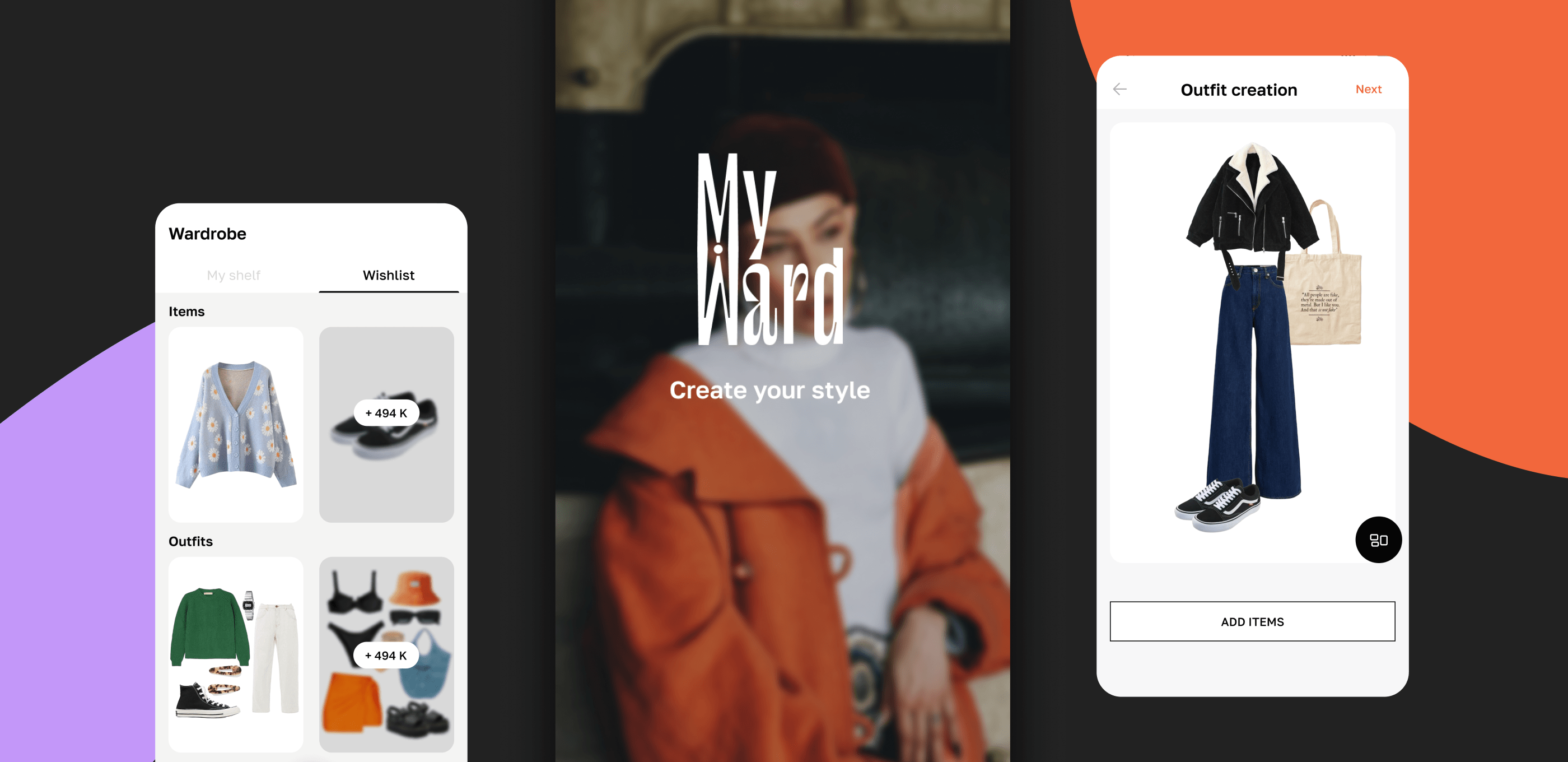
Eventually, we reached the initial goal. The finished healthcare app design-concept looked much like lifestyle apps target audience was used to.
From concept to clickable prototype in 1.5 weeks
Next, we needed to build a clickable prototype. This stage is entirely about crafting lacking screens, working through user scenarios.
Designing screens is a piece of cake: once we agreed on the design-concept, everything usually goes smoothly. We basically split user scenarios into 2 groups: standard (log in, password recovery, etc) and unique. When it comes to standard user scenarios, using big competitors and market giants as a reference is the best thing to do.
“Using competitors as a reference” — in theory, this sounds pretty easy, however, most founders ignore competitors’ experience — this generally causes higher bounce rates. Let’s say, your competitor has a very expensive technology, like, online-chat for gaining user feedback. Rather than executing a cheaper and technologically-simple chat alternative, startuppers tend to opt for phone calls, which is painful these days for regular users and leads to zero feedback in the result.
For startuppers, being actively involved in the project work is a real must. To keep clients informed, we prefer sticking to an iterative approach and divide the entire project into subtasks, then schedule client meetings (every 2 days) and present the work done during the iteration. This approach brings two main benefits. First, to-the-point change requests from clients. Second, no ridiculous requests like “Design is pretty good, but let’s create a new one!” at the end of the UI/UX stage.
One more life hack that eases both clients’ and product teams’ lives: less text, more visuals. In this regard, mind maps, roadmaps, sketches, and storyboards are super helpful.
At the end of this stage, we deliver a stunning clickable prototype created in Marvel (or in any of its alternatives). Such a prototype is perfect for sharing on conferences, with venture capitalists and investors. In addition to that, some founders create a short video demo — which might also be a very good idea!
There were several proofs that this approach has the right to live. We shared the design case on Behance and gained tons of positive feedback. Besides that, we got rewards and recognition from the design community and healthcare industry clients.
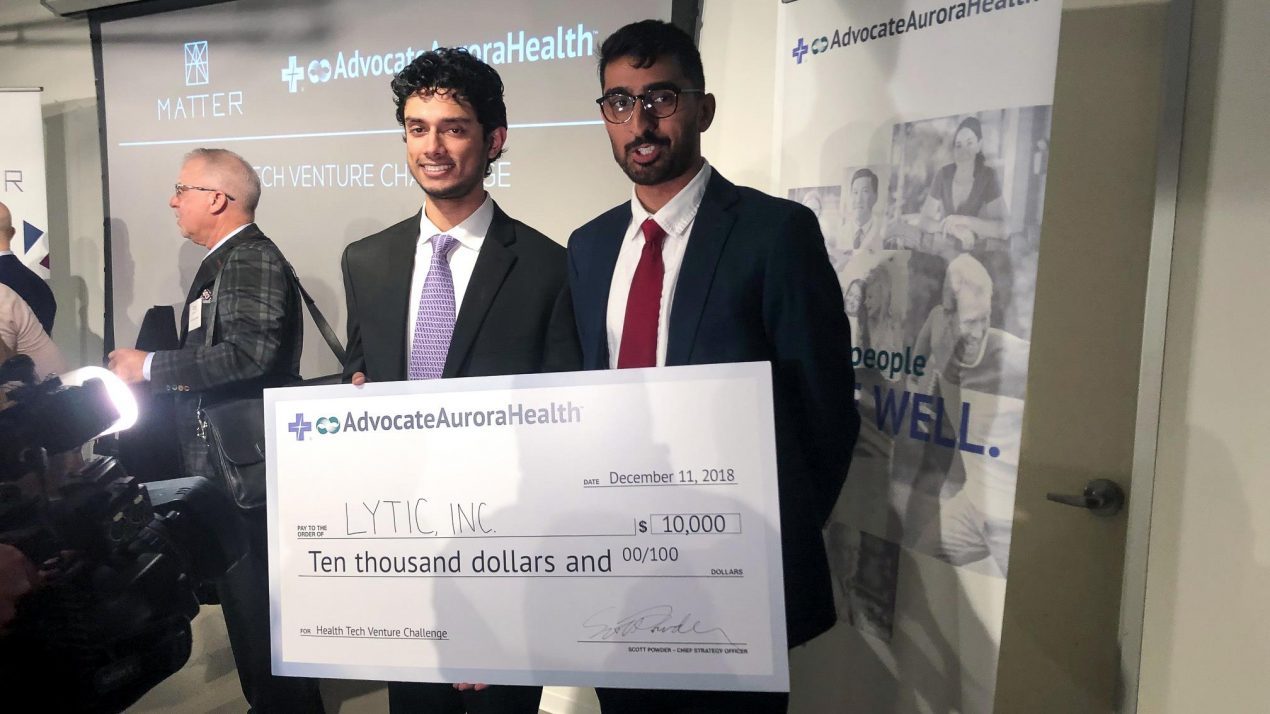
After getting a clickable prototype designed, Bilal Naved and Adeel Malik decided to build the authority in the US healthcare market and eventually raised $400K. Their success was mainly due to a well-designed idea. Because a beautiful prototype isn’t only a sign of good taste, it also means commitment, diligence and a strong motivation to improve the quality of healthcare services.
First founders’ successes
To take their business idea to the next level, founders decided to pick a new name. It is worth noting that general stylistics, color pallette, and specific design-elements stayed the same as we initially designed.