


In 2020, we created an app for online workouts. It wasn’t just a set of ready-made programs — with the app users being able to train online with a coach. We couldn’t avoid self-analysis and changes in internal processes, but this fairytale has a happy ending and swift storyline — we managed to finish it in just a quarter. My name is Kristina Spiridonova, an account manager at Purrweb, and I’m going to tell you how we learned to estimate projects accurately, which made our lives easier.
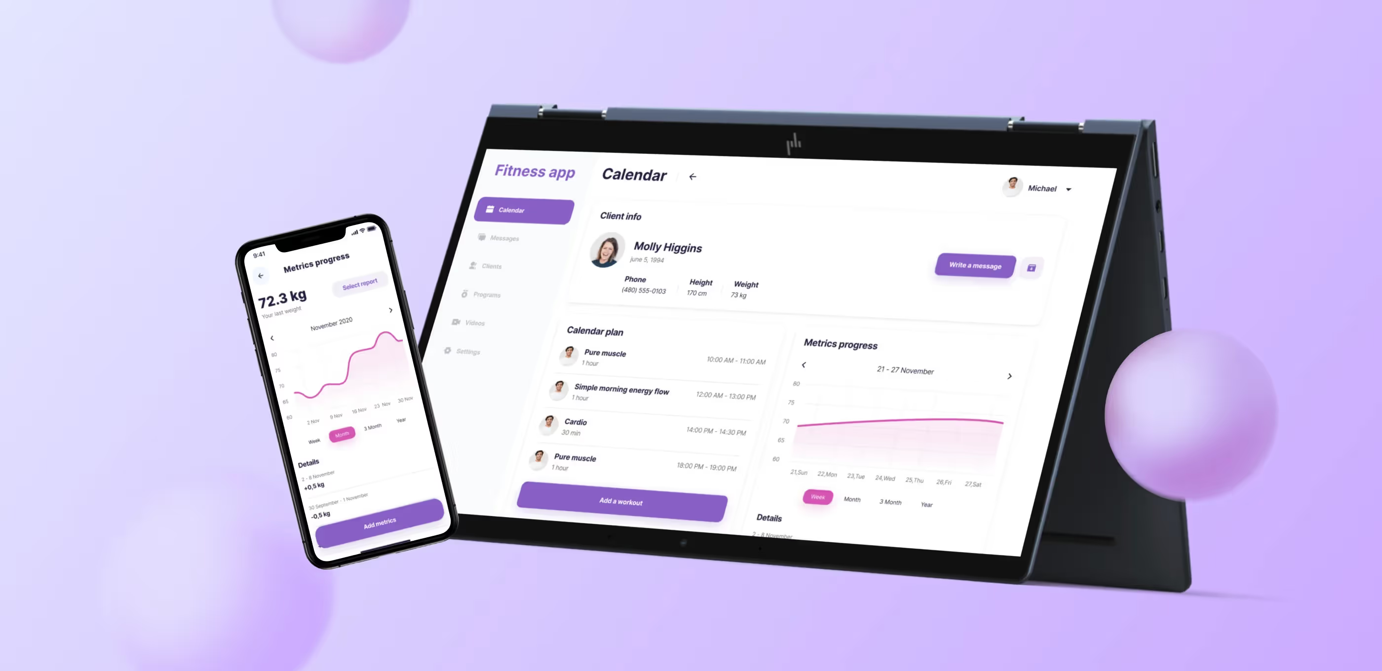
Our clients — Tyler and Ben — are fitness-savvy guys. In November 2020, they requested that we make a fitness mobile app that would connect coaches with their clients. It was supposed to work this way in the app: clients can find a new coach or train with coaches who earlier worked with them in the gym.
The clients knew that we specialize in MVPs and we already had experience with fitness mobile app development — project FitForce.com. They liked the project and wanted to get something similar. We agreed on terms and started working. Our team consisted of nine specialists.
We developed FitnessApp from scratch. Our clients already had a website, but they were not satisfied with it. It was hard to organize the process of training and connecting coaches with clients through the website, but an app is a totally different matter.
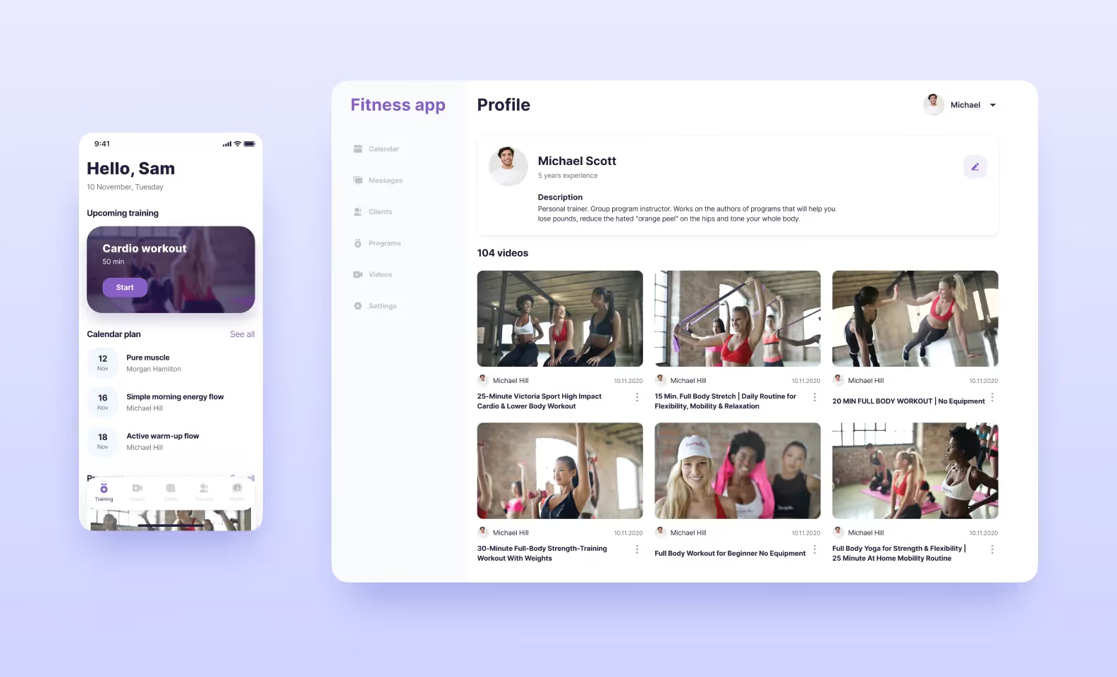
To stay within the budget, we decided to split the project into two parts. The first part was a web version of the platform for coaches, and the second one — a mobile version for clients. In other words, the functionality differs for each role since we couldn’t do one version for both sides. That was the best use of resources.
And now, the most interesting part. I’ll tell you how we estimated the project in 1,200 hours, but then we realized that we overrated our forces but underrated the project.
In the beginning, we estimated the project to have all the features that should be included in the MVP — it turned out to be 1,200 hours. The number seemed real, and the clients were fine with the timeframes. We signed the documents and started off.
Developers and designers worked in parallel, and when the design was finished we realized that the quote was inaccurate — we needed more time. Our CTO, Sergey Ponomarev, found some risky moments in the quote and summed up that we needed 2,000 hours.
That’s why we scoped out some features in the scope and agreed to do them as separate tasks. The client accepted our arguments — after the design was finished, the situation became \clearer. Besides, the design adds extra features here and there, which is why deadlines increase unavoidably.
We continued to work with realistic timeframes and clear deadlines. And improved the estimation process for the future. Now, we have two rules:
We discussed with the client all the features they certainly wanted to see in both app versions. For the coach’s side, these are:
For the client’s side, these are:
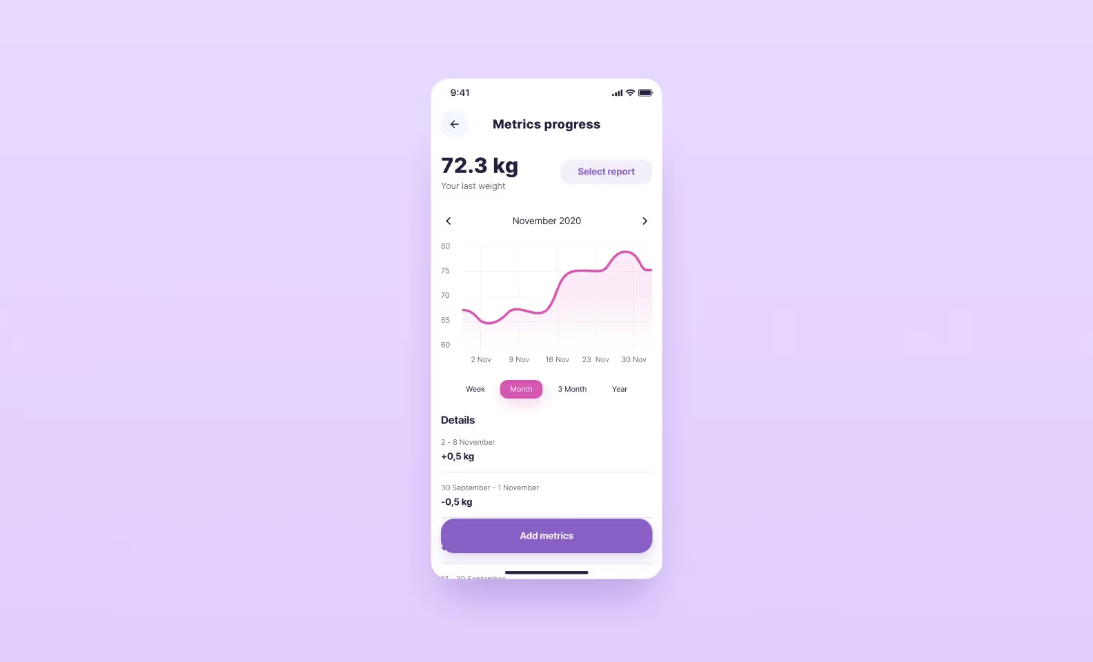
Initially, we wanted to add a motivation system in the MVP: users fill in all the metrics, see the progress, and get happy (or upset). But then we thought: do the users pay coaches, and do they need to monitor and do data entry manually? That’s why we decided to get back to the progress diagram later.
Despite the fact that our client made mention of our previous sports project Fitforce.com, we decided not to copy it but use it as a reference. Besides, when we started working on the project, Fitforce was already a little old-fashioned.
In the design stage, we called our clients two times a week and showed them intermediate progress. We were getting feedback fast and making some edits right away.
What’s the difference between this project and Fitforce? The devil is in the details:
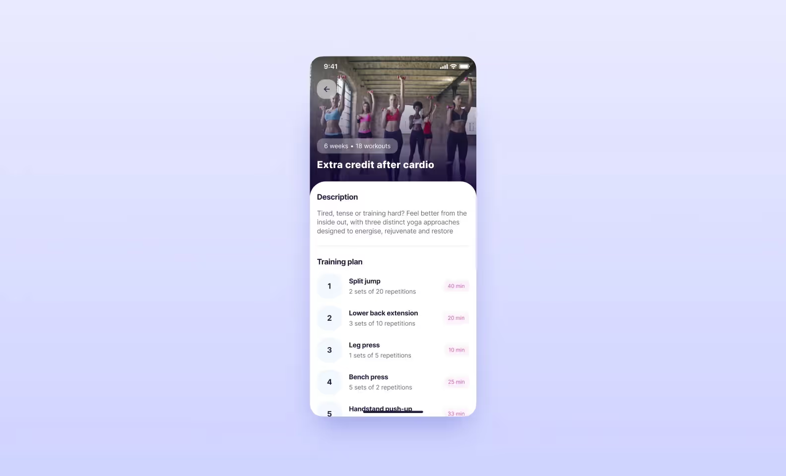
Sometimes, in the design stage, it happens that a designer prepares all the screens, the client approves everything, and we hand it off to developers. But actually, it is hard to develop everything exactly as the designer projected. Some changes appear, and we have to adjust during the course of the project. We created a checklist of important things that can be forgotten in the design stage. At the start of the project, the developer checks that everything is done.
We didn’t want to spend much time on bug testing because we needed to meet the ambitious 1,200 hours. We planned our work this way:
This way, every sprint was ready for demonstration to the client straight after its realization, and we didn’t have to spend eternity fixing bugs at the end of the project. Thanks to this, we managed to finish in three months.
The development was organized this way:
We decided to choose typescript as a programming language. Typescript is strongly typed, that’s why developers have less freedom of action, which leads to fewer bugs. The mobile app was built on React Native, the web — on React, and the backend was written on Node.js using the nest.js framework — it is convenient to write isolated modules and then use it in other client’s projects if necessary. That’s our standard tech stack.
To meet the deadline, we decided to implement a part of the functionality with the help of external services. We often do it when working on MVPs to keep within budget and meet deadlines. We used:
Ready-made solutions take only one-fifth of all code. For example, you can write custom authorization and spend 25 hours on it, but with a service, you can do it in five hours.
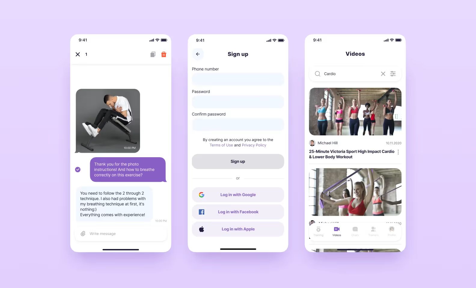
We made features that were not included in the scope of MVP and published the app in the AppStore. What did we do?
After release, we test the project with our internal team to make sure everything works well in the production stage. We have met the 1200-hour time frame although we had to carry some features out of the initial scope. However, we agreed with the client about it and could prove why these features should be realized separately. This project turned out to be a good ‘material’ for setting and improving our processes.