Need help with your project?

Oops! Something went wrong while submitting the form.


Some time ago, we at Purrweb found it a great idea to make a design concept in 16 hours: a client got a design test drive, and we had our chance to shine. Now, we spend 2.5 times more time making a concept, but the clients are still happy. The result: more valuable concepts and more design projects completed. Here’s our new process and how we’ve ended up with it.

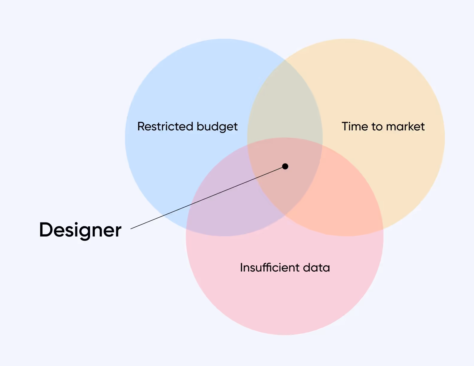
At first sight, design for a startup may look just like any website or app design. Still, our 10 years of experience prove this idea wrong.
As a result, a designer gets into a tricky situation:
We believed that design concepts were supposed to save clients’ time and demonstrate what our contribution was like. So, we devoted only 16 hours to design concepts.
Over that period, a designer had to study a client’s industry, select references, choose a scenario, and make a graphic version of 2-3 screens.
We were sure it was a win-win approach. We could show what we were capable of and get more projects. At the same time, startups could test our skills at a reasonable price. Thus, we minimized our clients’ risks plus saved their time and money. Soon enough, we learned there was another side to that approach:

Therefore, to get rid of the downsides, we decided to change the process and give more time to design concepts. Besides, we made a portfolio and built quite a reputation on the market, so our clients were ready to wait longer.
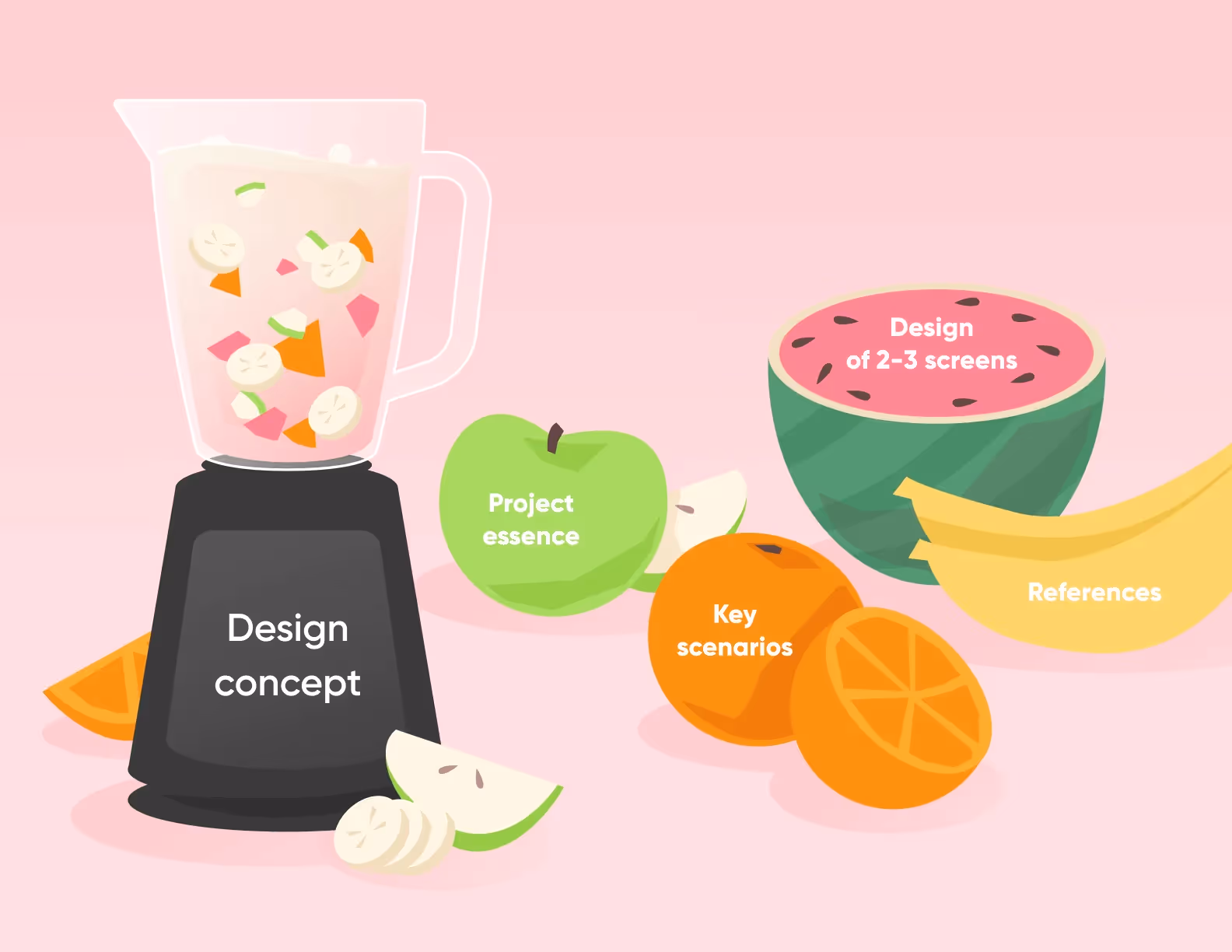
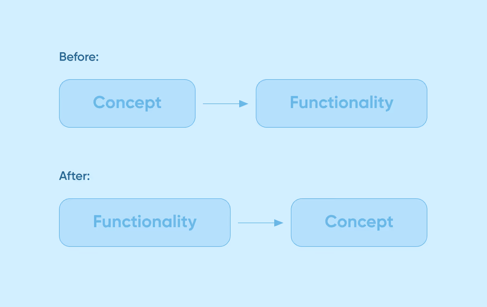
Now, we create a design concept only after we think the app functionality through. It’s the key difference of our new approach.
A fully-fledged concept takes 40 hours to complete. This time is enough for a designer to get an insight into a client’s tasks, develop an app logic, and prepare a clear presentation.
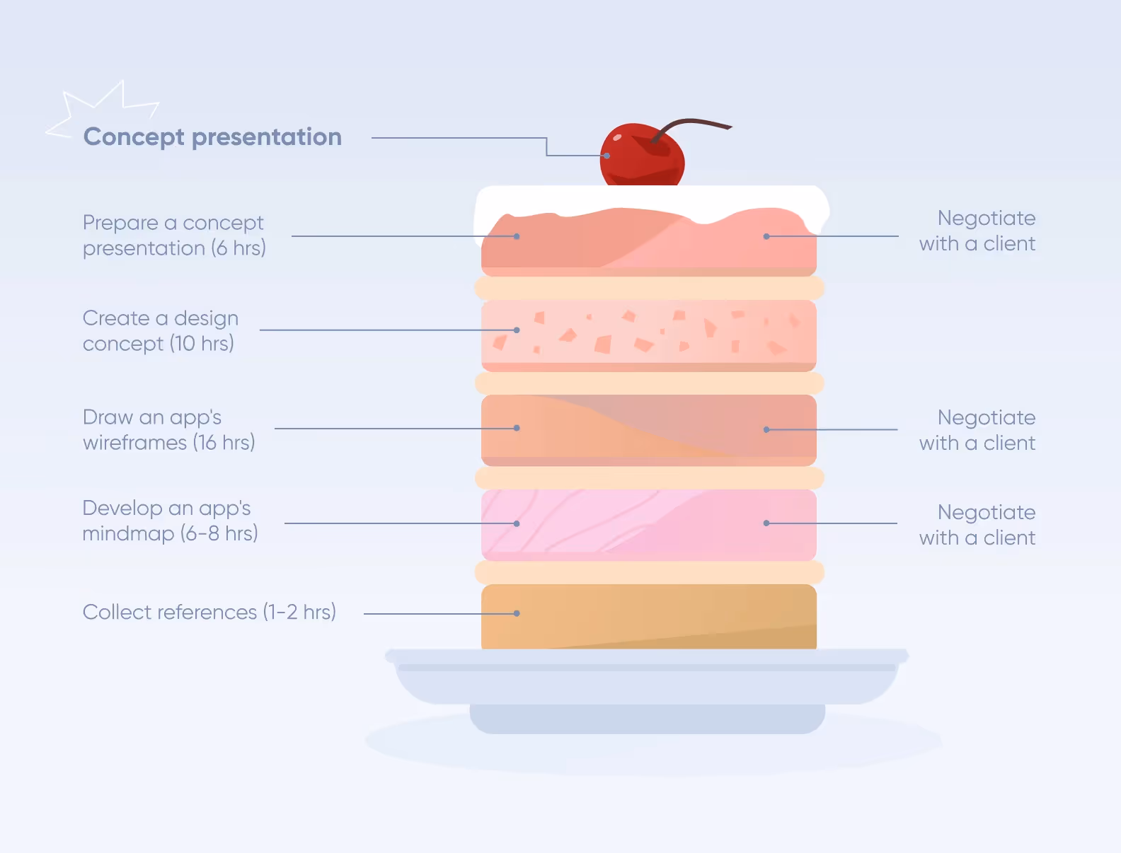
Here are the changes:

Let’s have a closer look at each stage. We will use the crypto wallet case as an example.
At a project start, a manager gives designers the project info — the app’s goals and tasks, user stories, user data, and references.
We ask our clients to provide positive and negative references that indicate our guidelines and the ideas we should stay away from. Both Dribbble guidelines and existing apps will do just nicely as such refs.
In the crypto wallet case, we got negative and positive visual references. Besides, Metamask served as a functional reference.
We also downloaded and studied other popular crypto apps — Binance, Coinbase, and Tonkeeper. This helped us avoid the competitors’ mistakes as well as take into account the best practices and patterns.
As soon as designers have explored references and seen what a client wants, it’s time to plan an app’s functionality. Functionality maps (mind maps) are perfect for this purpose. A mind map shows a scheme of product functions and the ways users will interact with them.
We use Miro to make mind maps. It offers ready-made templates, so you don’t have to draw arrows, rectangles, and other elements from scratch.
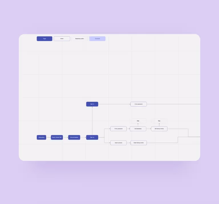
We visualize structure elements, connections, page content, and actions. For example, we used the following keys for the crypto wallet mind map:

A manager shows the finished mind map to the client to approve functionality. In the crypto wallet case, the client planned to add a marketplace and a game section, but at the design stage, they decided to exclude these functions from the MVP.
Then, designers start drawing wireframes — the B&W app screen skeletons. The main aim here is to decide on the position of the key elements on the screen.
We take an app’s functions, a user’s actions, and the required content and put it all on the screen.
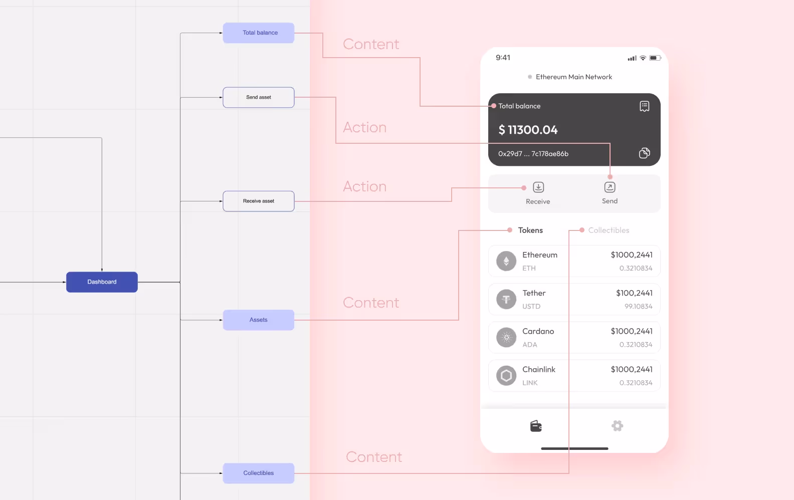
We build wireframes based on references. The main screens display the most frequent functions: a balance, a token list, and quick access to token transfer & reception.
We critically evaluate even positive references. For example, Metamask proved to have downsides:

In Metamask, the token import button is placed under the token list. We placed it above the list to make it more accessible.

In total, our designers created about 40 wireframes for the crypto wallet.
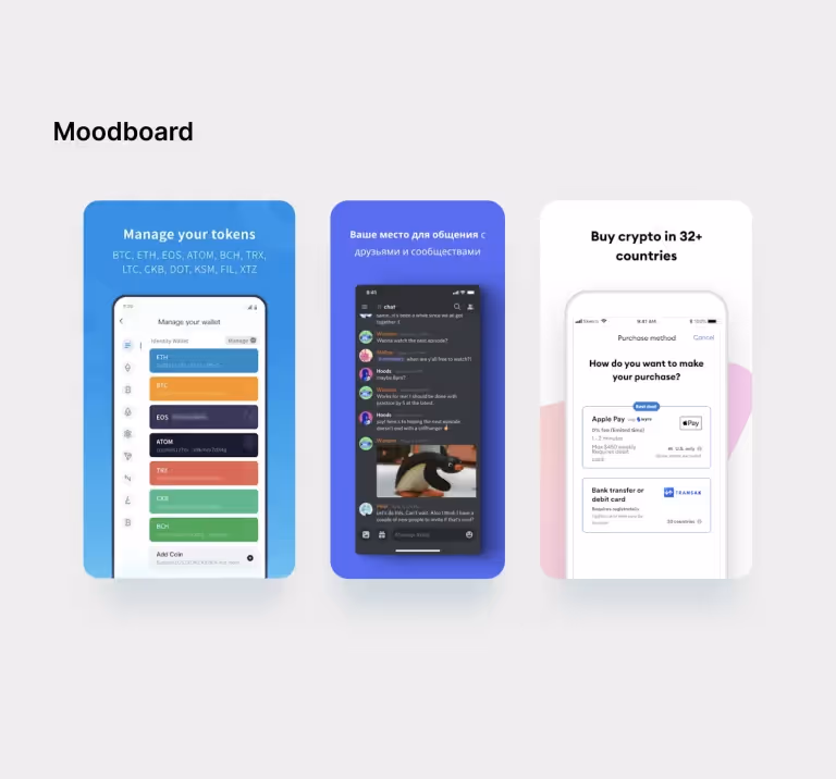
For the concept, we selected the screens that are packed with content and showcase the visual style:
The final design often differs from the wireframes — and it’s OK
We use Readymag to prepare presentations. It’s a website and lending builder with design and coworking tools. To show the result to your client, just send them the relevant link.
Presentation is a cherry on top of this process. It explains the ideas behind the design concept: why you have selected this menu option or why the button is round. Designers write texts for presentations, but a manager can help. Later, this presentation is demonstrated to investors or potential users during focus group research.
A presentation may also include:
Such a presentation is far more vivid and clearer than a few Figma screens
The crypto wallet concept presentation was successful, and our design was approved on the first try. So, it laid the basis for the other screens and UI kit — a set of key elements such as buttons, icons, and forms.
All in all, we made this design in 76 hours. We completed the other 100 screens in only 36 hours because we didn’t waste our time on corrections and approval sessions.
Sometimes, we make not only a design concept but also videos with an animated interface. This way, it’s easier to explain how some vital functions work. Besides, a dynamic presentation is more telling.
An animation example for the crypto wallet presentation
The 16-hour express concepts allowed us to give the result to a client faster. Besides, companies with insufficient portfolios can use express concepts as a marketing tool. Still, in our case, the disadvantages outweigh the advantages.
The new process takes more time: for example, it took half of the entire design process in the crypto wallet project. However, now we complete more designs, whereas with the 16-hour approach projects used to get abandoned pretty often. Our clients are more often satisfied with the result and continue to collaborate with us after the concept presentation. So, the new approach proves workable.