


Design requires much time and effort. Once a project appears on the horizon, a designer has to do research, consider user scenarios, communicate ideas, and test them all out. To achieve the best possible outcome, you cannot just skip any of those steps.
Building product designs is a huge process, so let’s start from the very beginning. At Purrweb, a UI/UX design agency for startups, all projects start with the ‘Trial contract’ stage.
A very small project with restricted time limits. It normally takes between eight to sixteen hours to get done. The core idea is to understand whether or not designers and clients look in the same direction and clearly understand each other.
This is as emotional as meeting your partner’s parents for the first time. The goal is to make them like you and not screw up.
So, yes, as a designer, your primary goal is to make a good first impression. What’s under the hood? Let’s figure this all out together!
Firstly, I try to understand what a project is all about. For that, I start bombarding a project manager with TONS of questions, go into details about the idea, and then add them all to my Kanban board. Having all this information accumulated this way helps to quickly come up with the first hand-drawn paper mockups.
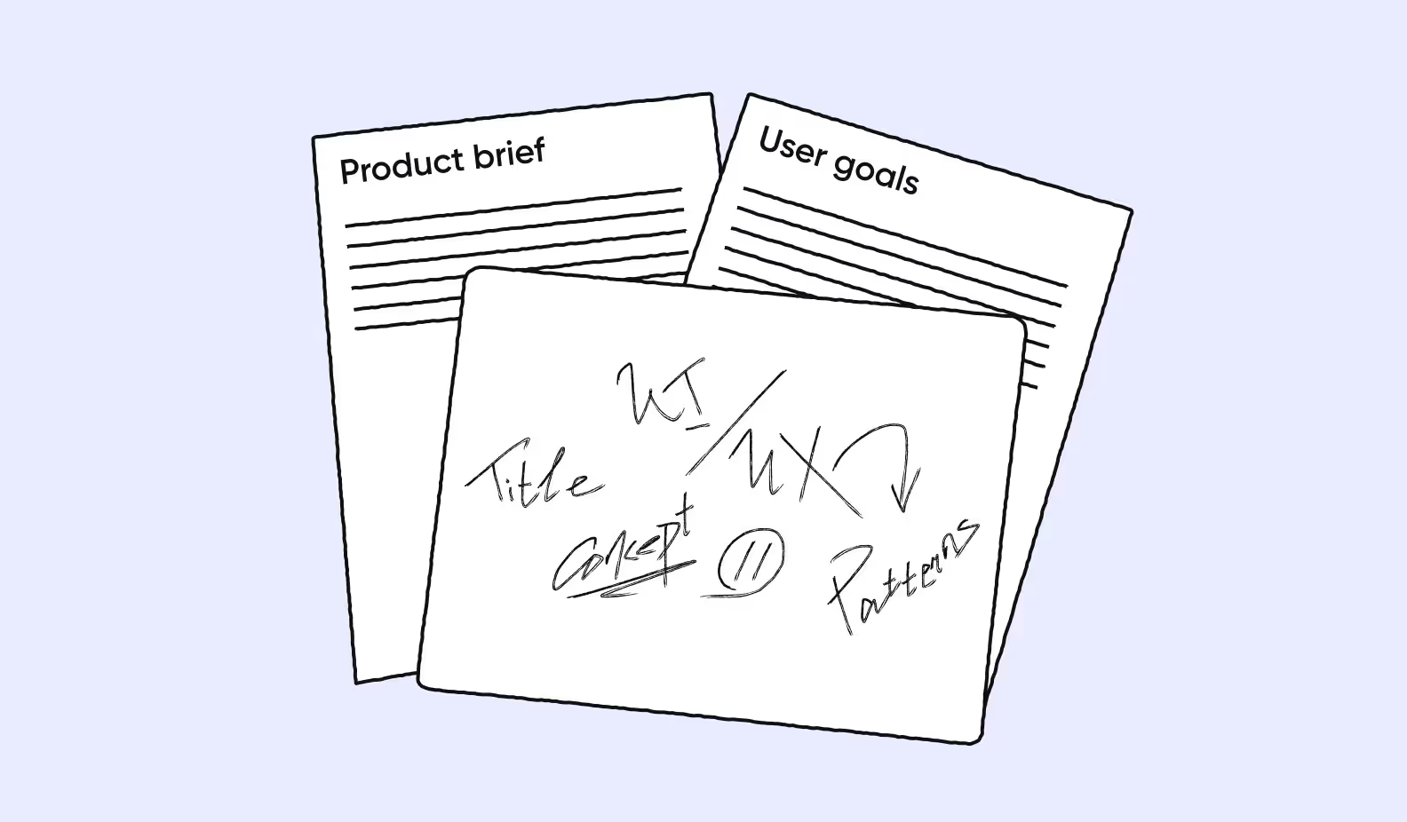
Quick sketching is superb when you need to determine the user’s key activities and interactions. It doesn’t look sexy, so this part of the work is usually NOT what clients see. However, such ‘ugly’ drawings help you quickly visualize ideas, communicate them (even if you communicate them with only yourself), and then start creating a more accurate wireframe.

It’s perfect when clients share their own visual design preferences and show services they really like in terms of UI. The designer’s goal here is to strike a balance. In some cases, all you need is to activate your listening skills and do EXACTLY what your client asks you to do. In other cases — stick to your guns or suggest alternatives. There’s a very fine line between ‘TO LISTEN’ and ‘NOT TO LISTEN’ — to know exactly what to do, a designer has to develop both design hard skills and empathy. The latter is all about the ability to listen to what people say and read between the lines.
Enough about the ‘Research’ stage. It’s time to dive deep into UI.
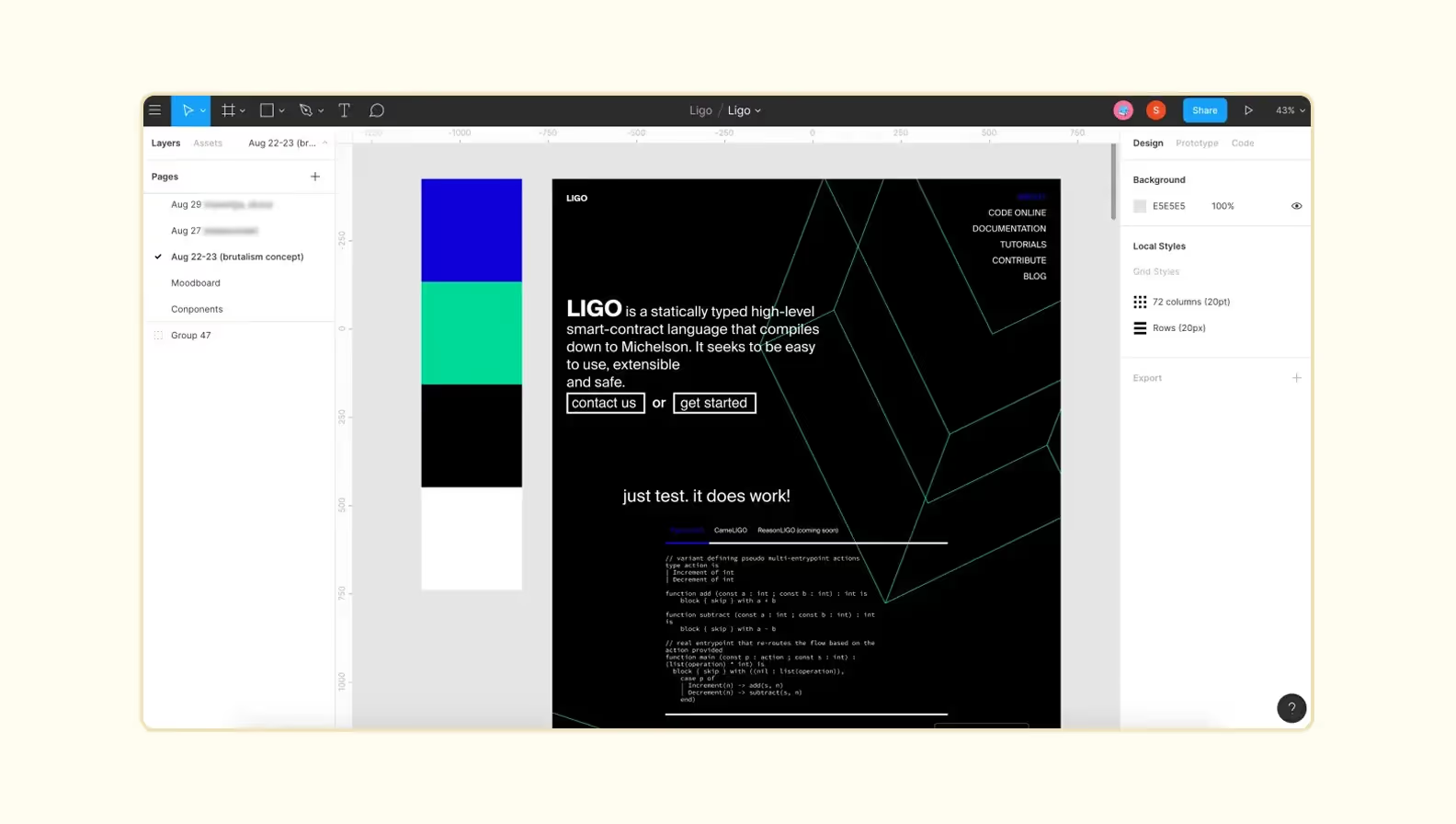
At this stage, a design concept is created. What does the term ‘design concept’ actually mean? Basically, it’s a tiny part of the entire visual design — one or two screens from the core user flow. The goal of creating a design concept is to communicate how the eventual visual design will look and feel right away.
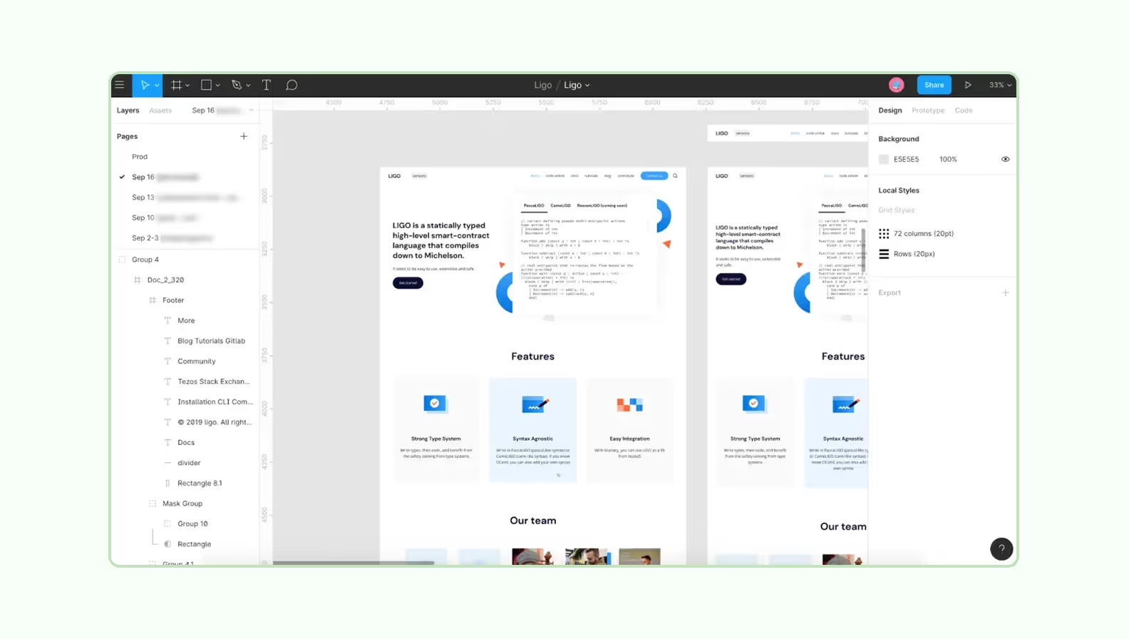
To get visual inspiration, I study competitors and visually-similar products, check the way they work, analyze search patterns, sidebars, and many more — Artboards in Figma are perfect for storing references. This research helps me clearly understand what colors, fonts, typography elements, and icons to use — below, I did the exact same thing.
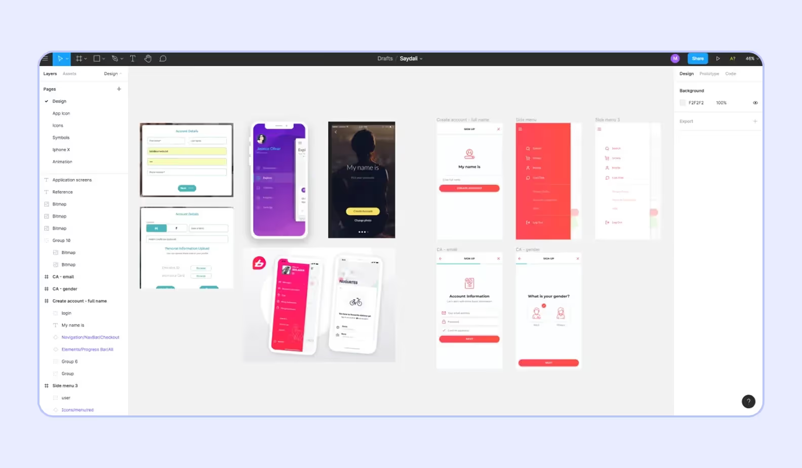
I’ve already told you that client references are super helpful when it comes to product design. Although, it doesn’t always work this way. Sometimes, there are no references at all. "Great! You can do whatever you want!" — you might say. Nah, it’s never like that. Without knowing client expectations, you end up with an absolutely sloppy and unreasoned design that brings zero value to a business or end-users.
‘Please, create something beautiful,’ doesn’t work at all. Having such a request, neither a design concept nor the entire product UI/UX can be created.
At the trial contract stage, the client might be the one who wants to change the direction.
Getting started with a design concept is a real godsend. Memorize the following:
The design concept isn’t the final stage of how your product will look and feel. The design concept is more of a litmus test for determining if the chosen direction is right for all the parties — client, designer, and users.
What are prototypes, mockups, and wireframes all about? Are they anyhow different? When to use any of them? What are their biggest pros? Our next article will give you all the answers!
Keep on reading!