Need help with your project?

Oops! Something went wrong while submitting the form.


Want to improve your product? Ask users. That's exactly what our client, the owner of a popular local pizza place, did. The delivery service was already in place, and they constantly gathered customer feedback regarding the app.At some point, there were so many ideas for improvements that they realized it was time to implement them. They turned to a team of experts to redesign the app. Warning: after reading this case, you may find yourself craving pizza!
.avif)
Panam has been operating for over ten years and is quite popular in its hometown. They have unique features that customers love, like the ability to customize a pizza with two different halves or add/remove ingredients to taste.
To make ordering their favorite dishes even more convenient, Panam Pizza launched a delivery app. They aimed to stand out from similar services by keeping up with trends and gathering user feedback — customers often suggested improvements.
Over time, they accumulated so many ideas for improvements that they decided it was time for a redesign.
The client wanted a professional look at their app to identify growth points.
Additionally, they planned to release a mobile app and wanted the web app redesign to happen simultaneously with the mobile app design. That’s where we, Purrweb, came in 🙂 We already had experience developing food delivery apps, like Talentum — a platform where you can order dishes from a personal chef.
We discussed the task with the client and thoroughly examined the existing web app. Its design was good and neat. In this case, a complete overhaul wasn’t necessary; minor tweaks would suffice to make the interface more user-friendly and straightforward.
The client provided a Figma file with the current web app design and comments on what they wanted to improve. This made the redesign requests very specific, allowing us to dive into the project quickly.

We analyzed the client’s ideas and suggested improvements to enhance the user journey:
1. Add an order сancellation button. This allows users to cancel their orders without having to call an operator if their plans change.
2. Allow users to add addresses from their personal accounts instead of returning to the main page for this.
3. Move elements closer to the screen edges: some elements (e.g., the close button) were slightly off to the left, disrupting common UX patterns.

4. Mobile version adjustments: adjust margins and add more space to ensure visual comfort.

5. Add back navigation arrows: ensure more intuitive interactions with the application.
6. Use icons or labels for inputs: help visually impaired users interact better with the interface.
These details contribute to the overall product impression. Small mistakes can leave a feeling of sloppiness and negatively impact the user experience.
The client liked our suggestions, and we moved forward.
One of the project’s tasks was to develop a design for the upcoming mobile app. We wanted to visually show the client how we envisioned the Panam Pizza mobile app and how it would differ from the web version.
We immersed ourselves in the client’s business needs, studying their wishes, current design, and web app logic. We also reflected changes for the responsive version, ensuring the website would adapt seamlessly to any device screen.
This is a crucial stage: the concept allows the client to get a clear understanding of the future design, and it helps us better grasp the client’s vision. This results in fewer revisions and approvals during the work process.
We allocated 40 hours for the design concept — by the way, in this article, we explained how we used to create concepts and why clients are happy that we spend a week on them.
We asked the client for positive and negative references — he wanted the new design to be airy, with smooth rounded edges on the icons.

We also did our own research — analyzing various food delivery apps and other services.

We used the Panam Pizza brand colors: green and yellow. These were already part of the brand so we couldn’t change them. We added gray to the palette since it can be used as an accent to highlight dish cards placed on a white background.

For the typography, we chose the Onest font. It has several letterings and reads well on different devices — we considered that people would be accessing the web app on smartphones. Onest allows for the compact placement of a lot of content without taking away space from other elements. This font has an open license which helps save the client’s budget.

Here’s what we achieved:


We used a block layout to create a simple and clear screen structure. Each block is responsible for important elements: selecting dough and pizza size, adding toppings and sauces, and comments. This helps the user avoid confusion and order exactly what they want.
The client liked the result, and there were very few revisions, for example, they suggested making the card borders a bit brighter. We took the feedback into account and moved on to the redesign.
We had to:
The updated design had to maintain the brand’s signature style and identity with a focus on user-friendly navigation and thoughtful user scenarios.
It might seem like an easy task. We just needed to update the interface a bit, compile all the design elements into a UI kit, and create the mobile design — not from scratch, since we did good preparatory work. In fact, it turned out to be more complex than we expected. But let’s take it step by step.
It might seem like there wouldn’t be many pitfalls in the user scenarios of a food delivery app. Register or log in, browse the catalog, add items to the cart, and place an order with just a few steps.
Generally, that’s true, but there are nuances. The user adds items to the cart. Next, they can choose home delivery or pickup. Or request the pizza to be delivered within a specific time frame. Or it might not matter, they’ll pick the “as soon as possible” delivery option.
The same goes for pickup — they can request the pizza to be ready by a certain time or not specify and come when they can.

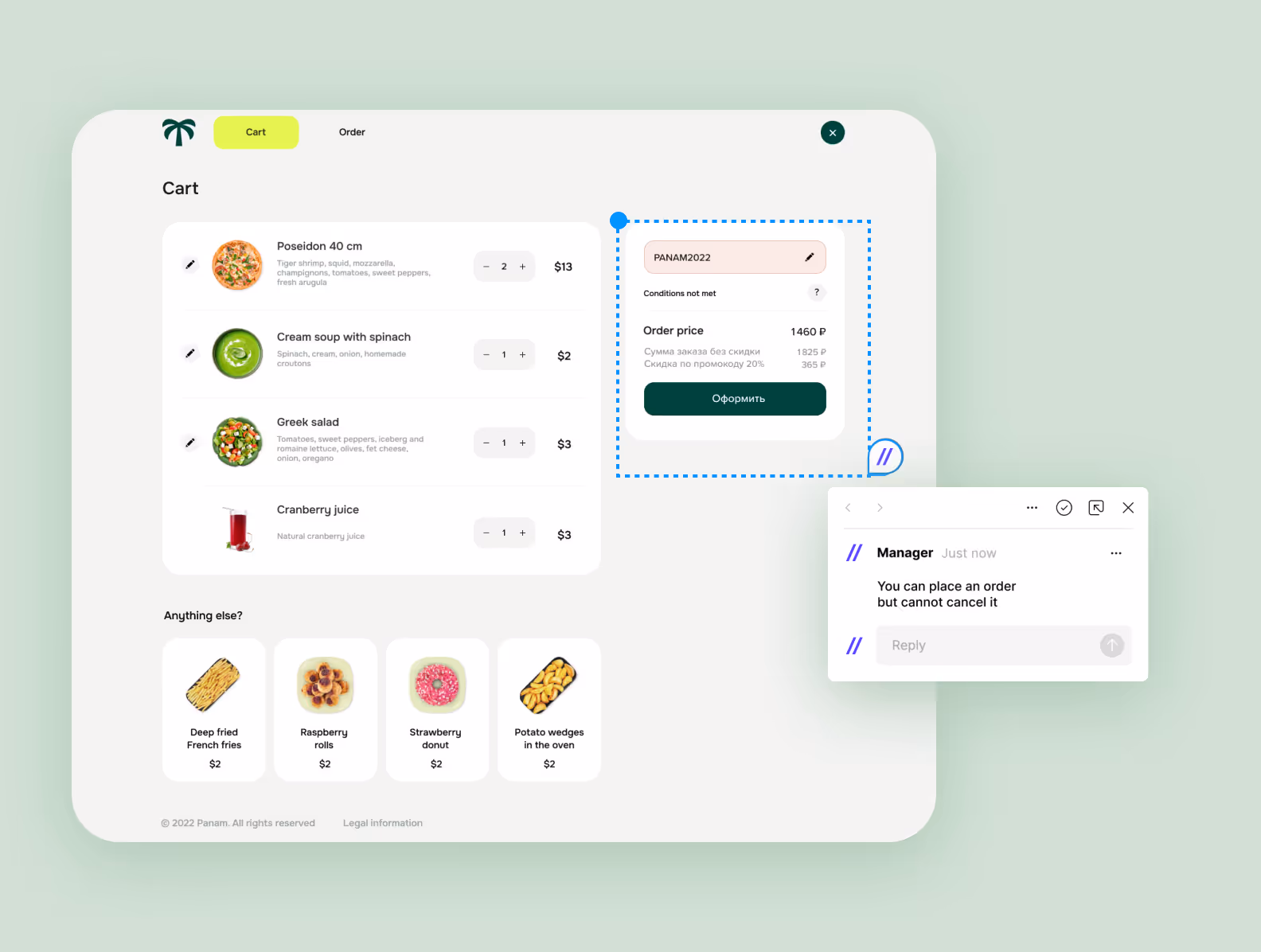
Next comes the payment. The user chooses to pay by card or cash. Sometimes, they need to change from a large bill, and it’s helpful to specify this during order placement to avoid unpleasant surprises.
The user might also have a promo code or discount, valid or expired. Sometimes, users make mistakes and enter the promo code incorrectly. Occasionally, online payment fails, and the order isn’t paid for. The app should notify the user when something goes wrong.

You get the idea: a lot can happen with delivery 🙂 An order isn’t just one scenario but a multitude of different scenarios. And designing the user flow means anticipating all of them. This was the puzzle we faced when redesigning the Panam Pizza web application.
Each scenario and step needs its own status screen, its own elements on the page, and a sequence of actions. The user should be able to navigate them as simply and intuitively as possible, or there’s a risk they won’t place the order.
We worked hard on the complex “Cart” flow but in the end, we figured it out.
This project revealed a growth area for us. We realized we needed to improve our expertise in product design, which would complement our UI/UX design experience.
The thing is, we usually work with startups and help them bring an MVP to market quickly. Designing UI/UX for an MVP has its own peculiarities, which we discussed here, but in short, it focuses on key functions and interface simplicity to test a hypothesis quickly.
Product design is also a type of UI/UX design based on usability principles and a comfortable user experience. The difference is that design teams work specifically on developing one service or application.
They know the industry well and see all the possible ways to implement a feature in the product. They also work extensively with user metrics collection and A/B testing to more accurately assess what users like and which interface decisions are the most effective.
It’s like two different chefs: one is a generalist who can cook various dishes equally well, and the other is a pizza chef who has perfected the art of making pizza 🍕

So, we had to learn on the go. We weren’t scared! We analyzed solutions from various delivery services, looked for best practices we could adapt, and prepared several screen versions to determine the most successful one.
Fortunately, our client knew the market well and shared insights about the audience and niche specifics. We once again realized that a passionate client is the best teacher.
We combined our UI/UX expertise with their product understanding and achieved the result together.
Can’t wait to show you what we ended up with!
Let’s take a look at the main screens of the Panam Pizza application.
This is what the personal account looks like. Here, delivery addresses, payment cards, and bonus/discount information are stored.

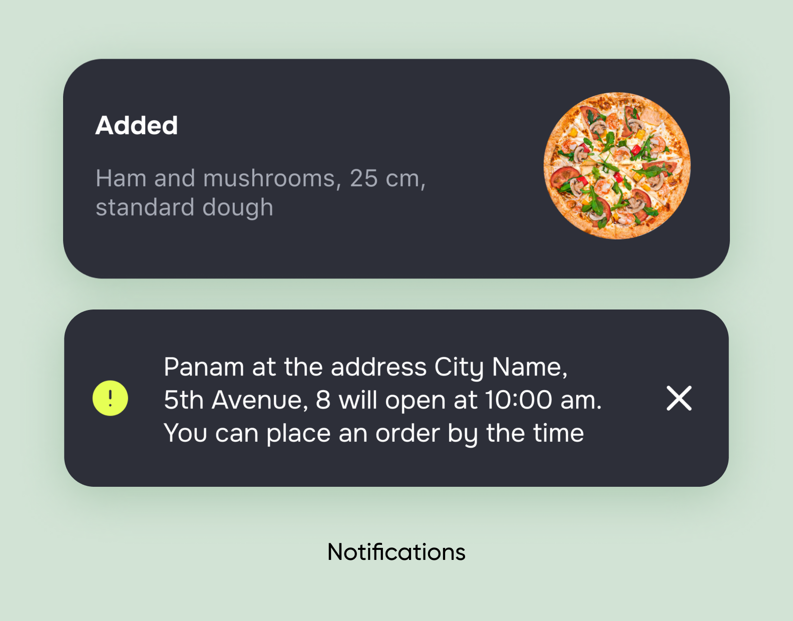
Here you can also view the order history with statuses: delivered on time or not. This is a completely new flow. If the delivery is late, the user will receive a gift with their next order.

This is what the pizza card looks like when the user makes a selection. You can customize the dish: choose the size, dough, sauce, and toppings, and change the ingredients.

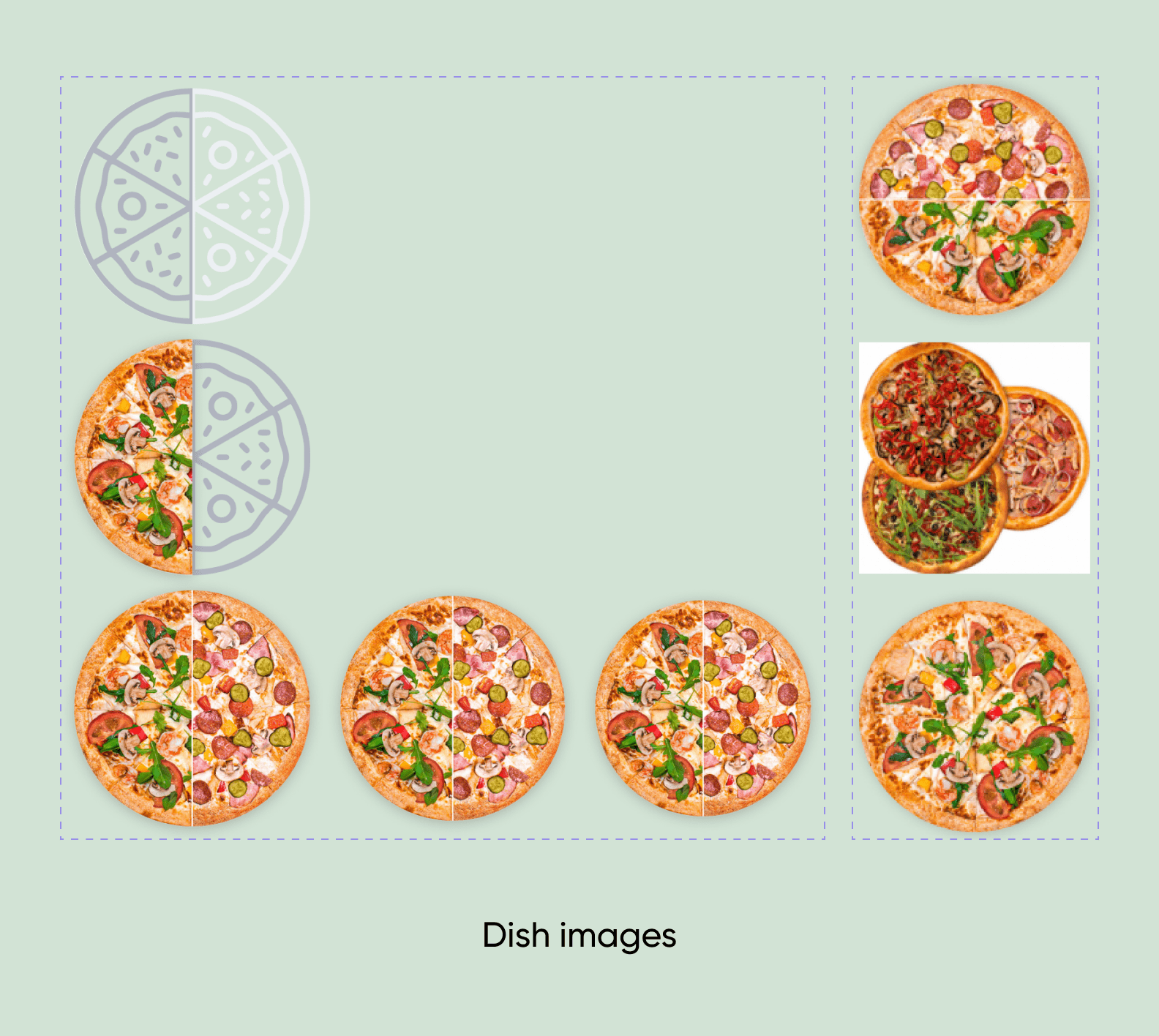
One of Panam Pizza’s features is the ability to create a pizza from halves. The designer created 18 different screens for this flow to account for all possible user steps and available options.

The composition of the halves can also be changed! The user needs to select “change ingredients”, and they’ll be taken to the corresponding screen with checkboxes.

We added the ability to track the order status on the main page — another new feature in the app. There are several statuses: order accepted, preparing, handed to delivery driver, delivered.

A UI kit is a set of ready-made components that make up the interface. A UI kit ensures that all interface elements look consistent and don’t conflict visually — designers call this “consistency.”
A UI kit is primarily for frontend developers. They don’t have to create interface components from scratch since they are already designed and ready for development — saving time and money.
By the way, in this article, we explained what a “healthy” UI kit consists of and how to properly hand off a ready UI kit to a developer or other designer.
Panam Pizza didn’t have a UI kit, which could complicate the development process. Now, typography, icons, colors, spacing, and other important interface elements are standardized.

Result
We completed the project and handed over a ready UI kit, carefully assembled in Figma, screens with new user scenarios, and redesigns of old flows.
The project is now in the client’s development stage. The web application already works with our flows and interface, and the mobile app may be released later.
If you need a redesign for your project, fill out the form to contact us. We will listen carefully, share our experience, and estimate the costs and timelines.

.svg)