Looking for a development team?
We can help with design and development of apps for businesses and startups
Zero value, Lorem Ipsum-texts, bugs, and crashes — these are evident parts of every article titled ‘App Store Submission Checklist’. Let’s see what has changed over the year and go through the non-obvious points at the review stage again.
Submitting apps to the App Store — Purrweb, an MVP development company, has tons of experience on this matter. In this App Store Submission Checklist, we propose studying out all probable pitfalls that may result in a several-weeks (or even several-months) delay of the app release. Welcome!
1. Subscription management
It’s important for the App Store team to know that when the user taps the ‘Buy’ button it won’t lead to any abrupt consequences for them. What does it mean for you? First of all, there should be no non-obvious hurdles — all text content should be concise, transparent, and easy to read.
Check out the example below: this is how the subscription screen of Talentum, a food delivery service, that we developed in Purrweb changed during the App Store submitting stage. When we sent the first build, the App Store rejected it due to the ‘blurred’ benefits for users in the description. Redesign was aimed at transparency.
The screen you see on the right went through:
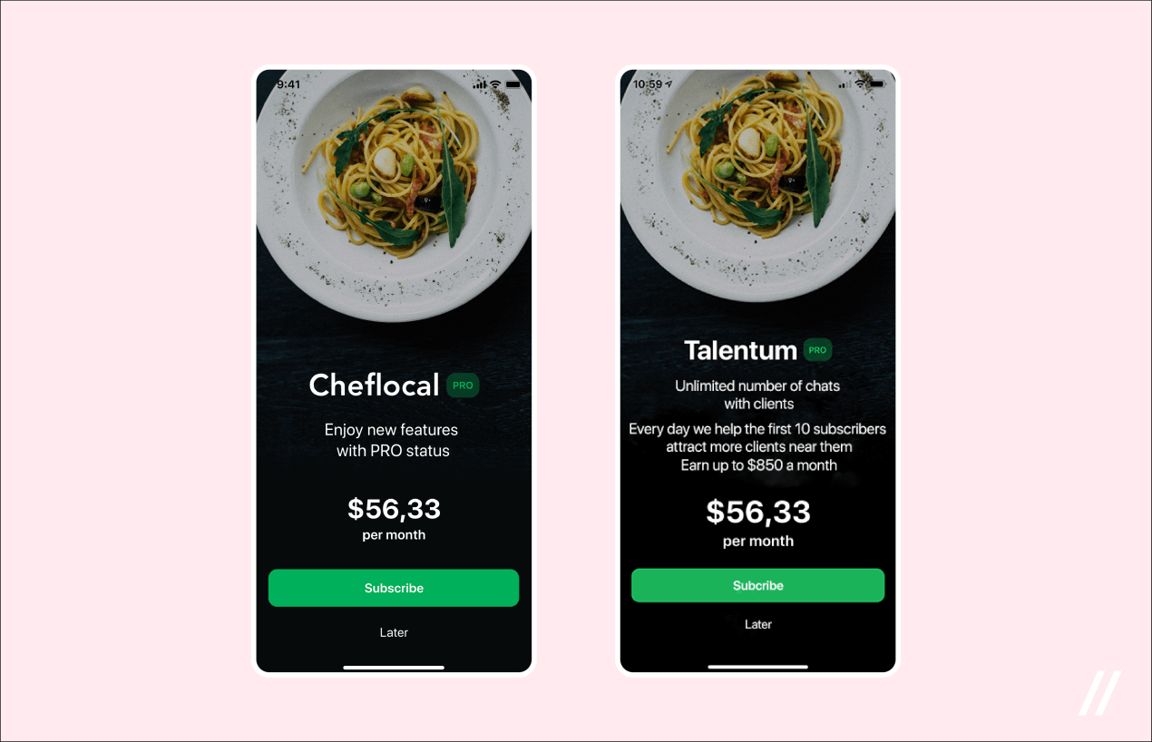 As you can see, the app’s name also changed 🙂
Another point that the App Store team pays attention to while checking subscription-based: list of available plans is to be displayed on one screen. It’s useful not only for user experience but for testers from the Apple who will surely find it hard to tap the button to see more options are people too: they also suffer from a lack of sleep, heartburn, and get into a bad mood. So do them a favor: do not make anyone fiddle around with 25 different screens to study all available plans.
Don’t forget about the ‘Subscription Management’ button — it allows the user to cancel a formerly chosen subscription or change it to a more relevant option. What’s crucial to take into account is redirection to iOS global settings.
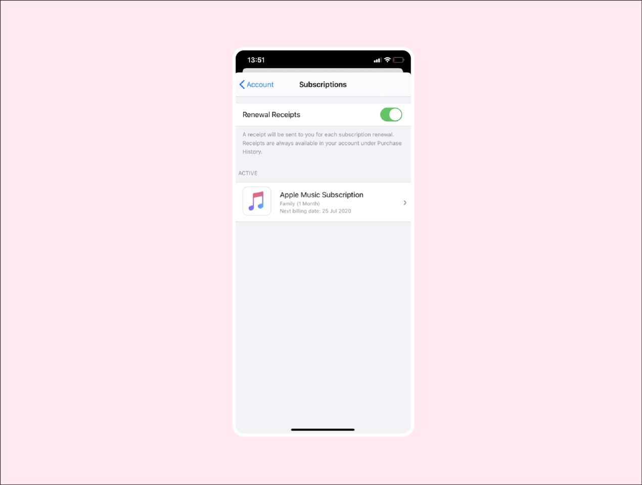 This is where we check
 where our money is going active subscriptions
It works the following way: the user taps ‘Cancel subscription’, and the app redirects them to the iOS native screen where all subscription services are stored.
2. Functionality for reporting user-generated content
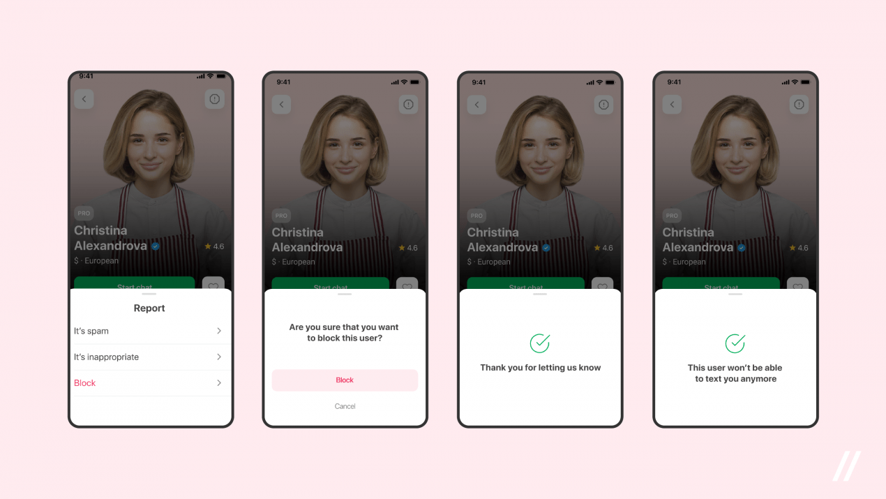
The user needs the opportunity to complain about any content that can be created or uploaded: profile pics, photos, videos, text publications (ads, for example). This means that if your app is similar to Instagram or Airbnb, you will have to make sure it has a feature allowing users and administrators to block improper materials from the very first.
We wanted our App Store Submission Checklist to be as clear as possible — a possible question from you might be something like ‘Hey, what is meant by improper materials?’ The answer is the following: any content containing a demonstration of cruelty, social minority discrimination, having a pornographic character, or advertising of illicit drugs.
Any app which includes a chat feature won’t go through without capability to block users:
3. Account for a QA engineer
Every decent App Store Submission Checklist should contain this part. The review team is not interested in spending much time and effort to log in to every app submitted to the App Store. It’s likely that making a super-minimalistic sign-up form still won’t be enough. Let us give you a little advice in this App Store Submission Checklist: take care of the Apple team and just create a testing account for them. It’s as easy as pie.
It’s more or less clear when we’re talking about registration via email. The question is: what to do when the app requires a mobile number? We usually generate a number+code bundle and hand it over to the tester — it allows them to sign in the app without taking the SMS confirmation step.
4. Screenshots can’t contain alpha channels or transparencies
No screenshots with transparency is allowed. It means that you have to turn off the alpha channel when saving the PNG.
5. Terms of Use and Privacy Policy
It may seem that the Terms of Use and Privacy Policy are formal or useless (and both aren’t worth being a part of this App Store Submission Checklist) but you can be sure that you will need to have both documents at the stage of sending the app to the review.
Although the App Store testers don’t read carefully the Policy and Terms, they always mind these documents. Preparing texts for them won’t be challenging at all — just study the similar pages of three or four competitors, run their content through adequacy, and, if necessary, adapt it to yourself. An alternative option is the generators offered by Google (just search for ‘App Terms of Use generator’ and you’ll see tons of different options).
Where should you place the Policy and Terms of Use? Both should be in the app. In addition, each document is to have a web page.
6. Explanations for why you access user data and hardware
In this App Store Submission Checklist, this should definitely be mentioned. Apple won’t let you ask the user to provide your app with access to geolocation if you need it for no good reason. They expect you to give a clear answer to the question ‘What do you do and why do you do this?’. And the answer to the second part should represent the obvious benefits for the user. Regardless of what you need: access to the user’s photos or contacts, camera, microphone, or geolocation.
 Set the reason why the app requires specific data or access to one or another service into Info.plist in XCode
7. Native payment service for subscription-based apps
Neither Stripe nor PayPal can be integrated into apps that offer non-material benefits (access to premium features, perks for gamers, or exclusive content). You’ll have to adopt Apple In-App Purchases which is the native payment system. This rule doesn’t apply to mobile online stores with real goods (pictures, sneakers, beauty products).
P.S. to enable auto-renewable subscriptions, you have to get permission from the App Store. Authorization for auto-renewal is issued only after submitting the necessary legal information about the business. For the Apple team, this is a necessary condition to weed out scammers.
8. Product specificity
This point of this App Store Submission Checklist definitely deserves your attention. If the app is related to sports bets, religion, or falls into the category ‘For kids’, be ready to undergo long negotiations with the Apple team. This may require several additional iterations. Just because the niche requires it.
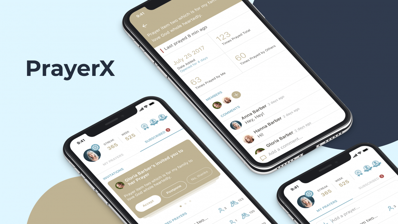 We had to undergo it: when worked on this social praying app
What else can you examine and put to work?
Is there anything else to include in this App Store Submission Checklist? Let’s look through the steps.
Start by exploring the App Store Review guidelines. You probably won’t have to make much effort. Everything is stated in plain and simple words and has exhaustive explanations. Sit down and study the document with your team — the more people read it, the less risk that you will miss something.
Once you’re done with the guidelines, study the most common App Store rejection reasons. Then open Google and look through articles on similar topics. Check the popular mistakes from the get-go to not become this ‘one more person who lost this battle’.
It’s also important to provide the App Store with all the information they are interested in. ‘The more, the better’ rule works perfectly here. Make sure testers won’t tear their hair out over not understanding what they’re working with and how the hell should they test your thing.
Below we’re explaining how to test in-app purchases for a sleep app:
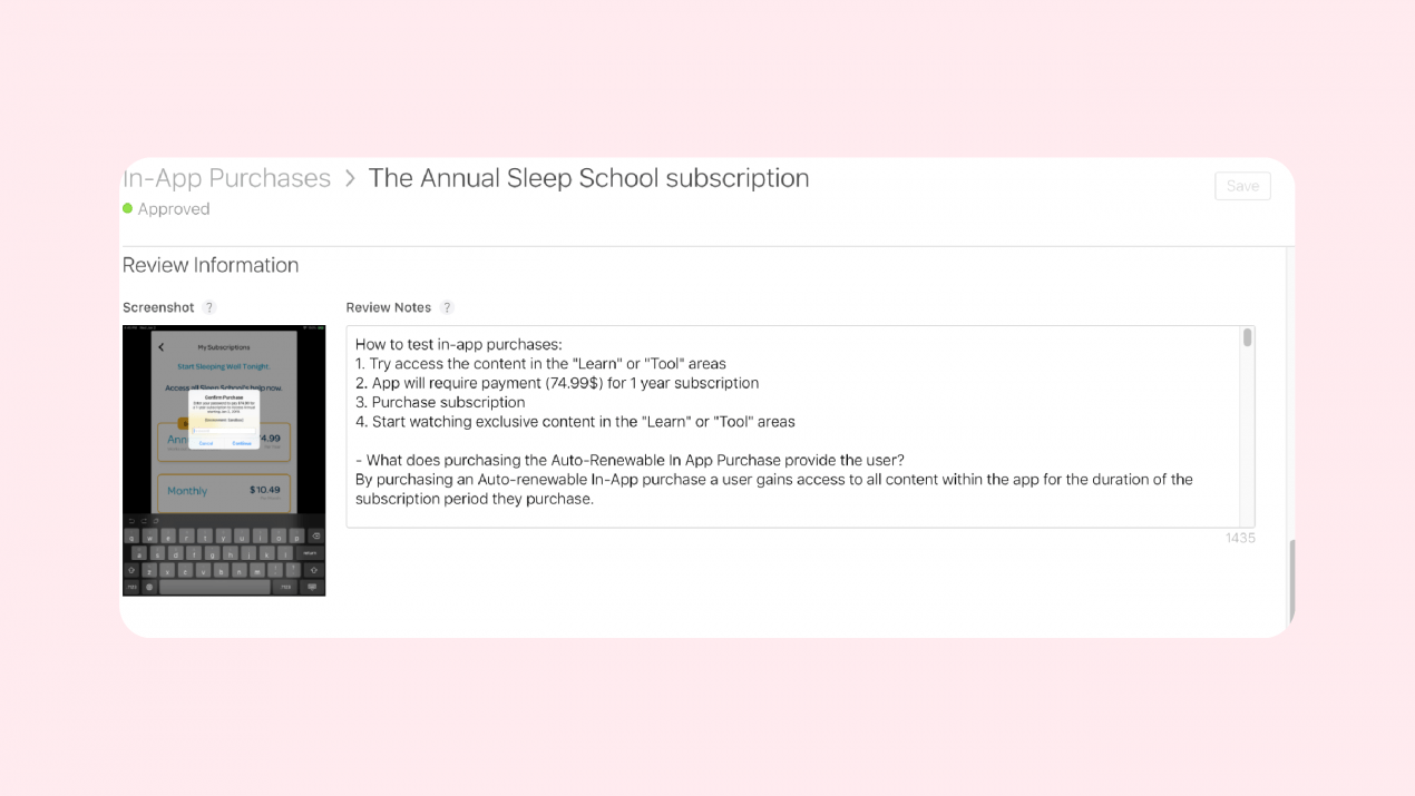 The filled-in Review Information section minimizes the risk of an unsuccessful review
Finally — no matter how thorough the pre-release preparation is, App Store reviewers are just people who may interpret the rules in their own way. Luck or justice – whatever you want to call it – may not always be on your side. You may get approved on the second, third, or even fourth try — it is absolutely normal. Note the details that testers ask about, be persistent, open, and willing to help. And there will be an app release for you!
[wpim]

