


In the 21st century, businesses need CRM systems. Enormous data banks are hard to manage by hand and employees struggle to remember everything CRM algorithms run to a tee. On the interface development side, what goes into creating an impressive and comfortable tool for controlling, planning, and analyzing customer relationships and events? Below, we are going to look at some popular systems and derive a formula for a perfect CRM design.

A sales manager used to have one tool for keeping tabs on people and events: his notepad. This was neither handy nor reliable; even we sometimes forget the contact info or the date of events we enter into the phone. The simple old notepads would get lost, warm leads would be handled as cold ones, and there was no question of precise analysis and statistics. But not anymore!
CRM stands for “customer relationship management” — an application that automates sales, marketing, and support. CRM systems can issue invoices, remind about events, schedule calls with clients, and distribute the workload in the pool of sales personnel. They take the minutes of all the wrangling and back-and-forths that go on between the company and its clientele and show the statistics to illuminate which sales channels and event managers perform the best.
Today, the market for CRM systems is overcrowded. Users can afford to look at the ease of use beyond mere performance. Web design software comes to the forefront, as we are about to demonstrate a selection of twelve well-rated CRM applications for sales and event management. They do some things better than others, however.
These CRMs all serve a client base of a different type, and the list of its design examples includes solutions intended for small, middle, and humongous-scale enterprises. These cases will let you know exactly how to build a CRM properly.
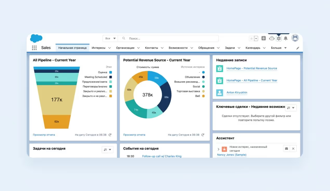
If your CRM solution is meant for big business, you could do worse than learn from Salesforce — possibly the best-known CRM program internationally. It can be customized to infinity, adding functions to suit company-specific needs such as event planning. But in most cases, this is fairly complicated and requires assistance from the technical staff. Salesforce has a clean and laconic interface in neutral colors — a sound choice from the UX standpoint. The user focuses on the information displayed.
Salesforce is great because it manages to fit so much data on the dashboard in an understandable way. Using Salesforce for the first time, the user is bound to be blown back by the gush of information, but in some time, the flood settles into manageable pools. The sales funnel is represented by an image, revenue sources ride a graph — the design is very sensible and direct. Event organizers will like this tool, too.
Another major CRM system on the market, often compared to Salesforce, is only intended rather for small companies. It is not a wooly mammoth of functionality like its counterpart, but it is simpler to use and tunes to one’s desire.
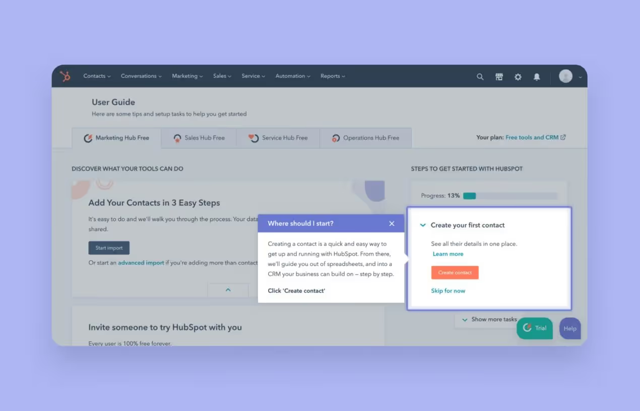
Hubspot stands out for its approach to incoming traffic. Usually, CRM solutions are built on the sales funnel principle: get as many clients (users) as possible up on the rim and sieve them down to the bottom line. Hubspot, on the other hand, uses a flywheel model throughout — the customer sits at the center, and the event managers and salesmen follow-up and woo him with their round delays. This approach sets the priority on inculcating a long-term relationship for a better LTV.
Hubspot is great because it has a clean design with obvious navigation. A newbie user can learn what is what here pretty quickly, aided by pictures and starting tips.
It’s a platform, with built-in Gmail and LinkedIn integrations, which enables users to manage events, tasks, and the sales pipeline without leaving their preferred communication channel. This system lets users add recent leads with a click of a button or automatically from their inbox. If you want to manage your email campaigns or events easily, NetHunt will help you do so without having to open another tab.


NetHunt CRM is great because it allows you to install the Google Chrome extension and to use an inbox by Gmail with subsidiary functions such as handling post-event reports. Moreover, it is possible to connect this software with LinkedIn and other channels. Such a feature enables customers to get used to the new interface quickly. They should just tweak some parameters in a web version.
Zoho is a software provider that has about 45 SaaS products for small and medium-sized enterprises. Zoho CRM is one of the best projects of this enterprise. It has a simple and minimalist design. When customers start to use this system, Zoho CRM shows a guide for newbies. If users accidentally click a wrong button, it won’t be hard to fix as this CRM displays recent activity and allows you to undo steps.
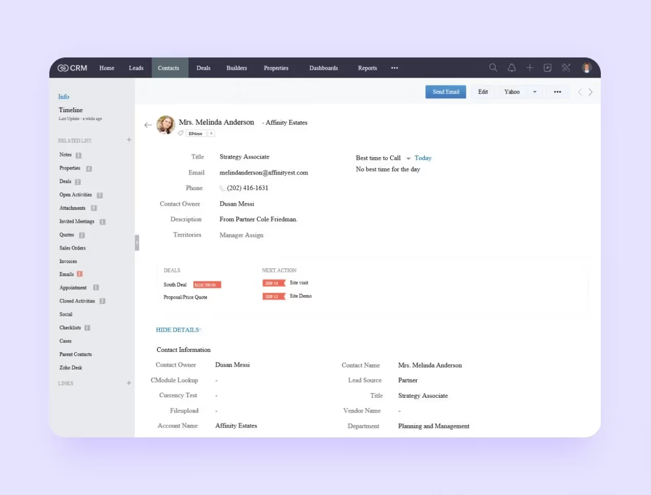
Zoho CRM is great because its users can customize the system’s design. For instance, it’s possible to change the order of menu items above, interface colors, or blocks with contacts. Such a feature allows customers to build a CRM design for their unique needs. For example, event managers can add relevant activities to a menu.
This system was created for different types of businesses. It’s important that the program shows learning blocks when users start to use new templates. Such a nice design solution helps newbies get used to this software effectively.
If you want to connect features of the platform with other tools from familiar companies, you can use Apps Marketplace by this CRM. For example, there are Facebook, Gmail, and Outlook connections.

Monday CRM is great because of its mammoth set of default workflows. That design feature means the platform is a sound choice for small companies because there are employees who play different roles at once. It’s crucial for them to be able to choose an appropriate template to manage the system effectively. For example, event coordinators can choose a relevant template and use it fruitfully.
It’s an AI-based system for small and medium-sized businesses mainly. On the one hand, some functions will be hard to get used to if users have no experience working with complex analytical tools. On the other hand, customers can benefit from pre-installed automation templates. For instance, newbies can use event managing, autoresponders, and welcome emails for new subscribers.
Freshworks CRM is great because it has a precise design with a hint from an AI assistant Freddy which is always available. The system learns from users’ information to give actionable predictions, advice, and insights. Freddy can remind users about events, analyze site visitors, and discern hot leads from cold ones.

This is a sales department-oriented CRM system with clear design solutions. The interface offers sorting deals by different criteria: hanging, inactive, or closed. Calls here are added to the database automatically and the database is segmented by client type.
When this solution is started for the first time, it shows hints to help learn one’s way around the workspace and the sales process itself. For example, when the first potential deal or event comes in, Amo will explain what the sales funnel is and do it in nice detail.
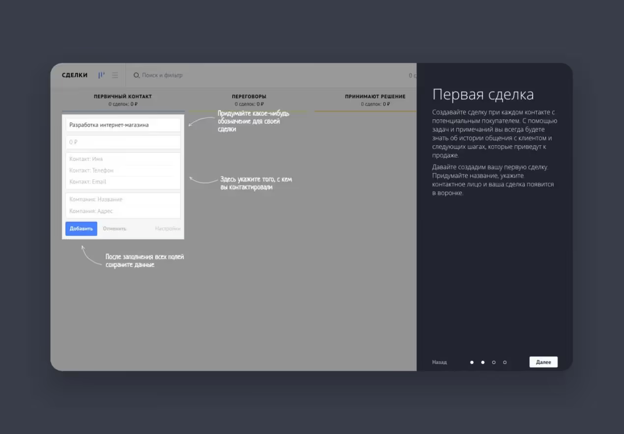
The app design is intuitive enough and can be tweaked to your preference. The navigation panel with a few humble icons waits unobtrusively on the left.
AmoCRM is great because it features messenger software integration. The user can get in touch with a customer over WhatsApp and invite them to an event from inside the CRM program.
This program was created with online commerce in mind. It can link up with e-store engines, download product, and order information, and update order data in both directions in real time. Leads are converted straight from social networks and messengers.
In 2020, the developer committed to a clever overhaul of the whole CRM design, including the colors.
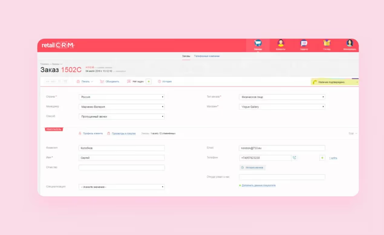
According to the developer, the system has become “more human.” Navigation has been revamped, too. Now, all of the instruments for Retail can be found on the side panel. Expanded statistics are shown online in the analytics section: on customers, products, and amounts. There is also a “best salesman” scale where you can compare people’s KPIs.
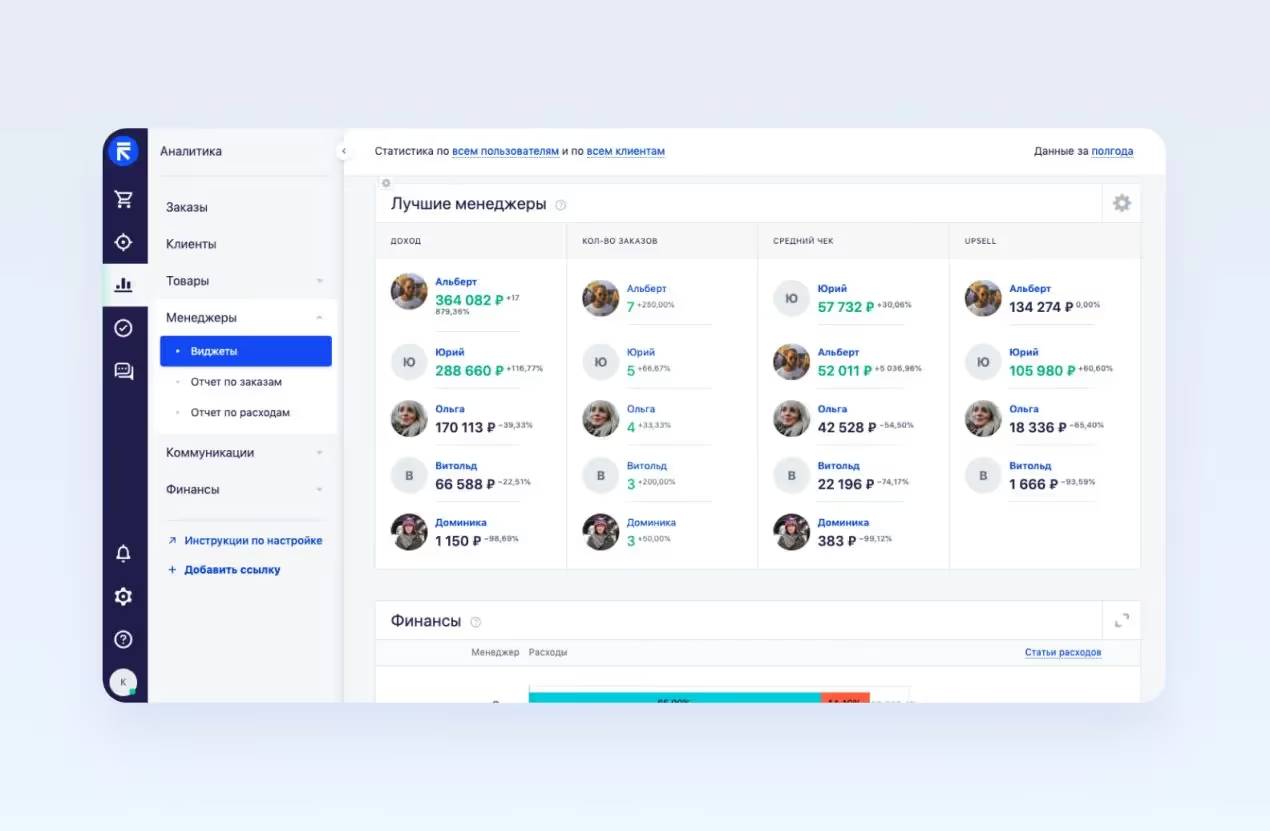
RetailCRM is great because orders can be processed in the same window. This design solution allows the user not to click away to view inventory data, issue invoices, formalize shipping, and so on.
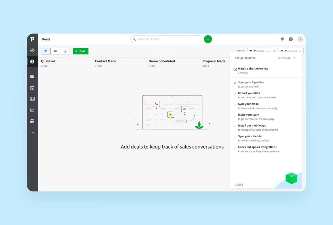
This Estonian startup has grown into a “unicorn.” The developer positions its CRM solution as a suite for small businesses. An abundance of plug-ins lets Pipedrive be set up to match the needs of a company flexibly. For instance, event planners can manage events’ calendars in the system.
The sales funnel and leads are emphasized and set apart on top of the side panel. Every new lead goes to the funnel automatically, and the process can be controlled via a convenient interface. Its scheduler allows the customer to plan events, too.
Pipedrive is great because the CRM design is so minimalist. Capterra has rated this system’s simplicity at 4.5 out of 5.
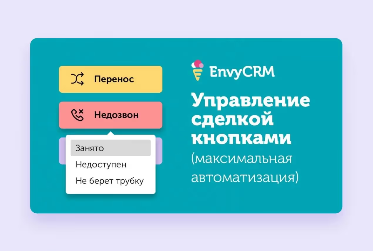
According to the developer, this is a program that does not require pre-training for sales and event personnel, a super-easy CRM with a simple design. In Envy, tasks for customers are loaded automatically when moving from stage to stage in the deal-making process: the call is overwritten, call resumes, and schedule the next call. The customer will not be abandoned halfway or the manager will flounder.
EnvyCRM is great because deals can be controlled by pushing buttons, that is, routine tasks are wholly automated. If the user presses “Failed call,” he will see other buttons to choose: “Line busy,” “Not reachable,” “Won’t pick up.” This way the salesman can devote less time to micromanagement and concentrate on the tasks offered by his superior, who defines the button line-up.
This СRM system is targeted at beauty parlors, clinics, gyms, and other service sector companies. It has an option to notify clients about appointments and events over instant messaging and e-mail and canceling and rescheduling can be done online.
Yclients is great because here it is possible to set up widgets for online events. A widget can be put up on a website or a social network page, its design is easy to customize. Customers will make their appointments and the user can send out notifications, plus the customer gets into the YClients database directly from the widget. It is a convenient tool for event marketing, too.

A respectable CRM system for middle and small businesses. It creates tasks for every stage of the sales funnel, reminds of deadlines, offers checklists with tips to sales or event managers, and informs customers about the state of their orders over SMS.
Like in Retail, everything here is done inside one window, but the design is considerably more turgid. The icons are on the sides, the navigation panel is on top of the screen.
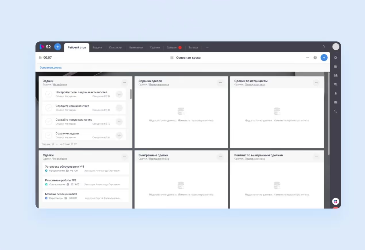
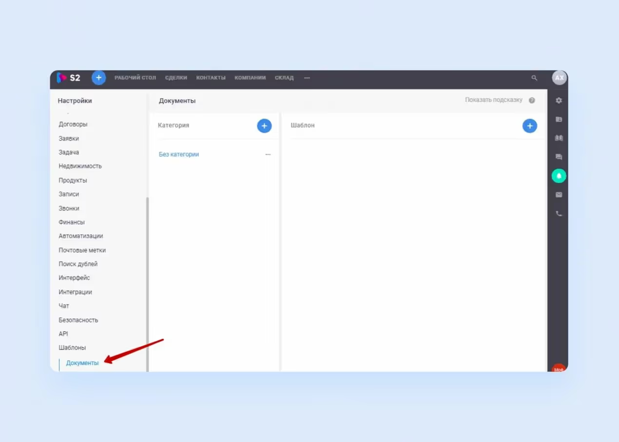
S2 is great because it features a convenient doc template creator. Salesmen and event planners are relieved of having to fill in agreements and other complicated documents. Once laid down, a template can be filled in with data in a couple of seconds, which, of course, increases the event coordinator’s productivity.
These were some of the most popular solutions and their outstanding features which shed some light on the methods of how to design a CRM. Now, let us look at the essentials of platform interfaces all of them pay homage to. These elements serve to simplify the workflow (surprise!): especially to ease event planning.
Your future CRM solution’s interface is going to reflect the purposes and scale that you meant for the program. Small companies need somewhat different functions than heavies. Still, there is a basic set of CRM design features they all try to include.
Now for where CRM can go wrong. When CRM design is considered, it is easy to be swallowed up by data display and forget about the interface. Here are some more widespread errors that allow you to understand how to build a CRM to avoid such flaws.
We can point fingers here at Salesforce, so overloaded with information on the side panel that at first the user does not know where to look. A crawling chaos of charts, graphs, and numbers is a bad thing in design. Keep the screen spacious. You can do this by putting the power in the user’s hands and letting him choose the main screen settings. And the easier this will be to do, the friendlier the design will feel. Allow the users to focus on the parts they consider important and banish the rest from the workspace.
Different business sectors need different analytics. Before you start working on the dashboard’s CRM design, you need to know what information will be relevant. The service sector will want rescheduling info, salespeople and event managers will need the numbers on that, and online stores like to tally up successful deals.
The user experience is the king of the hill for CRM systems, because they are supposed to save companies time, not waste it some more. The simplest thing you can do to meet the user halfway is to caption the icons and put them in a side panel.
If the event planner tried to find a client’s telephone number in a notepad filled in by a doctor, this would be the equivalent of using bad fonts. Font readability affects users’ performance. Restrain your individuality here. As a general rule, avoid serif fonts, because they look better in physical, printed media. For app design, you want something boring and smooth.
Users should be able to spend hours upon hours of their lives in the system without cone cell breaks. When planning color contrasts, aim for practicality, not surreality. The color circle is the usual tool for testing color combinations.

Say what? Yes, just listen to the people who try or envision themselves trying to use the program and respond to their wishes and complaints. You can also read up on feedback for competitor solutions or try putting the workspace of your future CRM program out there as an MVP. Let the users themselves decide if they fancy the prototype CRM design. For example, the event planning feature is hidden in the interface and users complain that they can’t find it. It’s important to fix this flaw.
If you have an existing CRM and while reading through the common mistakes, you recognize your platform’s traits and features — no worries. You can improve the design at any point in CRM’s life, and even little tweaks can make the biggest impact.
We put together a list of 4 practical tips to help you spruce up your CRM platform and boost your product.
Let’s face it, users don’t like staring at a cluttered screen, especially when they need to get work done ASAP. The more elements your interface has, the more confusing and disorienting it can get. Keep your interface clean and straightforward. Ditch the unnecessary CRM UX design elements and stick to the essentials — easy-to-navigate menus, clear buttons, and intuitive layouts. Remember, less is more when it comes to automation platform design.
When it comes to CRM systems, there is no one-size-fits-all. Beauty salons need one set of features, while sales recruitment teams, the other. Take some time to customize your CRM platform to fit the specific business needs of your clients whether it’s adding custom fields to track important data or creating personalized workflows to streamline processes. Don’t be afraid to experiment with a custom CRM until you find the perfect setup that works for your users.
Another important yet often overlooked tip is regularly asking for feedback from your customers to identify areas for improvement. Whether it’s a simple survey form or a quick interview for a free subscription, hearing what people actually think about your CRM can provide invaluable insights and give you a direction for scaling up or pivoting. Building an effective CRM platform is an ongoing process, and it’s important to include users and their needs in the development.
Your users probably already use a bunch of other tools to run their businesses — from email marketing platforms like MailChimp to accounting software such as Quickbooks or Xero. Instead of keeping your CRM on its own, add a third-party platform integration to create a seamless workflow. This way, users can sync their tasks and data from other software, save time, and eliminate double data entry headaches.
<div class="post_divider"></div>
CRM design doesn’t have to be intimidating or stressful. By following our CRM UX design guide, you can elevate your platform in no time and make sure your customers are getting the most convenient and easy-to-navigate product. Remember, it is all about following the key steps: keeping things simple, customizing the solution for your needs, and listening to your users.
If you are still thinking about the design of your dream CRM, holler out to us! The talented and dedicated folks at Purrweb will descend upon you like helpful bees. Our UI/UX designers will assist with developing the concept, fixing the colors, choosing the right font and graph/chart presentation — and so on down the list.
Some of our previous cases can be viewed here.