


We at Purrweb have recently started with the cryptocurrency industry: our first project came in the fall of 2021. In this article, we'll tell you a story of how we developed the Broex wallet app, explored the intricacies of crypto trading, saved our smartphones from burning, and proved that the team’s enthusiasm can make a difference in winning a project.

Broex is a licensed multi-currency crypto wallet. Having a European license, Broex can guarantee security and credibility of transactions. This is a serious advantage for such a project. But how do you compete with other wallets?
Turns out, despite the low entry barriers, around half of potential cryptocurrency users drop out due to the lack of knowledge, fear of running into scammers, or simply pressing the wrong button and losing all the money.
Broex took it upon themselves to help newbies by offering the world’s most user-friendly wallet, the fastest verification, and the option to hold crypto money.
The clients came to us at the end of last summer when Bitcoin was just recovering from a massive price drop. At the time, it was difficult to predict demand for cryptocurrency, but they had faith in their project, and this enthusiasm was contagious.
Our clients had already launched the browser version but were having a hard time with the mobile app. It was never published to App Store — just kept getting rejected. It became a huge problem, because wallets should be universally accessible, and using a web app on a smartphone is inconvenient.
Our task was to develop a cross-platform application for iOS and Android from scratch, avoiding the mistakes of the previous team and dealing with a backend that we didn’t write.

We were eager to try our hand at developing cryptocurrency applications, and potential pitfalls wouldn’t stop us. Thanks to our enthusiasm, we got this project even with no experience.
We’ve had to learn as we go more than once before. For instance, we figured out how Chinese power bank charging stations work with no translated manual available for the EnerGo project. But that was only a part of a larger project, while with Broex, we lacked the very basis — the theory behind it all.
When it comes to blockchain and cryptocurrencies, it’s not enough just to be good at developing applications. It is important to understand the logic behind buying, exchanging, transferring, and withdrawing cryptocurrencies, as well as rounding, balance calculation, and establishing fees. In addition, there are a lot of tricky words involved — coin, token, address, smart contract. If you don’t know their meaning, you won’t understand what requests the application sends to the backend, and what data returns.
We’ve had some experience in the financial industry as we developed the Fintarget trading platform. Still, we had to study crypto in great detail. Otherwise, it would be impossible not only to ensure the financial security of users but simply to work with the client’s backend.

The clients knew their audience, their needs, and motivations very well, and they shared this information with us. It was vital for us, as developers, to figure out how everything worked in the crypto space. But the users don’t care at all.
The main idea was to make everything stylish, intuitive and easy-to-use, without overloading the users with unnecessary information. Especially given that Broex aimed at beginners.
To make the application more beginner-friendly, we paid extra attention to navigation and interface patterns familiar to most users.
Users should always know where they are and how to reach their main goal. We made sure they remain on the same screen while running secondary user scenarios. The new content appears on the panels that slide up — also known as backdrops. For example, in Broex, viewing a list of transactions is a primary user scenario, while sorting it is secondary.
A backdrop consists of two surfaces: a back layer and a front layer
Backdrops provide quick access to the app’s additional features and at the same time keep users from getting lost between screens.
Broex has a lot of buttons, input fields and other UI elements on each screen. To make it obvious what goes where, we labeled all elements carefully, eliminated confusing icons and remembered to add placeholders to form fields.
We named the input fields and added tips on how to fill them
Lots of users, even those new to cryptocurrencies, have experience with classic financial apps. Therefore, our competitive analysis included indirect competitors, such as Tinkoff Investments.
Our designers applied the usual page structure of fintech products to Broex. There, at the top of the screen, you have a card with account information, and the rest of the content goes below.
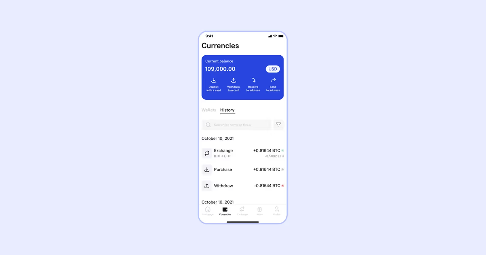
We also adopted some UI components’ behavior from banking and investment applications. For example, it is customary to display currency selectors as backdrops, so that’s what we did in Broex.
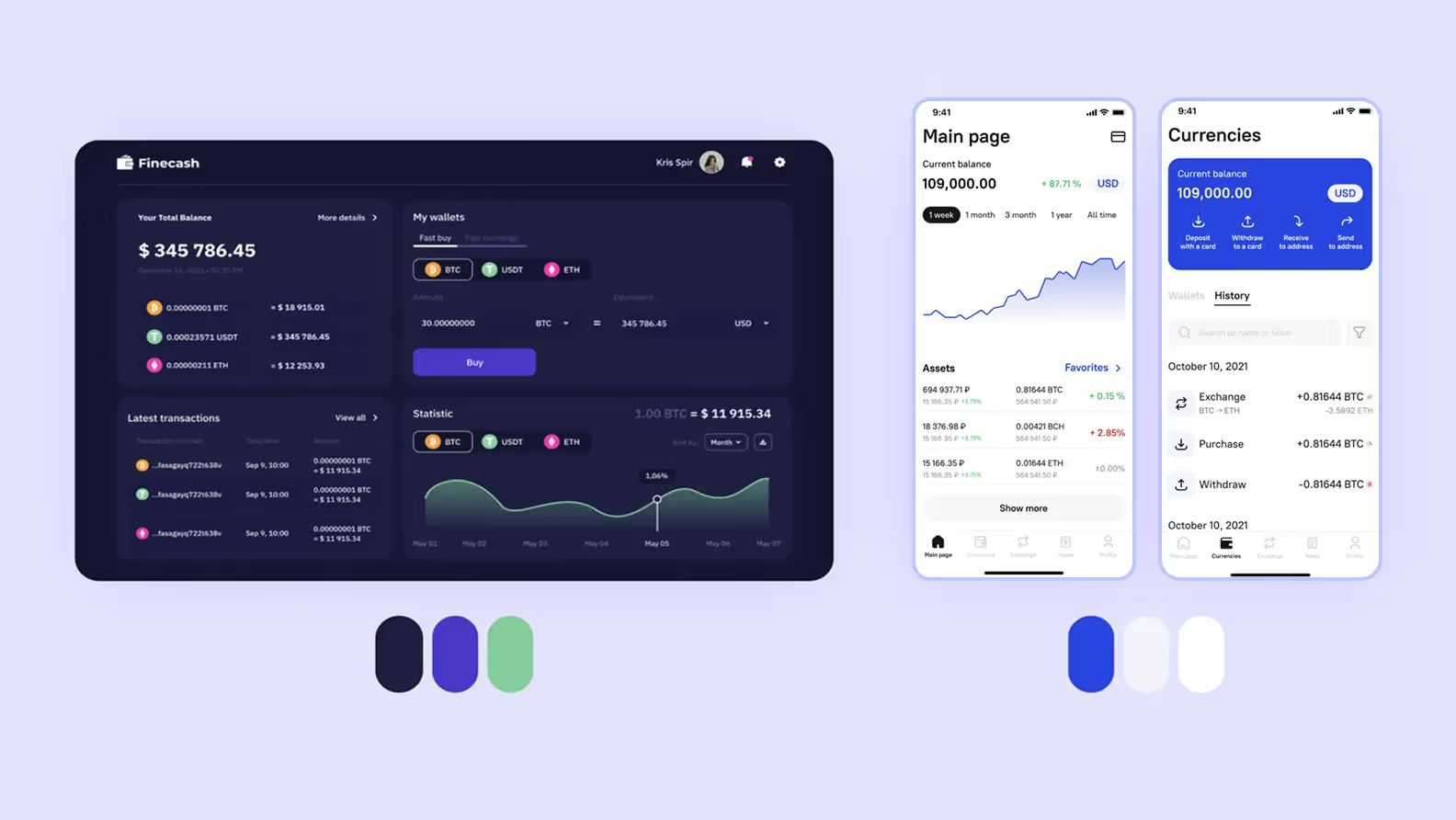
When Broex approached us, they didn’t have a design guide yet. There was only the logo and the main color — classic blue. So before moving to UI design, we found out their likes and dislikes through positive and negative references.
Cyberpunk is the most common design style when it comes to crypto wallets. We wanted to avoid stereotypes and turned to classic financial applications. Their style is more familiar to beginners, easier to comprehend, and visually cleaner.
There was nothing new for us in terms of the tech stack: we always develop mobile applications with React Native. But we faced a lot of small technical nuances.
For example, crypto exchanges have to verify their users through the KYC (know your customer) procedure. This is a security standard and an anti-money laundering measure.
We implemented KYC in the app through SumSub SDK. The client’s backend already depended on it, so we had no choice. But, fortunately, SumSub is a great service, and we didn’t run into any problems.
The currency selector is a basic component of financial applications. Usually, this is a drop-down list with currencies in alphabetical order. We tried many ready-made selectors, but none worked for us.
As a result, we developed a custom component based on the backdrop — a modal window that opens from the bottom of the screen. The new selector combined all the features we needed and fit seamlessly into the app’s design.
A standard solution did not suffice, so we developed a custom currency selector
Working with someone else’s backend, you are bound to run into difficulties and limitations. There was no direct access to the backend. And it didn’t help that it was designed for the web version, missing out on the specifics of mobile development.
Unfortunately, any global changes on the backend were out of the question as they would affect the web frontend. So in most cases, we had to handle occurring errors on the mobile app’s side.
At some point, due to the enormous amount of real-time data, the app began to slow down and heat the phone.
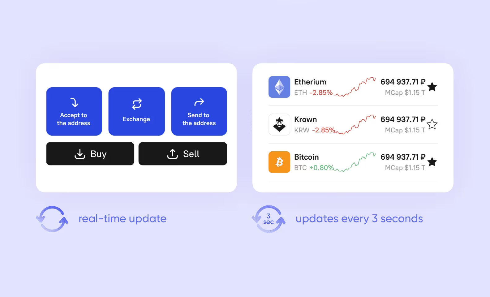
We found a compromise between which data to update non-stop and which data can wait. So now we update everything related to currency transactions in real-time (buying, selling, withdrawing funds). The rest (for example, exchange rates) — every three seconds.
Another problem that we encountered had to do with one of the app’s key features — the currency price chart.
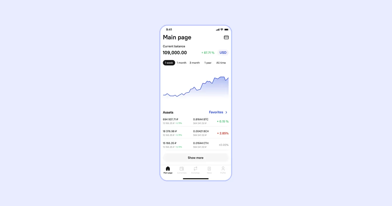
This chart consists of data points with two variables — time and exchange rate. The backend generates them in real-time. The time is always valid, but the request for the exchange rate may fail due to external issues. Then we get coordinates like this: {x: 100, y: undefined}. It’s impossible to plot such a point on the coordinate plane, so you get an error instead.
We solved this problem the following way: filtering the data, excluding invalid points, and then feeding the remaining data to the chart. It was a feasible option since such occurrences were rare and hardly ever went in a row.
Not everything can be solved on the application side. Luckily, we were able to connect with the backend team, and they optimized a few functions where possible. For example, there were such user scenarios that the backend did not facilitate at all. One of them was the transaction history filter.
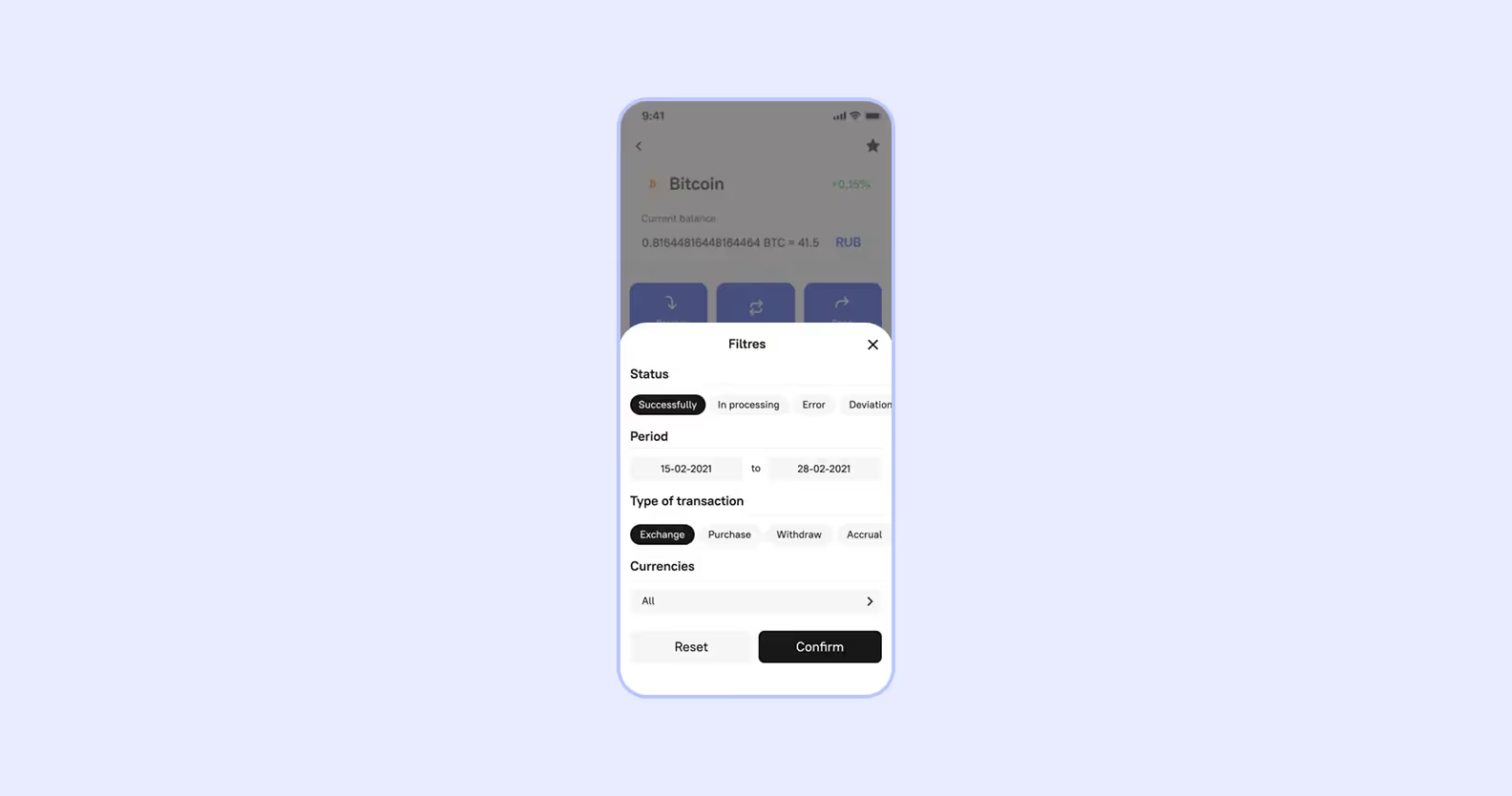
For every query, transaction history used to upload in full, and the application had to save and display tens of thousands of transactions. We convinced the client team to set up data pagination on the backend: from then on, the data was loaded on an as-needed basis.
Clients tend to slow down a release because they want to add that one-more-feature. We were pleasantly surprised when Broex suggested we publish the first version as soon as possible. And with each release, the app became more and more functional.
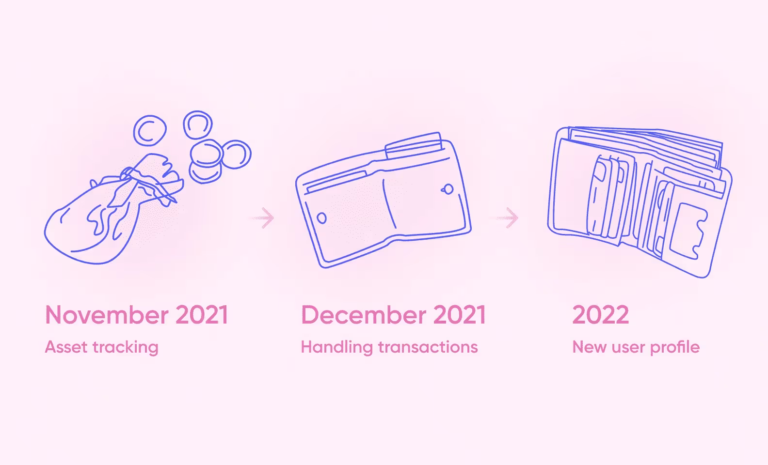
At first, we stuck to basic functionality, currency transactions not included. But even at that point, the users were able to:
By December, we added financial transactions, which included not only receiving and making payments to a unique wallet address but also using a card to buy and withdraw assets.
The latest release introduced biometrics for iOS devices: now you can log in to the wallet using Face ID and Touch ID. We also updated the profile a bit, so now it features default currency, social media integration, and app version info.
As of date, we provide ongoing support for Broex: fix bugs, release updates. The company has a lot of ideas and plans waiting in the wings. For example, to add trading signals for cryptocurrencies and attract more traders.
Our enthusiasm helped us get a project without experience in the cryptocurrency industry. We followed it through due to the team’s perseverance and our tech expertise in related fields. Also, being beginners ourselves, we understood the barriers the users faced and incorporated that into the design.
All the tech challenges we faced just upped our crypto game. We are already applying this experience to new projects: one is about NFTs and the other involves crypto investments. This time, we are developing the backend ourselves. It’s not just less complicated this way, but also gives more opportunities to optimize app performance.